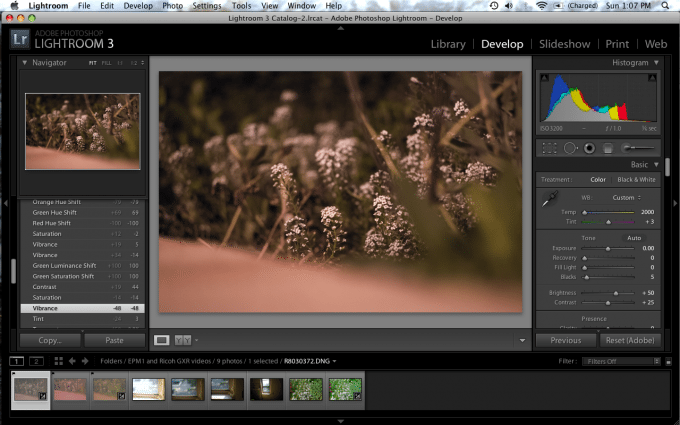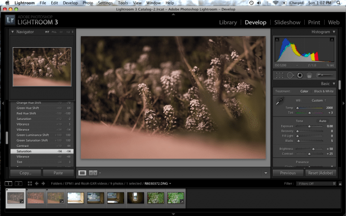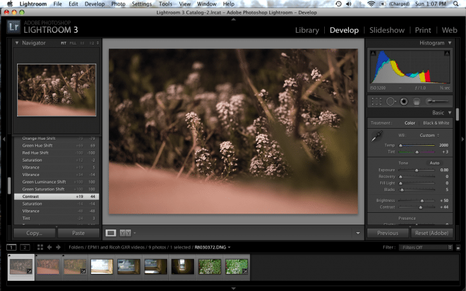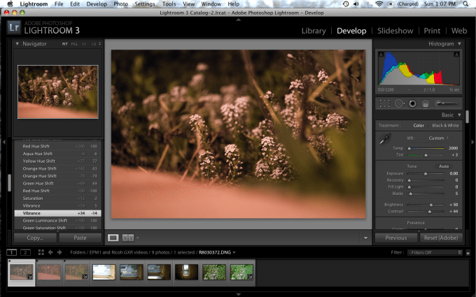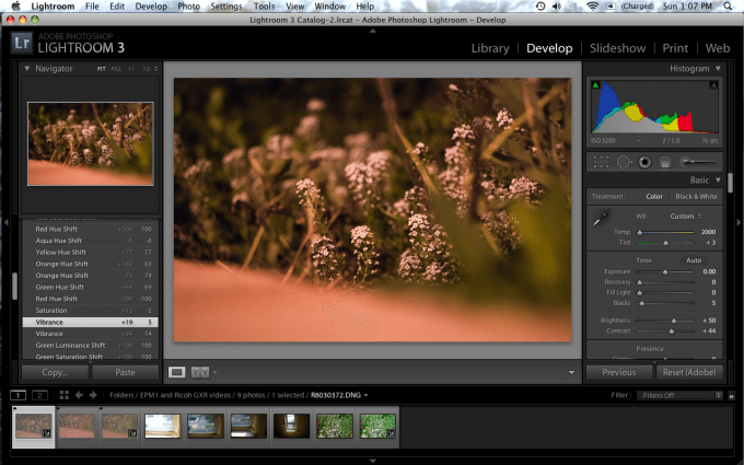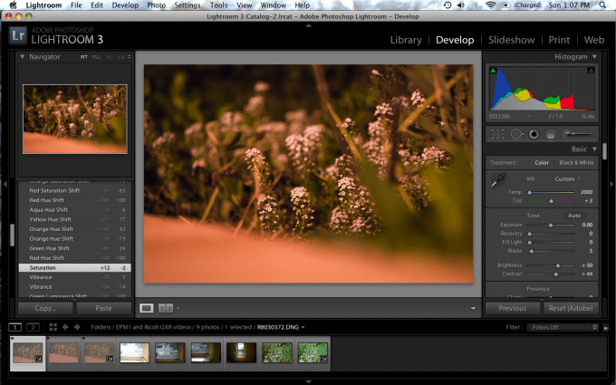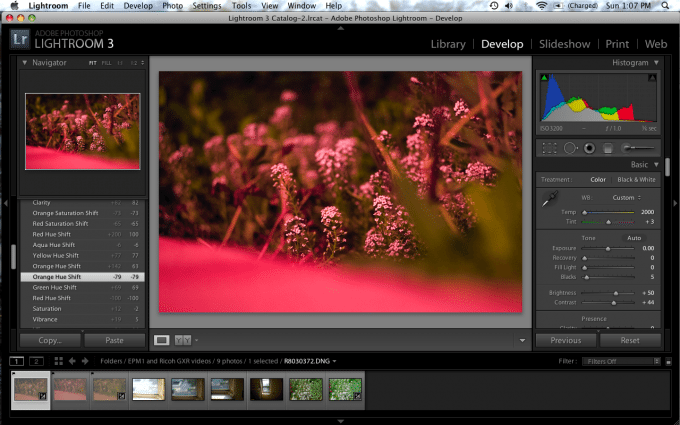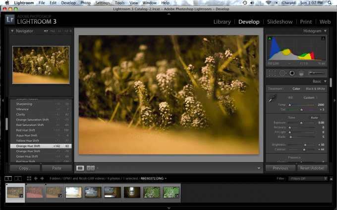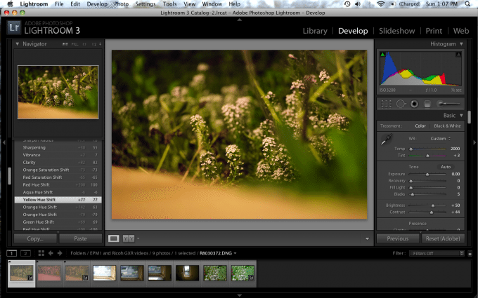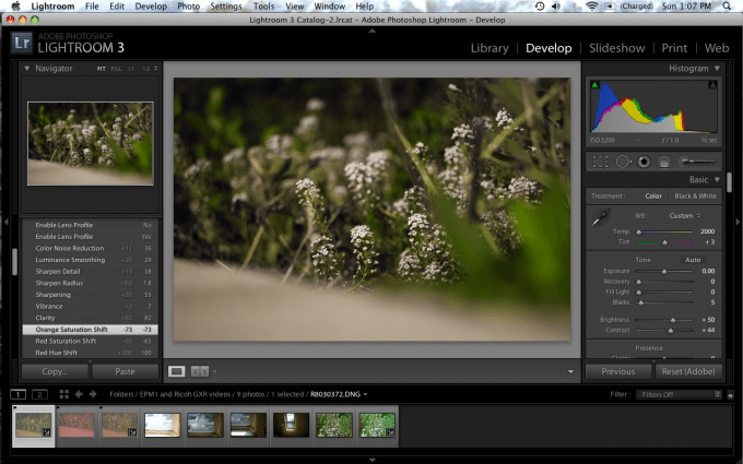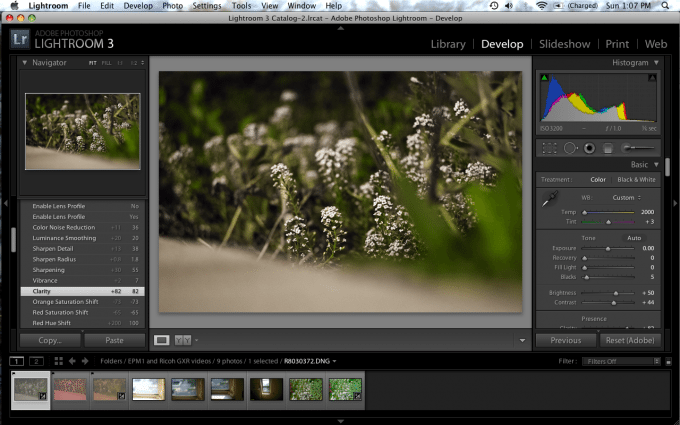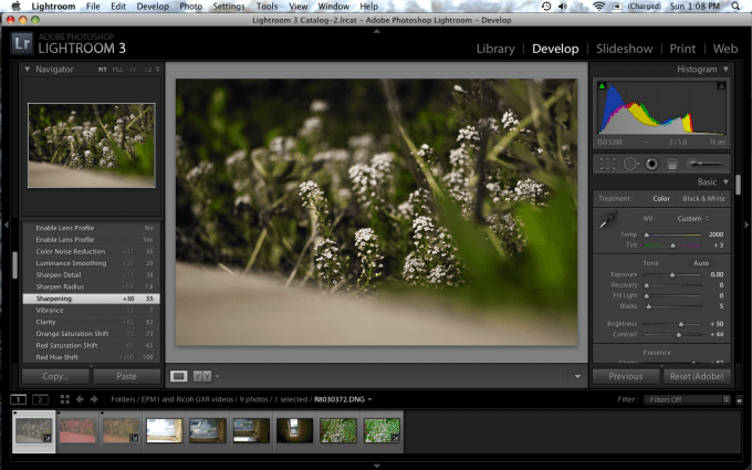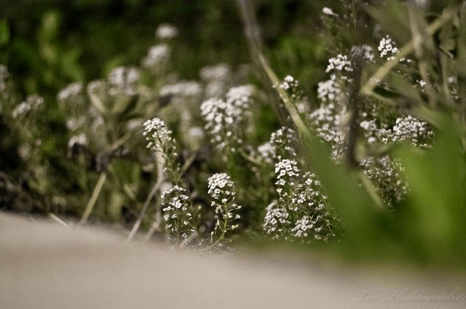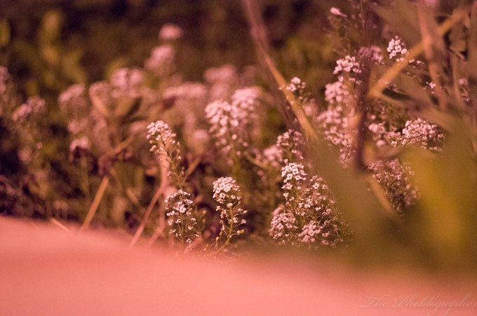
During the Ricoh GXR review, I shot a photo at night of a couple of flowers in my front yard. The problem is that this was shot during nighttime with no extra light besides the illumination from the orange colored street lamps. The flowers in the photo are supposed to be white, the bricks tan, and the plants themselves a healthy shade of green.
After weeks of working in Lightroom 3 on and off, I have finally rescued the image by taking my time and reassessing the reasoning behind color theory. While it looks like and seems like an easy fix, it really isn’t. Here’s how you can rescue an impossibly white balanced image; after a couple of basics.
Editor’s Note: This is a long post. So stay with us and you’ll be very well rewarded with a treasure chest of knowledge.
A Bit About White Balancing
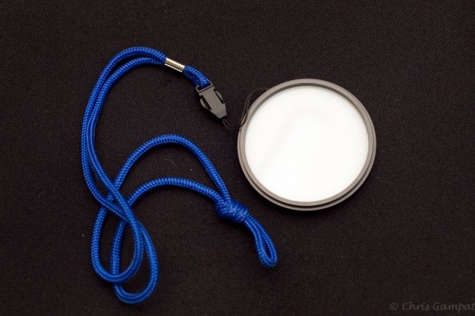
First off, I strongly recommend that you never, ever use auto white balance unless you really need to. Experience and some of the major editing pains I’ve dealt with have taught me this. I recommend using the ExpoImaging ExpoDisk that we reviewed. This is a major necessity when you’re shooting in lighting that is really oddly colored or when you’re shooting in mixed colored lighting.
Once again, manually white balancing will save you a major headache in the post-production process. More on this later on in the actual tutorial.
White Balancing and Color Theory
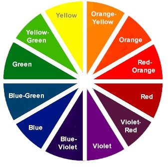
Look closely at this color wheel above. No really, take around 30 seconds and analyze it.
It explains white balancing perfectly. As a rule: in order to neutralize and properly white balance you image, your camera/film needs to be the exact opposite setting of your light.
For example: the daylight balanced output from my flashes is very cool in color. Let’s say that it’s blue. Okay, so look at blue on the chart. What’s right across from it? Orange. So since my light (my flash) is very blue, I need to set my DSLR’s white balance to be very orange in order to neutralize that color. Luckily, I can either set it to daylight or flash to immediately set that up for me. However, I’d probably still manually do it myself using the Expodisk.
This same principle of white balancing needs to be taken into consideration when you are working with an image.
Finding Middle Grey to White Balance
A quick workaround is to find Middle Gray. To do this, use the dropper tool in Lightroom 3 and move it around each of the pixels until you find one that has the color values:
R: 50% G: 50% B: 50%
If you can’t find that specifically, get the closest you can do it. Here’s a tutorial of how I did that over at BHInsights.
Once you select that value, your image will be color neutralized and it will be the easiest to work with and perhaps even the most pleasing to the human eye.
Now, when all this doesn’t work, what do you do? Here’s how you work around all that and why I did every single step.
Editing
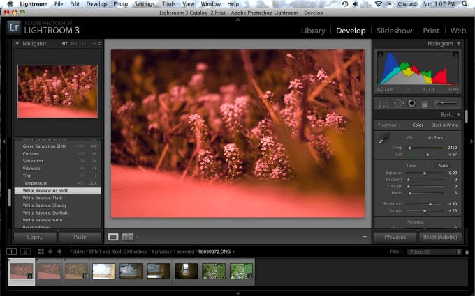
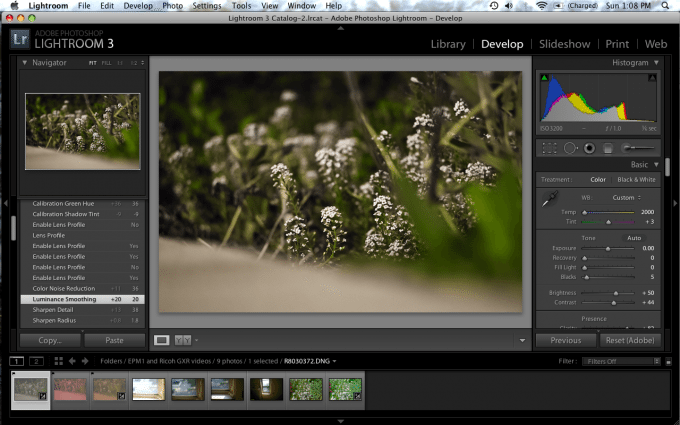
So here’s how this all started in Adobe Lightroom 3. Notice how natively the white balance is set to the coolest it could possibly be. However, tint is also very purple. Plus, check out the histogram. Blue levels are high, then green, then red and yellow. We could probably salvage this photo but it’s going to take a lot of work.
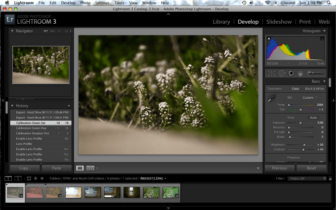
Editor’s note: follow along by reading the history panel on the left hand side.
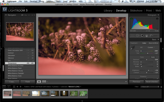
So the first thing I did was tried to see if I could find a pixel to balance off of using the Middle Gray method. Alas, I could not. So I went to work cooling the image even more because of the red and purplish tones are seemingly dominant all over the image. That brought back a bit more life to the greens and also brought out the whites a tad more.
Because the purple tones were still very dominant, I needed to get rid of that but still keep some balance to the image. So I lowered the tint 24 degrees. By moving the tint levels away from purple and more towards the green, I recovered the beginning of editing and enhancing the green plants. Justifiably, you’ll want your plants to be green and not purple. Notice how I’m saying plants and not flowers. Once again, those were white.
To get more of the subtle color tones back, I played with the vibrance levels, which controls this color range. In order to continue color neutralizing the color, I lowered these subtle color tones. This effect gave me more dead looking greens with little to no life in them. However, it also got rid of some of the subtle purples that were plaguing the image.
To continue to combat the purple levels, I lowered the saturation levels of the overall image. Lowering the saturation levels is a common method to turning an image into a black and white. Though we don’t recommend it, it is useful in saving an image like this. In this case, it once again brought us closer to a more color neutral image and also made the image closer to what the human eye would ideally want to see.
For clarity on that, think about it: isn’t it just natural to see plants as green, flowers like these as white, etc? We’re not on Mars where the atmosphere has a creamy pink look to it.
To try to get some of that green color back to work with though, I raised the contrast. Contrast adds more depth to your image between the brights and darks, but it also can be useful in boosting colors. By lowering the contrast, you can often also create an old school film-like look to your images. Or, you can use our recommended presets. Now that the image is looking close to what can be considered color neutralized, it’s time to go in and adjust specific color values.
Since I lowered the overall saturation of the image in order to save it and neutralize the colors, I needed to go back and save what I did to the green levels. Using the saturation slider for the green levels, I saturated the green levels in order to make the plants look more life-like. That gave them a bit more of a wet look (pun totally intended.)
In general, saturation will be a good friend of yours when photographing plants. It will help them to look healthier. But don’t overdo it!
I also did this with the Luminance levels, which dictates how bright those colors will appear. Playing with it and judging the results by eye was the key here.
Since these greens are still so subtle, I went back and adjusted the vibrance again to see if I could restore them to life. While it did work a bit, the ugly purple hues returned.
To get rid of the purple hues, I lowered the vibrance again and thought of going back to the color channel saturation levels. Before I did that though…
I decided to raise the overall saturation tones a bit more so I’d have more lifelike images to work with later on the editing process. As you see, the flowers also became more purple.
Let’s think about the colors that could be causing that terrible purplish tonality.
Red
Purple
Magenta
So I started by lowering the red levels because of the fact that I remembered that there was no red at all in my mom’s garden.
Now I tried adjusting the color hues to see what I could get. By raising the green, I hoped to neutralize the reddish-purples. If you look back to the color wheel at the start of the post, you’ll see that this is key. As further evidence, check out the tints in Lightroom: at one end is green and the other is purple.
And by trying to lower the orange levels, I only turned the image into something more reddish in tones. Hues work like the rainbow: ROYGBIV = red orange yellow green blue indigo violet.
By lowering the orange hue, I only intensified the red. So I raised it more towards the yellow levels and now I started to see something come more into what I’m aimed to get in my final image.
Once again, think of each channel as having their own weight on a scale with many cups. And think about where you want to place that weight in order to get what you want.
By raising the yellow hue levels, I intensified the green levels. And now we’re starting to see a lot more life to this image; especially in the greens.
Just to see what I could get, I played with the aqua tones. The reason for this is because of the fact that the image is already so cool in temperature. This proved to do nothing for me.
I increased the Red Hue shift as well just to see what would happen.
Nothing.
But what about the saturation levels then?
Lowering the red saturation levels brought me a bit more to a color neutralized image. Those flowers are starting to look more white now. But now there is an orangish hue all over.
Lowering the orange saturation level neutralized the image some more. In fact, it’s now totally neutralized. By both lowering the orange hues and saturation levels, I was able to effectively and totally kill off that ugly tint to the image. Now it looks like like what you might see in real life.
Now that the image was neutralized, it was really just about doing some cosmetic fixes. I raised the clarity to see what I could get. The image started to pop more.
To see what I’d get when adjusting the more subtle colors more, I adjusted the vibrance levels. The greens started to come out a bit more in the background.
Then came sharpening, setting the radius and choosing the detail levels.
Then it came to some noise reduction because this was shot at ISO 3200. Additionally, I reduced the color noise and calibrated the hue shifts a bit on the bottom of Lightroom’s panels just to see what I could get.
And now for the export.
Final Image
This is the final image and down below is the original.

Want More Resources on Photo Editing?
First off, we used Adobe Lightroom 3 and I recommend purchasing an ExpImaging Expodisk. We also used the Ricoh GXR, A12 Leica M Mount module and Leica 50mm f2 Summicron lens.
Want to learn more about editing? Check out our resources
Solving White Balance with the Expodisk
Creating a Better Black and White Image
Film Emulsion Presets for Lightroom 3
Cross Processing an Image in Lightroom 3
The Golden Spiral Method of Composition
Sharpening with the High Pass Filter in Photoshop
Histograms Part 1 and 2
Getting the Cross Processed Look in Photoshop Elements
Please Support The Phoblographer
We love to bring you guys the latest and greatest news and gear related stuff. However, we can’t keep doing that unless we have your continued support. If you would like to purchase any of the items mentioned, please do so by clicking our links first and then purchasing the items as we then get a small portion of the sale to help run the website.


