Last Updated on 08/30/2011 by Sander-Martijn

In this exciting second installment of my 3-part series on the histogram, we’ll go a step beyond the basics by examining three specific ways to use this interesting tool. Take a look at part one here.
A Histogram Can Help You:
1. Preserve Highlight Detail
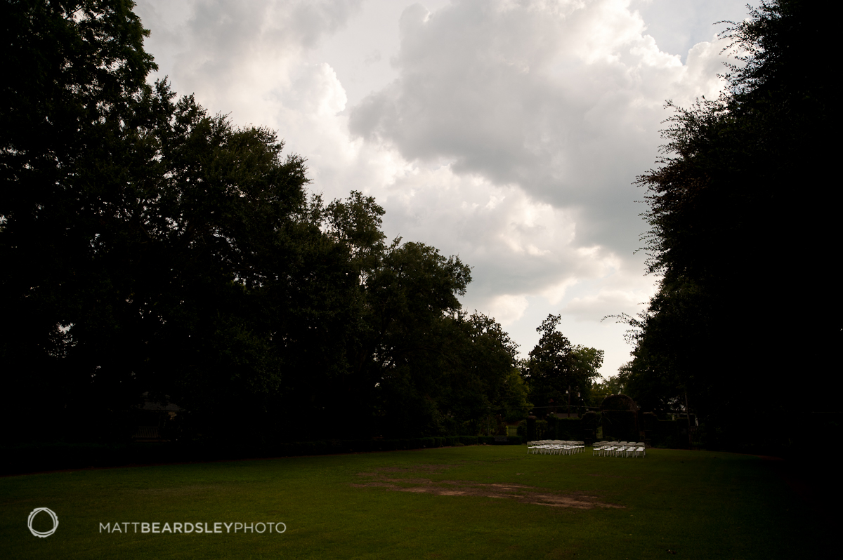
In the above photo, there is too wide a dynamic range for a contemporary DSLR to capture. Compared to the bright Alabama summer sky, the trees are very dark. A photographer, then, has to make a creative decision: create nice, brightly-detailed trees and a blown-out white sky or create ominously dark trees and a detailed sky full of puffy clouds. The right answer, of course, would be to come back in a few hours when the exposure is more naturally balanced, but let’s decide, for the sake of argument, to save the sky and let the trees go dark.
The trick is to lower exposure until the highlights are no longer clipping. As we discussed in Part 1, a clipped highlight in an image like this would look, on the histogram, like a ski jump on the right side. Instead, I’ve lowered the exposure until we have a nice, unclipped mound at the extreme high end of the camera’s dynamic range. The extreme left-hand ski jump clearly informs us that the shadows have “blocked up”. When an image is too dark, detail is lost, meaning – for this image – where there were once leaves and branches, there is now only black. In our piano metaphor from Day 1, it would be a lot of abuse on the instrument’s last key.
But, we have saved the highlights, and it’s a pretty cool sky. Also, I think the well-exposed sky works well to draw attention the little clump of chairs, the only other properly-exposed detail.
If we were feeling techy, this would be an important image to have for an HDR merge: one with good highlight detail and no clipping, and we can verify both on the histogram. In the bright Alabama sun, it would be more or less guessing to judge exposure by the screen preview image alone. The histogram is much more objective.
2. Preserve Shadow Detail
In this image, we find a dark-toned subject against a very bright background. As in the previous example, the range of tones in this image is beyond the capture ability of our cameras. Unlike the first, though, the subject is at the low end of the keyboard. If left to its own tiny electron brain, the camera would equalize the two exposures and guess at an average. Even using spot metering, the camera would measure a small area and pick an exposure that would yield an average exposure for that spot (which would be much too bright if your subject is black to start with). What we want, in this case, is for the low end to be dark and clear, with good detail. We want to be able to read the contours of the sculpture and its interaction with the water.
To do this, I increased the exposure until all the low end detail was contained in a nice, unclipped histogram mound at the extreme left side of the chart. Looking only at the histogram, I know the exposure is exactly right for the sculpture. I can also tell, by the abrupt end to the graph on the right side and the thin, very tall spike, that the highlights are totally gone, blow clear off the map, too far gone to even leave a proper ski jump as a farewell notice.
In this photo, the highlights are not significant. A darker exposure, a black bird silhouetted against a bright, mid-day sky would have been a weaker image. If we were framing a dark subject against a beautiful sunset, then it would be decision. Also, just like with the first example, we have one of the exposures needed for an HDR merge. HDR rarely looks good with any blocked-up blacks and we can tell from this histogram that we have every bit of shadow detail perfectly captured.
3. Make Mid-tones POP!
In this last example, we have yet another scene that far exceeds the dynamic range of current cameras. These three images, if nothing else, should illustrate well why photographers prefer to work in the morning and evening and not mid day. None the less, we can tell from the abused histogram that this image is blowing out at both ends. It has both an extremely hard-core ski jump on the right and bold shadow clipping that appears to be cutting a would-be pretty mound of image data cleanly in half.
In a case like this, which is all too common, the histogram can help us confirm that the camera has recorded a wide range of usable data and that we have the best possible exposure. Every point along the chart has at least a little data, and there is a good amount of image recorded in the meaty middle tones. The highlight ski jump can be explained by the bright sky and indicates (as compared to the previous example of the bird) that there is still some trace of detail in those bright clouds. A too-bright, washed-out image would show much more substantial highlight clipping, and a darker image would have a low-contrast muddy look indicated by a histogram with a heavy left-side loading. Image data at both ends, as we have here, indicates contrast, which we can confirm visually.
As these three examples show, sometimes there is no way to record a scene with a perfect bell-curve histogram. The histogram can be used, though, to lend valuable feedback as to what exactly the camera has recorded, whether it’s detailed bright highlights or clear, deep shadows, or some delicate balance of the two. Exposure, a critical creative and technical decision in photography, can be confirmed objectively in the field. The histogram is an invaluable tool for the digital photographer.
In our third and final entry, we’ll take a look at post processing by using the histogram.
Please Support The Phoblographer
We love to bring you guys the latest and greatest news and gear related stuff. However, we can’t keep doing that unless we have your continued support. If you would like to purchase any of the items mentioned, please do so by clicking our links first and then purchasing the items as we then get a small portion of the sale to help run the website.


