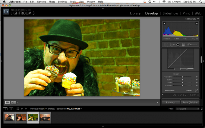
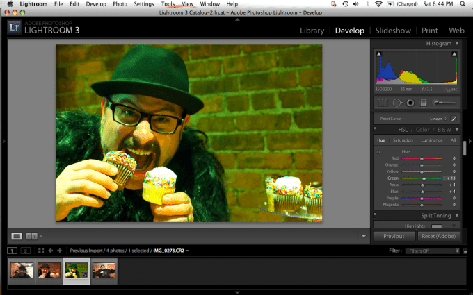
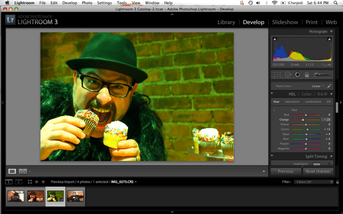
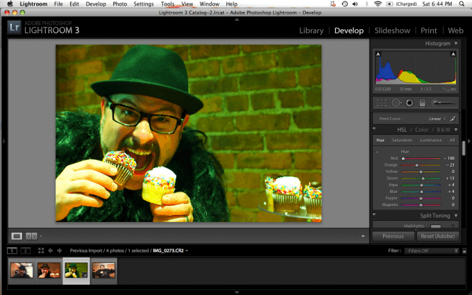
Cross Processing—it’s been all the rave for quite some time now and you’ve probably seen it all over the interwebs. Back in the film days, cross processing meant developing your film with the wrong chemicals in order to get some weird and kooky effects. In the digital age, it can be done with manipulation and understanding of color theory. Though I’m often one to go against trends myself, I’ve done this for wedding clients and they loved it. Since many readers of this site use Adobe Lightroom 3, I’m going to show you step by step and screenshot by screenshot just how to do this and without dropping hundreds of dollars on a Lomography camera and film. However, I’ll also tell you that if you haven’t tried the plastic cameras, you should do so at least once.
If you want to read more, you can read about processing the image in Photoshop Elements as well.
There are a couple of things that you should keep in mind before you begin the cross processing transformation. For starters, this works best with images that are fun, quirky or very interesting because even if the processing job doesn’t come out looking top notch, the subject matter will still be able to stand by itself. For images that are far off from looking natural, you’re best off color neutralizing the image first by finding a middle gray pixel and white balancing the image off of it. With this in mind, let’s begin!
Warning: This is a long and very thorough posting. Go grab a cup of coffee.
The Easy Way
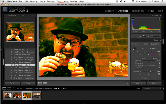
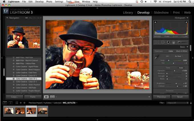
Lightroom 3 has an easy way of doing this. In the development panel, you can take a look at the navigator module on the left. If you scroll down, you’ll notice that you have various filters. When you get down to the Color Creative section, you’ll notice the Color CP options. There are three of them. These allow you to cross process the image easily and without lots of work. However, you can still do your own manipulations to them if you’d like afterwards.



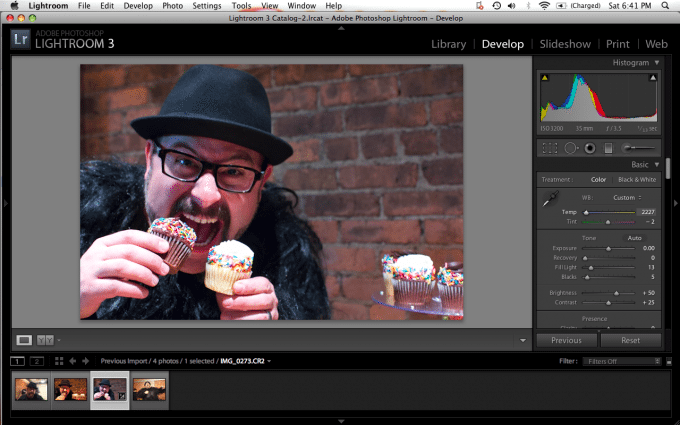
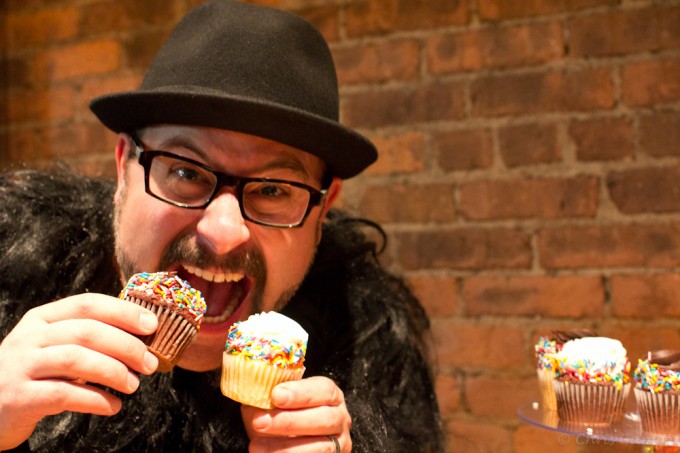
As you can see, they all have their own differences in strengths, tonality, etc vs the original image (opening image of this story). But if you don’t like either of them, don’t worry, there’s hope.
The Manual Way
My favorite way of doing this is by doing into the right module and manually starting some trouble. I say trouble because of the fact that I consider each image to be my own work in progress, and by starting trouble I’m sitting there and tweaking the image until I like it.
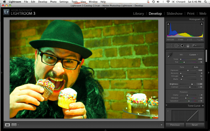
The first thing I didwas look at the image and the histogram. Before I started changing around the settings, I clicked the reset button to set the image back to the original way it was. Blues are strong in this image, so I decided to make them even stronger and mess with the white balance and tints a bunch.
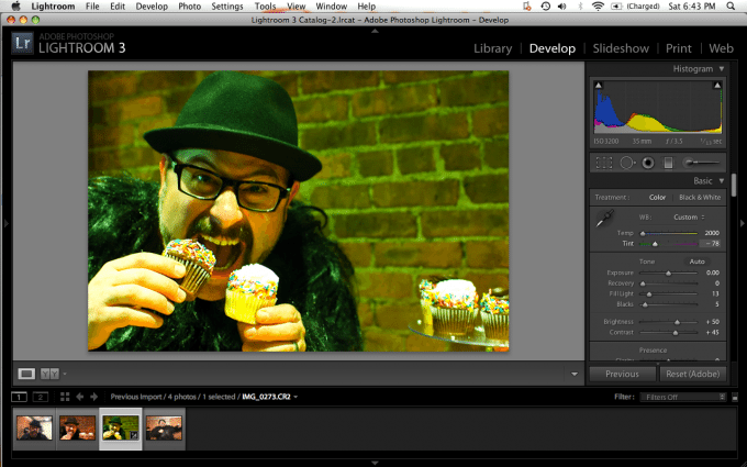
Then I immediately cooled the image temperature a bunch by moving the white balance slider to the left.
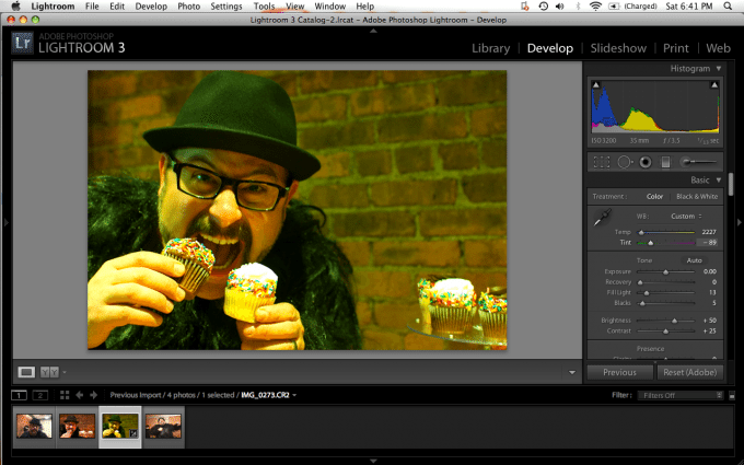
After cooling the image, I tweaked the tint to give it a funky greenish hue. Notice how I’m still not going too overboard and that Gabe’s skin and the cupcakes are still reasonably close to the original in terms of color.
When I was happy (at least for the moment) with the way the image looked, I went down to the saturation level and added some extra wetness to the colors. Plus, I messed with their vibrancy a bit and lowered the clarity. The vibrance will control how deep the colors are and the clarity takes away from the sharpness of the image.
It’d probably be a good time to say that this image was shot with the Canon T3i and 35mm F/1.4 L.
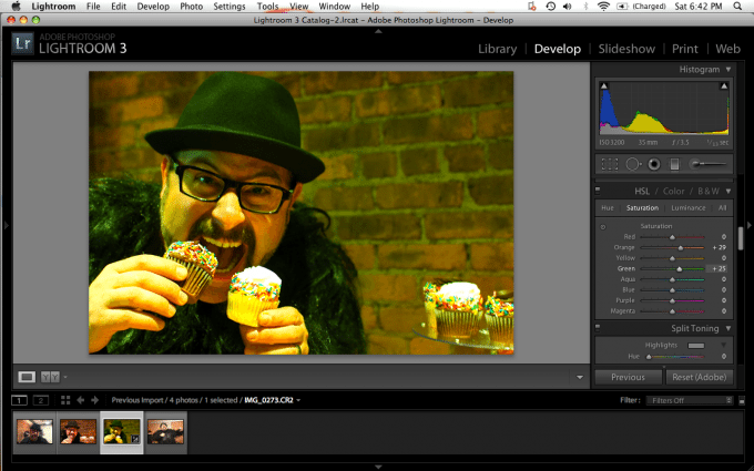
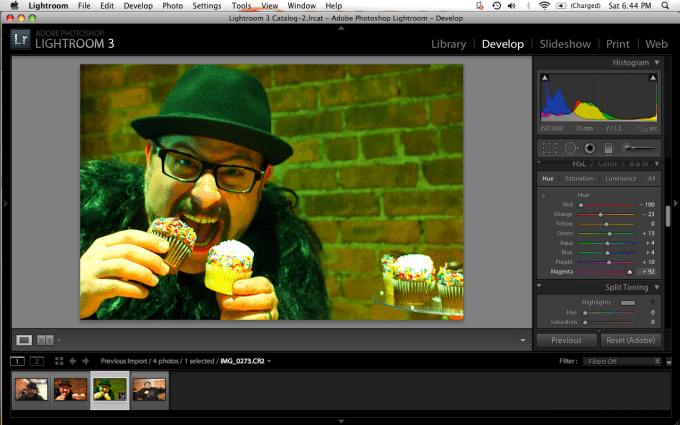
Now here is where I messed with the saturation of each color individually. Notice how the image is dominated mostly by blue, orange, green, and some yellows. Adjusting the levels accordingly will help to change the image even more.
Once again: cause some trouble and go crazy. Be experimental.
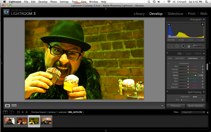
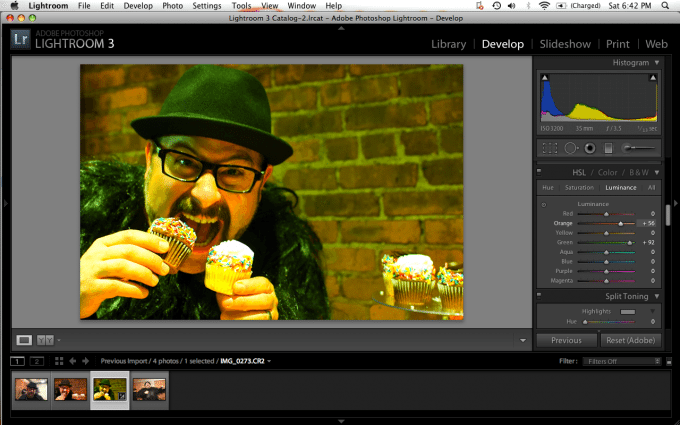
After dealing with the saturation levels and making each individual channel the way I wanted it, I went into the Luminance section and messed with the luminance (brightness) of each color. Though the effects are subtle, they are enough to be visible with the end result.
Once again, it’s a great idea to mess with the colors that are clearly visible as those will have the most effect on the end result. As another remind: go crazy and have fun with them but also be sure to take careful note of the effects of what you’re doing.
When the luminance and saturation were all adjusted for the specific color levels, I decided to mess with them overall. So I headed back on up to the tint slider and adjusted it some more. Now the image is starting to look really funky but still fairly natural.
Then to be even more experimental, I headed down to the point curve and set it to linear so that the highlights, lights, darks and shadows were all neutralized. This opened the image up to even more editing and creativity.
Now I decided to go and adjust the hues accordingly to see what else was possible with this image. I know the T3i’s dynamic range is fairly decent, so I also knew that I would be able to do quite a bit with this image.
Once again while adjusting the hues, I took note of what the dominant colors were in the image and adjusted those.
After a while, I took a look at some of the more subtle colors, like Gabe’s lips and his ears. By adjusting the according colors, I made them selectively pop more.
And even more adjusting…take notice of the differences in the images.
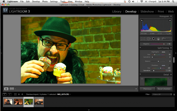
Now I went down into the split toning panel and adjusted the hues and shadows and then saturated them accordingly. Notice how the image is now looking more blue.
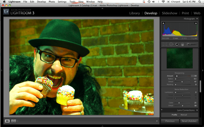
Now to give it an even more plastic camera look, I unsharpened the image and lowered the radius and detail.
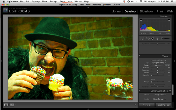
Now, I added a bit of a vignette. However, I was careful not to add too much lest I completely ruin the image. Moderation is always the key.
Then to make it look even more film-like, I added more grain to the image and increased the size of it. However, I left the roughness alone.
And finally I tweaked the brightness a bit to boost the overall colors in the image.

Was this helpful? Let us know your thoughts and questions in the comments below.
Please Support The Phoblographer
We love to bring you guys the latest and greatest news and gear related stuff. However, we can’t keep doing that unless we have your continued support. If you would like to purchase any of the items mentioned, please do so by clicking our links first and then purchasing the items as we then get a small portion of the sale to help run the website.


