Experimenting around in Photoshop is fun! For those of you that love shooting portraits and have a bit of an artist edge, perhaps you may want to edit your photos to look a bit vintage. If you’re one of those photographers, hit the jump to see how I accomplished this look.
Author’s Note: I’m using Photoshop Elements 6. It’s a more economical version of the program and can accomplish the needs to most people very easily. This is a very illustrated guide that will be able to help most people and make the process as simple as possible for you.
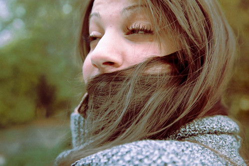
There are a couple of things that you’ll want to do. This may seem like a long and lengthy process but it really isn’t. This photo was edited in roughly two minutes. To be fair, I know my way around Photoshop, had a clear/defined idea for the look I wanted, and also knew the technicalities of how this photo was shot.
Don’t let that intimidate you though. This is a really simple process.

My first recommendation for this would be to shoot in RAW. ALWAYS shoot in RAW. This usually gives you the most versatility in the editing process. Think of it as a digital negative of some sort. When you’ve finished adjusting all of your levels, clarity, white balance settings, recovery etc. I recommend not touching saturation yet for reasons that will be explained later on. However, if you have more confidence in your editing skills then go ahead and saturate or desaturate away! You should click on the done button to bring your photo onto the canvas for editing.

Make sure that the photo is adjusted to a size that you’ll be able to work with it at ease: preferably without having to scroll up and down. Most people will tell you to create a new layer but I say create a duplicate layer of your background copy. The reason why for this is because it doubly ensures that your original is not touched in any way. Think of it as total insurance of some kind.

Now you want to select that background copy layer. After that, head up to layer and select new adjustment layer. Mouse over ot the Gradient map. This is where things will start to get a bit trippy in the look.

Once you’ve selected gradient layer, select the Soft Light effect. We’re going to need this to achieve that washed out look. Doing this works better for this process vs desaturating the image as a raw. However, if you want to do the latter, feel free to before it goes onto the canvas. It can help you achieve a similar look. Don’t adjust the lighting angle or anything else yet, we’re going to do that later.

Once you click okay you’ll get the options for gradient mapping. Select transparent rainbow. And then click okay. By now you’ll have three layers and you’ll have the look that you see below. It is much different than the original.

If you haven’t done so already, try turning up the brightness of your monitor all the way. I edit on my Macbook and the brightest setting always delivers the most spectacular results. This is where the color processing will really come in handy.

Above the layers is the opacity button. Ensure that the Gradient Map layer is selected and adjust the opacity for it until you get something close to the look you’re going for. This is a very delicate and technical process. Too much in either direction won’t look great. There is usually around a 10% area where the images still look real. Have fun and really think about it because we’re about to add more lighting.

This time you’re going to go back up to layer and select new fill layer then gradient. Select Soft Light again and this time we’re going to adjust the lighting to a specific area. Click ok.

Mess around with the angle of the lighting until you’re satisfied with the look. Also be sure to change the style of lighting if you’d like. This is all really up to you and your personal preferences. It will take some time on your part but it will help to make the image beautiful. Really put effort into this and don’t be lazy. Select ok when you’re all done.

Now that that’s all done, go back up to layer and select flatten image. This will flatten all the layers on top of the original to create the image you want for the most part. An alternative to this is merging all the layers down individually. If you’re very OCD about not touching the original in this, then that’s the option for you.

We’re not totally done yet but we are getting there. You’re going to want to mouse over to the Filter area and select filter gallery. Now here is where the really cool and artistic part comes in. You’re going to be adding film grain.

A word about film grain first: if you’re shooting at a higher ISO and you can see the film grain, you may not want to touch this option at all. I, however, shoot with a Canon 5D Mk II with a lens wide open, so little to no noise comes in.
Open the texture area of the filters and select grain. Set the grain type to enlarged and change the intensity and contrast. Adjust in varying amounts until the desired results come in. Intensity will create a really grainy/noisy image and contrast will mess with the colors that you previously messed with. Go crazy with it all if you’d like. If you haven’t done so already, set the view down on the bottom left to something along the lines of, “fit to screen.” When you’ve achieved that old school polaroid look, select ok.

And that’s it, you’re all done now. Now you can just add your own watermark in a layer of some sort or any other way that you do watermarking. Now just get ready to export the photo and you’re all set now.
What other tips can you add to this? Let us know in the comments down below.
Get rid of the ads!
Did you enjoy reading this article as much as we enjoyed writing it? There's a way to support us and our reporting, getting ad-free navigation and more as a bonus. Subscribe to us for less than a coffee per month —just $3.99— or take advantage of our yearly subscription with a hefty discount for only $25.- An ad-free experience
- A free mystery box for Lightroom or Capture One
- All the books in our store
- 20% discount on Capture One
- 30% discount on Imalume Photo Theft Protection
- 20% off Herbs and Kettle Tea Company.
- 20% off your order from MPIX printing services.
- 5% off Viltrox Products via their eCommerce store.
- 10% off all film developing, printing and scanning services from Blue Moon Camera and Machine
- 15% off 7Artisans products: The lens and accessory maker is offering a sweet discount for Phoblographer's readers.