
I’ve often been one of the journalists who speaks about the colors and the way that the images from the Leica M9 always felt. But I’ve also been one of the very few going beyond that to discuss how the Leica S2 also was in the same boat. That camera was basically a medium format Leica M9 — and how can you beat that? Well, in 2026 I’ve been reindexing my archives of images that I’ve made over the past 20 years. With that, I’ve been able to find and catalog the images I made in 2012 with the Leica S2. And I’ve found a problem that no one else seems to know how to talk about — and it’s not the ISO noise.
The rest of the text of this article is an update to our review of the Leica S2. You can find the full review here. Why update it? Because photographers still talk about how great old CCD sensors were. And I agree with them. But they don’t understand how editing images from them also needs to evolve if brands are going to bring them back.
Update in 2026: The Kodak Sensor in the Leica S2 was Something Special, With a Big Problem
Yes, back then, medium format sensors weren’t great for high ISO output. That’s because they were a CCD sensor with a processor that just wasn’t developed for it. The time period was early digital still, and CMOS sensors were starting to become more of the norm over CCD. They used less power, could offer arguably better high ISO output, etc. But still, the older CCDs still had a charm of some sort.
What a lot of folks don’t know is that the Leica S2 was more or less the same sensor as the one in the Leica M9. To that end, they had very similar image quality.
Though there was one big problem that I’ve only really realized now as I’m older and have become a much more experienced editor and far more outspoken against issues in the camera world.
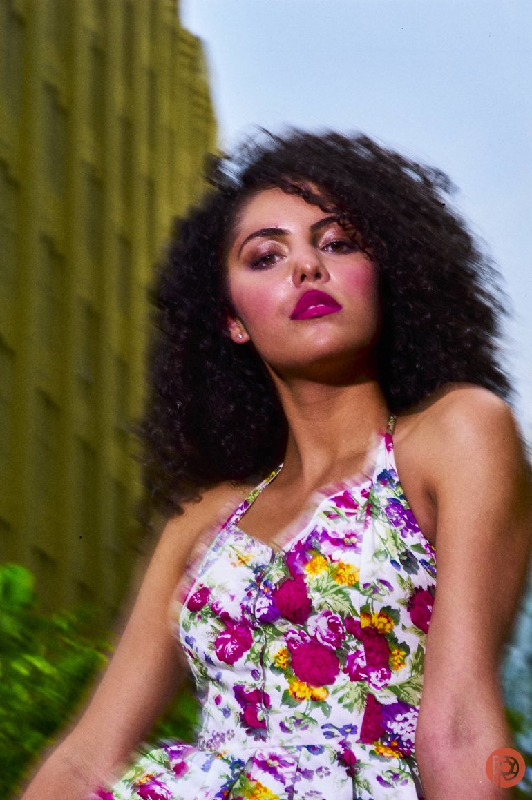
This sensor was pretty terrible for photographing people of color specifically with noticeable amounts of melanin in their skin. What do I mean by that? If you look at someone from Germany and someone from a country like Argentina who tend to be more fair-skin brown, you can tell the difference. And in my Leica S2 review, I mostly photographed women of color. When I went to edit the RAW files in Capture One, I found the color depth to be pretty lacking. Below are images that I’ve edited in Capture One; the program considered by serious working photographers to be far superior to Lightroom when it comes to editing.


Put bluntly, the sensor in both the Leica M9 and the Leica S2 wasn’t great for people of color when it came to editing the colors in the scene. You often need to really adjust the color channels for their lips.
And even then, there are some a fair amount of oddities that I haven’t encountered with newer cameras as much. The key word there is, “As much.” To that end, I’ve still found that editing my images for different skin tones to be annoying.

Overall, it reminds me of an old teaching from Steve McCurry about making sure that the colors in your portraits have three colors that really stand out from one another. Here’s a quote from an article I wrote in 2024 explaining his methods:
Steve McCurry is known for something called the three-color portrait method. This process more or less doesn’t include black or white in the method. Instead, it focuses on the ROYGBIV colors. It states that in order to not overwhelm the human eye, you have to make the colors pretty minimal.
Steve basically uses the following:
- The color of the person’s skin
- The color of the outfit
- The background color
And he makes them stand out from one another just enough. But he also uses light and depth of field to make the image even more effective at emphasizing the subject. By default, lots of his backgrounds are some shade of green. And the science behind that is pretty simple. Like black, white, and gray, the color green is found naturally to work with everything in nature. Here are examples:
- Red and Green: Roses, tulips, saffron
- Orange and green: Mandarin trees
- Yellow and green: Lemons and limes. Also flowers
- Blue and green: Seaweed. Landscapes alongside rivers.
- Indigo and Green: Spiderwort flowers.
- Violet and green: Violet flowers
With all this said, green is a color that you can easily try to make the background for every shoot that you do.
So why bring this up in 2026? Well, photographers have been getting into digi-cams and the older CCD sensors quite a bit. To that end, they’ve been requesting camera brands to make them again. If the brands are to do this, they need to also work on the processors and the color science quite a bit more to make the image files more inclusive. But they only need to do a bit of a tweak. Not a lot. The sensors are still, to this day, quite capable and deliver a look that’s really wonderful.


Get rid of the ads!
Did you enjoy reading this article as much as we enjoyed writing it? There's a way to support us and our reporting, getting ad-free navigation and more as a bonus. Subscribe to us for less than a coffee per month —just $3.99— or take advantage of our yearly subscription with a hefty discount for only $25.- An ad-free experience
- A free mystery box for Lightroom or Capture One
- All the books in our store
- 20% discount on Capture One
- 30% discount on Imalume Photo Theft Protection
- 20% off Herbs and Kettle Tea Company.
- 20% off your order from MPIX printing services.