
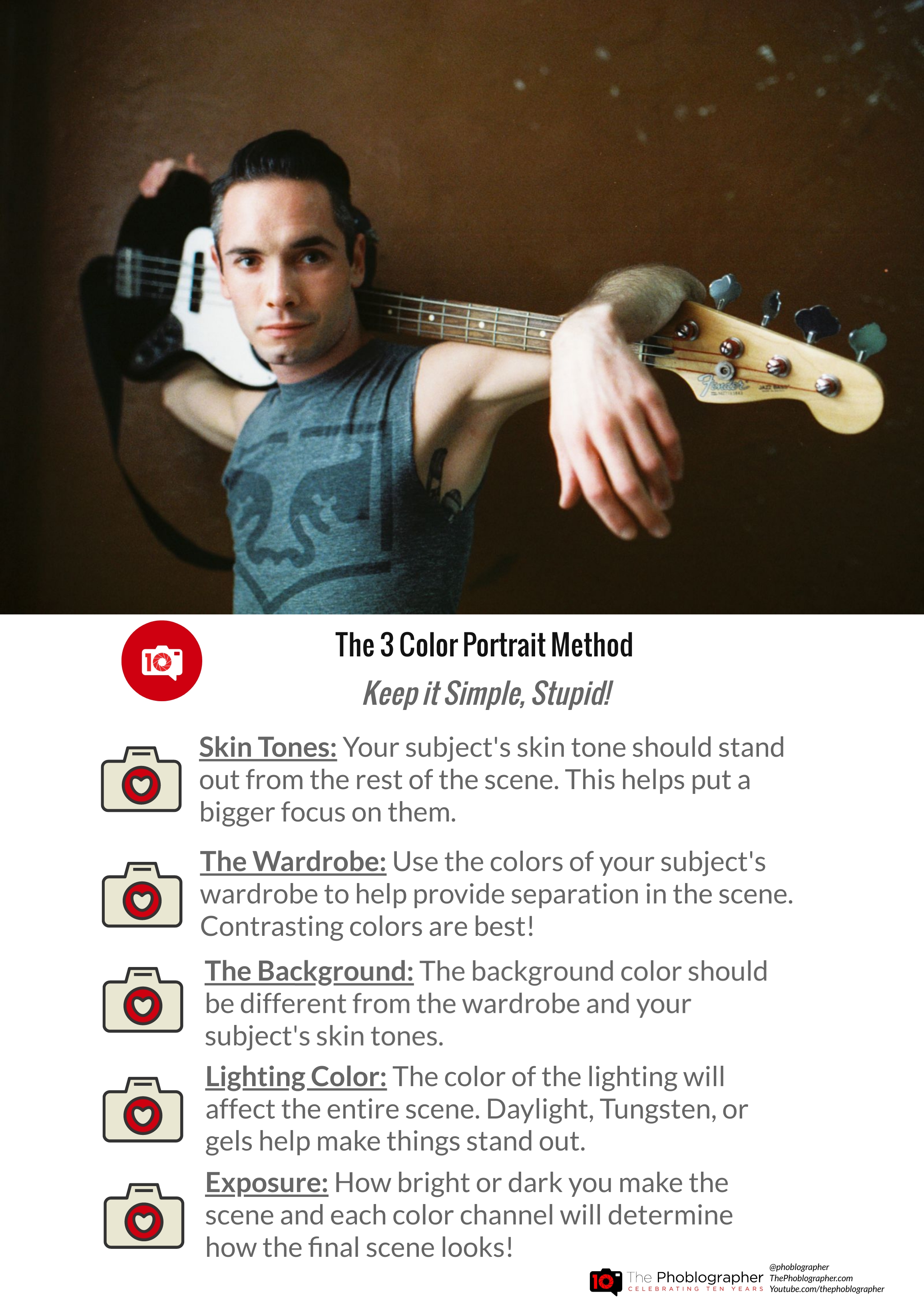
The three-color portrait method has been used by so many professional photographers.
We’re big fans of keeping it simple when you can. This is critical for portrait photography. The objective is to put the emphasis on a single person. So you need to find a way to make them stand out. Naturally, the human eye goes to them. You can also use the depth of field and bokeh to single them out. Then there’s also composition rules. But what about composing by color? There are lots of ways to do this. And with portrait photography, it can be a game-changer. The truth is that not every excellent piece of wardrobe works with every scene, so keeping it simple is the best approach. Focusing on using it, three colors can do a lot for your portrait photography. Let’s take a closer look!
Previsualize: Create, Don’t Capture
The approach for many portrait photographers is arguably lazy. Instead of genuinely creating, they rely on the model to do something. But besides giving them instruction, try giving wardrobe input. Using the Behance platform to develop storyboards and mood boards helps a lot. It can dictate things like lighting and so much more. Plan to go above and beyond by using the three color portrait method. Add props into the scene to give the model something to do. Try flowers or candles. Create a story. Don’t just sit there lazily, capturing a model vibing in front of a camera. Those photographers tend to do nothing else but copy the work of others. If you’re looking to create work to feed the Instagram algorithm, then just stop. Put the camera down, thumb through a few photo books, and get genuinely inspired.
The Colors
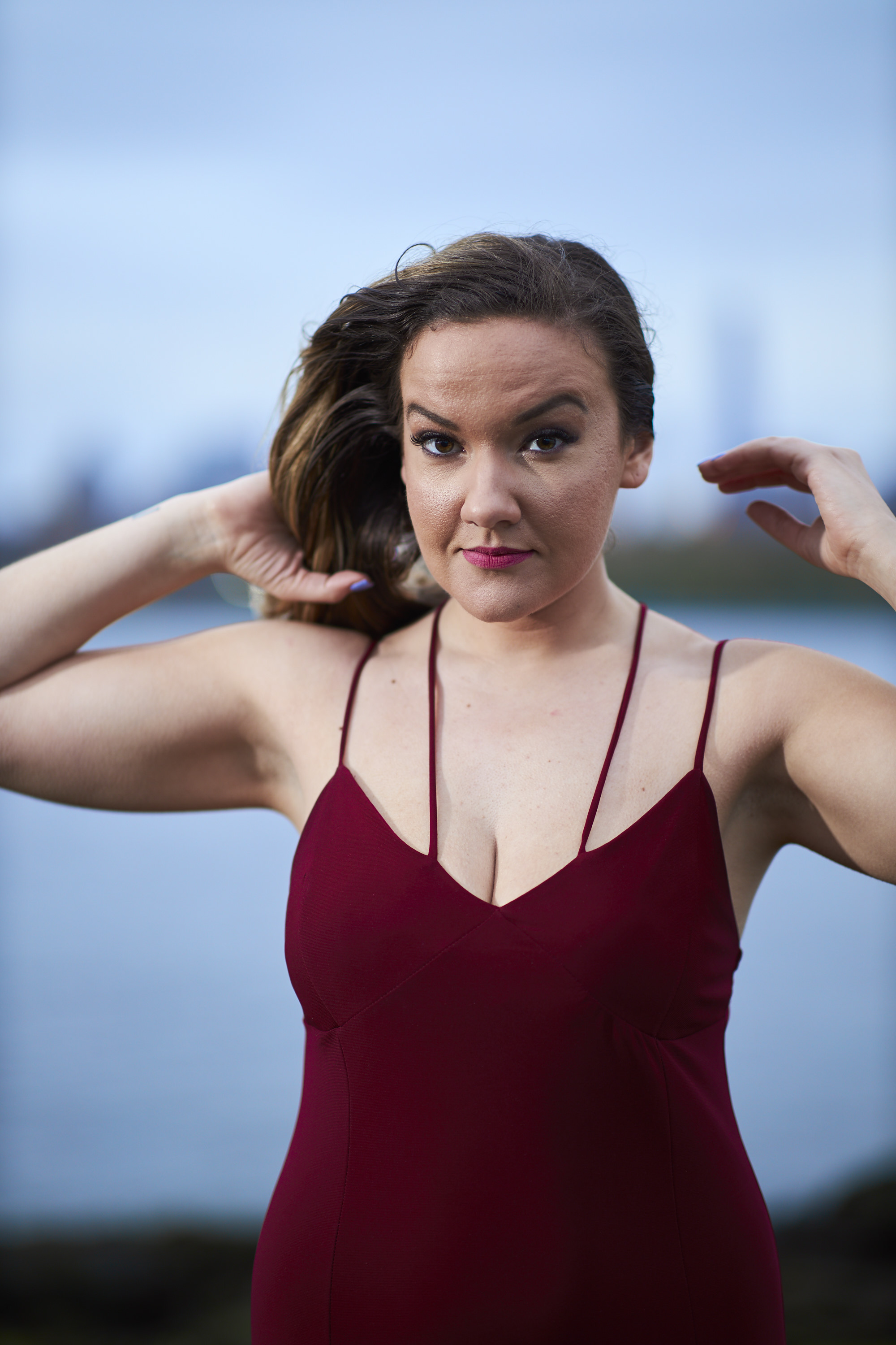
The colors in your scene are paramount to a better portrait photograph. The general rules are to use three specific colors that stand out apart from one another. Look at the ROYGBIV scale. In the photo above, her dress is a reddish-purple, the background is blue, and her skin is a type of orange. That’s what the Canon EOS R picks it up as at least! Red and orange are close to one another, so you have to use lighting to make those two colors stand apart from one another. This photo would be a nightmare to edit if it were shot during the golden hour. The warm hues would make editing the color channels very difficult. But when you make the colors stand apart from one another, you get more clearly defined areas of the scene.
“You see, one of the biggest rules of portraiture is to keep your colors relatively simple. Steve McCurry for example uses three primary colors in his images: a fair stagnant background, skin tones and clothing colors. These three colors working together don’t overwhelm the eye and do more than traditional depth of field effects to separate a subject from the background.”
A quote from Katrin Viil: Gorgeous Use of Specific Color in Portraiture
Your Lighting
I’ve spoken a lot about lighting so far. It’s a big part of the three color portrait method. To make this easier, I like to manually white balance my scenes. So I typically start at 5500K Daylight or 3200K Tungsten. Otherwise, I mess around and choose a specific preset on the camera. But if you’re using a flash, most of them are balanced to daylight. When you add a gel, it makes the color from the flash completely different. Placing a gelled flash correctly can make your subject really stand out in the scene.
The Phoblographer’s infographics are made with VisMe.
Get rid of the ads!
Did you enjoy reading this article as much as we enjoyed writing it? There's a way to support us and our reporting, getting ad-free navigation and more as a bonus. Subscribe to us for less than a coffee per month —just $3.99— or take advantage of our yearly subscription with a hefty discount for only $25.- An ad-free experience
- A free mystery box for Lightroom or Capture One
- All the books in our store
- 20% discount on Capture One
- 30% discount on Imalume Photo Theft Protection
- 20% off Herbs and Kettle Tea Company.
- 20% off your order from MPIX printing services.
- 5% off Viltrox Products via their eCommerce store.
- 10% off all film developing, printing and scanning services from Blue Moon Camera and Machine
- 15% off 7Artisans products: The lens and accessory maker is offering a sweet discount for Phoblographer's readers.