
I’ve changed how I’ve edited images many times over the years. Lots of photographers these days lay into the clarity slider like cultists making an offering for their salvation. As a result, they then ignore the sharpening tool. They also tend to mess with contrast quite a bit. Over the years, though, I’ve worked with independent color channels more and more instead of the basic adjustments. However, I recently came back to a slider that I haven’t touched in years: the saturation slider.
Why The Saturation Slider?
If you shoot a lot of portraits, then you probably hate the saturation slider. It can throw off skin tones in a portrait very easily. And if there are orange and red tones anywhere else in the scene, they might really get affected by it. These can throw off a lot in the final image. Because of this, I never touched the saturation slider all that much and instead worked with individual color channels. But if you’re shooting other types of work, then saturation can be really fun.
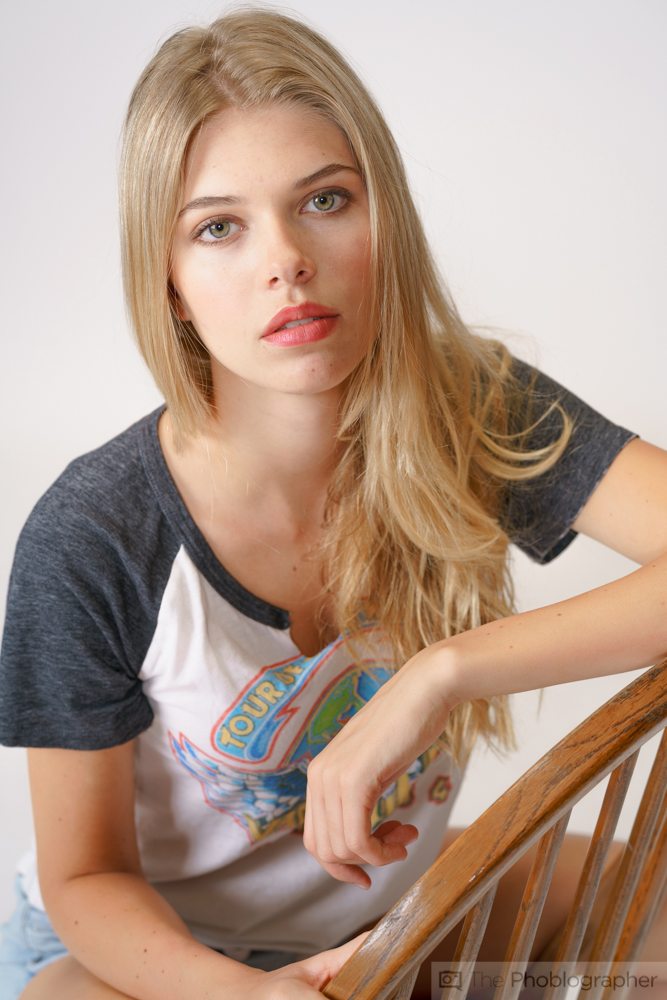
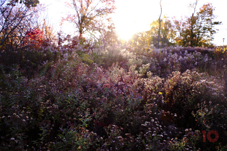
Specifically, I’m talking about landscapes, street photography, cityscapes, astrophotography, product photography, etc. The deep, wet colors that the saturation slider can give you can make a huge difference and can even inadvertently add some nice contrast to your photographs.
We’ve done an important tutorial on HSL adjustments, which stand for Hue, Saturation, and Luminance. You can check that out right here.
Understanding It
In Capture One and Lightroom, the saturation slider tends to work similarly. It basically either makes the colors look deeper or more muted. If you mute them all the way, then the scene becomes a variant of a black-and-white image.
Before you mess with the saturation slider, we strongly believe that you should get your white balance as perfect as you possibly can. I tend to white balance to Daylight 5200K or Tungsten 3200K. Then, from there, I mess with things accordingly until I get the colors I want. After this, I found the primary colors in the scene. If they’re clearly separated from one another on the ROYGBIV scale, then I’ll lay into the saturation slider. If they’re not, then I’ll be a bit more careful when editing.
If you shoot with Fujifilm cameras and use the Velvia setting a lot, then you’ll really get where I’m coming from here. You can also see it very pronounced with both Canon and Sony cameras.
A Little Goes a Long Way
Just like with clarity and contrast, a little bit of the saturation slider can go a long way. It’s often a lot more apparent in Lightroom than it is with Capture One. This is often why lots of photographers tend to tweak the individual channels instead. But your white balance can have a huge impact on how the saturation slider affects the scene in the end.
Like any good photo editor, we also recommend a few other tips:
- Change the background of your photo editor to the same color background of whatever platform you’re posting the image to. It will look much different on an 18% gray, white, or black background.
- Take some time to look away from the image unless you’re very confident about how it looks. Lots of times, I’m not totally confident about my photographs, but after several months, I’ll come back to look at them and love the way they came out.
- Remember that lighting is essential. The right exposure (not always the balanced one according to the light meter) can save your colors much better than pushing the RAW files in post-production.
Lastly, generally speaking, Capture One does a better job with color editing than Lightroom does. In fact, we even stopped using the Adobe Suite for the most part.
Get rid of the ads!
Did you enjoy reading this article as much as we enjoyed writing it? There's a way to support us and our reporting, getting ad-free navigation and more as a bonus. Subscribe to us for less than a coffee per month —just $3.99— or take advantage of our yearly subscription with a hefty discount for only $25.- An ad-free experience
- A free mystery box for Lightroom or Capture One
- All the books in our store
- 20% discount on Capture One
- 30% discount on Imalume Photo Theft Protection
- 20% off Herbs and Kettle Tea Company.
- 20% off your order from MPIX printing services.
- 5% off Viltrox Products via their eCommerce store.
- 10% off all film developing, printing and scanning services from Blue Moon Camera and Machine
- 15% off 7Artisans products: The lens and accessory maker is offering a sweet discount for Phoblographer's readers.