
For more stories like this, please subscribe to the Phoblographer.
Some camera menu systems are better than others. Some deliver on ergonomics. Others focus purely on image quality. But when it comes to the best camera menu system, it’s all about an easy and enjoyable experience. In 2021, we want to look at screens a whole lot less. So the faster it is for us to get to what we need, the better. So we dove into our reviews index and found out which was the best camera menu system. Which do you think it is?
Table of Contents
How We’re Ranking the Best Camera Menu System
Cameras are all very subjective. But one thing isn’t: there’s a great reason why Apple got to where they are. Part of that is the old visionary coordination of Steve Jobs. Remember the iPod? The thing that made it so great is that you could get anywhere you wanted in the menu with two clicks. It made you want to keep using it. You didn’t have to scroll through menu after menu. It was fast, intelligently designed, and enjoyable to use. Some cameras and their menu systems are much better at that than others. A few other menu systems want to outsource that work to you by creating a My Menu system. But we believe that a camera menu system should be great right out of the box.
For the record, we have over a decade of experience testing various cameras and camera systems. That’s evident in all the original product imagery. It’s all done in-house by our Reviews Team. And we’re pulling a lot of that information from our experience reviewing these cameras.
Fun fact: Did you know that most of the reviews team are women now? We’re super proud to be pushing the boundaries when it comes to diversity.
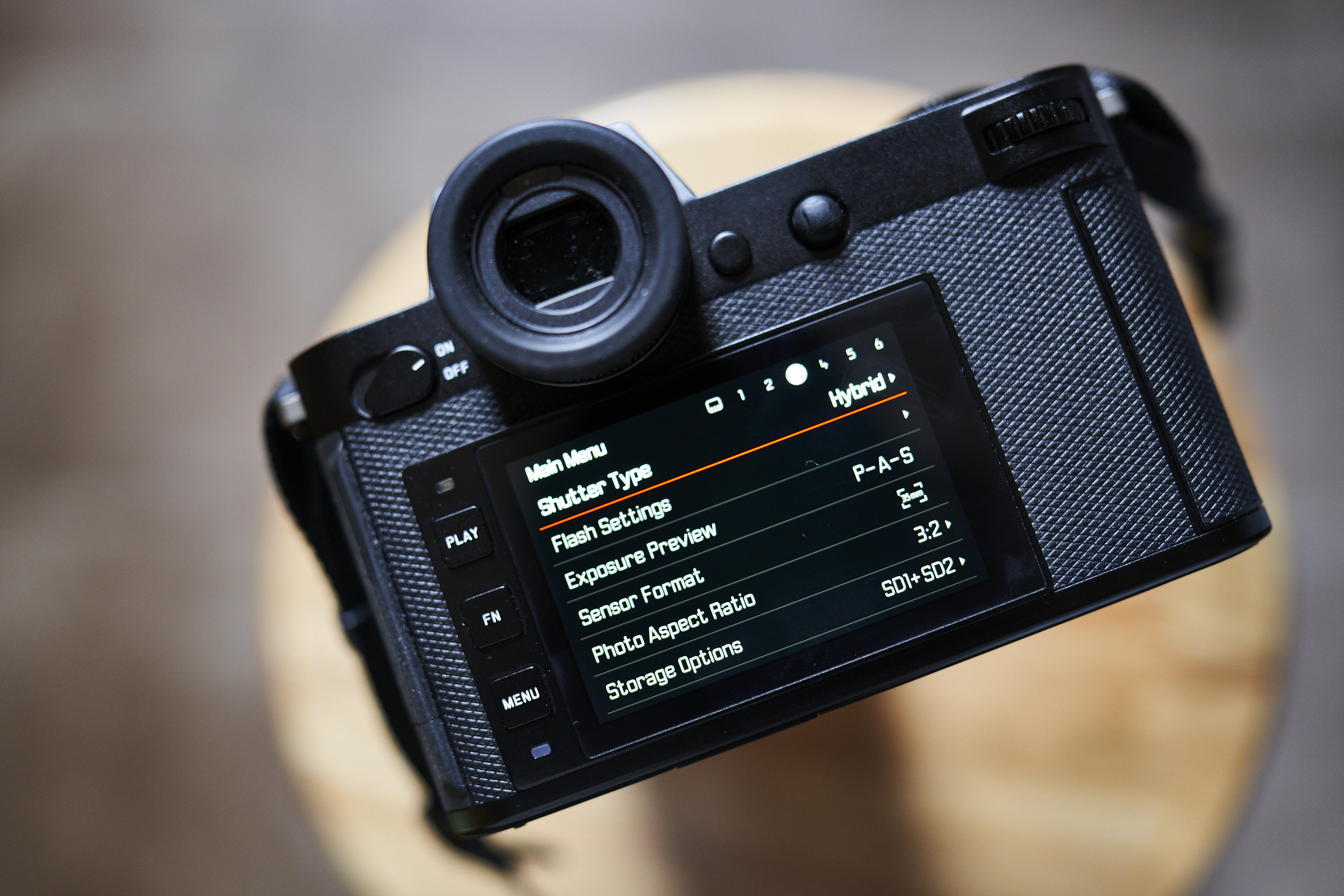
Hasselblad
If there’s one thing that most of our findings have concluded, it’s the Hasselblad by far has the best menu system on the market. It was designed very much like a phone, and that’s the modern interface we so desperately need. Further, it’s also a wonderful menu system. Arguably, they’ve done it a lot better than Leica did with the T-camera system. So, by far, the menu system is the best reason to buy a new Hasselblad camera. But if we’re frank, this will take some getting used to because of just how starkly different it is. Their cameras have horrid autofocus issues, and the RAW files are annoying to deal with. But at least their cameras are pretty, and the menu systems are well organized.
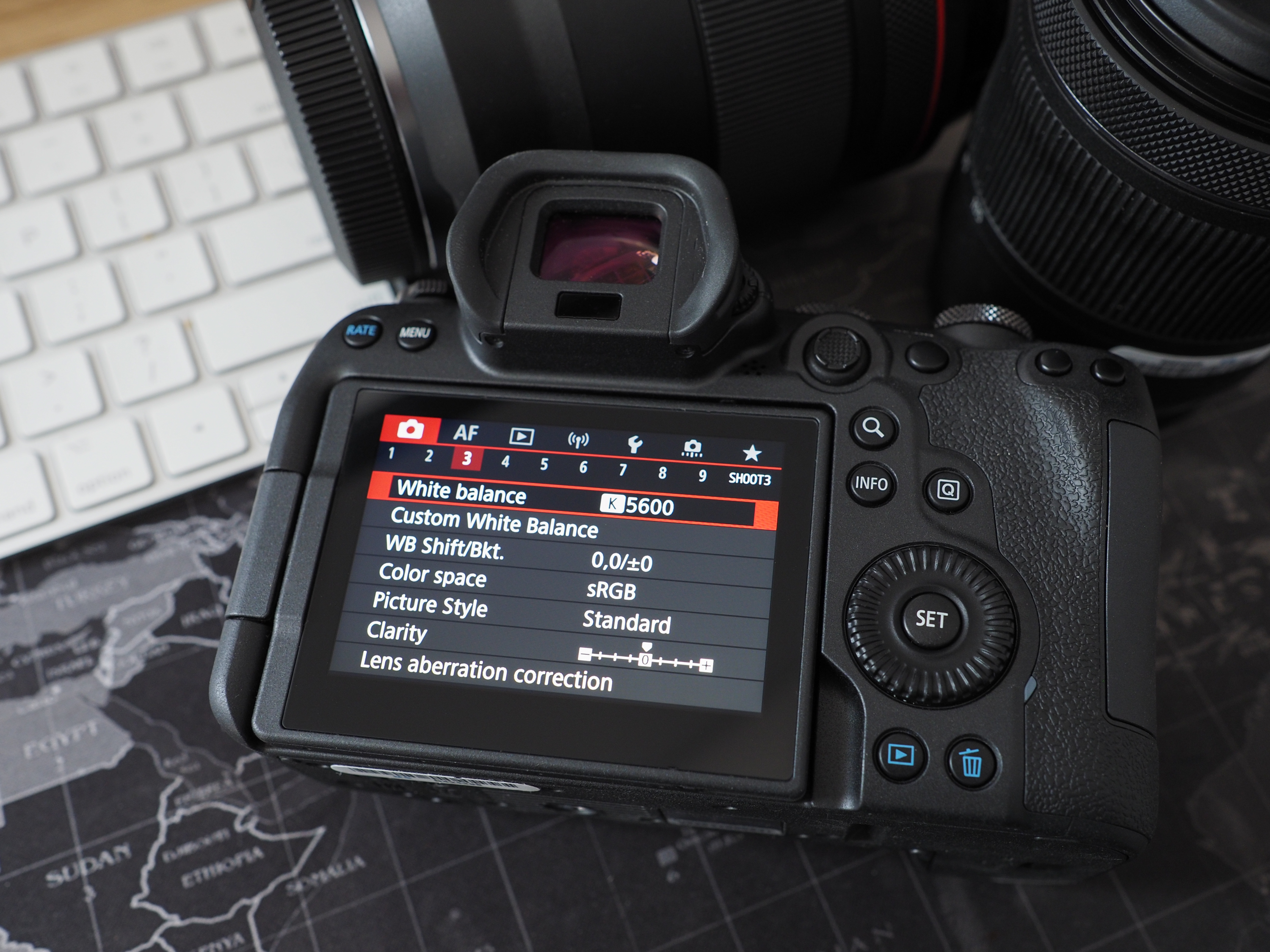
Canon
My personal favorite camera menu system is from Canon. I, like many other photographers, spent years angry at them. Let’s be honest; there was a time that they didn’t seem to care about innovating. But their menu system was always on-point. When they moved to a touchscreen menu, it became even easier to use. To this day, the Canon camera menu system is still the best to navigate. True to the ideals, you can get anywhere you want in two taps. Plus, you can drag your finger across and go from one part to another.
Most of my work for years was done with the Sony system. But even Sony’s new touchscreen menu feels like an afterthought. This is one of the places where Canon wins a major advantage over them and anyone else. Better yet, the sections are big and very responsive to sensitive touches.
Even better, it’s nice to know that in two taps, you can easily get to formatting your memory cards.
Panasonic
Panasonic comes in right after Canon. If Canon’s interface has a horizontal emphasis, Panasonic is similar but with a vertical emphasis. You can touch and drag across the menu system, but it isn’t really as responsive as Canon’s menu system. It becomes more responsive with touch and drag than it does with simply tapping. Personally, I still use a combination of the buttons and the screen to navigate. But the Panasonic camera menu system is still leagues ahead of the others.
Nikon
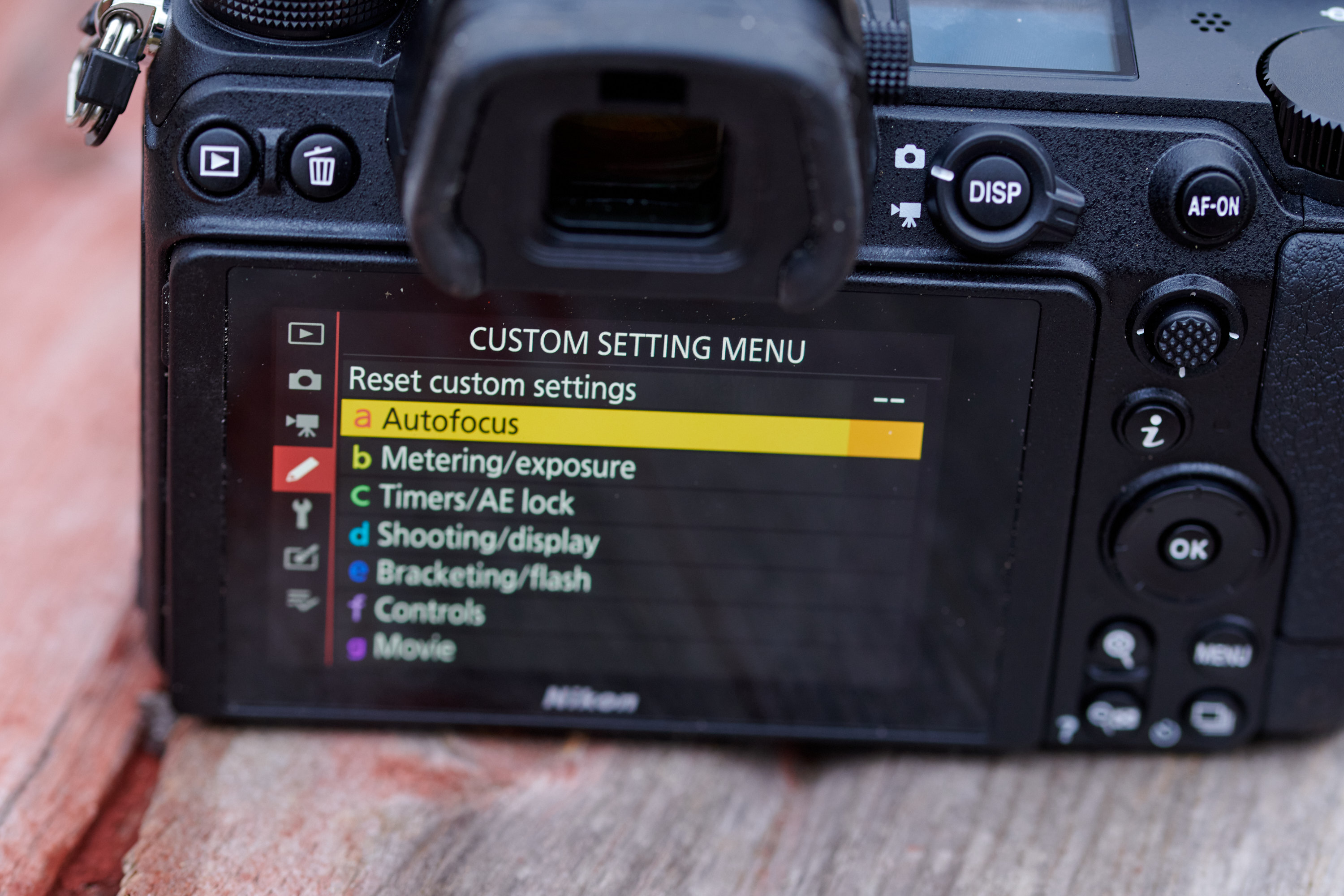
Nikon, like Panasonic and Canon, has an excellent menu system. There are the biggest sections organized into smaller sections. Their touchscreen interface is excellent. But tap to navigate isn’t as smooth as Canon’s menu system. The Nikon camera menu system has a lot of sections where it’s just easier to swipe through.
Like the others above it, Nikon’s menu system is also incredibly well organized and color-coded.
Leica
The Leica camera menu system is one where I’m super torn. Compared to every other camera menu system out there, it’s far different. But it’s also straightforward to find most of what you want. There are three specific menu systems: their L mount, M mount, and T mount. For the most part, we’re going to ignore the T-mount. But the M-mount and L-mount camera menu systems are very similar. You have to navigate the entire thing using the buttons, though. And that’s incredibly annoying. Leica claims that they’d need to redesign the camera menu system to accommodate touch. But that’s where I majorly disagree. I think that in its current state, it’s incredibly touch and swipe capable. Some parts of the current Leica camera menu system are even touch-capable. However, we can’t do it with the entire menu system.
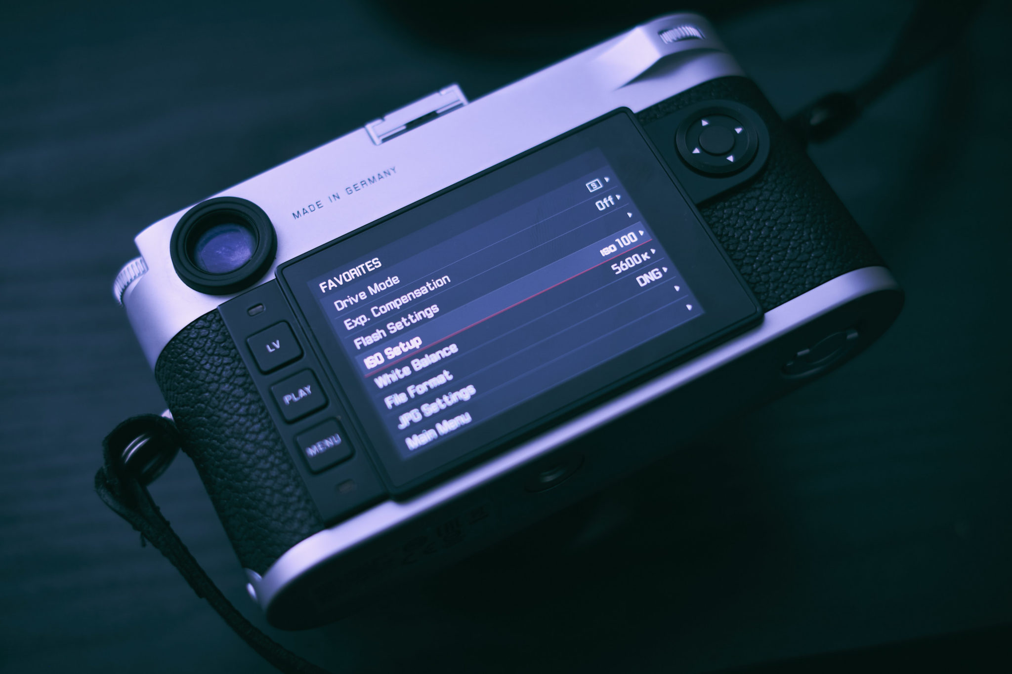
A big thing to remember with Leica is that you’re basically going to need to forget almost everything that you’ve learned with various other camera menus. Theirs is so much different, and it inherently shows. Even so, there are some oddities about it that you’ll need to get used to.
Fujifilm

The Fujifilm camera menu system is sort of an odd one. I’ve seen folks complain about it online and tie this criticism in with their mobile app. Fujifilm still has the best ergonomics of any camera system I’ve used for what it’s worth. Certain things about the Fujifilm camera menu system are just plain odd. Formatting the cards and things like wireless communication are a bit buried for my liking. It’s also not as easy or quick to navigate the menu. This is where Fujifilm really needs to work on things.
One of the biggest things is how tracking autofocus works in the Fujifilm menu system. So that’s one that you’ll always need to familiarize yourself with.
Olympus
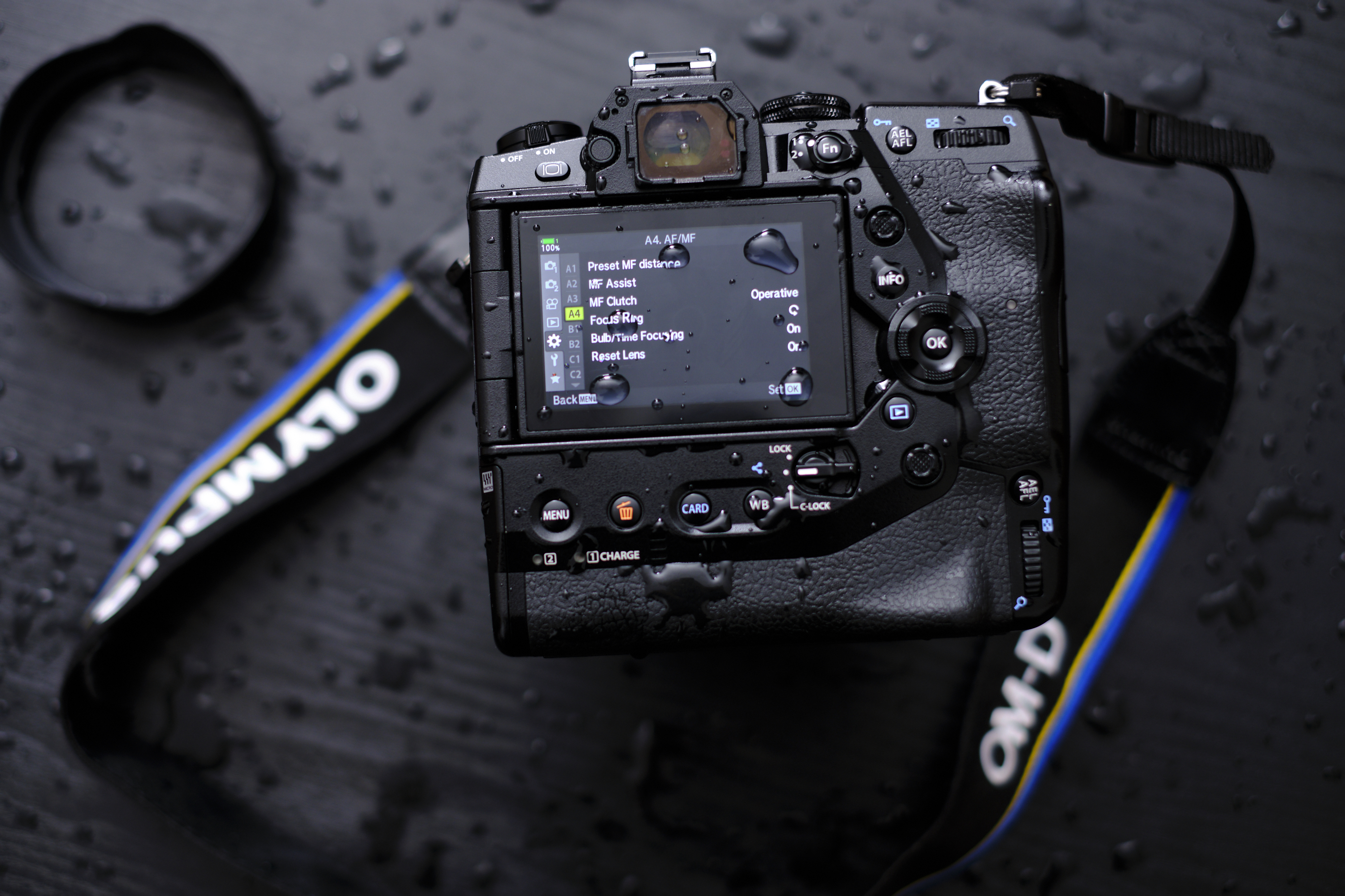
The Olympus camera menu system is one of the deepest and most complex I’ve seen. It needs to be trimmed or completely reorganized. A few things are peculiar. For example, there are multiple ways to ensure that the exposure readout displayed in the viewfinder doesn’t change. Simulated OVF is by far the best way, but even so, it seems odd. Most annoyingly, Olympus was the one that really pushed the touchscreen many years ago in a very pioneering way. But navigating their camera menu system is anything but.
In fact, I’m not sure I know many journalists that really like the Olympus camera menu system. Luckily, you don’t need to do a deep dive into it often.
Sony
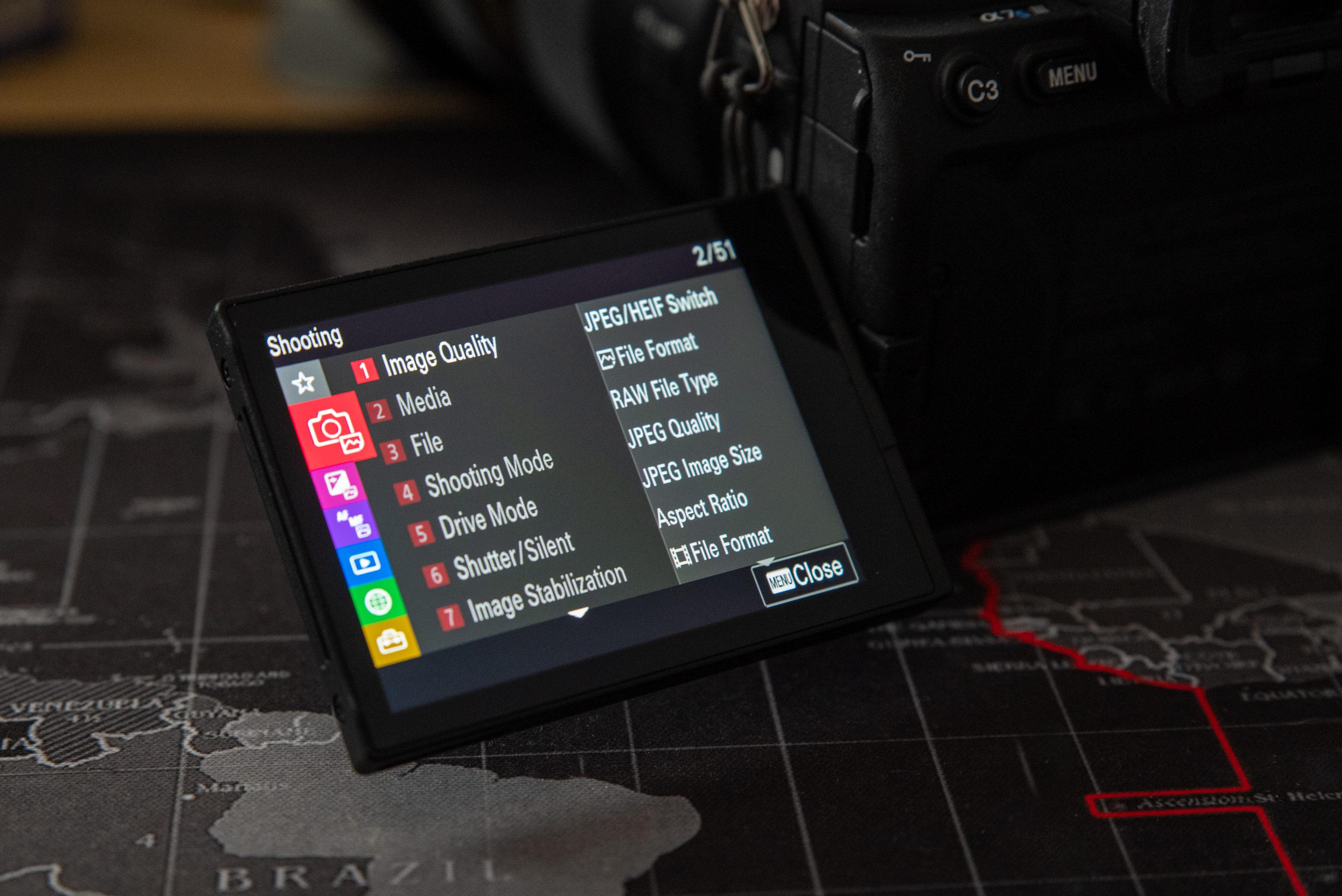
The Sony camera menu system is still, to me, the most annoying one. Lots of Sony users tend to rely on the MyMenu system instead. And when your own userbase doesn’t even want to use the touchscreen much, you know there’s a problem. Sony only recently came up with their touchscreen in the past two years. And, while it can be navigated, it’s pretty annoying. It isn’t as touch responsive as others. But to be honest, we’ve had beef with Sony’s menu system for a while in various ways or another. More so than any other, it’s hard to find the thing you really want when you navigate through. If you were very used to the old menu system, this new one is a revamp that’s a bit of a headache.
Get rid of the ads!
Did you enjoy reading this article as much as we enjoyed writing it? There's a way to support us and our reporting, getting ad-free navigation and more as a bonus. Subscribe to us for less than a coffee per month —just $3.99— or take advantage of our yearly subscription with a hefty discount for only $25.- An ad-free experience
- A free mystery box for Lightroom or Capture One
- All the books in our store
- 20% discount on Capture One
- 30% discount on Imalume Photo Theft Protection
- 20% off Herbs and Kettle Tea Company.
- 20% off your order from MPIX printing services.
- 5% off Viltrox Products via their eCommerce store.
- 10% off all film developing, printing and scanning services from Blue Moon Camera and Machine
- 15% off 7Artisans products: The lens and accessory maker is offering a sweet discount for Phoblographer's readers.