")
Last Updated on 12/08/2018 by Mark Beckenbach
Photographers who hate watermarks should really consider them, and protecting their work.
It’s no secret: photographers are scared about watermarking. It’s often been seen as a faux pas for lots of us out there. But watermarking is something I’ve always found to be essential, not only for protecting your images, but also for branding. There is no good reason not to watermark your image. For starters, it’s your image! When you do anything in life, you most likely customize it to your own wants and needs. If you’re the owner of certain cameras, you also probably use the embed copyright data capabilities from the camera to input said information. If you’re even doing that, then you obviously care about your images.
So here’s what you should do about watermarking your photos.
Disclaimer: This doesn’t replace registering your images as part of your copyright with the government. Don’t think for a second that it does!
What is a Bad Watermark?
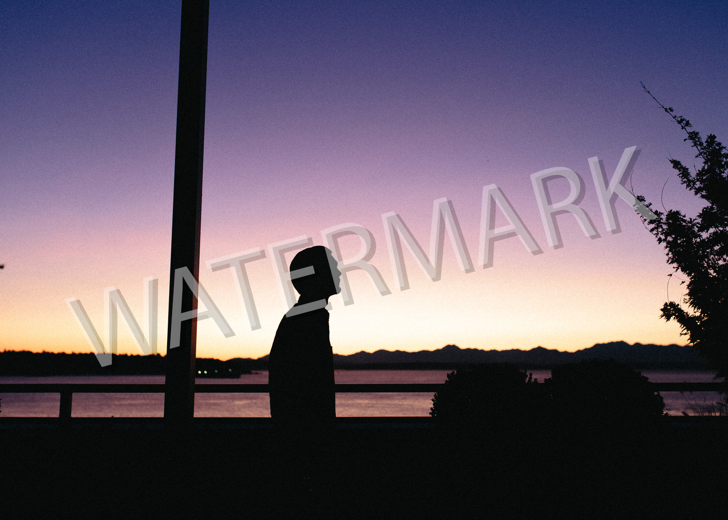
Let’s go about understanding what a bad watermark is in the first place. Generally speaking, it’s one that is distracting and that goes through the entire image sort of what you see above. It sucks. Not only is it distracting, but it makes a nice image absolutely awful. One can argue that that is the point of a watermark, but the point of a watermark is more to show ownership. You don’t want it to ruin your image.
Use a Pretty Text Font

Before I go deeper, I want to point out a photographer who I think has found a way to do a great job with his watermarks: Todd Owyoung. You probably haven’t heard that name in years, but when I was coming up as a photographer he was a major inspiration to me and I liked how his watermarks were not invasive. It influenced me to create my own. So one day a long time ago, I went into Lightroom and experimented with a font I liked. I eventually got one and stuck with it. This watermark saying “Chris Gampat Photography” is still one that I use today for more personal work than what I do for the Phoblographer. You can see my watermark in the image above in the bottom right. It’s subtle though and finds a way to naturally blend into the scene.
Using a pretty text is your first option in combination with a few methods I’ll talk about later on.
Design a Pretty Logo Using Adobe Spark Post
Adobe Spark Post is a logo designer that I tend to go for. It’s an app on mobile that lets you use stock images, a variety of fonts, colors, etc. And it honestly has rarely failed for me. In the case that it fails, I go for hiring a designer. To really put your stamp of approval on your work, you should create your own logo and use this as your watermark. It not only shows effective branding, but it’s unique to you.
Lower the Opacity

Lowering the opacity of your watermark means that you’re going to look for it but that others may not necessarily spot it. If they use your photo, you can call them out on it easily. So by lowering the opacity, you’re letting more of the actual image bleed through. It adds to not being distracting as I spoke about earlier. Somewhere below 25% is great; generally I aim for 33% with Phoblographer’s watermark.
Ensure that Your Watermark Takes Up No More Than 1/16th of Your Photo

To add onto lowering the opacity to make it less visible and making it pretty to begin with, you should also ensure it isn’t that large. The exception: proofs. Proofs are proof of concept images you deliver in case someone hasn’t paid for the images. So what’s too large? Honestly, I’d say 1/16th of the photo or even smaller. Split your image into quarters and split those quarters into quarters. The watermark ideally will not take up more space than that. But of course, that rule can change as it has with some of my images.
What I should also note: watermarking in Lightroom and Adobe products is far easier to do than in Capture One. You can surely watermark in Capture One, but it’s a roundabout process.
Don’t Post a Large Photo to Begin with; 1000 or 2000 Pixels on the Long Side Work Fine
Our final tip: don’t be stupid and post really large images. One can argue that Adobe has given its customers intelligent upsizing–but that only works to a certain point. To ensure that your images don’t get stolen, don’t post high res images or images beyond a certain pixel dimension. With retina and high resolution displays there is encouragement to post higher res photos online. If anything, don’t go beyond 2,000 pixels on the long side.
Get rid of the ads!
Did you enjoy reading this article as much as we enjoyed writing it? There's a way to support us and our reporting, getting ad-free navigation and more as a bonus. Subscribe to us for less than a coffee per month —just $3.99— or take advantage of our yearly subscription with a hefty discount for only $25.- An ad-free experience
- A free mystery box for Lightroom or Capture One
- All the books in our store
- 20% discount on Capture One
- 30% discount on Imalume Photo Theft Protection
- 20% off Herbs and Kettle Tea Company.
- 20% off your order from MPIX printing services.
- 5% off Viltrox Products via their eCommerce store.
- 10% off all film developing, printing and scanning services from Blue Moon Camera and Machine
- 15% off 7Artisans products: The lens and accessory maker is offering a sweet discount for Phoblographer's readers.