
The color red has meant so many things to humanity over the years. Worn in a specific way, it’s an alluring and tempting thing that draws us in. When it’s worn in another way, it can inflict fear and radiate a sense of power. In nature, red is often used to signal various things. At times, it’s a sense of arousal. But in other situations, it can signal danger. So it comes to no surprise that in our very visual culture, the color red is used similarly — or at least that’s where the roots come from. In this article, we’re taking a look at how various photographers we’ve interviewed over the years use the color red.
All images in this article are used in our interviews with respect to the owners. They are being recycled here as informative and illustrative points.
Table of Contents
Understanding the Color Red
The color red is a fascinating one. The aesthetic of using a lot of red in images and cinema could be stated to come from a really fascinating place: red light districts. When we think about it one way, they’re looked down upon. But the aesthetic is heavily borrowed in major cinema pieces like Ingrid Goes West and several other films. Eventually, everyone else just ended up using it and making their own takes on it. Red serves as both taboo and alluring in our culture. We can label it as forbidden — and therefore attractive in a similar way to keeping our hands out of the cookie jar.
At the same time, red is used as a sign of caution, contrast, beauty, and raw. Over the years, we’ve interviewed several photographers here on the site. And we’re exploring how different photographers have used the color red in their work.
A Sense of Beauty
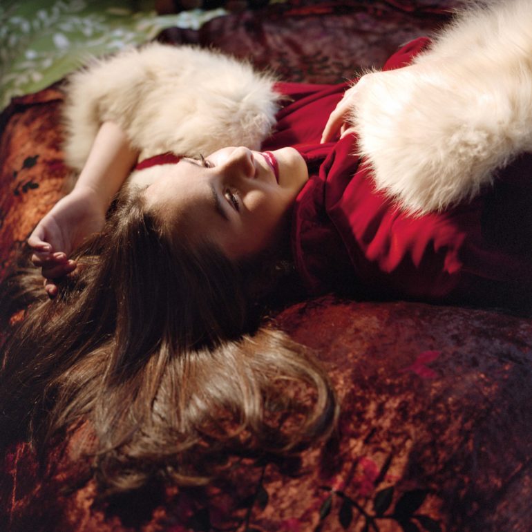
Considering her background, it’s easy to see how photographer Aline Smithson has used the color red to portray regal and Bohemian beauty. “I own a gazillion books on old Hollywood, particularly the ‘candid’ photographs taken of movie stars at home in the 40’s-60’s, shot on Kodachrome, filled will brilliantly with color,” she tells the Phoblographer in an interview. I studied lighting and pose and tried to understand how an ordinary person can turn into something more.” She continues to explain how the images have to have a specific level of magic to them for her to consider them worthwhile.
In the photograph above, we can see a few different things. There’s a fairly thin depth of field that captures only the face of the hero of this photograph. They’re dressed very regally with furs and a red piece of wardrobe. It contrasts enough against the brown sheet and the green background. What’s more, the lighting is soft and makes the image seem that much more inviting. This image is tempting in the way that the viewer would either want to be this human, or they’d immediately be spellbound.
Red is partially used here to frame her face — and the composition puts both red and the subject’s face just enough off-center that we need to pay attention to it. Combined with the very specific lighting, it makes for a painterly image worth of something David Seidner would adore.
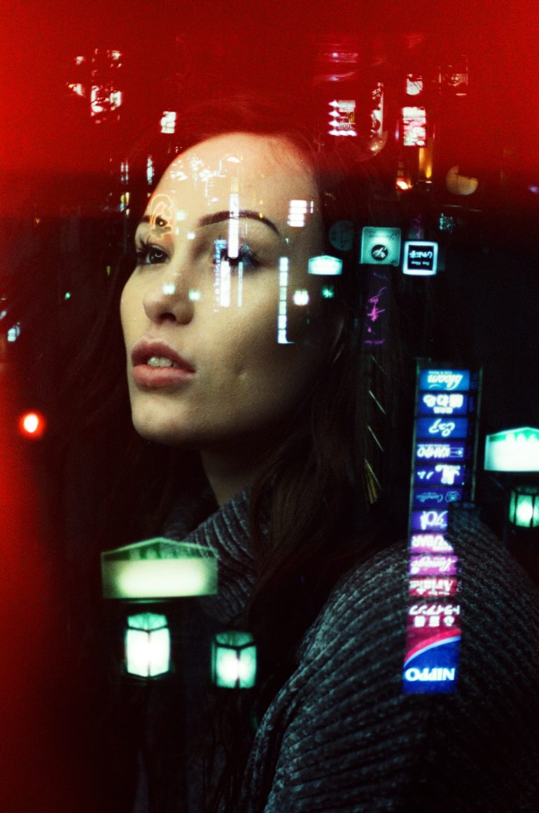
One of our favorite photographers to use the color red is Kate Hook. She’s a film photographer based in Brighton, and often makes incredible fashion work. We can throw a ton of adjectives out there: sparkly, alluring, sexy, artistic, expressive, invigorating, unique, etc. She’s known for souping her films, using prisms, lens filters, and alternative methods like multiple exposures. By all means, she makes photographs that you can’t make digitally very easily — and she does them in-camera and in the darkroom. You could call her an alchemist, and I’d add to that a dreamer and an achiever of a life-goal of emotional depth.
“I never want to be very exact to whatever I’m thinking because then I feel some photographs can come across as quite forced or too gimmicky,” she told the Phoblographer in an interview. “When it comes to double exposures I always shoot the portrait first and then think what scenery would suit it afterward, but sometimes I’ll have a decent idea of what I do.” She continues to discuss how this series took months to make. Throughout the images, the heroes of her photographs have red lips and tinges of red throughout the scenes. But the most striking is the multiple exposure photograph of hers that’s we’re featuring here.
It uses red so incredibly well. In reality, this is a known defect with CineStill 800T film. However, it’s a very happy accident here where Kate’s subject is surrounded by the red film defect just well enough for it to be acceptable as a vibe. It works very well because of the framing. If the red had gone through the image like a crack, I’m not quite sure it would be as appealing. In this imagte though, it doesn’t obfusicate the most important part — the human subject. And if you didn’t know any better, you might think that this was a reflection of some sort and an emergency vehicle’s flashing lights. But instead, it’s a multiple exposure.
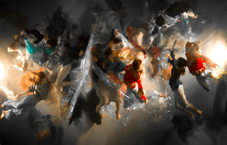
Another photographer worth mentioning is Christy Lee Rogers — who uses the color red sometimes as part of her style to make photographs immitate Baroque paintings. We can all agree that there’s a lot going on in her image above. But the color red works just well enough to add contrast without diving in too hard. A deep blue, hunter green, or royal purple would’ve overpowered the scene. But red provides enough contrast here while adding to the scene. If anything, what we’re learning here is how red can be used alongisde other colors to not be overpowering.
The Visceral and the Eerie
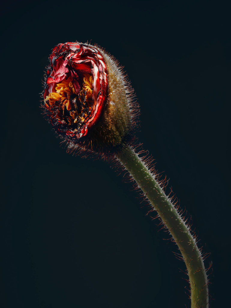
On the other side of the art world, the color red can be used to appeal to more visceral feelings. One of the photographers that demonstrates this si well is Simon Puschman. His series on assaulted flowers is a metaphor for the me too movement. His goal? To show how the women behind this campaign have kept their dignity, strength, and beauty despite falling victims to assault. More of this can be explored in our short spotlight article on him. And as you can tell, the color red is used in a very visceral way that immediately makes the mind and the face react. Indeed, this is what art is supposed to do — make people react.
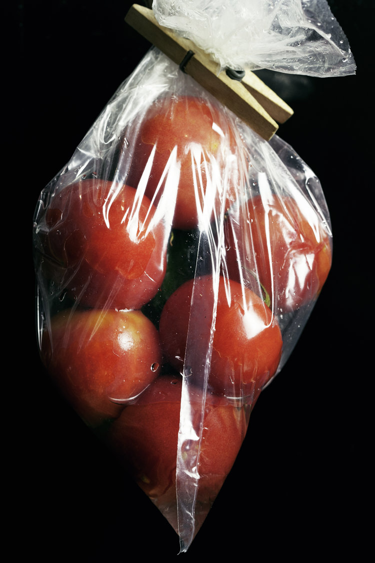
Photographer Aldo Chacon also uses the color red to tell specific stories. “RED is a project that is created with the purpose of looking at things beyond of what they really are,” he told the Phoblographer in an interview. Through the combination of real and surreal elements and moments I try to take an audience on a visual journey into exploring things we see on our daily life but with an added twist. Red is one of the most powerful colors and I believe that serves as a basis to explore all human feelings, starting from love and ending in fear.” Indeed, his work includes the visceral, the scary, the abnormal, and the beautiful. The work conjures up so many different feelings.
Picking apart the image above, we see a pack of tomatoes. But there are some very odd things here. First off, these are some of the most perfect tomatoes I’ve ever seen. It looks like they’ve been washed and then put into the plastic bag. It’s odd that there is a clothespin — I mean, who does that? Additionally, the lighting gives us a very slight blue cast on the images that isn’t making the red fade into purple. Is the image beauty? Maybe to someone. But there is something puzzling about it that makes us have several questions. Perhaps this is what makes it beautiful — that we don’t understand it.
As we can tell, the color red can be used in various ways. What we can all agree on though is that it balances a duality between danger and allure. And how we percieve that is all up to the viewer.
Get rid of the ads!
Did you enjoy reading this article as much as we enjoyed writing it? There's a way to support us and our reporting, getting ad-free navigation and more as a bonus. Subscribe to us for less than a coffee per month —just $3.99— or take advantage of our yearly subscription with a hefty discount for only $25.- An ad-free experience
- A free mystery box for Lightroom or Capture One
- All the books in our store
- 20% discount on Capture One
- 30% discount on Imalume Photo Theft Protection
- 20% off Herbs and Kettle Tea Company.
- 20% off your order from MPIX printing services.
- 5% off Viltrox Products via their eCommerce store.
- 10% off all film developing, printing and scanning services from Blue Moon Camera and Machine
- 15% off 7Artisans products: The lens and accessory maker is offering a sweet discount for Phoblographer's readers.