")
When you work with a film like Kodak Portra 160, you get a pretty fine detailed film designed to be used more or less with controlled lighting. Though interestingly enough, I’ve personally had much better results working with many other films using controlled lighting and instead found that this film is one of the best to be used with natural light. Designed for skin tones in portraiture, Kodak Portra 160 has a very muted color palette but not as pastel as Fujifilm’s Pro 160 NS–its closest competitor which is now discontinued. Like many other films, it is available in both 120 and 35mm. But if you’re reading this website, then you’re probably only using it in 120.
I’ve been using Kodak Portra 160 for years; and even though I prefer to work with 400, 160 is surely a nice film in the right settings.
Gear Used
We tested Kodak Portra 160 with a variety of cameras and lights over a period of years. The specific cameras are mentioned in the image quality section but the lenses used, as is typical Phoblographer, are some of the best Canon L lenses, Zeiss Milvus glass, and some solid medium format lenses.
Tech Specs
Kodak has a massive technical sheet that does a better job of this than I will.
Ease of Use
When you load up Kodak Portra 160 you automatically know that it’s a color negative film. So with that said, it should have a decent amount of versatility. Indeed, it does. When working with a studio strobe, know that you’ll be able to get a lot of details out the highlights and even a fair amount from the shadows. My best and favorite flash work in my opinion with Kodak Portra 160 was done using speedlights. In fact, if you’re shooting an event with this film and speedlights, you’ll do just fine.
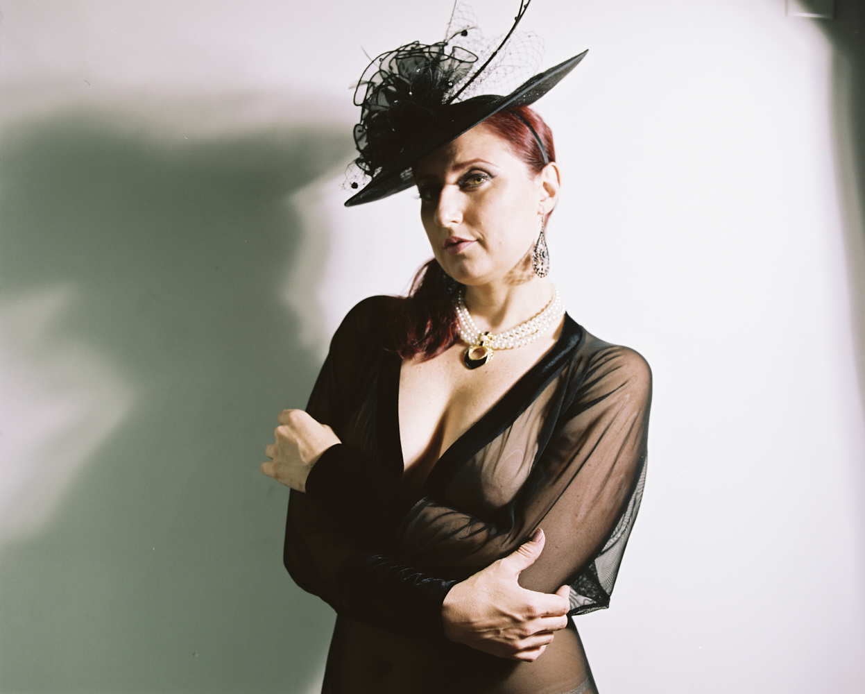
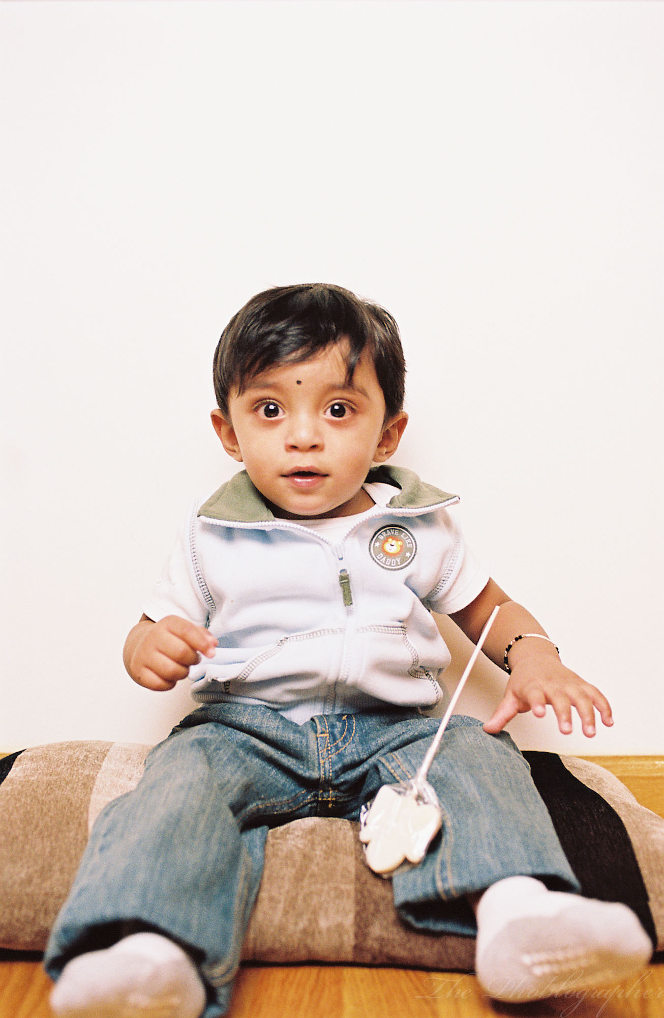
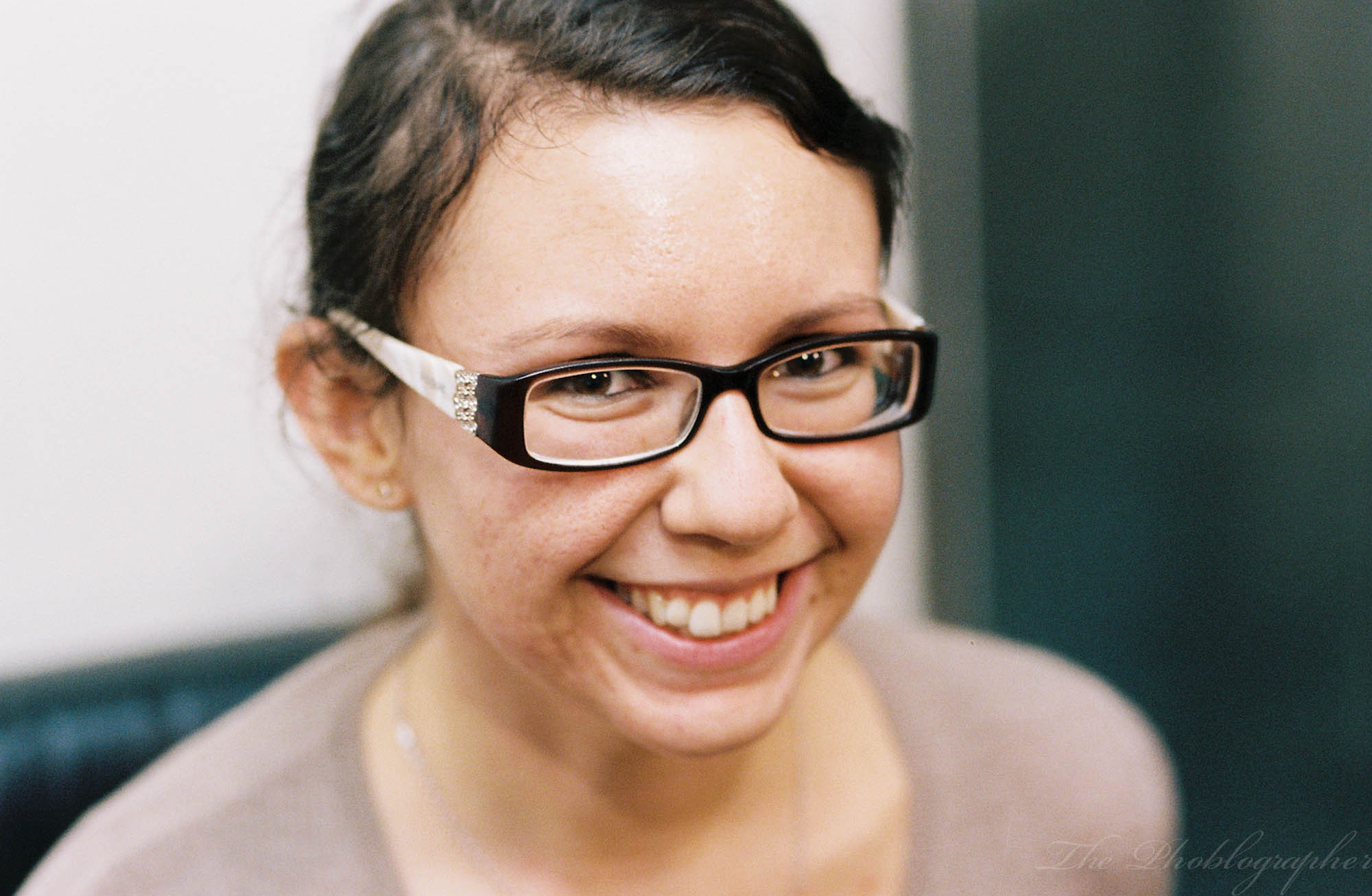
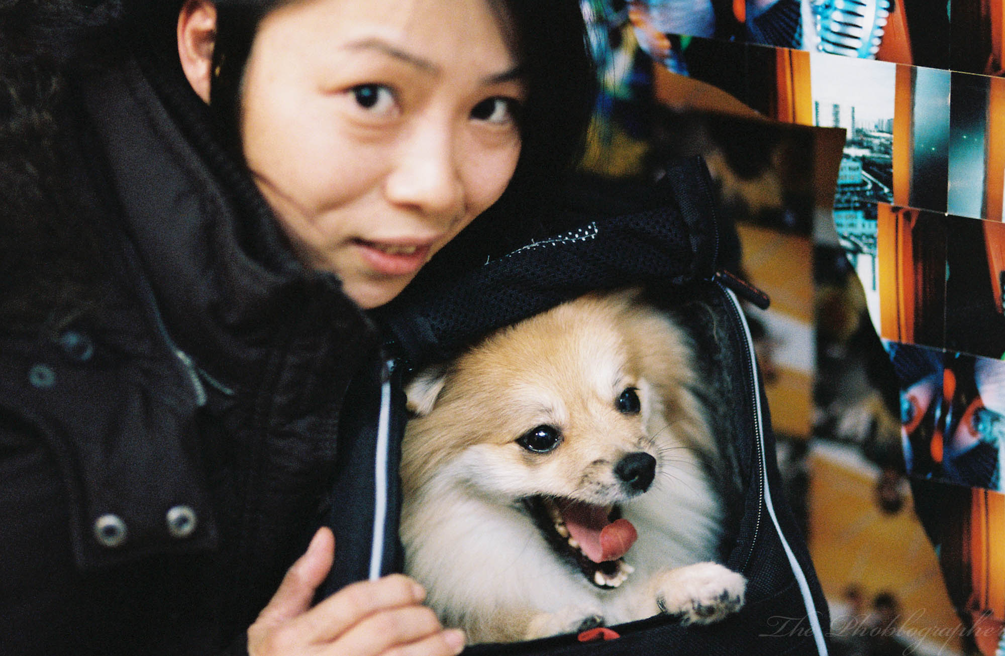
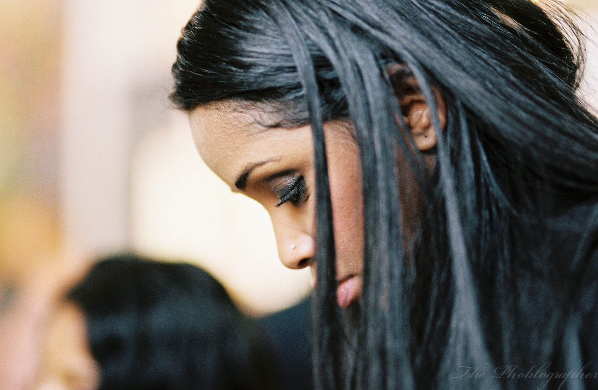
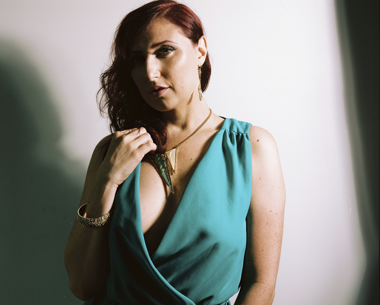
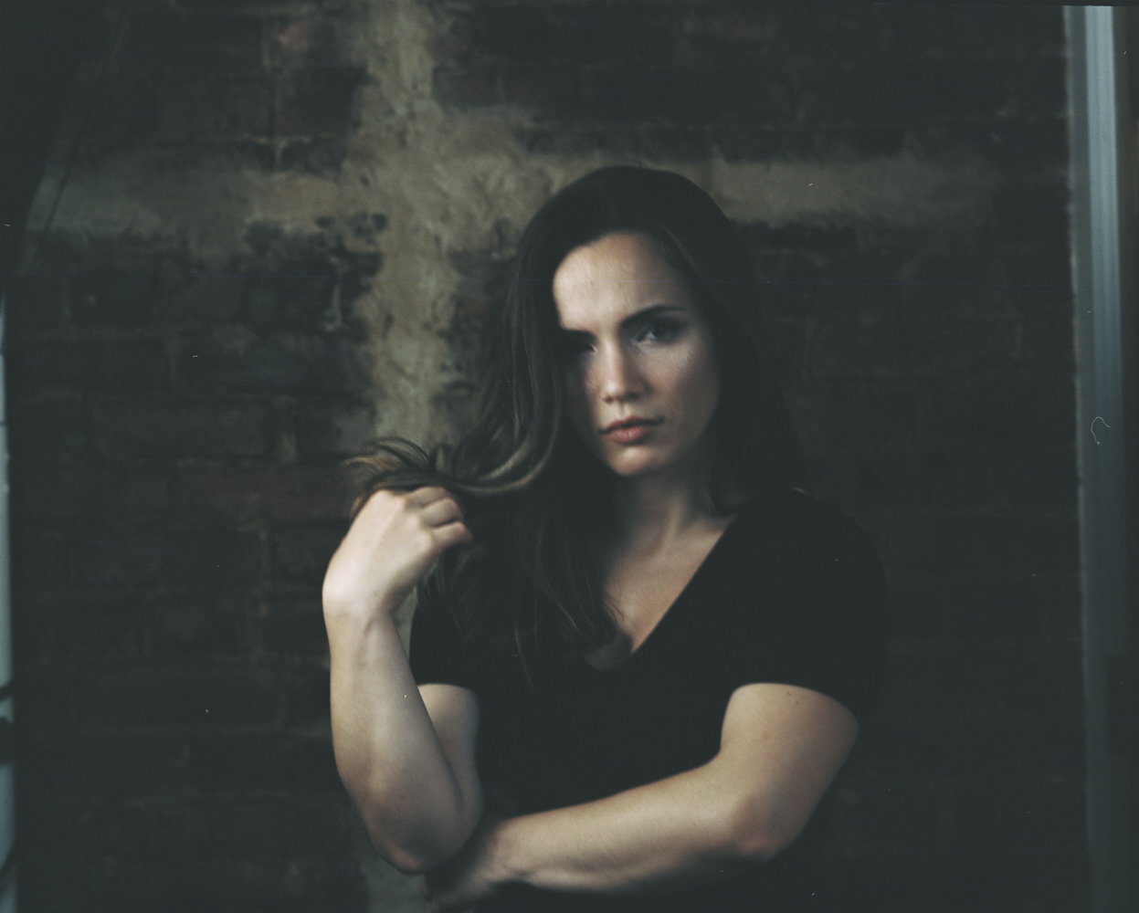
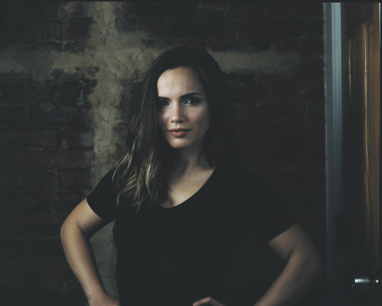
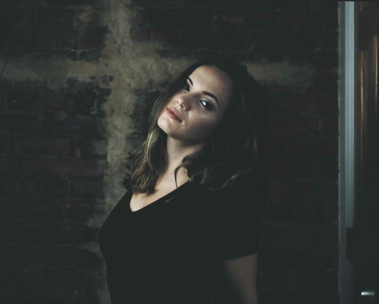
Kodak Portra 160 also does very well under mixed lighting–significantly better than anything digital. What it does even better with is undertones with skin. Those with green undertones are bound to look pretty neutral while folks with red undertones will look natural.

But otherwise, what you’ll is obviously how it renders skin tones. Kodak Portra 160 renders them very, very well. The film also tends to naturally skew more towards the warm end of the spectrum but for skin tones I’m sure you won’t mind this. If you’re looking for something cooler, then Lomography Color Negative 100 could be a good option for you. Generally speaking, I’ve never found a good reason to push or pull the film. The reason for this is because the film comes in 160, 400 and 800 emulsions.
Here are some quotes from a previous experience:
“I must comment on how much more subtle Portra renders skin tones vs Ektar. I love Portra, but I personally have more of a love with Ektar and never felt that I could get those gorgeous and wonderful Portra photos that everyone is used to seeing. But Portra renders skin tones more accurately overall.
One of the biggest features that is most notable about the new Portra is that it was designed to be scanned. And indeed, it scans very well. The sharpness is perhaps the best I’ve ever seen. These scans were resized for the web, but the TIFFs that CRC in Midtown Manhattan gave me were exceptional.
Interestingly, it seemed to render all colors more mute across the spectrum. Not a single color is punchy and the film lacks contrast. Indeed, this is a look that has been mimicked by post-production filters, apps, etc. In fact, we’ve got a bunch of some of those filters here. However, they fail to perfectly capture the real thing though they do come close.
This is still a great film for portrait photographers, but I believe it to be best in a studio scenario. I say this because this is where you have the most control over your lighting. Sure, natural light is nice, but it can also be tough to work with because of how the sun moves. If you are working with it in natural light, I recommend using a reflector that compliments your subject’s skin tones very well.”
Image Quality
Lots of photographers really like Kodak Portra 160 and I’m sure that when you expose it right, you’re bound to as well. I’ve used it in studio settings and in natural light settings. I’ve felt it isn’t giving me as consistent results as Kodak Portra 400 gives me. Quite honestly, I’ve never had a problem just pushing or pulling the 400 film anyway.
Canon EOS 1V
Kodak Portra 160 in 35mm works best when you overexpose it by around 1/3rd to a full stop in my experience.


Mamiya RB67 Pro S
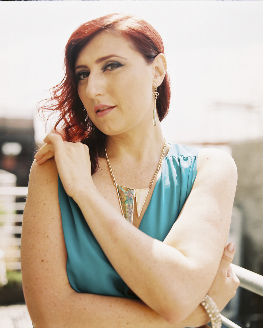
In 120 format, Kodak Portra 160 is really where the film shines. You’ll get the most accurate colors (though still warm), skin tones, and overall a very beautiful look.


Pentax 67


Conclusions
Do I like Kodak Portra 160? It’s not my favorite, but I surely do think that there are better options. If you want something cooler toned, then Lomography Color Negative 100 is what you want. Like the look of the warmer tones? Then go for this. Otherwise, consider getting Fujifilm Pro 400H or Kodak Portra 400 and pulling/exposing it at 160. And if you want a film with a similar look but even finer grain, then go for CineStill 50D.
Get rid of the ads!
Did you enjoy reading this article as much as we enjoyed writing it? There's a way to support us and our reporting, getting ad-free navigation and more as a bonus. Subscribe to us for less than a coffee per month —just $3.99— or take advantage of our yearly subscription with a hefty discount for only $25.- An ad-free experience
- A free mystery box for Lightroom or Capture One
- All the books in our store
- 20% discount on Capture One
- 30% discount on Imalume Photo Theft Protection
- 20% off Herbs and Kettle Tea Company.
- 20% off your order from MPIX printing services.
- 5% off Viltrox Products via their eCommerce store.
- 10% off all film developing, printing and scanning services from Blue Moon Camera and Machine
- 15% off 7Artisans products: The lens and accessory maker is offering a sweet discount for Phoblographer's readers.