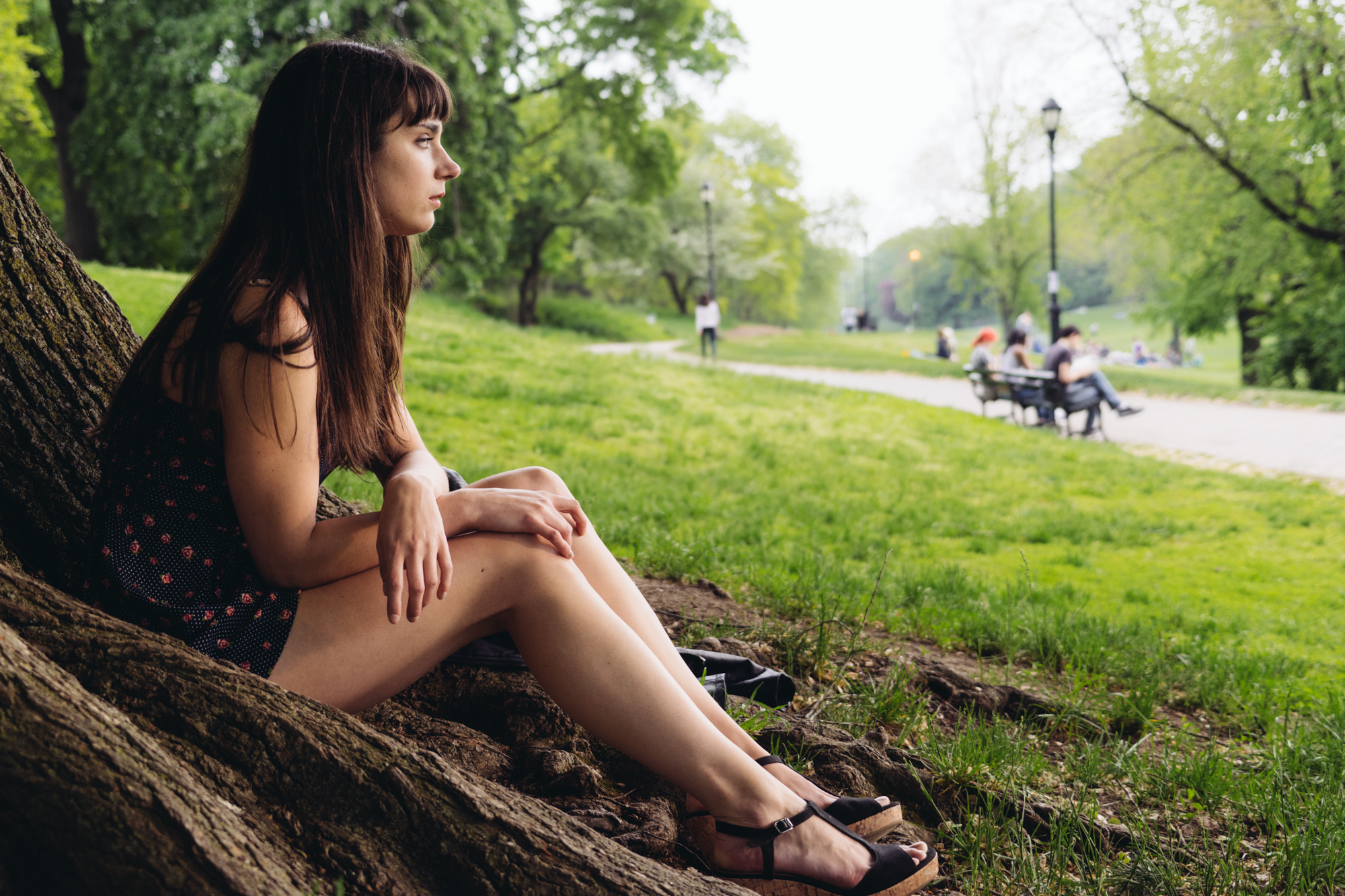
Editing portraits in Adobe Lightroom can be a daunting task sometimes, but the specific color channel tools can help you create a better image than simply just working with the basic adjustments. They can give you much more professional looking results and in reality, they’re very simple to work with. Before we begin to talk more about this though, we also recommend that you work with a calibrated monitor to get even better looking images and also have an easier time with editing.
Start With the Color Channels
Scroll down past the basic adjustment panel in the Develop section of Adobe Lightroom and look at the HSL section. Here you’ll see lots of different colors for the Hue, Luminance and Saturation areas. You can selectively pick one parameter or all three. For the most part, we’re going to ignore the Hue section and instead work with Saturation and Luminance.
The reason why you’re working with these is that the channels allow you to have a lot more control over the image. Think about it in terms of camera shooting mode: Program mode just lets you make the entire thing brighter or darker while manual mode helps you to make specific parameters brighter or darker which affect the entire scene. With the color channels, you’re affecting the scene by changing the way it looks color by color.
This works with much more than just portraits. It’s great for landscapes though they can have less variance in colors than portraits can.
Luminance and Saturation: What’s the Difference?
Now before we go any further we’re going to specifically define what saturation and luminance do in order to ensure that you don’t get ahead of yourself.
If you had to ask someone what saturation is, they could probably know what it is by seeing it and telling you, but they may not be able to actually explain it to you. Saturation has to do with how the specific color channels look. Words associated with saturation are wet, deep and vivid. To that end, it’s fair to say that the more saturated a color is, the deeper it looks.
While that’s fair to say, it isn’t always necessarily correct because Luminance can have an effect on Saturation. However, Luminance has to do with how bright the image is. In this case, imagine that you’re exposing a scene color by color and not just for the entire scene itself. The closest way to think of it is by thinking about leaves on a tree. During the summer, many trees have a very bright green look to them due to their leaves. But during the winter months, the only trees that have any sort of green on them are Evergreens–and these have a more dark green to them. Luminance is specifically associated with exposures being brighter or darker.
The Most Used Settings
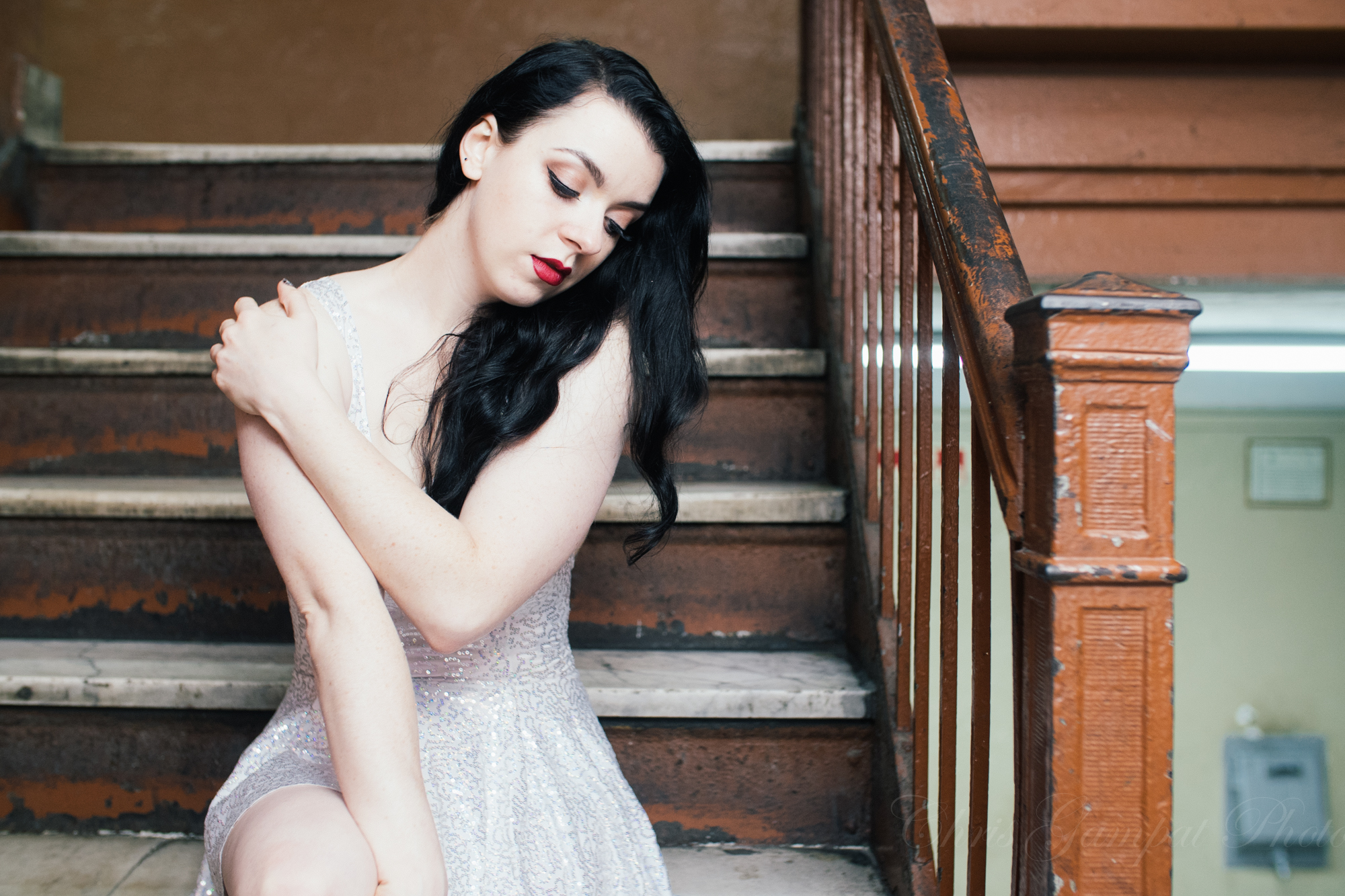
Generally, most skin types (white, yellow, brown and black) can be associated with the Yellow or Orange color channels while undertones can be associated with green or red. If a subject has bags under their eyes, you can most likely associate it with purple.
The key to making skin look better has to do with brightening and darkening specific areas and typically desaturating skin a bit to make it look nicer and healthier. These two work excellently together because the process can make skin glow and look radiant.
To start off, try adjusting the white balance of the image to what you want it to be, then scroll down to the color channels and adjust specifically.
So why not just over the overall saturation or vibrance slider? If you do this, then you’re choosing to saturate or increase the vibrance of every single color in the scene when what you actually need to do is selectively enhance parts of it. When you’re all done with this, you can make the more basic adjustments and see how that affect the image.
We encourage you to take this knowledge and try it out for yourself.
Get rid of the ads!
Did you enjoy reading this article as much as we enjoyed writing it? There's a way to support us and our reporting, getting ad-free navigation and more as a bonus. Subscribe to us for less than a coffee per month —just $3.99— or take advantage of our yearly subscription with a hefty discount for only $25.- An ad-free experience
- A free mystery box for Lightroom or Capture One
- All the books in our store
- 20% discount on Capture One
- 30% discount on Imalume Photo Theft Protection
- 20% off Herbs and Kettle Tea Company.
- 20% off your order from MPIX printing services.
- 5% off Viltrox Products via their eCommerce store.
- 10% off all film developing, printing and scanning services from Blue Moon Camera and Machine
- 15% off 7Artisans products: The lens and accessory maker is offering a sweet discount for Phoblographer's readers.