
The Capture One Editorial Color Grading Style Pack is one of the company’s best offerings yet, but your opinion may differ.
The Capture One Editorial Color Grading Style Pack is perhaps the company’s best offering so far; and if you were to purchase any single style pack from the company, I’d immediately tell you to spring for this one. This pack was designed with a number of photographers and retouchers who shoot for big campaigns. As the name implies, it’s designed to give you look that you’re used to seeing in all those glossy magazines without the hassle of it. But like many other bundles of presets out there, you’re probably going to gravitate more towards three or so. However, the massively wide breadth of lighting situations that the Capture One Editorial Color Grading Style Pack can cover is great.
Pros and Cons

Pros
- Great versatility with all different types of RAW files
- There is a style for everyone and nearly every situation in this pack
- They’re completely unlike anything else out there.
Cons
- Some folks may think that the $69 price tag is high, but it’s worth it.
Features
From the official listing page:
Michael Woloszynowicz, Marie Bärsch, and Pratik Naik are all celebrated photographers and retouchers with hundreds of thousands of dedicated followers, and years of published work to their names. Their approach is at once contemporary and timeless, and they have chosen to work specifically with Capture One to create 7 Styles each that reflect their individual aesthetic.
Ease of Use
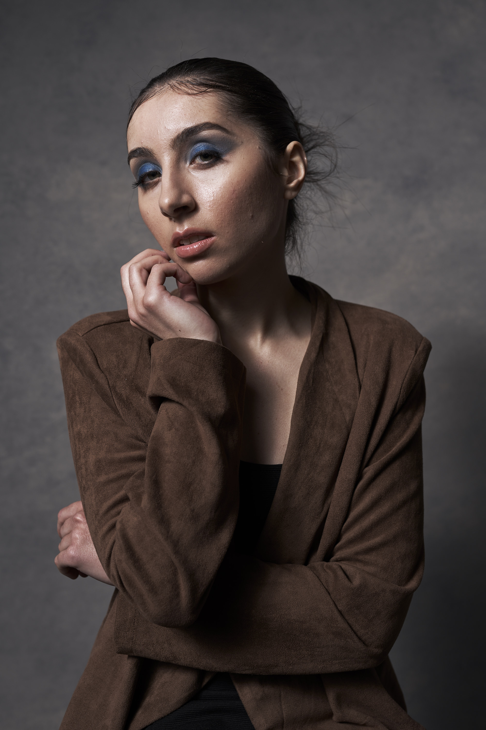
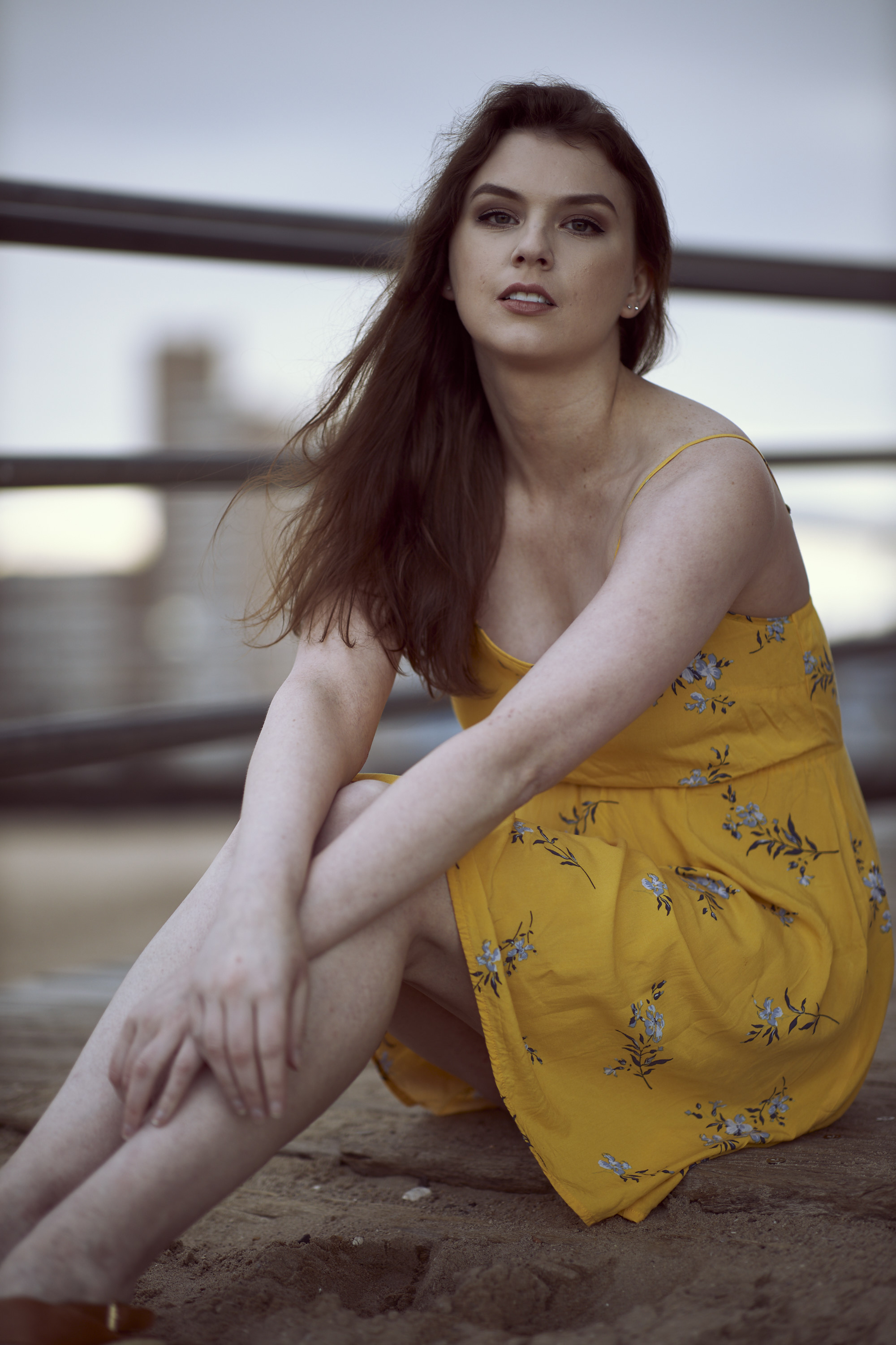
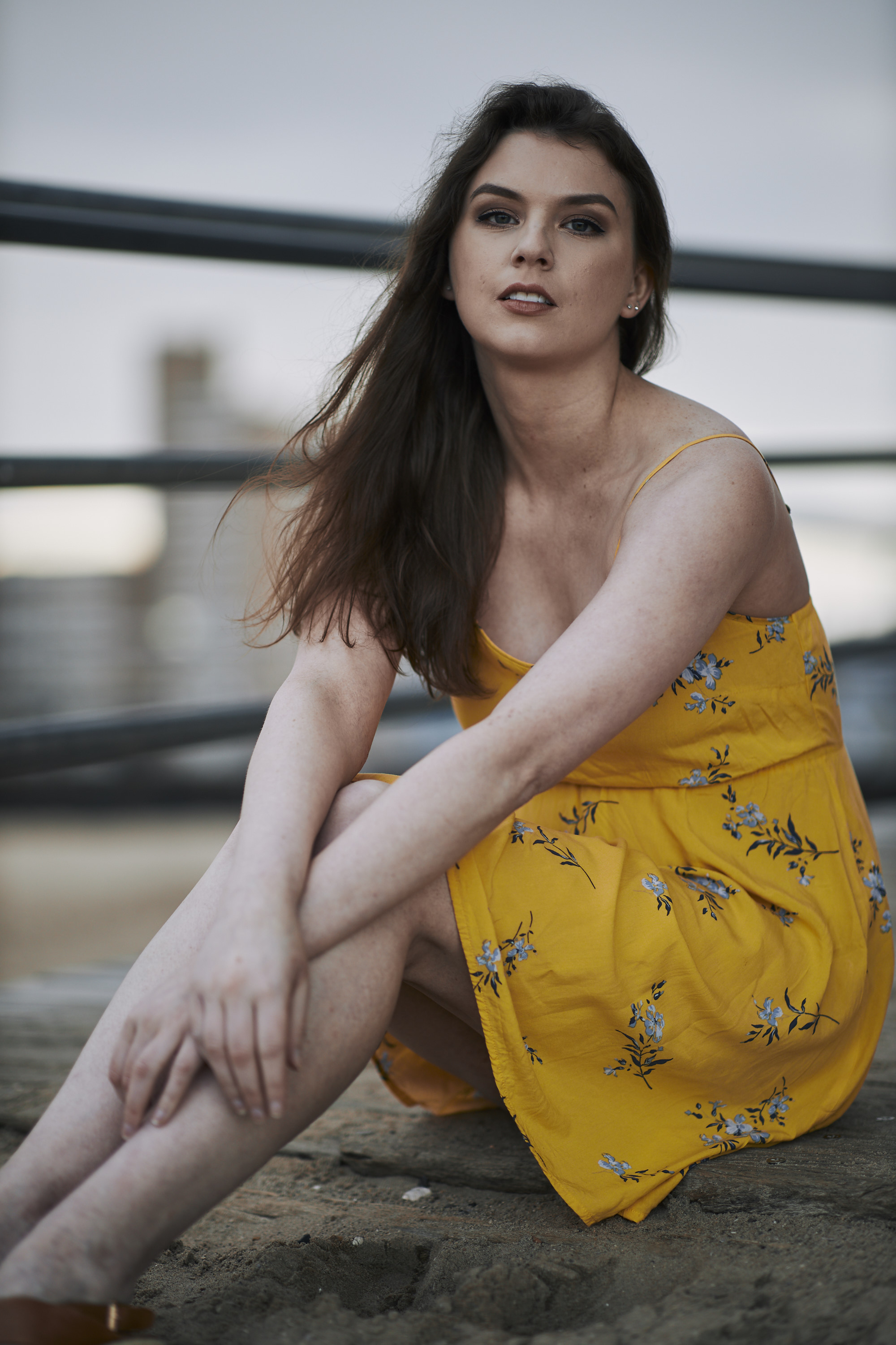
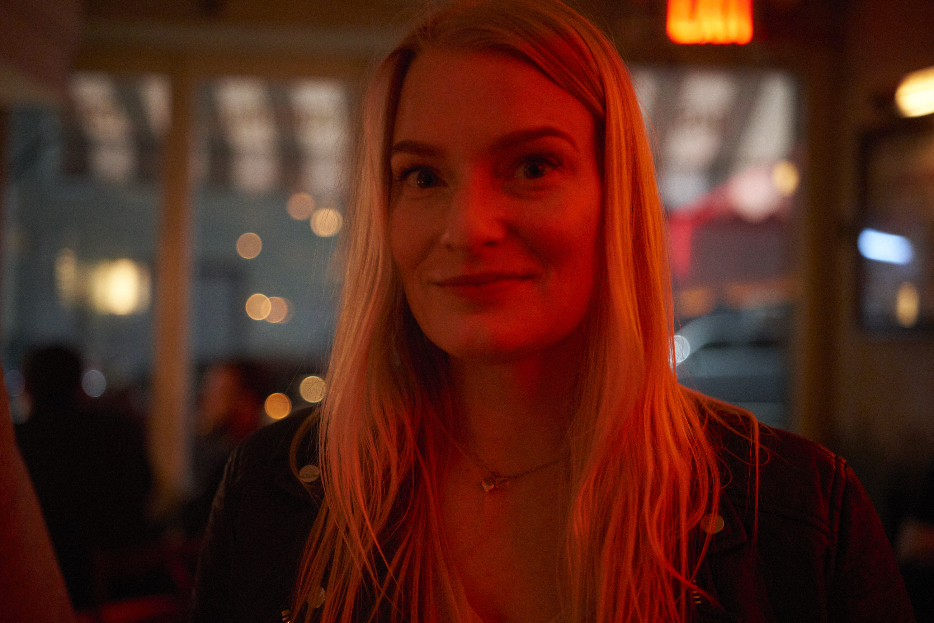
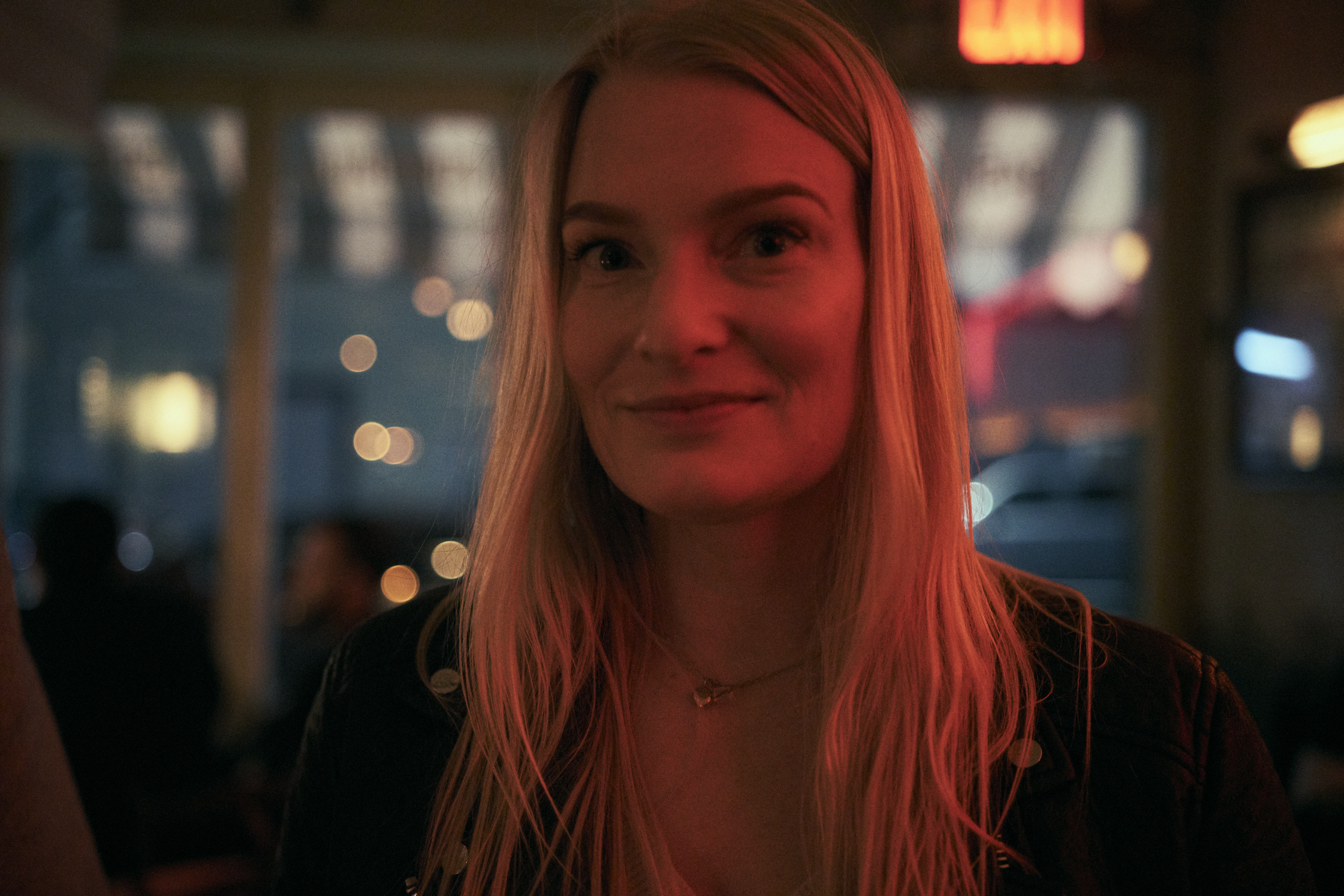
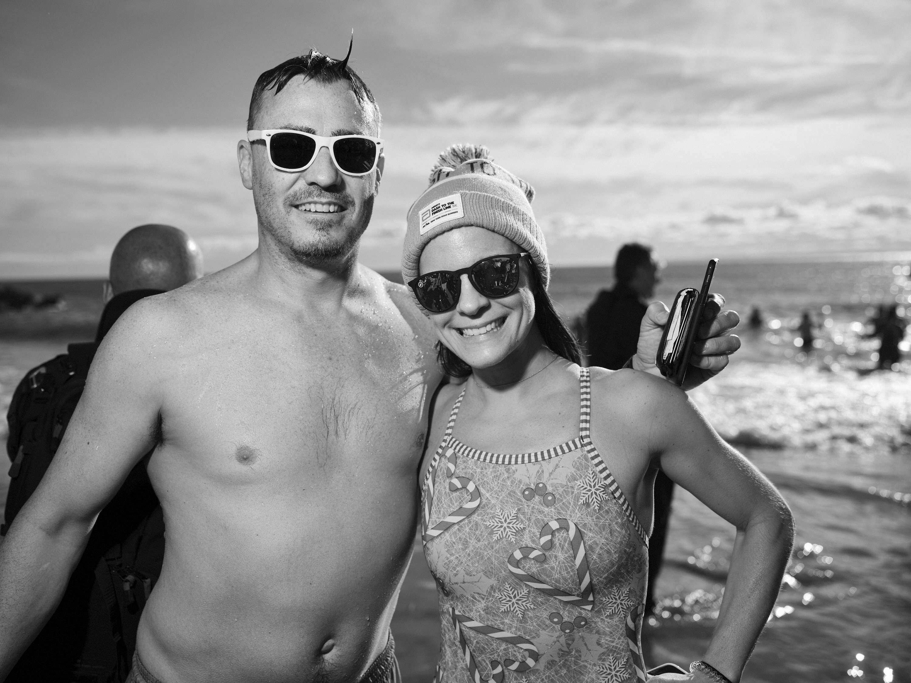
The Capture One Editorial Color Grading Style Pack are installed easily enough into Capture One. Once you’ve got them loaded into the software, you can simply hover over them to see the effect that each will have on the image. By and large, these are designed for portrait shoots. However, we’ve used them for product shoots on the site too. Arguably, these styles are perfect for many of the things that we tend to shoot as lots of what we do is testing gear. Where ethically appropriate, we’ve used the Capture One Editorial Color Grading Style Pack in our previous reviews. For cameras, it would mean in our RAW versatility tests and a few other spots to show off just what’s possible with a camera’s sensor output. For lens tests, it’s often been with seeing what’s creatively possible while balancing the output with other samples.
Throughout the style pack, you’ll find styles that are better suited to warmer color temperatures and some that are better for cooler temperatures. In our testing, we rarely found anything worked well at 5500K and 3200K. And no matter what, you’re still going to want to edit your images. These presets unfortunately aren’t a one-click-solves-all option. For those, I’d recommend working with the RNI Films Style packs. But with the Capture One Editorial Color Grading Style Pack you’ll need to work with the images. If anything, you’ll apply the preset and then just go in and mess around at times.

At times I found the Capture One Editorial Color Grading Style Pack to be a bit odd and curious to work with. In certain situations like with the Sigma 28mm f1.4 Art lens image above, I felt like the styles rendered something more akin to what I would have seen from VSCO or others. RNI Films can deliver looks like this as well. Ultimately that made me think to myself about the slight overlap that they could possibly have. RNI films delivers a ton of different variations while the Capture One Editorial Color Grading Style Pack has a bit less. Can you get the same looks from both? I’m very positive that the most skilled of editor could do it, but the advantage here is that you’re paying for inspiration and a creative vision where you can manipulate it to your liking.
Here’s an example of what I’m speaking about. Perhaps the folks behind the Capture One Editorial Color Grading Style Pack were inspired by film, but in this case the two are very similar sans the color tonality and a bit of editing to the shadows. But if we were to do a blind test, I would probably not be able to fully tell the difference as I don’t have much personal experience with Astia. If this were Provia or Natura or even Pro 400H there would be a different story overall. But nothing from the Capture One Editorial Color Grading Style Pack looks like Pro 400H and that pastel look that everyone goes for despite the fact that the pack has pastel renders.
We’ve tested the styles with Canon, Sony, Nikon and Fujifilm RAW files. And thankfully they work all across the board quite well. They’re also all consistent in what they do. Where we found variance is with the different lens options out there. For example, a Sony a7r III with a Zeiss Batis 40mm f2 may render an image different than with Sony’s own glass due to how the two work together. Similarly, the Canon EOS R with Sigma lenses don’t give me as attractive a file as I can get with lenses native to Canon. On the other hand, a Fujifilm GFX 50R with the company’s own lenses are great.


Conclusions
I wholeheartedly like the Capture One Editorial Color Grading Style Pack. Between this and the RNI Films pack, a photographer should have everything that could possibly need. Would I choose one over the other? Personally no–they do a few things similar but then extend to go off into their own specific directions. If anything, I’d recommend that a photographer get and work with both.
Get rid of the ads!
Did you enjoy reading this article as much as we enjoyed writing it? There's a way to support us and our reporting, getting ad-free navigation and more as a bonus. Subscribe to us for less than a coffee per month —just $3.99— or take advantage of our yearly subscription with a hefty discount for only $25.- An ad-free experience
- A free mystery box for Lightroom or Capture One
- All the books in our store
- 20% discount on Capture One
- 30% discount on Imalume Photo Theft Protection
- 20% off Herbs and Kettle Tea Company.
- 20% off your order from MPIX printing services.
- 5% off Viltrox Products via their eCommerce store.
- 10% off all film developing, printing and scanning services from Blue Moon Camera and Machine
- 15% off 7Artisans products: The lens and accessory maker is offering a sweet discount for Phoblographer's readers.