
If the colors in your portraits are bland, then try something else.
One of the biggest problems that photographers have when it comes to portraiture can be dealing with the colors. The simple way to do this is to simply just shoot during the golden hour, but that takes away a major part of the creative process. Making the colors in your image pop not only has to do with effective placement, but it also has to do with their tones, the lighting, and your processing. Let’s delve further!
The Elements of Your Image (Subject, Foreground, Background)

Before you even click the shutter, you should start with setting up your scene. It’s best for there to be three primary colors:
- Your subject’s skin
- Their outfit
- The background
All of these things should be different colors and tones are are strong enough to add very clear contrast. Red, yellow, blue, and green tend to add the most contrast with the wide variety of skin tones out there. So too do black and white. Combine with this the elements of the scene: the subject, background and foreground. Ensure that there is quite a bit of contrast between them.

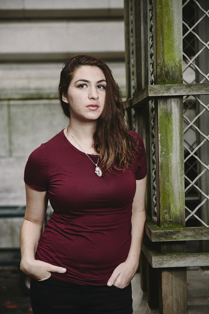
In the example above we can break this down:
- Erica is a tone of orange
- Her outfit is a tone of gray
- The background is green
All of this can be done with effective lighting, white balance, and post production. We’ll get to that soon after you solidify this step in your head.
In the Creation Process: Identify the Three Main Colors
Now that we know that we need three main colors, we need to identify them and gauge them on the ROYGBIV scale. Rarely do three colors right next to each other in the color scale work together in a scene. The ideal is to get one from each end and one in the middle. So that means:
- Orange or red
- Yellow, green or blue
- Indigo or violet
Of course, that’s just a bit of a rule that can be great to follow. It doesn’t need to. That, however, becomes more complicated as we’ll show later on.
In this scene the three main colors are:
- White
- Orange/red
- Black
I was able to get these colors by using a flash to make the whites brighter and by using a fixed white balance while shooting.
The Importance of White Balance and a Good Starting Point
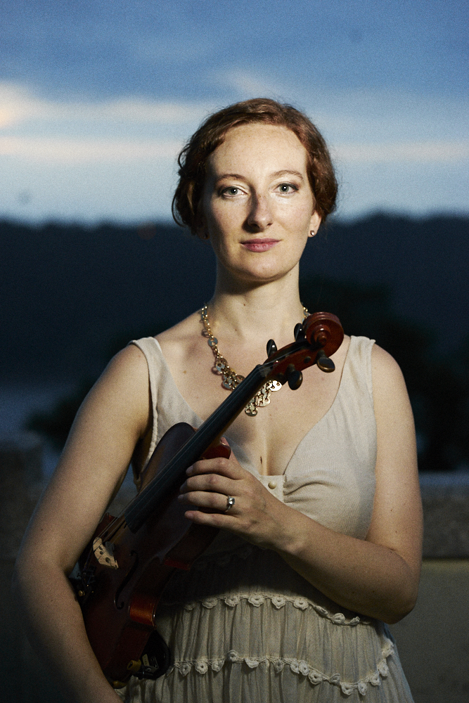
On the site, you’ll hear me talk about locking your white balance often and it’s for great reasons. They tend to work best with skin tones in general and also lighting types. You can of course adjust in post, but if you don’t know how to work with the hues, saturations or luminance for each color channel, then you’re out of luck.
The image above was shot at 5600K daylight white balance. Because it’s dusk, the background is a deep blue. But the flash that’s firing on Anna is daylight white balanced. So that means that it’s going to illuminate her to “normalize” the color and make her stand out. The formula is simple: she’s wearing white, she’s a tone of orange, the background is blue. There is enough color contrast in the scene to make the colors and subjects pop out.
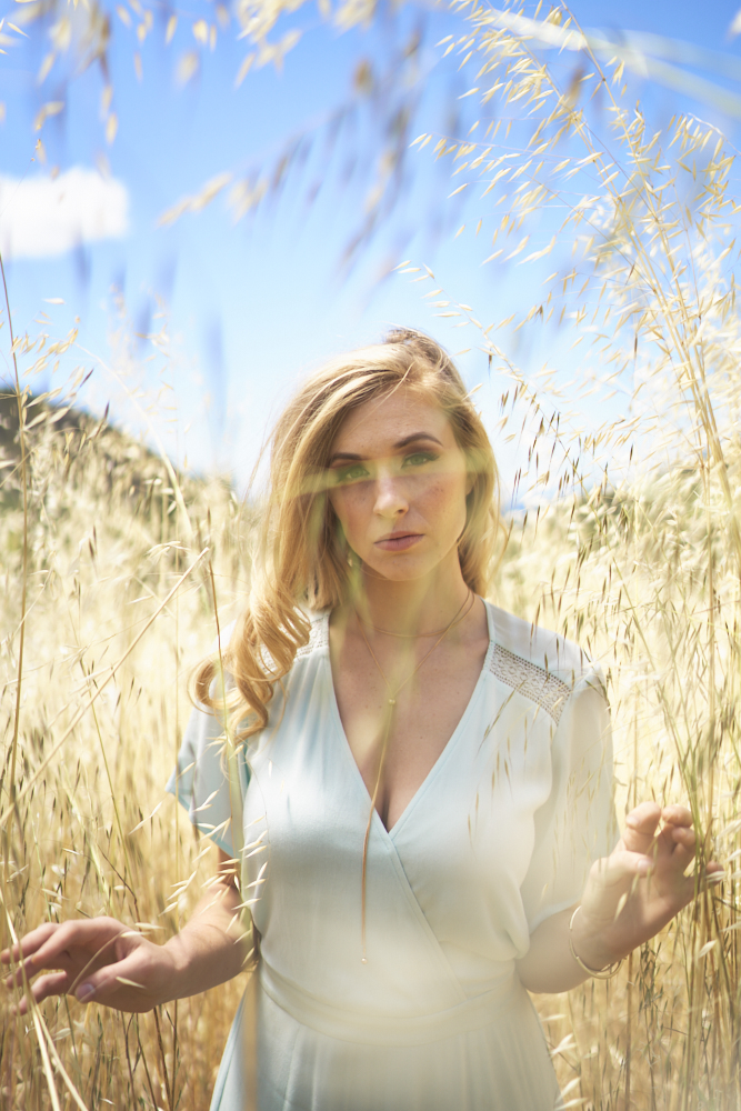
We did the same here: the model is a tone of orange, the field is yellow, she’s wearing blue and the sky is blue. But here is how this all works out so well:
- She is orange. So is her hair. But they’re mostly the same tonality
- The yellow/orange field is a brighter color than she is. That brightness helps her stand out when held against the field.
- Her dress is light blue while the sky is dark blue. Again, there is contrast with tonality.
In Post

Sometimes, the best thing that you can do is work with each color channel to make them pop. In this situations the orange blends into his hat, his skin and the background. But by adjusting it from a fixed white balance and balancing the shadows and highlights, we get a subject that stands out and where the colors pop due to their being different brightness levels. Or in this case, different luminance levels.
Then there is his hat, his sweater, and the light. Plus the out of focus areas.
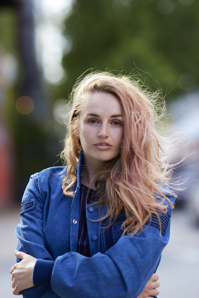
Here, it was a matter of adjusting the blue to be very saturated, making Sarah’s orange toned skin a bit less saturated, making her hair more saturated, and making the green background pop by brightening it and saturating it. Once the three big colors are identified, you can work with their HSL settings to make the colors pop.
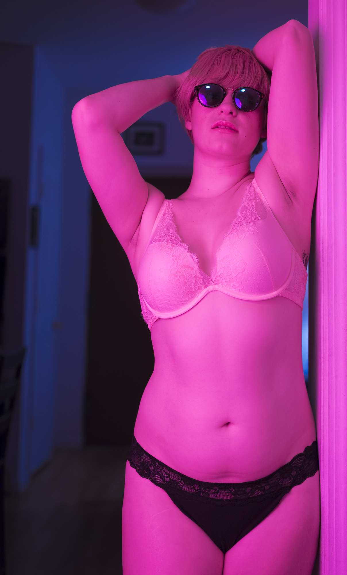
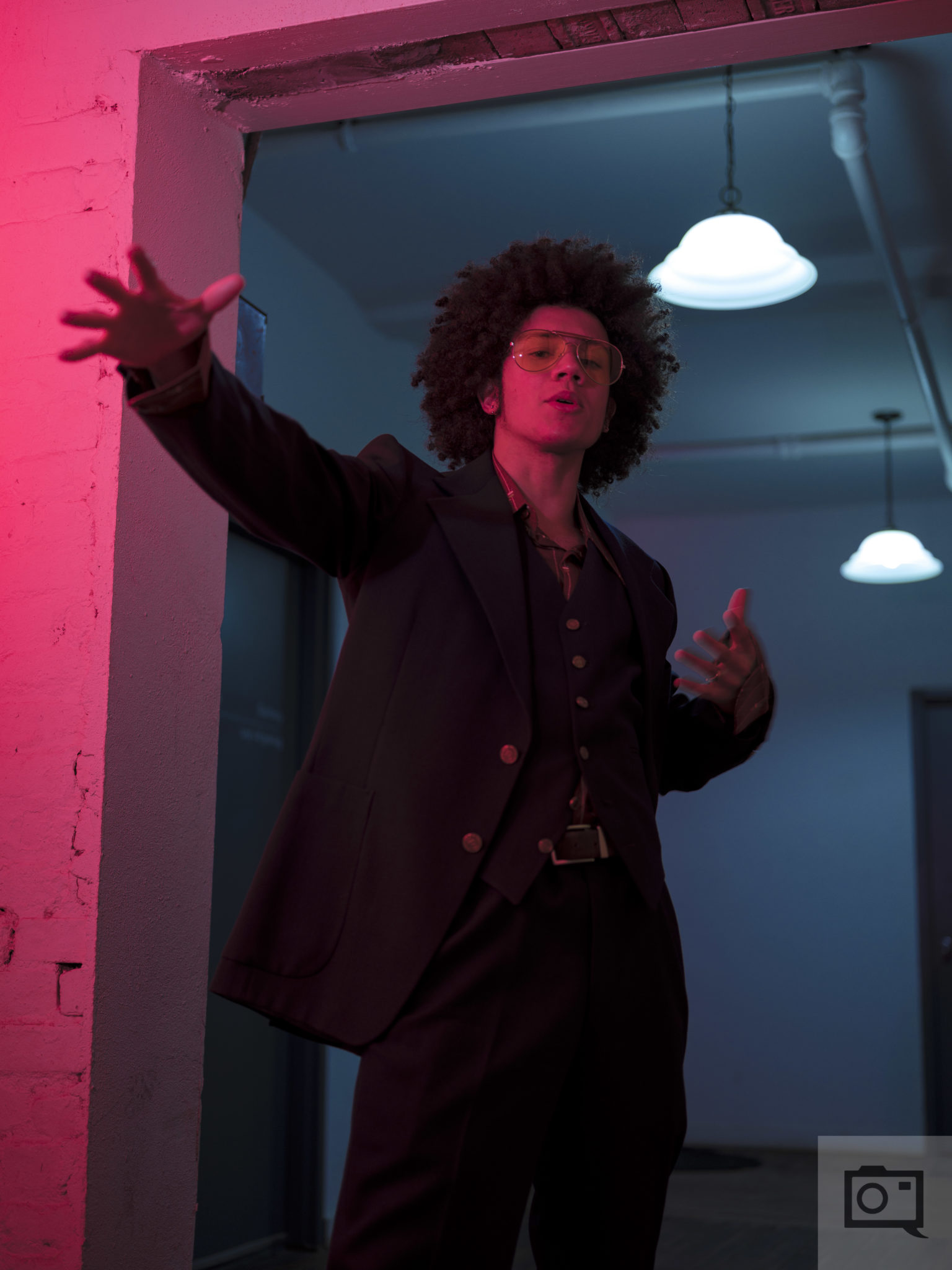
Or…Use a Gelled Flash

The arguably easier way to do all this is to add a flash to the scene and simply gel it. It’s a popular look with the neons being added in. When combined with controlling what your subject wears, white balances being locked, and different brightnesses, you can make the colors pop.
Get rid of the ads!
Did you enjoy reading this article as much as we enjoyed writing it? There's a way to support us and our reporting, getting ad-free navigation and more as a bonus. Subscribe to us for less than a coffee per month —just $3.99— or take advantage of our yearly subscription with a hefty discount for only $25.- An ad-free experience
- A free mystery box for Lightroom or Capture One
- All the books in our store
- 20% discount on Capture One
- 30% discount on Imalume Photo Theft Protection
- 20% off Herbs and Kettle Tea Company.