
Last Updated on 11/27/2017 by Chris Gampat
What’s your favorite ISO 400 film? How does it compare?
For film photographers, ISO 400 films are great for all-around photography and shooting with flexibility in various lighting conditions. If you’re wondering what the photos from the ISO 400 color negative films you can still find today look like, this quick side-by-side comparison video should help.
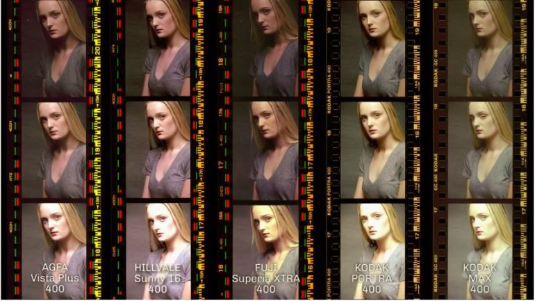
OnePlusOne, a group of film photographers in Australia, have put together a book called FLAVR (Film Lovers Analogue Visual Reference), an in-depth visual guide for various films. Among the emulsions they have in their collection are some well-known ISO 400 color negative films we can still (somehow) find today: Agfa Vista Plus 400, Hillvale Sunny 16 400, Fuji Superia XTRA 400, Kodak Portra 400, and Kodak Max 400. In a video below, they give us a peek into their pages with a side-by-side comparison of the five films.
The video may be short but it sure gives us an idea about how each film performs in terms of colors and tones, both straight out of the scanner and after color correction. Aside from the standard exposure, we also get to see what the photos look like when they’re underexposed and overexposed by one stop. These comparisons prove useful for those who want to see the dynamic range for each film.
It’s easy to see the clear winner in this comparison: Kodak Portra 400 produces only a subtle color shift between the uncorrected and corrected version. This shows us what makes Kodak Portra 400 a top choice for many photographers, especially for portraits and people shots.
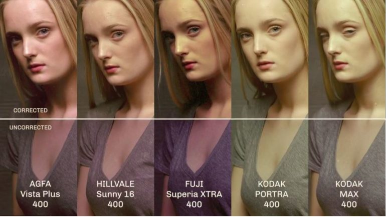
An eagle-eyed commenter noted that the Agfa Vista Plus 400, Hillvale Sunny 16 400, and Fuji Superia XTRA 400 are all made by Fujifilm just based from the markings on the edges of the films, and that the differences could simply be a matter of variations in the emulsion batch. OnePlusOne gives a plausible explanation to this. While they could all be manufactured by Fuji, the difference in the colors could be attributed to Agfa’s specifications for their emulsion.
Also, I just have to say I find this visual reference guide in the form of a printed book a great idea. With it, you don’t have to worry about colors varying because of differences in screen calibration. And it’s always nice to have something to flip through if you want to see what the photos from a specific emulsion typically look like.
Screenshot images from the video
Get rid of the ads!
Did you enjoy reading this article as much as we enjoyed writing it? There's a way to support us and our reporting, getting ad-free navigation and more as a bonus. Subscribe to us for less than a coffee per month —just $3.99— or take advantage of our yearly subscription with a hefty discount for only $25.- An ad-free experience
- A free mystery box for Lightroom or Capture One
- All the books in our store
- 20% discount on Capture One
- 30% discount on Imalume Photo Theft Protection
- 20% off Herbs and Kettle Tea Company.