Last Updated on 05/31/2017 by Chris Gampat
Creating a portrait photo that pops surely starts within the camera, but with some of the tools available in ACDSee Ultimate 10, you can create a photo that has even more pizazz. For a number of years, photographers have been looking for something a bit more powerful than Adobe Lightroom but not quite as complicated as Photoshop: and one of the options on the market is ACDSee Ultimate 10. The PC based software is designed for the photographers who want a bit more power and versatility but don’t need the entire Adobe Creative Suite. With one piece of software you get features of Lightroom, Bridge and Photoshop all in one place.
In this tutorial we’ll show you how to make a portrait pop in ACDSee Ultimate 10.
Editor’s Note: This is a sponsored blog post from ACDSee Ultimate 10. All words are from Chris Gampat, the Phoblographer’s Editor in Chief. This tutorial was created with the Phoblographer’s audience specifically in mind.
Getting Set in Camera During the Shooting Process
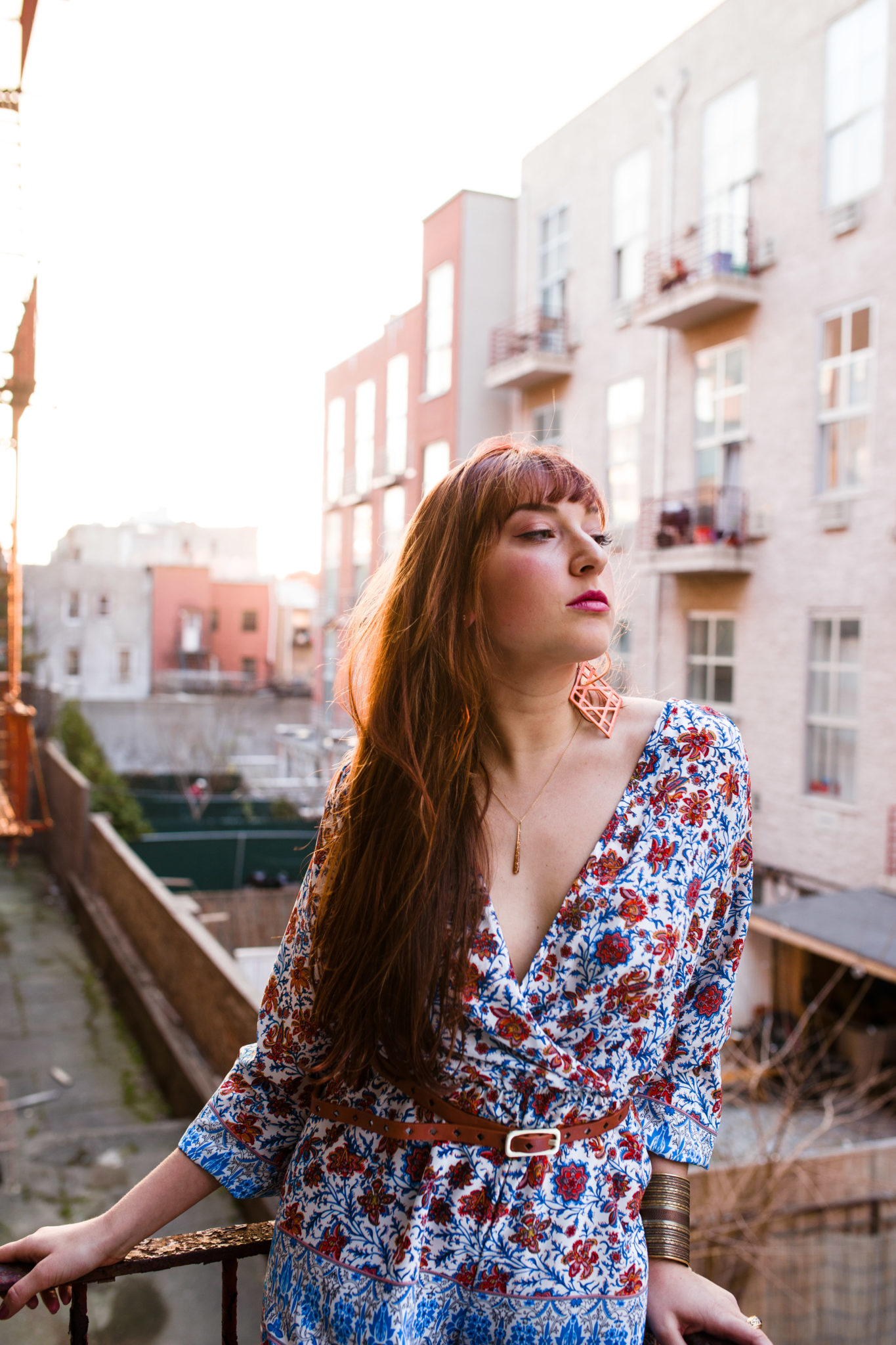
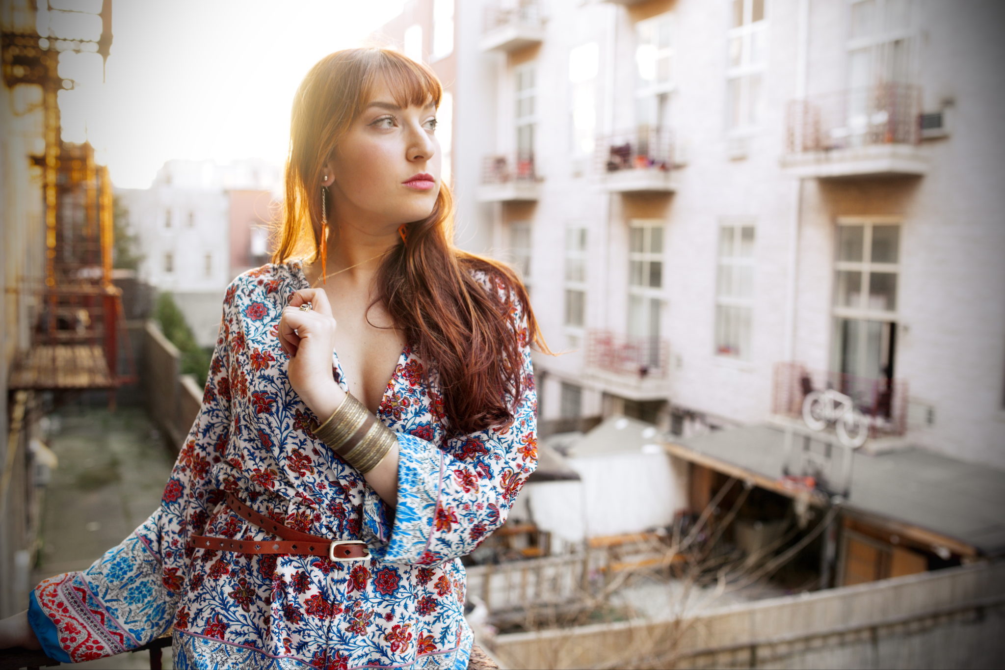
So let’s start with the in-camera parameters. When you’re shooting a portrait, we’re going to assume that you’re using natural lighting and that you’re probably going to shoot during the Golden Hour. With this in mind, consider one of the most important tips of portraiture: keep your colors simple. I like to call this the rule of three colors. Essentially this means that you work with three primary colors in the scene: the skin tones, the wardrobe and the background. It’s one of the reasons why the most fantastic portrait photos really work when you consider them in a technical manner.
Then consider your lighting. When working with Golden Hour light, I like backlighting my subject and finding a way to give the subject a sort of hair light and glow.
Now that we’ve got that, let’s get to editing in ACDSee Ultimate 10.
Editing in ACDSee Ultimate 10
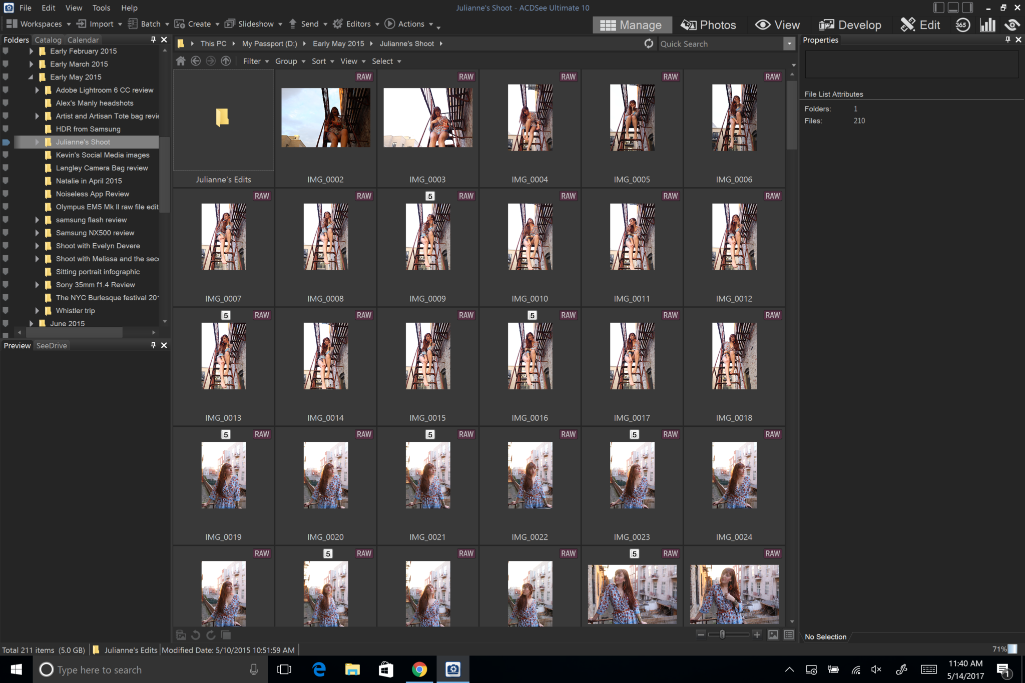
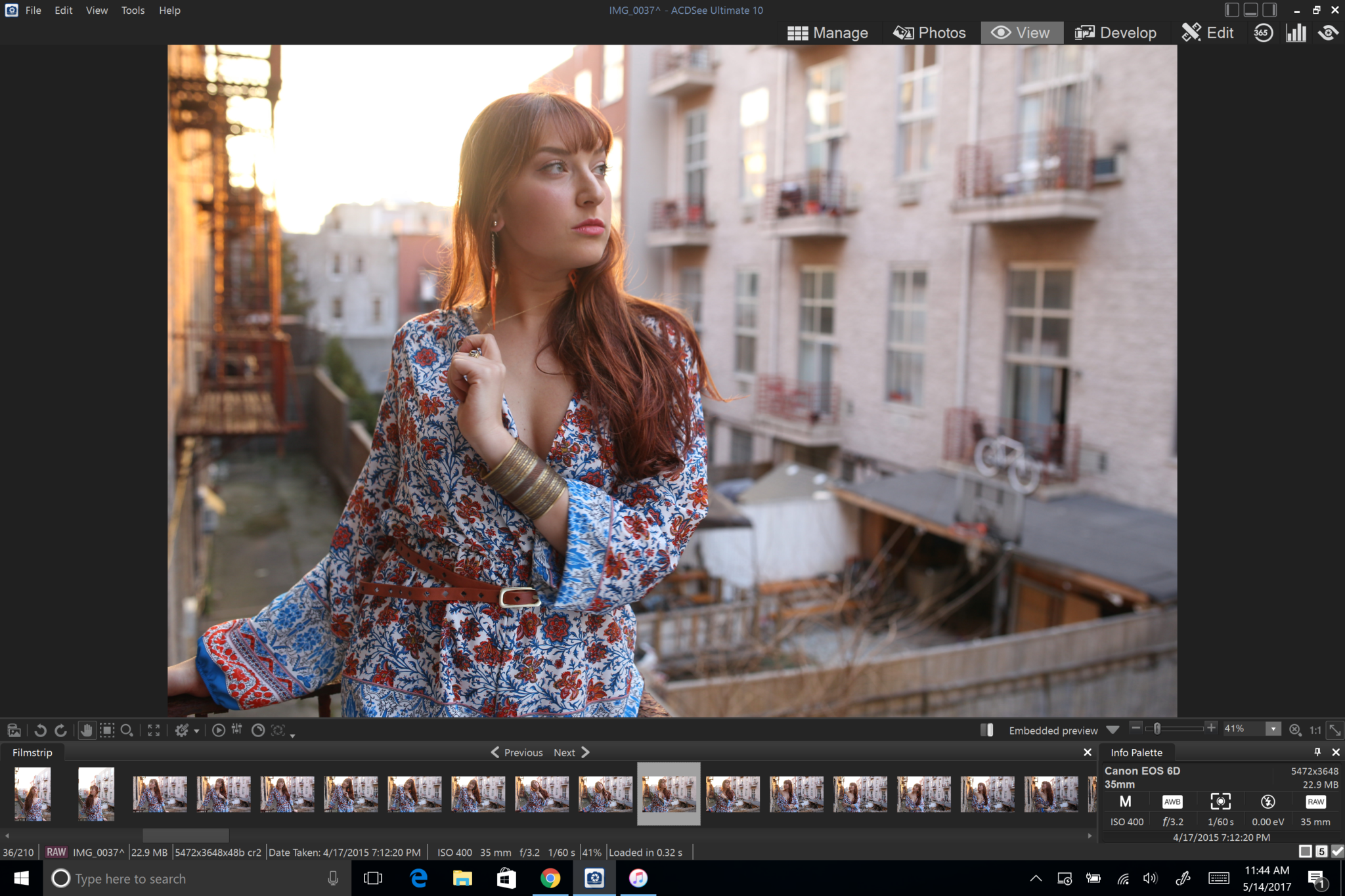
When you boot up ACDSee Ultimate 10, you’ll want to explore the folders available to your computer to figure out what you want to work with. You can look through your images in the Manage, Photo and View modes. But for ease of this tutorial, we’re going to get right into it. Head into the Develop mode–because we know that that’s what you folks really care about.
In the develop mode, you can do a lot of what other programs like Lightroom and Capture One can do; but it does it all in a different interface and way overall. ACDSee Ultimate 10 is more akin to Capture One Pro 10 though vs Lightroom in that ACDSee offers more editing abilities to a certain point.
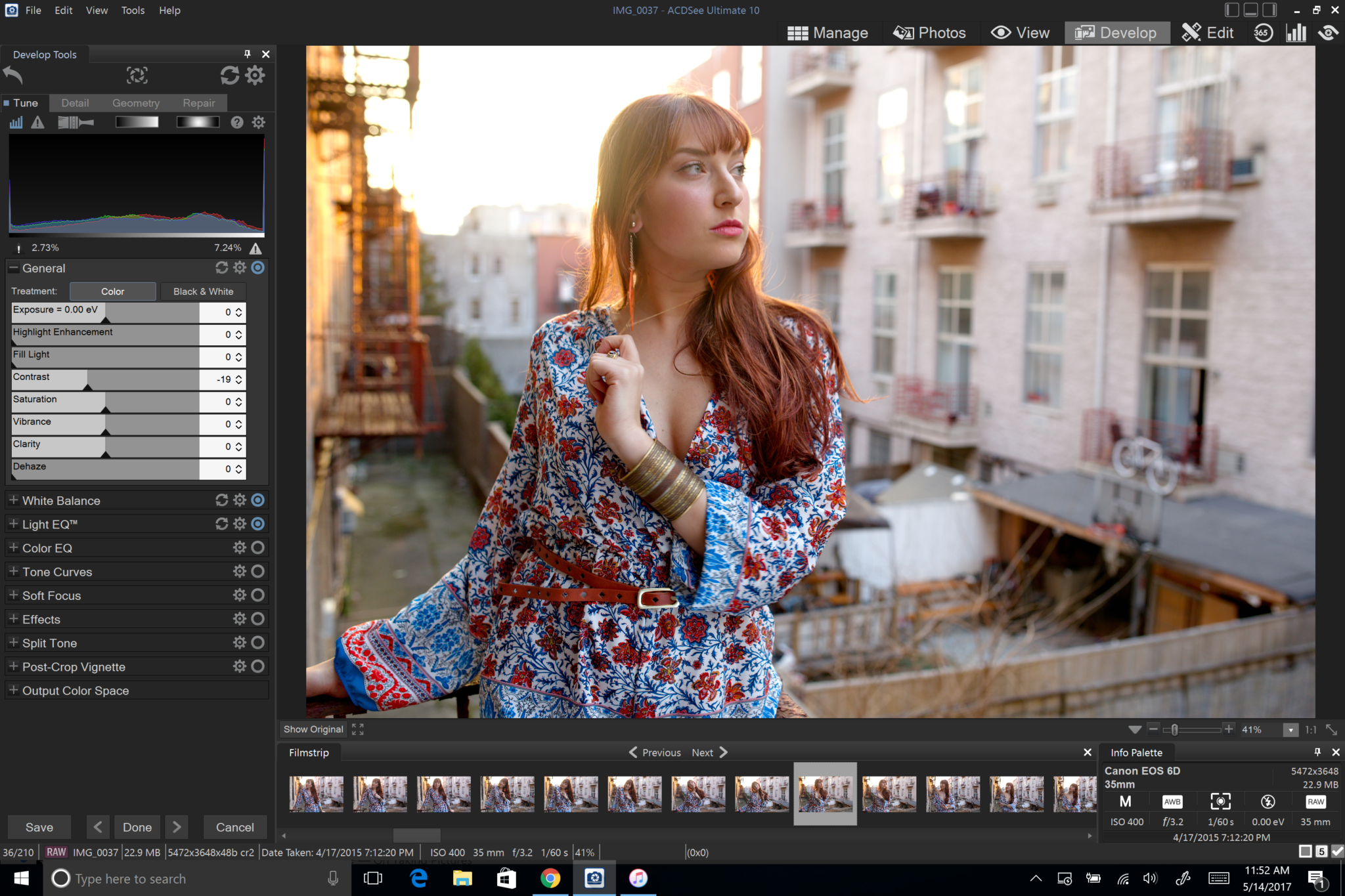
Providing you haven’t gotten your exposure just right, set that up first. You’ll notice that if you’re used to other editing programs that much of this will see familiar. As an extra tip, only adjust the exposure then move on to work with the contrast just a bit. I like to not really work with the contrast at all here because we’re going to be working with aspects of it throughout this tutorial.
What’s really nice about ACDSee Ultimate 10 is that the editing process works very well from top to bottom and unlike Lightroom, you don’t need to jump from place to place to get the best colors. Just work from the top all the way down. ACDSee Ultimate 10’s develop panel has a more better approach to editing.
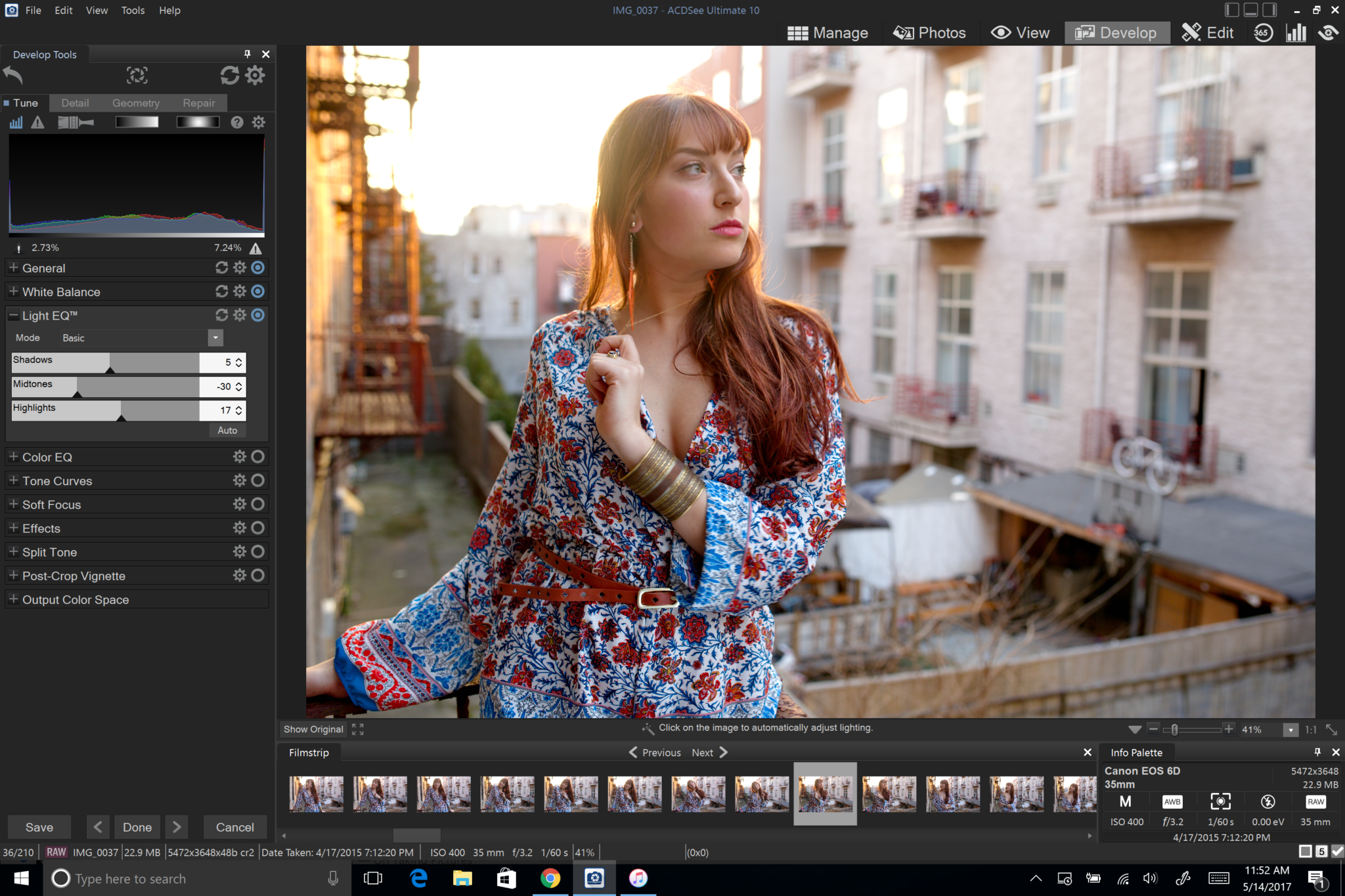
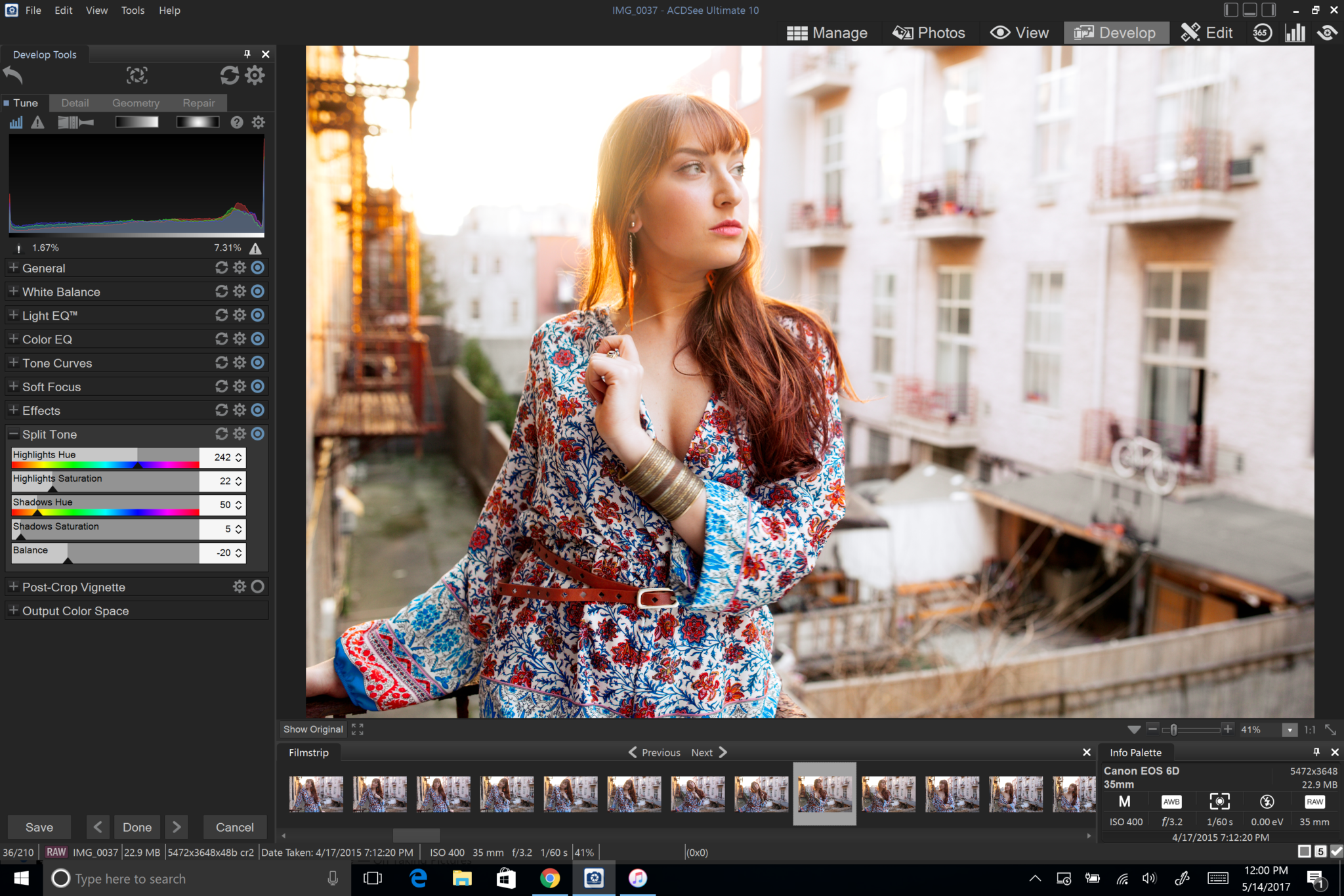
In Develop, and after you’ve adjusted your exposures accordingly, start with your white balance. White balance however you’d like but choose very carefully–you’ll see why much later on. My preference is to lock to Daylight, Tungsten or Shade. Part of this is because of how 35mm and 120 film works–which can give you better colors in the end depending on your creative vision. I like Daylight for this photo and I’ve chosen to work with a manual white balance at 5500K.
Now you can work with the Light EQ–which will give you a lot of the same effects as you’d get by working with contrast, but while giving you more fine tuned manual control. Tweaking the midtones will give you the most contrast in the scene (sort of light working with the clarity slider.) But here you can also tweak the highlights and shadows to your liking. I strongly suggest working with that here.
Look at the image and figure out what the major colors in the scene are. These are all based on the white balance that you’ve worked with. If I set this image to Tungsten, the colors and how they are affected would be much different.
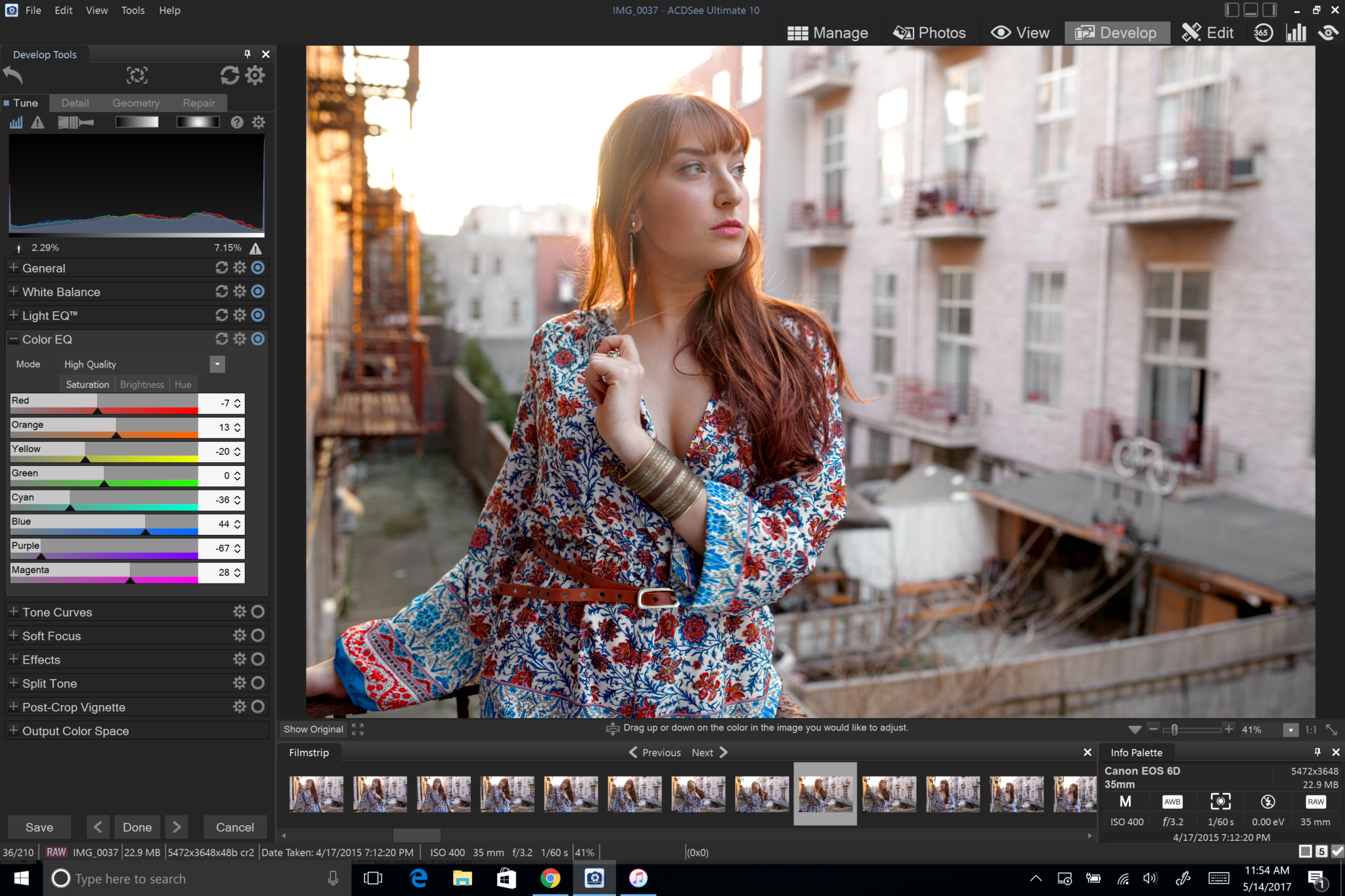
In this case, the major colors that we’re working with are red, yellow, orange, and there are tinges of blue. Play around with each color and you’ll see that ACDSee does a great job of working with the color parameters in a photo like this. The cooler tones have a lot to do with Julie’s dress in this scene but the warmer tones are all dealing with the rest of the scene. So by adjusting the Blue, Purple and Magenta, I get more from her dress (the wardrobe.) By working with the warmer colors like Red and yellow (her skin and hair) and Orange (the background) I can tweak each section accordingly.
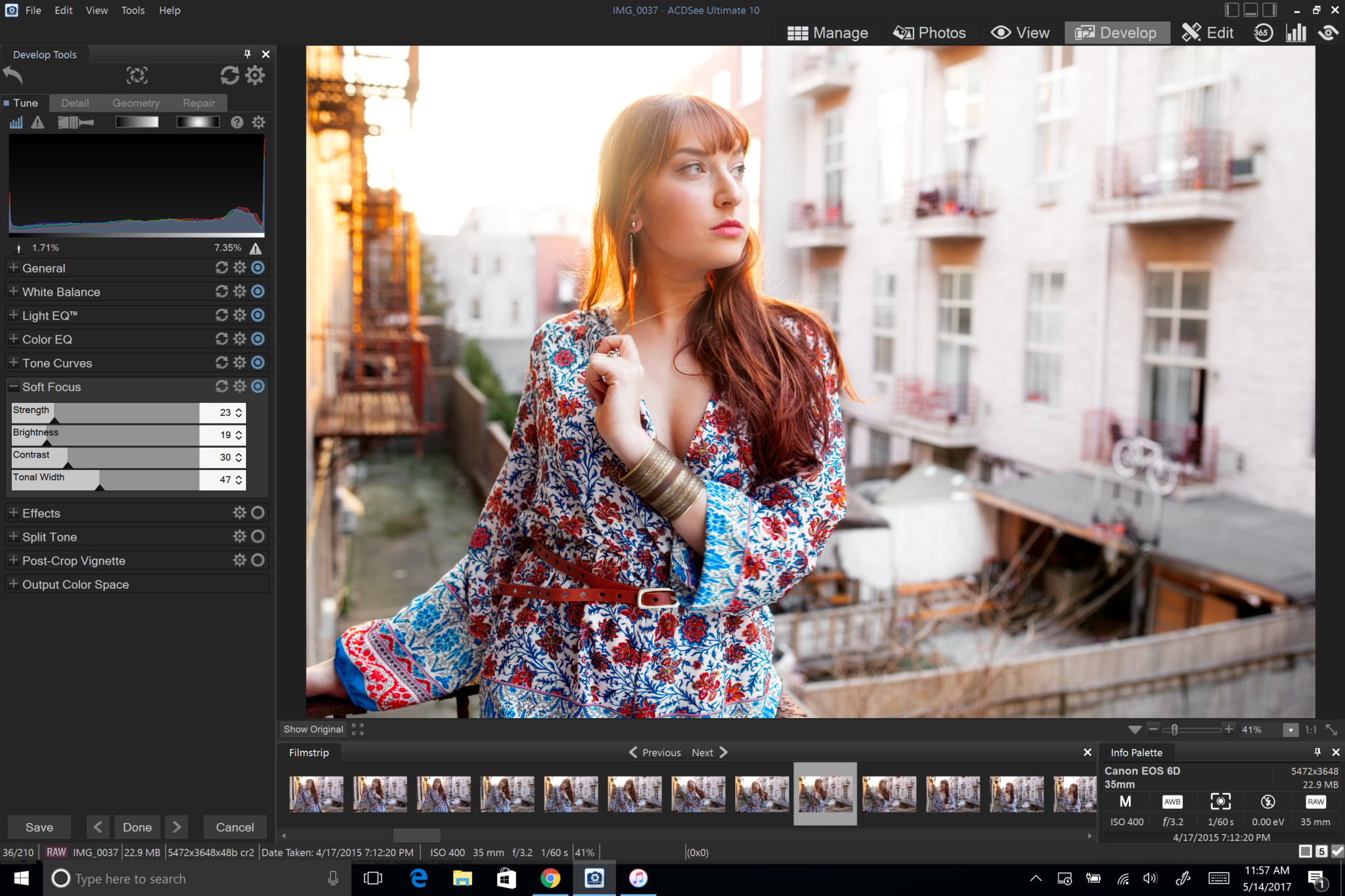
If you wish, you can also work with Tone Curves. What you should try to do here is tweak these accordingly to what you did with the Light EQ. In this case, we really just worked with the midtones and shadows. When you work with them here, you’ll start to see the colors get a bit deeper or more mute. Now you’ll start to see a whole lot more pop in the photo.
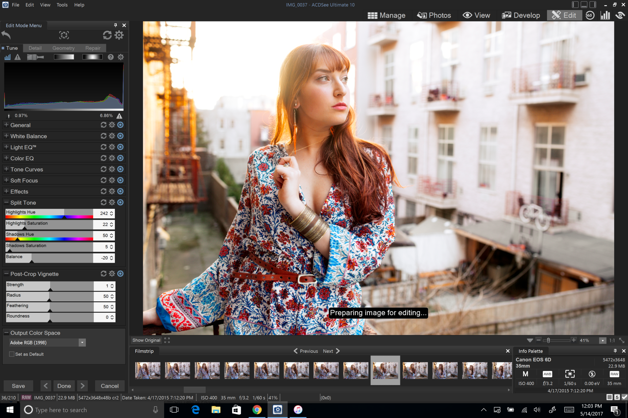
After this, I purposely moved onto the soft focus tool; which in this case lets you work with the way the perceived sharpness in the scene looks. Notice how at this point we’ve done a number of things that have made Julie pop out more in the scene. Now you can see how this image is really starting to pop.
Before we move on, let me explain perceived sharpness to you. Sharpness has to do with actual, pure, pixel per pixel sharpness. It’s typically associated with 100% crops all that non-sense. But perceived sharpness has to do with colors, lights, and black levels that make a photo overall just look sharper and pop out more when looking at the scene as a whole. Of course, we all know that that’s the most important thing.
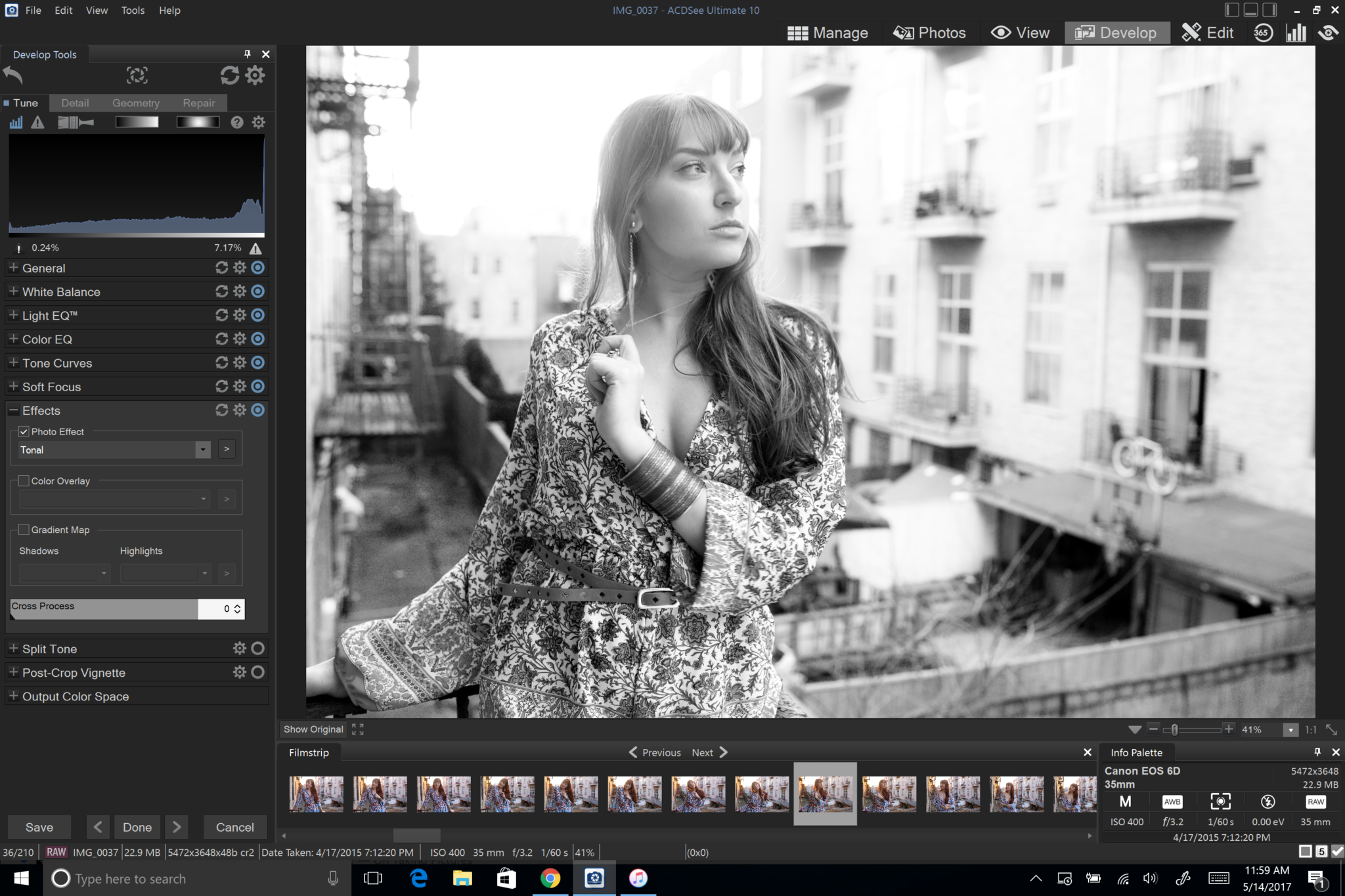
If you want, you can also choose your own effect. But In this situation I really didn’t want to do that. That would also require a whole different tutorial.
In the split tone you should set colors accordingly. With daylight white balance you’ll typically want to associate the highlights with a cooler shade (like blue) and the shadows with a warmer shade (like orange in this case due to the skin tones.) Then when you choose a balance between the highlights and shadows, you’ll find that your subject will start to pop out more from the background.
Considering the edits that we’ve done before, this will help the subject pop out a whole lot more.
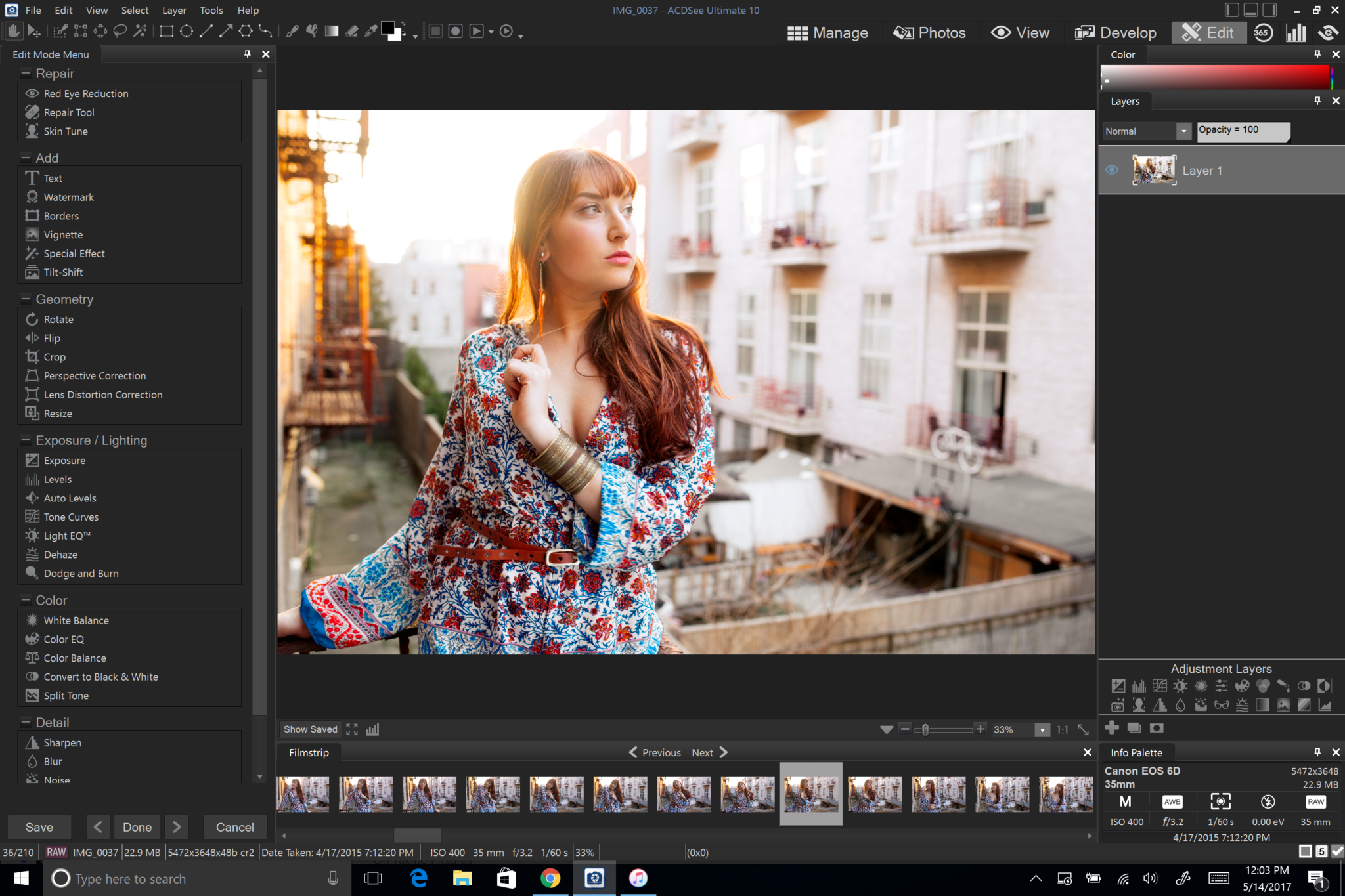
You can argue that you’re pretty much done right now, but let’s move into the Edit panel. The Edit Panel acts a whole lot like Adobe Photoshop but is nowhere as complicated. Cool that you’ve got features of Photoshop, Capture One and Lightroom all in one spot, right?
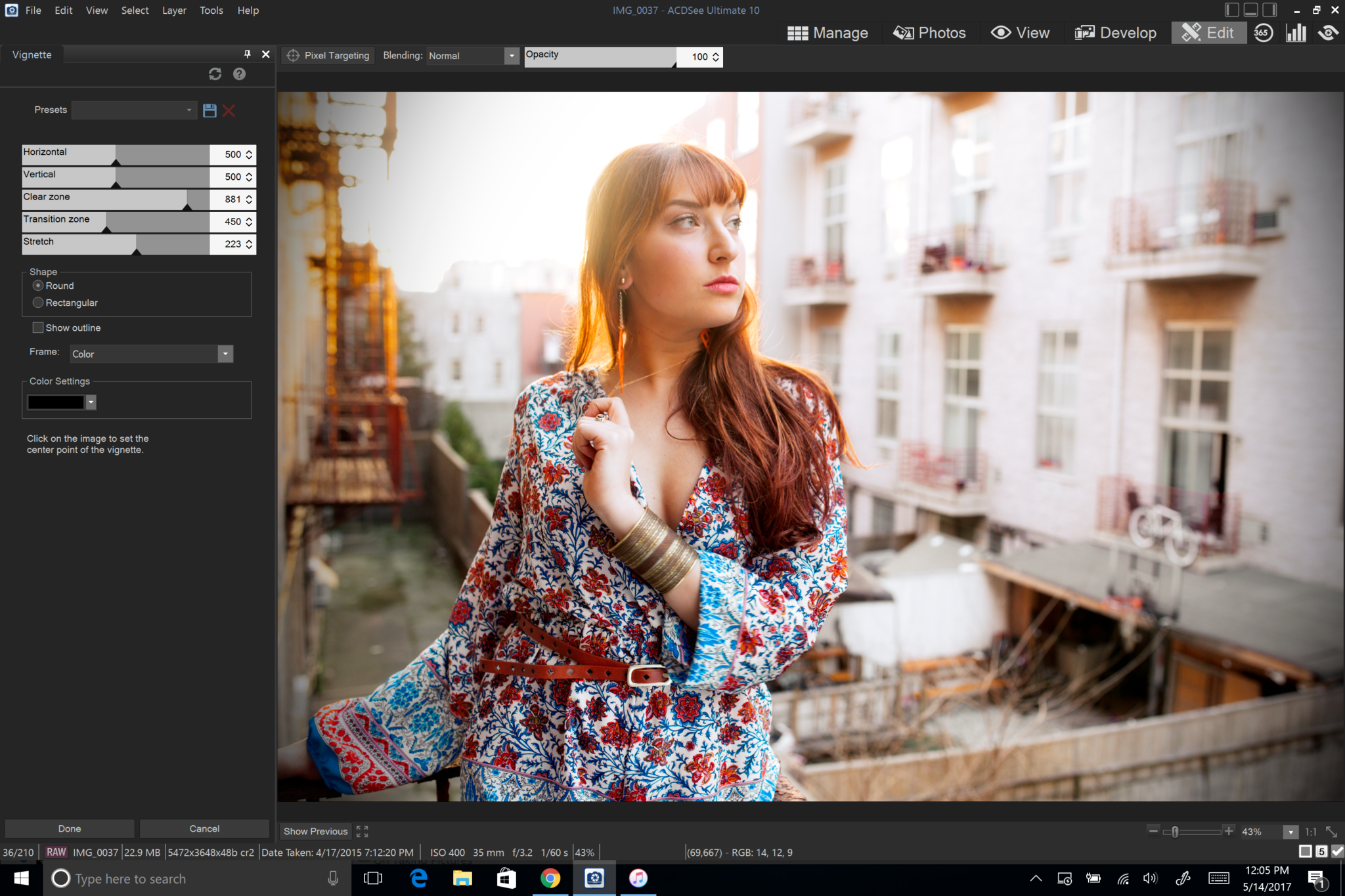
By adding a very slight vignette you can get more emphasis on the subject. We don’t need a whole lot but just enough to put some emphasis on the sides.
Try out creating your own eye-catching portrait with ACDSee Ultimate 10.
Get rid of the ads!
Did you enjoy reading this article as much as we enjoyed writing it? There's a way to support us and our reporting, getting ad-free navigation and more as a bonus. Subscribe to us for less than a coffee per month —just $3.99— or take advantage of our yearly subscription with a hefty discount for only $25.- An ad-free experience
- A free mystery box for Lightroom or Capture One
- All the books in our store
- 20% discount on Capture One
- 30% discount on Imalume Photo Theft Protection
- 20% off Herbs and Kettle Tea Company.