Creating a black and white image that isn’t lazy requires you to do a lot more to it than just hit the “convert to black and white” option when editing an image and it even requires more than just applying a filter. Conversions are one of the more looked down on ways to edit because photographers believe it to be cheap and easy–yet clients love it!
So how do you create one that doesn’t feel cheap, lazy, and that genuinely looks good? One way includes creating an image that looks good in color and black and white.
The Image Edits
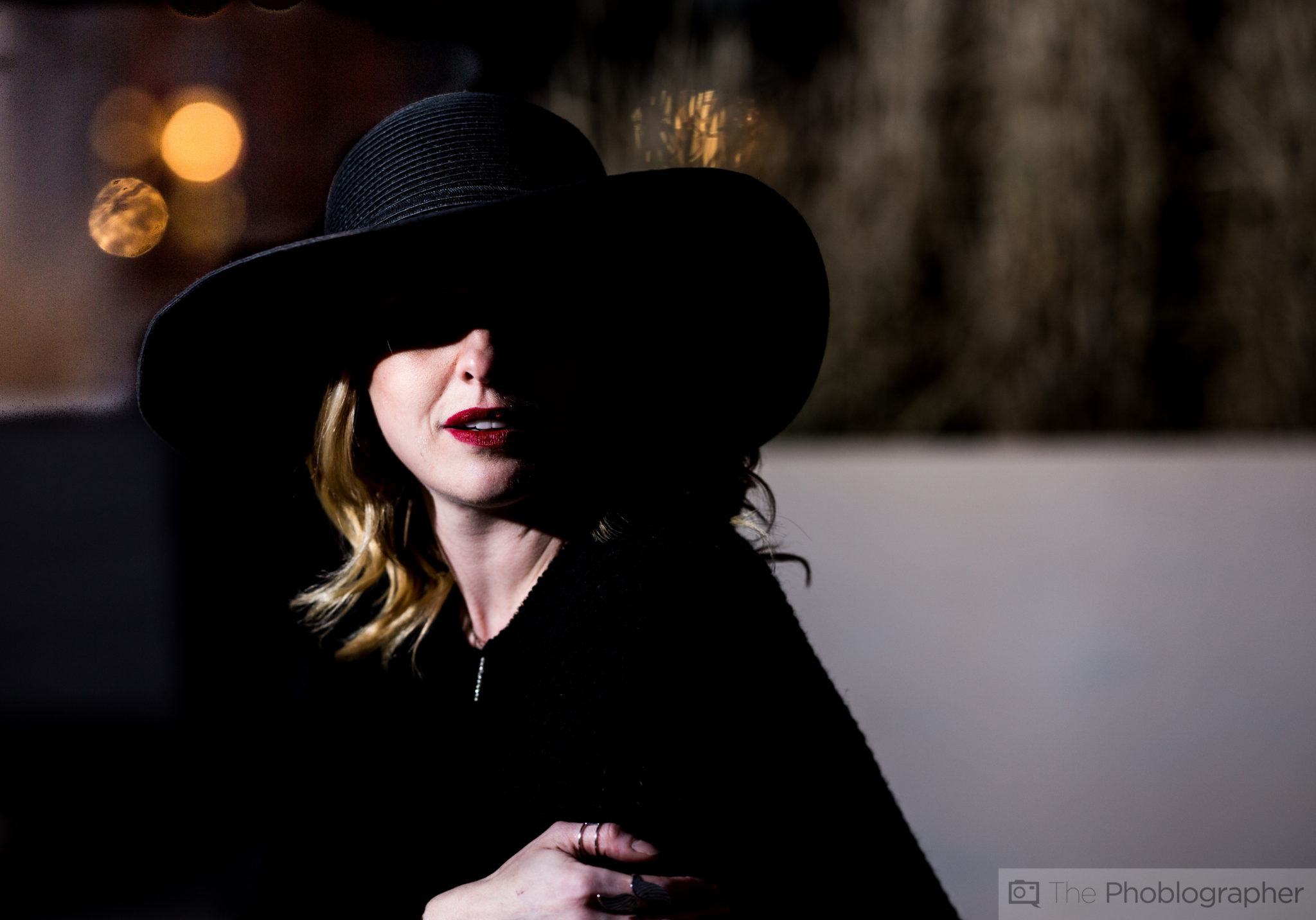
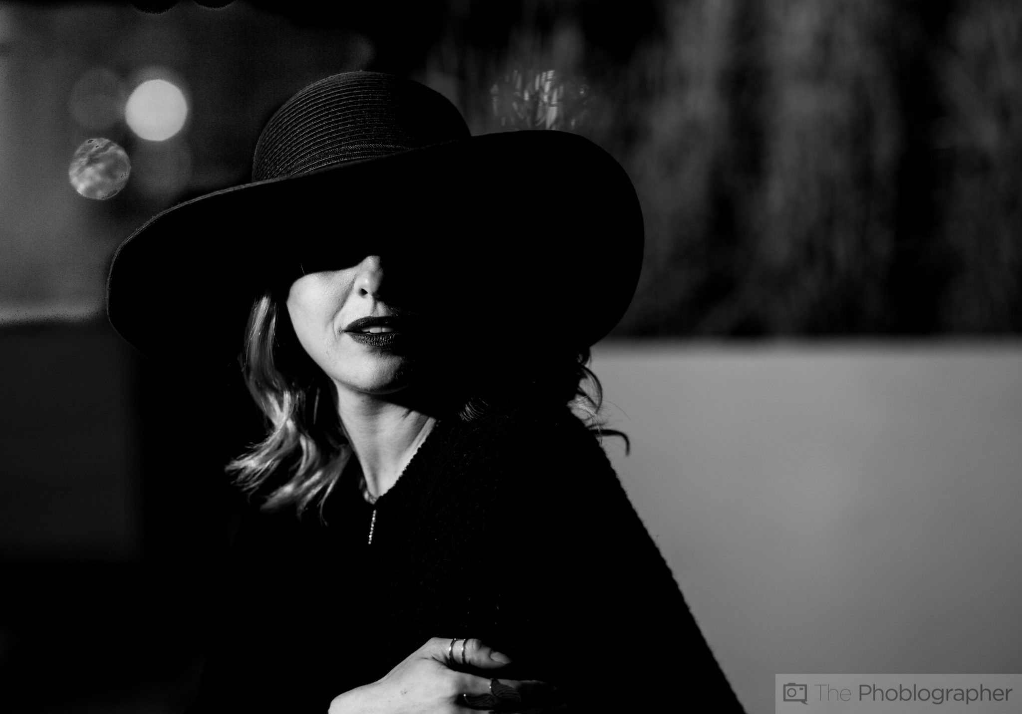
Before I sit here and eat my words, the lead image of this story looks like the above photo when rendered in color. Depending on your taste, you’ll like one or the other. I like both–but ever since I founded La Noir Image I’ve been on more of a black and white spree.
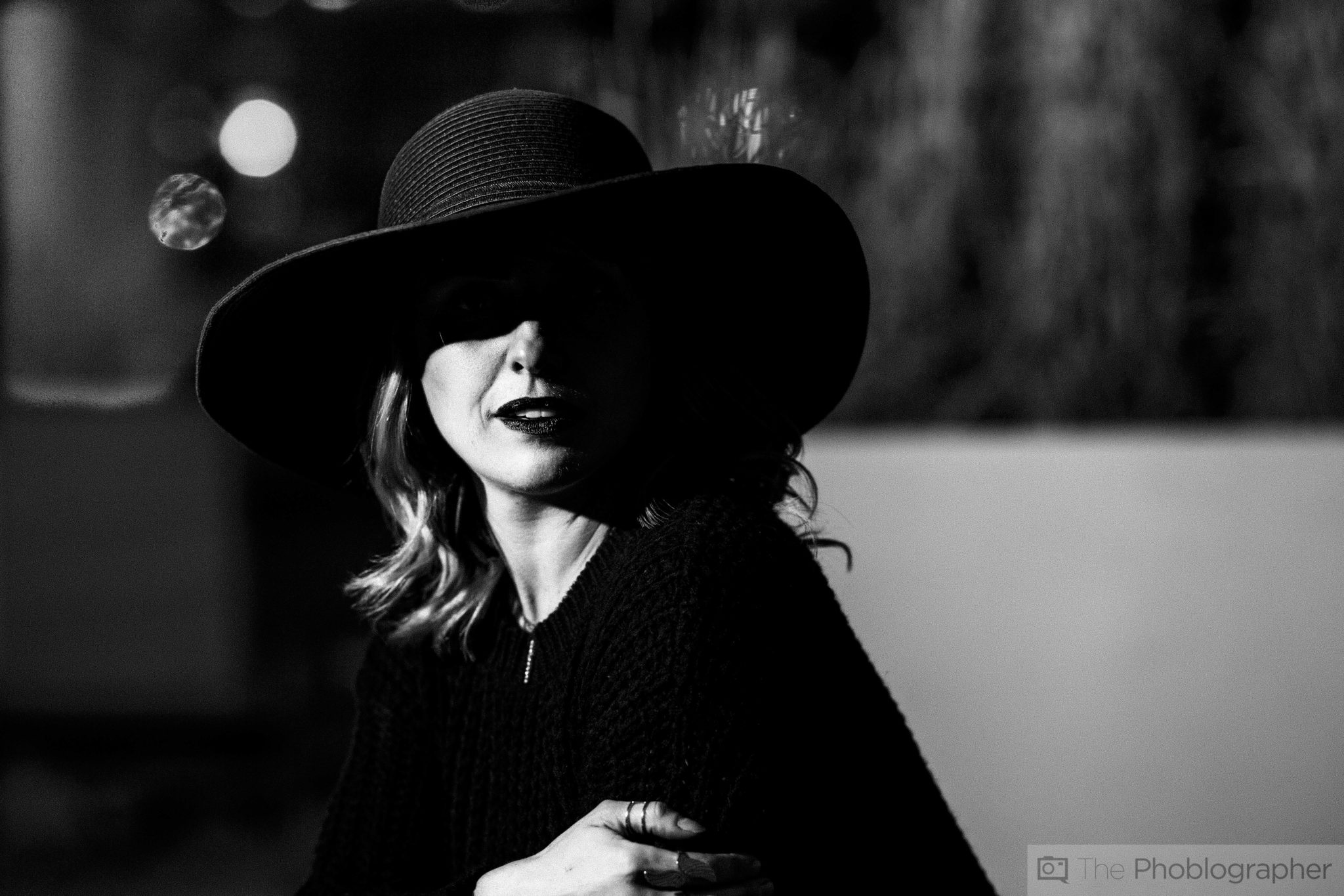
Now here’s that image with lots of grain added to it to further embrace the look of black and white. Not bad, huh? It looks kind of film-like because of the grain but we also understand that it’s a high contrast black and white. In fact, the look was inspired by my favorite black and white film: Ilford Delta 400.. I’ve shot with it for a while, so I know how to get it to look the way that I want. If I wanted the look of HP5, then there would be much less contrast. Kodak Tri-X would be less contrast with deeper blacks.
So how did I go about creating this?
Editing the Images

The image was shot with the Canon 6D, Rokinon 135mm f2 and lit with a single Phottix Mitros + fired off camera with a Phottix Odin. Now that that’s out of the way…
When I looked at the image I figured out that trying to get any sort of detail under the hat would be tough to do because of the fact that the shadow adjustments would probably interfere with other parts of the image that I didn’t want it to. Additionally, trying to just selectively brighten that area would fight too hard against the rest of the edits that I wanted to do. So instead, I chose to embrace the mysterious look of the photo.
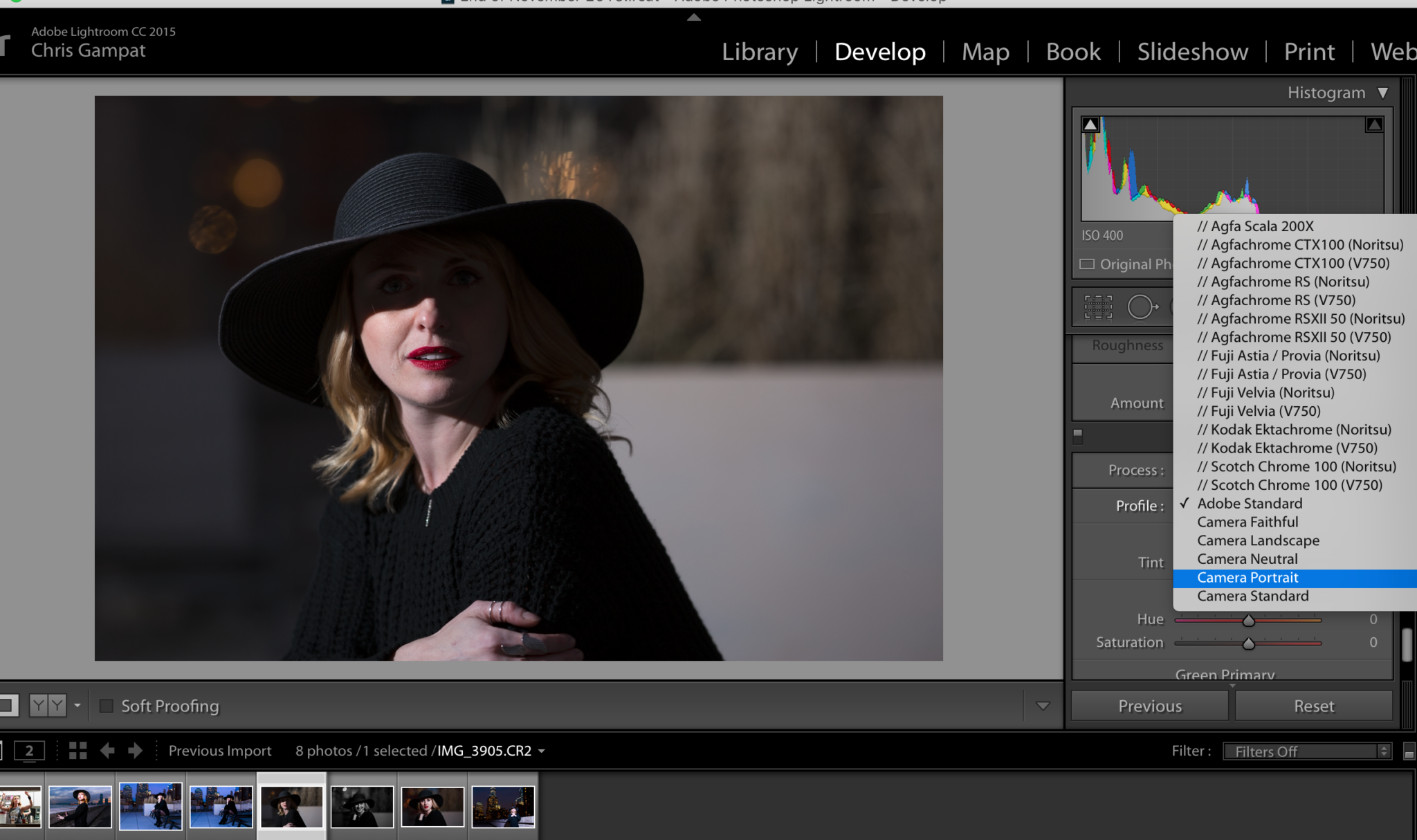
To start it all off, I went ahead and used the camera profile from Canon and added in the Portrait rendering. This made things a bit more saturated and darker overall. At this point I willingly chose to convert it to a black and white.
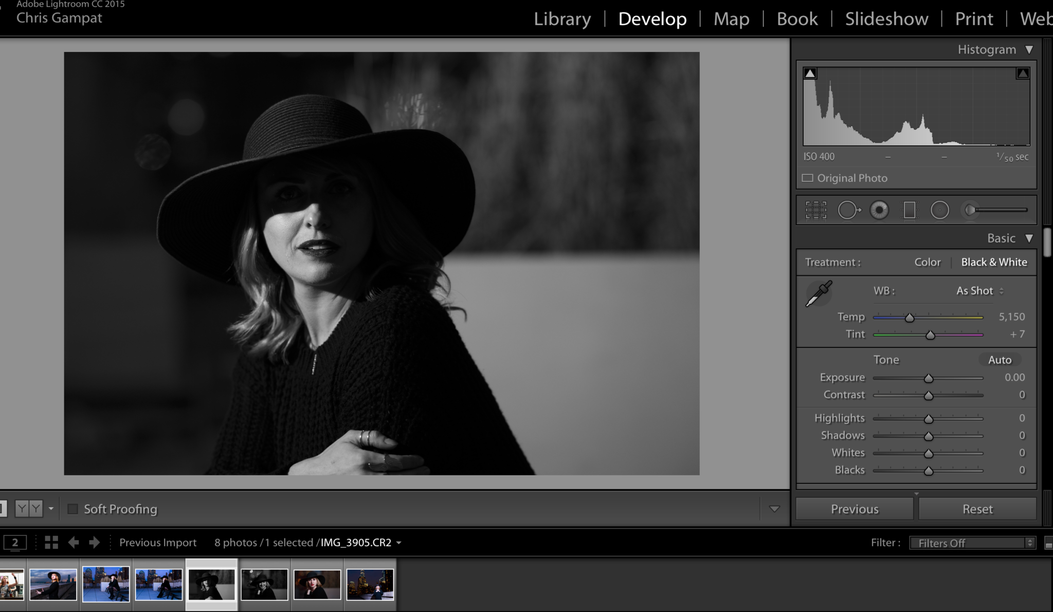
After the conversion I identified the problematic areas:
- Her skin is too dark
- The shadows need to be deeper
- The area to the top left is too dark
- The whites can be brighter
This is where you start the process of not just creating the lazy black and white. Instead, you’re putting work into it to make it look how you’d ideally like it to be. For that to happen, you need to have a look in mind–and one of the best ways to develop that is to work with film and learn how it renders light and shadow.
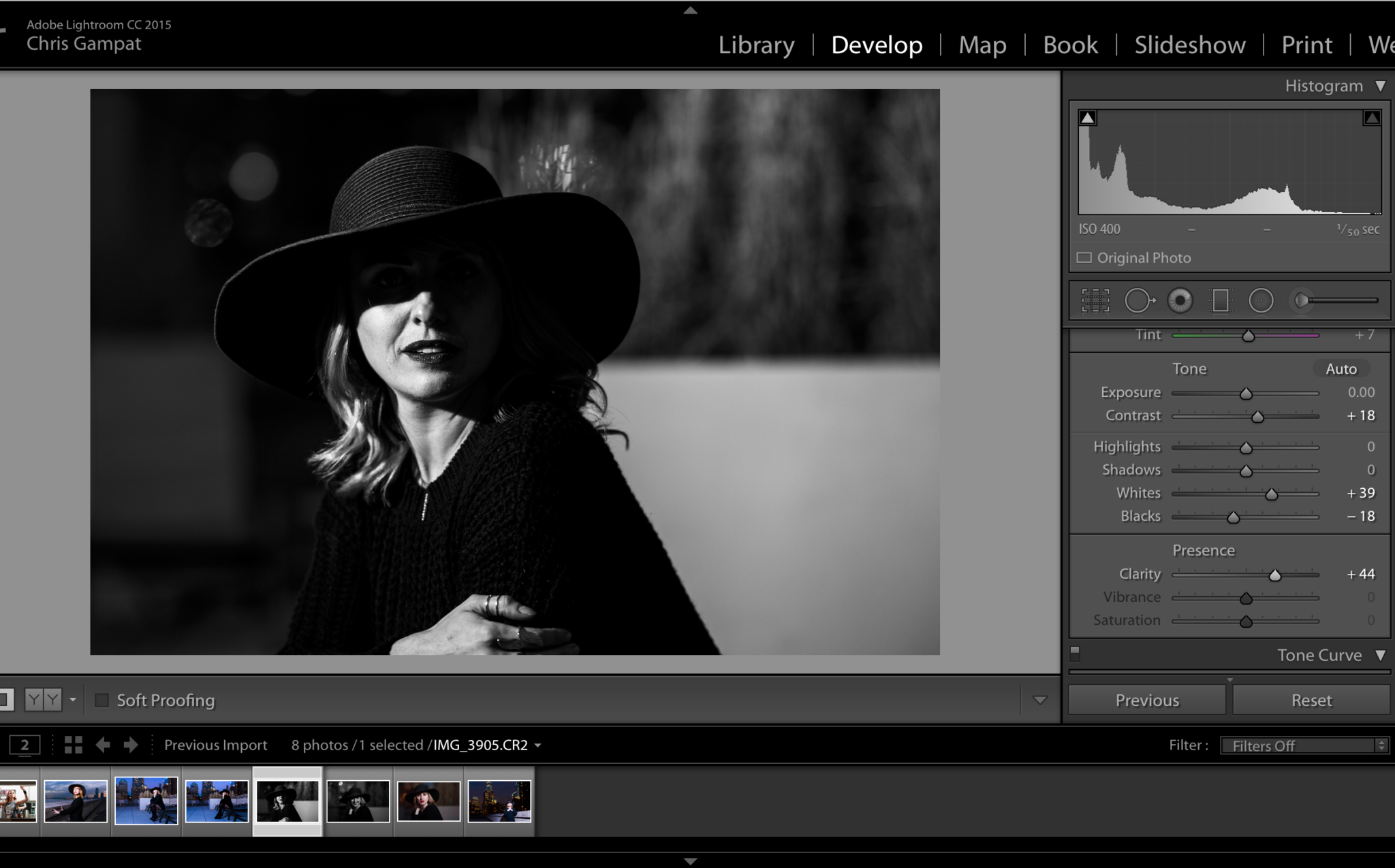
The basic adjustments were done first in this case vs working with color channels. When working with black and whites, you do the basics first and use the color channels to fine tune the work. Now we’ve got deeper shadows, we can see more of her skin, etc.
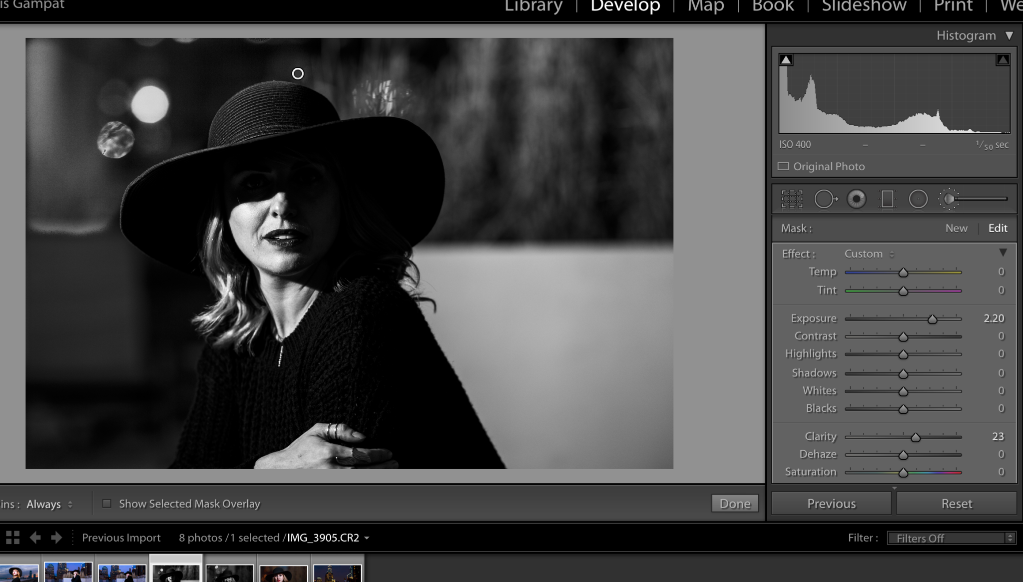
At this point, I chose to try to clear up the area on the top left. This was done with the adjustment brush by painting over the area and raising the exposure to even it out with the rest of the scene. It worked out pretty well.
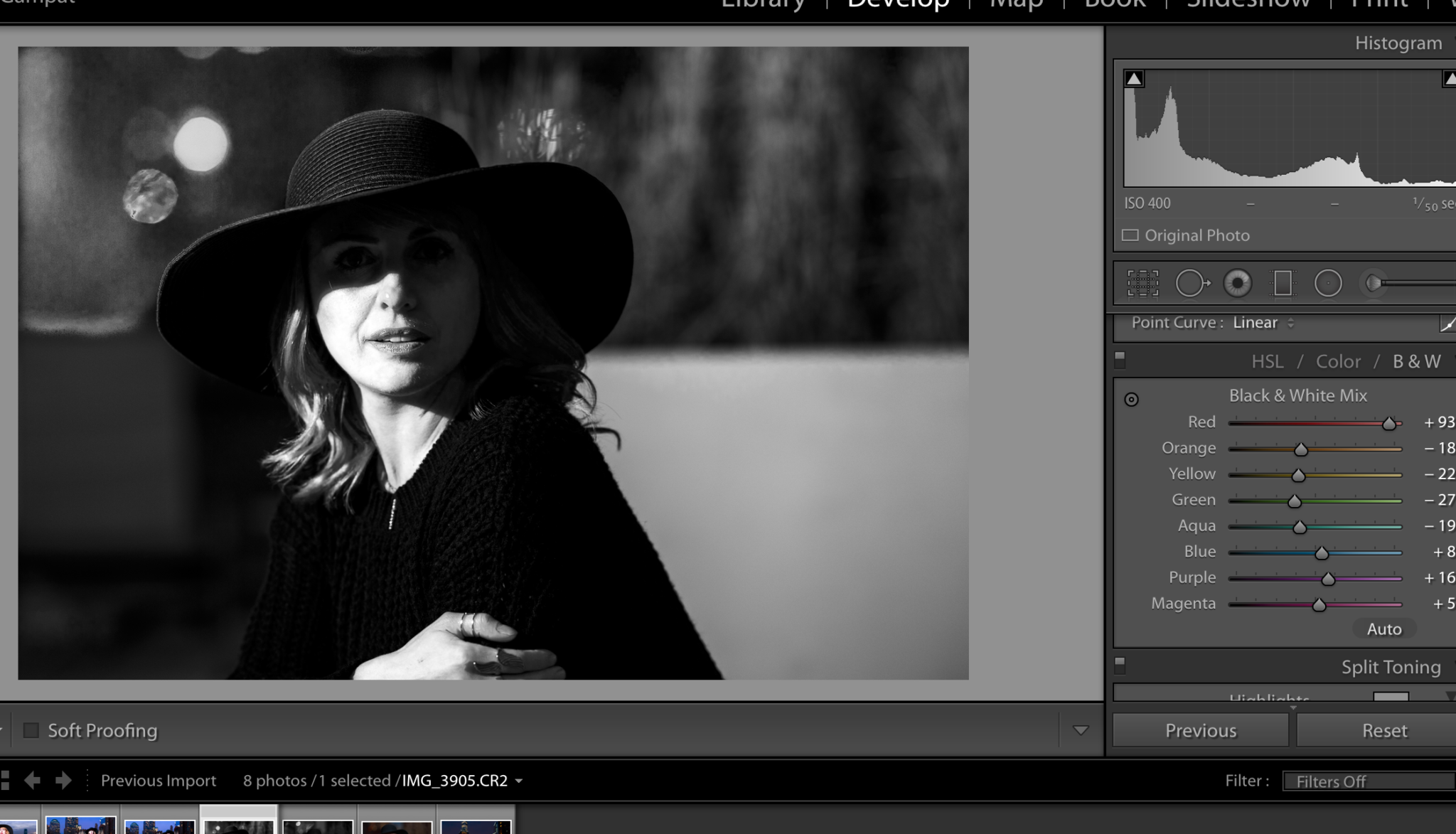
Now came the fine tuning. Consider the following: when editing the color levels in a black and white photo, those colors will still be associated with their according areas.
To that end, choosing to tweak the orange and the rest adjusted Bec’s skin more. Again, this goes to making the image be exactly what I want it to be and therefore avoid the typical black and white look.
Now keep this in mind: not all black and white images are pure black and whites. This post explains that further.
After all this, it was only a matter of cropping the image to being the way that I liked it. I chose to add the grain in later to embrace the look even further. This wasn’t necessarily a lot of work, but then again I know what I’m doing and work with film often. However, this is how you can go ahead and start working with black and white images to create an image you’re truly proud of.
Another way to do this is to use Tonality–which also lets you make the tweaks that you want and probably does it in a way that you may find simpler.
Get rid of the ads!
Did you enjoy reading this article as much as we enjoyed writing it? There's a way to support us and our reporting, getting ad-free navigation and more as a bonus. Subscribe to us for less than a coffee per month —just $3.99— or take advantage of our yearly subscription with a hefty discount for only $25.- An ad-free experience
- A free mystery box for Lightroom or Capture One
- All the books in our store
- 20% discount on Capture One
- 30% discount on Imalume Photo Theft Protection
- 20% off Herbs and Kettle Tea Company.