One of the biggest things about creating an effective portrait has to do with the colors involved. If you’re doing black and white, then it’s about composition, lines, contrast, shapes, etc. All of that gets involved here but color is yet another major factor that honestly you can’t control as well as you want to.
Right?
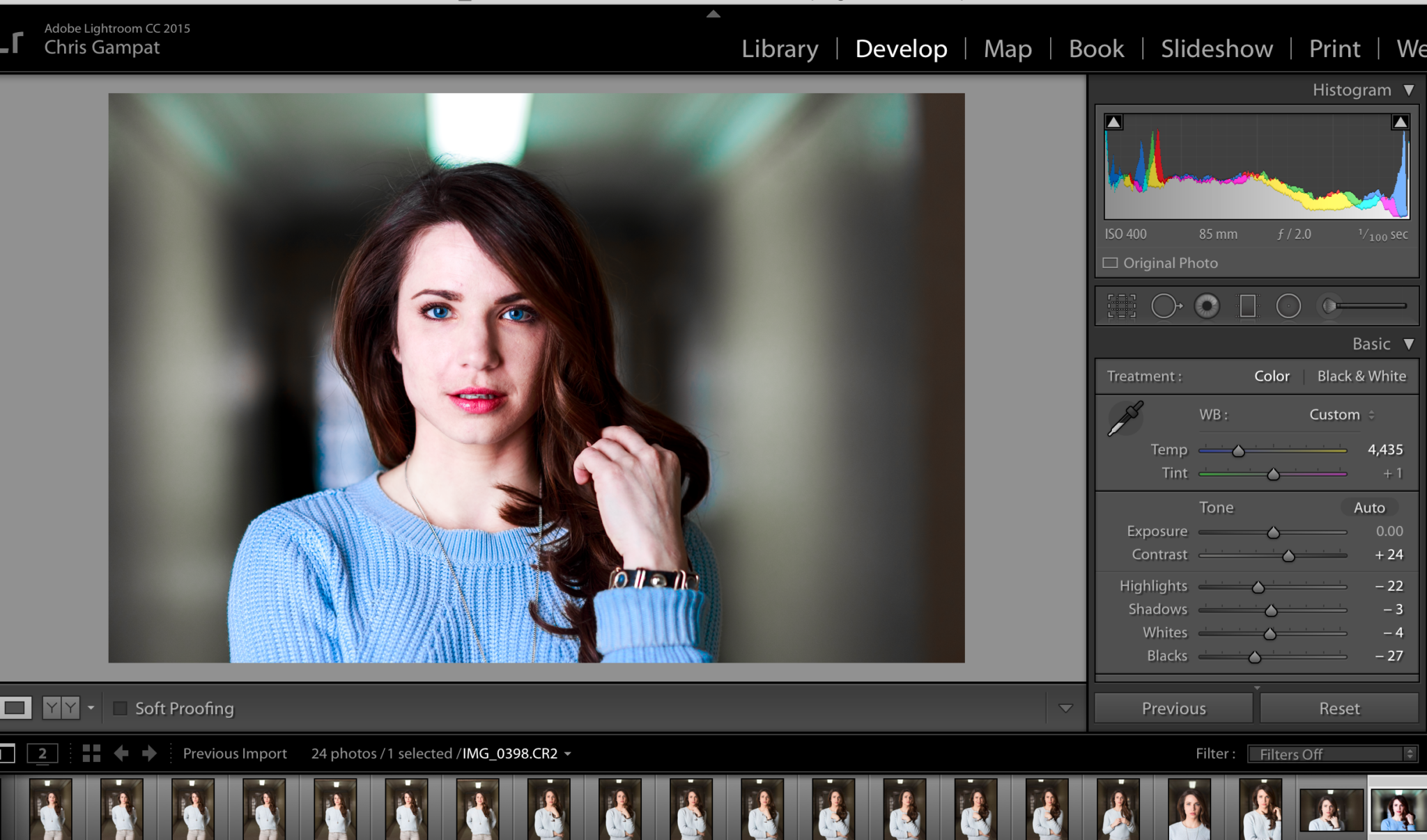
Not really–the above screenshot features an edit that I did a long time ago that folks loved. But how I made it work effectively all has to do with the colors involved.
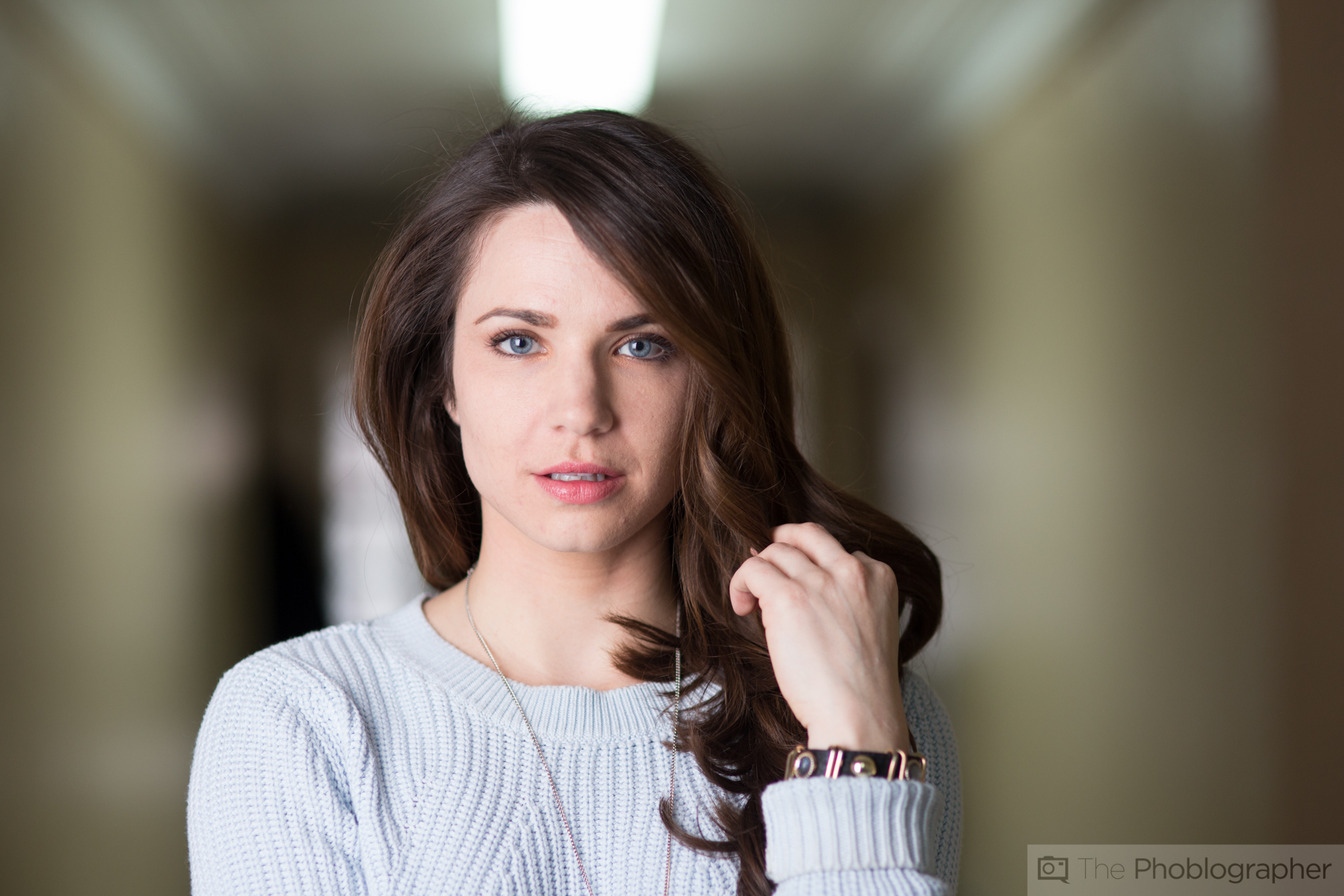
This is the original image shot with a Canon 6D, Sigma 85mm f1.4, and a Profoto B2 light. Before I go on, I should really mention this: 35mm full frame camera, 85mm f1.4 lens, and monolight used with in similar situation with similar settings can do the exact same thing. The gear means significantly less when it comes to technique.
And now: back to the image! This is what the image looked like right out of the camera. It’s flat–very Portra like, and muted overall when it comes to the colors. That and it’s before I cropped it.
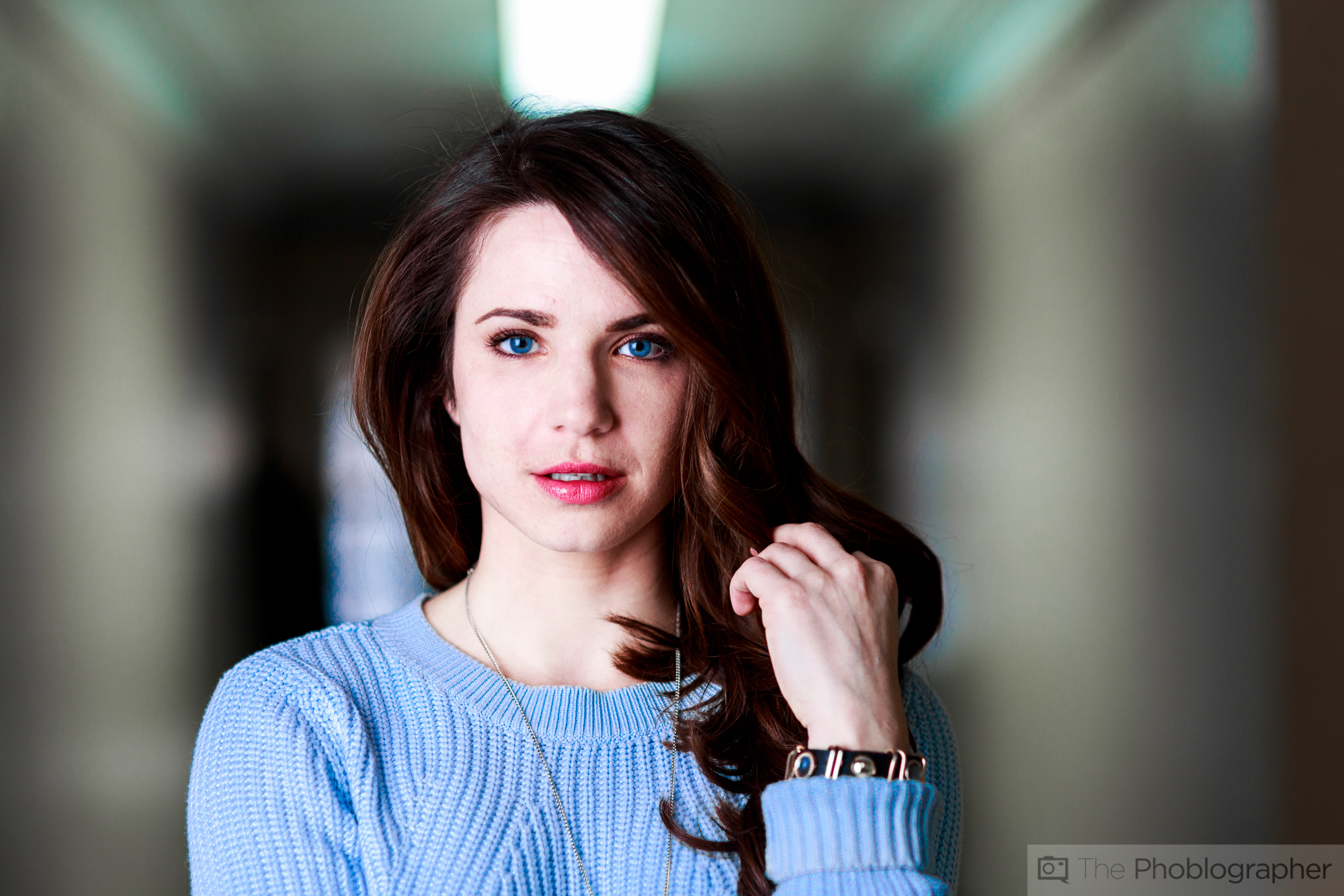
This is the edit I created. On my calibrated monitor, this looks fine. The colors are more vibrant–at least the ones that are very important to the scene are. But when you crop the image, it becomes an even better shot.
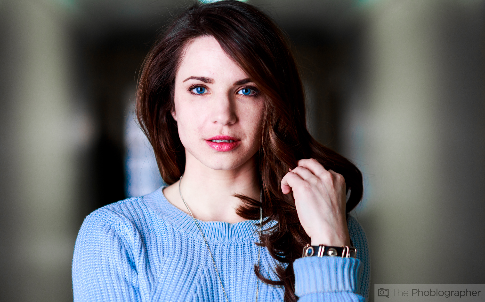
Here the image is cropped to get rid of the light fixture otherwise coming out of her head and distracting the viewer. It’s a significantly more effective version of the image that partially has to do with its colors.

To create the image, it was brought into Lightroom. First, I needed to identify the problems with the image:
- Flat colors
- Distracting light fixture
- Colors of the walls looking drab
- Skin tones
- The eyes
- The way that the colors flow from yellowish, to dark and blue, to blue and orange-red, to brown with blue and the skin, and back to yellowish.
So how can this be fixed?
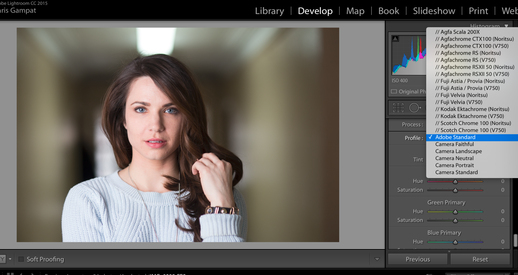
I started off the way I usually do, by applying the camera color profile to the image. The Canon 6D offers a portrait profile pre-loaded that Canon believes is best for portraits overall.
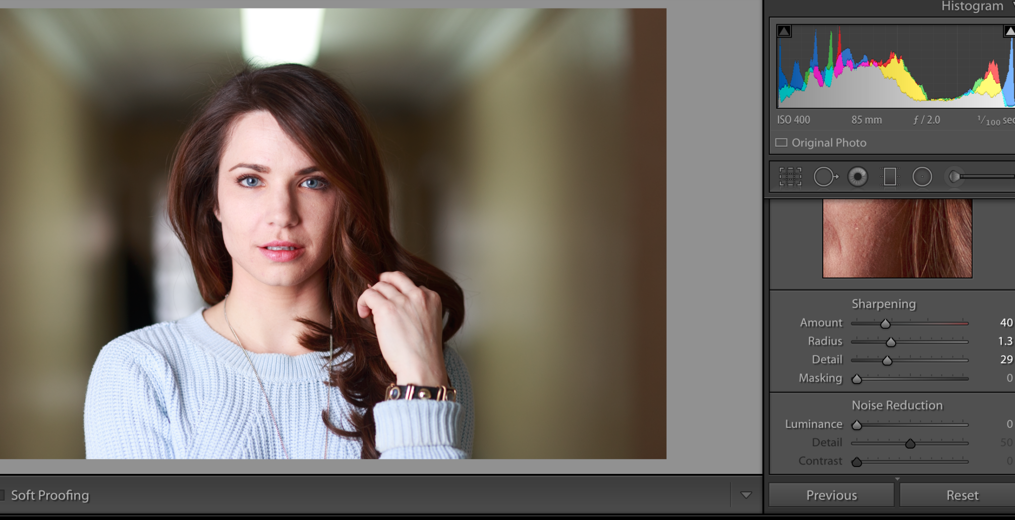
The application of the profile immediately changes things. The image is more vibrant and there is significantly more pop to it with this simple addition even without editing the image further. After this, I tweaked the sharpening a bit–though you can argue that I didn’t need to at all since the Sigma is just that good when used in conjunction with the monolight.
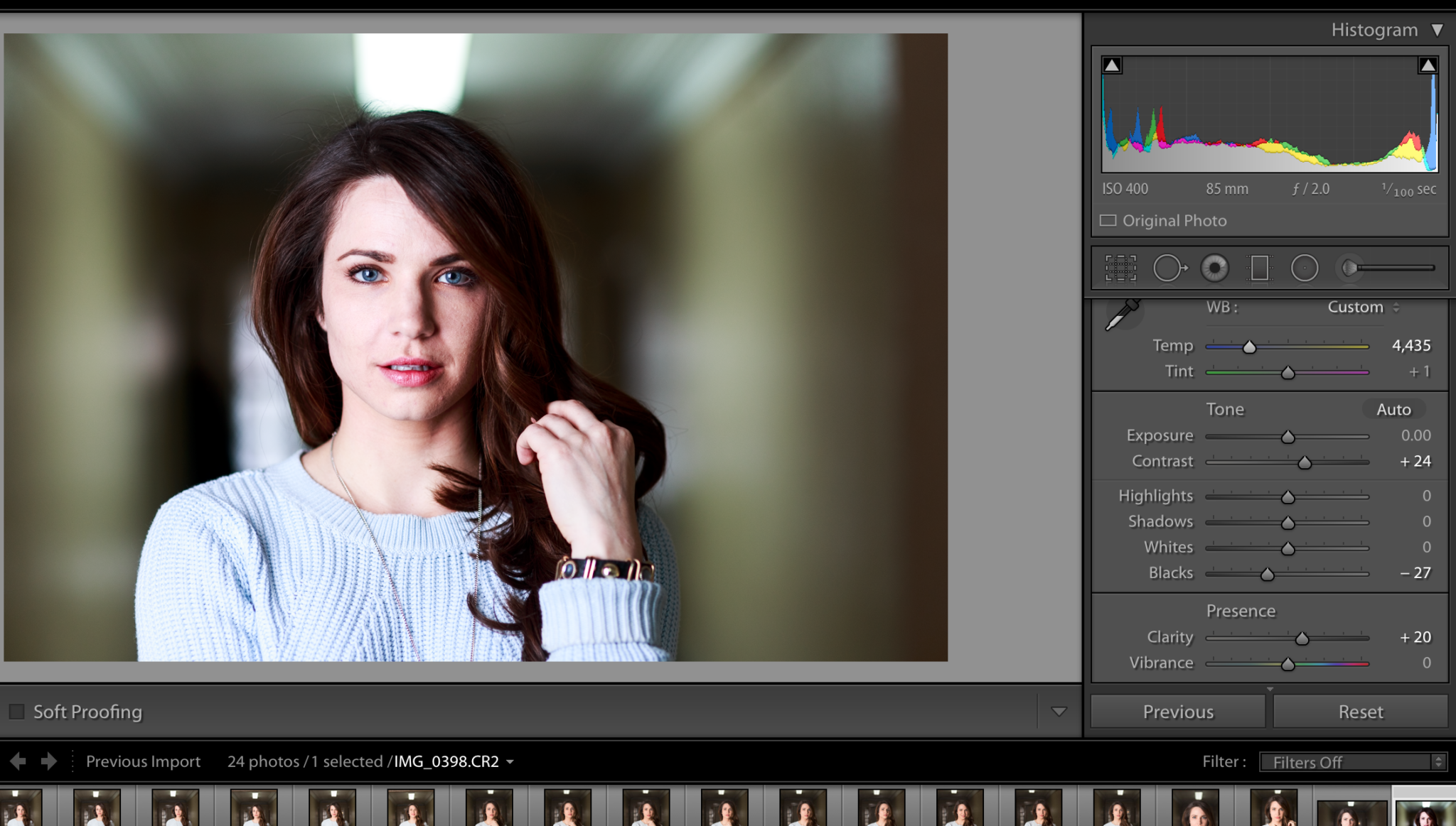
After this I did a couple of basic tweaks that further changed the way that the image looks. These are the contrast, clarity, black levels, white levels, and the highlights just a tad. There is no reason to touch the overall saturation or vibrance. In fact, doing that will have just caused me a headache. Why? It would saturate parts of the image that I didn’t necessarily want saturated. Instead, like the photographer who commits to always shooting in manual mode, I like to manually tweak my colors.

Tweaking the colors requires me to work with the saturation and luminance levels–and here’s where the biggest part is done. The yellow was completely desaturated and given extra luminance to cause more of a visual contrast. It also eliminates that color and forces us to focus on the rest. The major colors in this scene are:
- Orange: Megan’s skin
- Red/Magenta: the hair, lips and undertones which are associated with these colors in the editor.
- Blue: her sweater
Once those are tweaked to pop more, the image is almost done.

For the most part, after all that was done most folks would just stop there and call it a day. But I used the Lightroom retouching toolkit to adjust her skin a bit more and bring out the eyes to stand out just a bit more. As with all things, a little bit goes a long way.
As you can see, more of the red in her skin was eliminated and the eyes pop a tad more though they still look natural. With the removal of the yellow, you get to focus more on the primary parts of the scene and how she is framed by the darkness with light areas outside. After this, all that was left to do was to crop the image to make it more effective by eliminating the light.
Get rid of the ads!
Did you enjoy reading this article as much as we enjoyed writing it? There's a way to support us and our reporting, getting ad-free navigation and more as a bonus. Subscribe to us for less than a coffee per month —just $3.99— or take advantage of our yearly subscription with a hefty discount for only $25.- An ad-free experience
- A free mystery box for Lightroom or Capture One
- All the books in our store
- 20% discount on Capture One
- 30% discount on Imalume Photo Theft Protection
- 20% off Herbs and Kettle Tea Company.
- 20% off your order from MPIX printing services.
- 5% off Viltrox Products via their eCommerce store.
- 10% off all film developing, printing and scanning services from Blue Moon Camera and Machine
- 15% off 7Artisans products: The lens and accessory maker is offering a sweet discount for Phoblographer's readers.