Portraiture in photography is an art involving not only compelling composition and posing, but an effective use of color. Many photographers shoot in black and white because it makes the photographer rely more on shapes, lines, contrast, etc. But when it comes to color, things get more complicated. For example, have you ever had skin tones that just weren’t really working for you or doing your subject justice?
Chances are that you probably didn’t do these color tweaks that will absolutely work for every portrait you take.
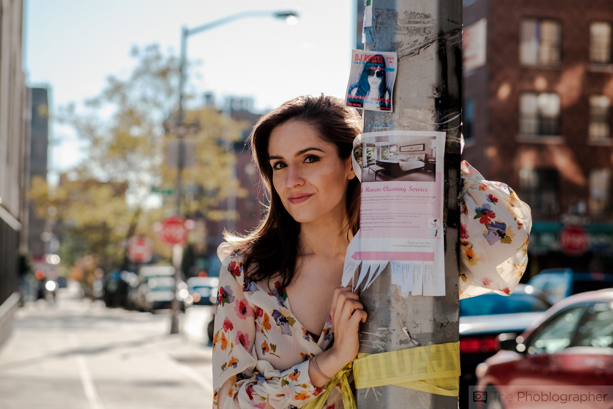
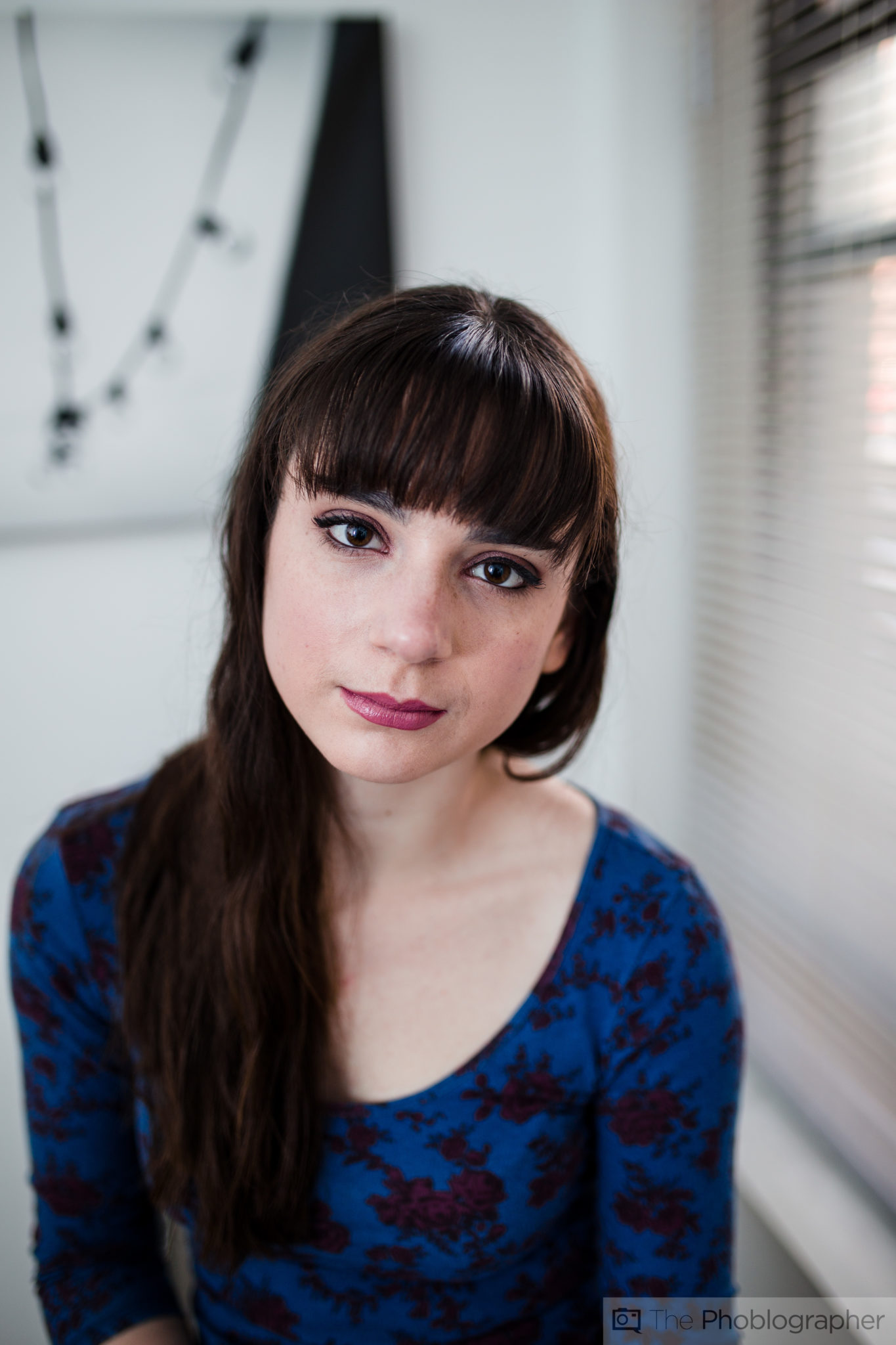
Three Primary Colors
Making good portraits start with making the colors simple. Too many colors can be very, very difficult to manage. This has to do with wardrobe, lighting, skin tone, and backgrounds. To help with the effectiveness of the portrait, use three major colors in your portrait. More than that can make a viewer’s eyes go all over the place and bring attention to one place vs another.
The above example has this according to Adobe Lightroom:
- Orange (Natalie’s skin tone)
- Gray
- Brown
More than that would have brought attention to other places. Don’t believe me? Imagine if Natalie had very deep blue eye shadow.
Your Intended Lighting
To help make your colors work, you’ll need not necessarily good lighting–but instead for the portrait to have the light that you really wanted and intended it to have. That means adding in a flash, letting in enough ambient light, controlling shadows, using reflectors, etc. If you don’t have that lighting, the colors that you specifically want may be muddled with blacks or whites–or even a completely different color.
Camera Profile
Chances are that you want your RAW file to look more like the JPEG preview on the back of your camera. If you want to do that, use the Adobe Camera Profiles as a start. For example, Fujifilm cameras will give you Astia, Velvia, Provia, etc while Sony will give you Vivid, and more. This is a starting point that adjusts the colors, lighting and more to get the scene to be what you want.
White Balancing
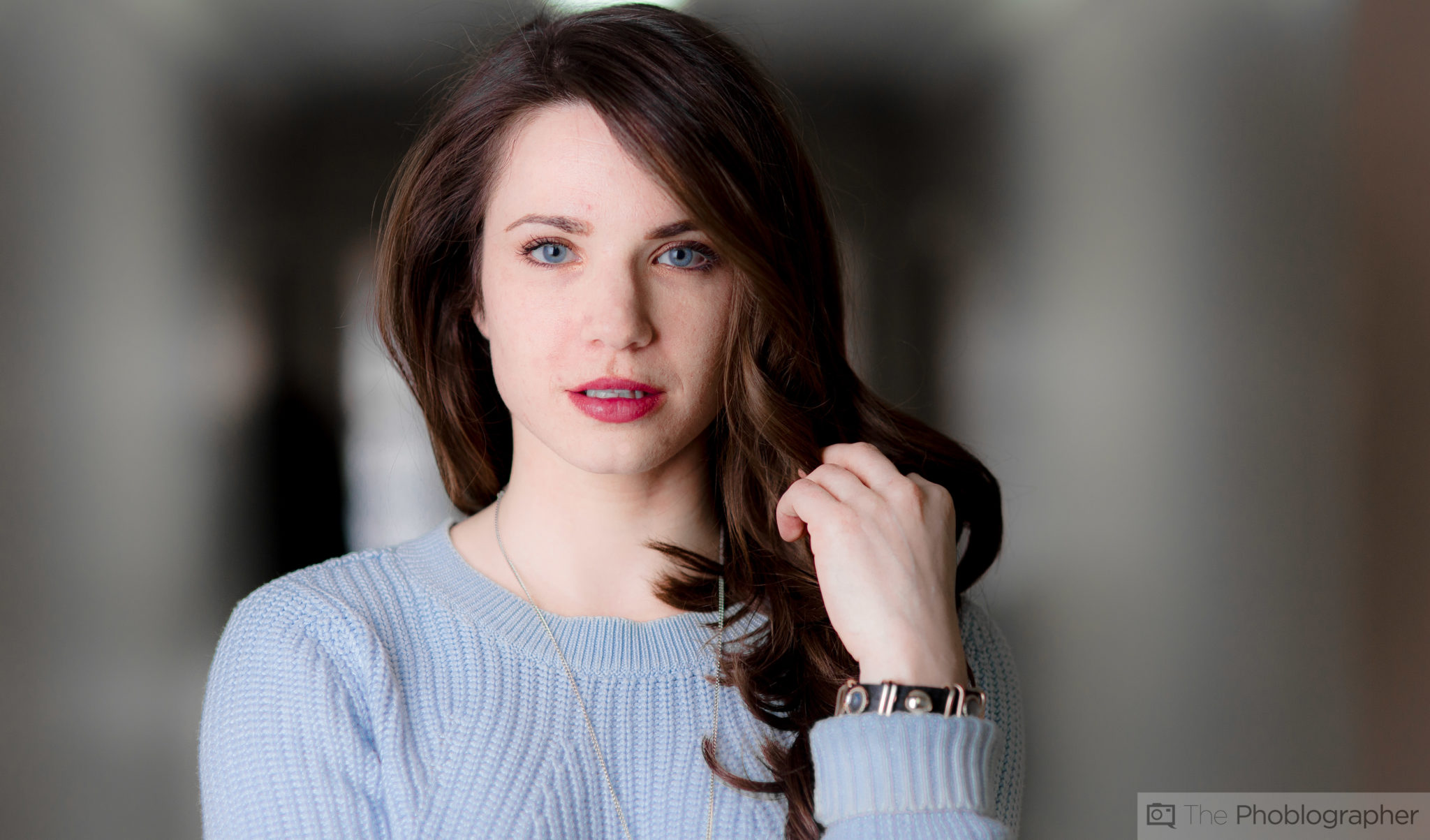
Model: Erica Lourde
When you’ve selected your camera profile, it’s going to change the white balance. For portraiture, it’s best to adjust the white balance to the point where it renders the skin tones to be the most realistic overall. This should be the primary focus of your portrait, and the rest can be adjusted later as you’ll see.
Exposure Overview
After the white balance is fixed, ensure that you’ve got the right exposure that you want to portray in the image. You’ll probably go back and forth here with the exposure and the white balance, but don’t sit there and stress over it too hard. Make it as close to your intended creative vision as you can.
Whites/Blacks and Clarity
After the exposure has been fixed, work with a couple of specific parameters. Adjust the white levels, black levels, and the clarity. The clarity in Adobe Lightroom has to do with the midtones while the black and white levels tends to affect things like skin tones, hair, perceived sharpness, etc. You’re also most likely going to work with the shadows and highlights.
Luminance and Saturation
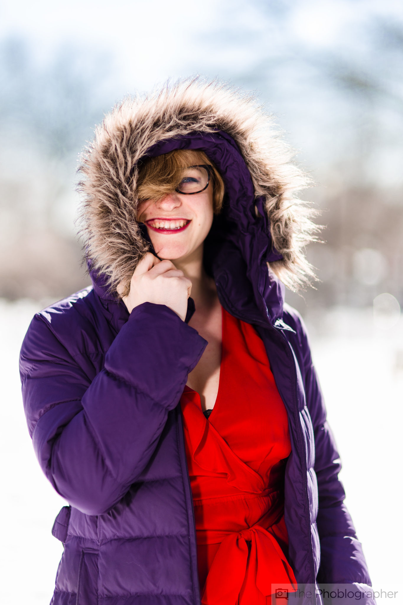
Lastly, work with the luminance and saturation of specific color channels. Remember the fact that I said use three primary colors? That’s where this will make your life so much easier as long as they contrast enough with the skin. In the image above I needed to work with red, orange and purple. A bit of working with the blues was done, but that’s how it was kept as simple as possible.
Get rid of the ads!
Did you enjoy reading this article as much as we enjoyed writing it? There's a way to support us and our reporting, getting ad-free navigation and more as a bonus. Subscribe to us for less than a coffee per month —just $3.99— or take advantage of our yearly subscription with a hefty discount for only $25.- An ad-free experience
- A free mystery box for Lightroom or Capture One
- All the books in our store
- 20% discount on Capture One
- 30% discount on Imalume Photo Theft Protection
- 20% off Herbs and Kettle Tea Company.
- 20% off your order from MPIX printing services.
- 5% off Viltrox Products via their eCommerce store.
- 10% off all film developing, printing and scanning services from Blue Moon Camera and Machine
- 15% off 7Artisans products: The lens and accessory maker is offering a sweet discount for Phoblographer's readers.