In today’s world of photography it’s very easy to get caught up about camera sensors, sharpness, lenses, etc. But one of the most important things that I’ve always stressed is the significance of color. If you study photographer who use color very effectively like the work of Steve McCurry, you learn that many of his portraits have one key or main color and two other complementary colors. The latitude of those specific colors is also quite important to the perception of the final photo.
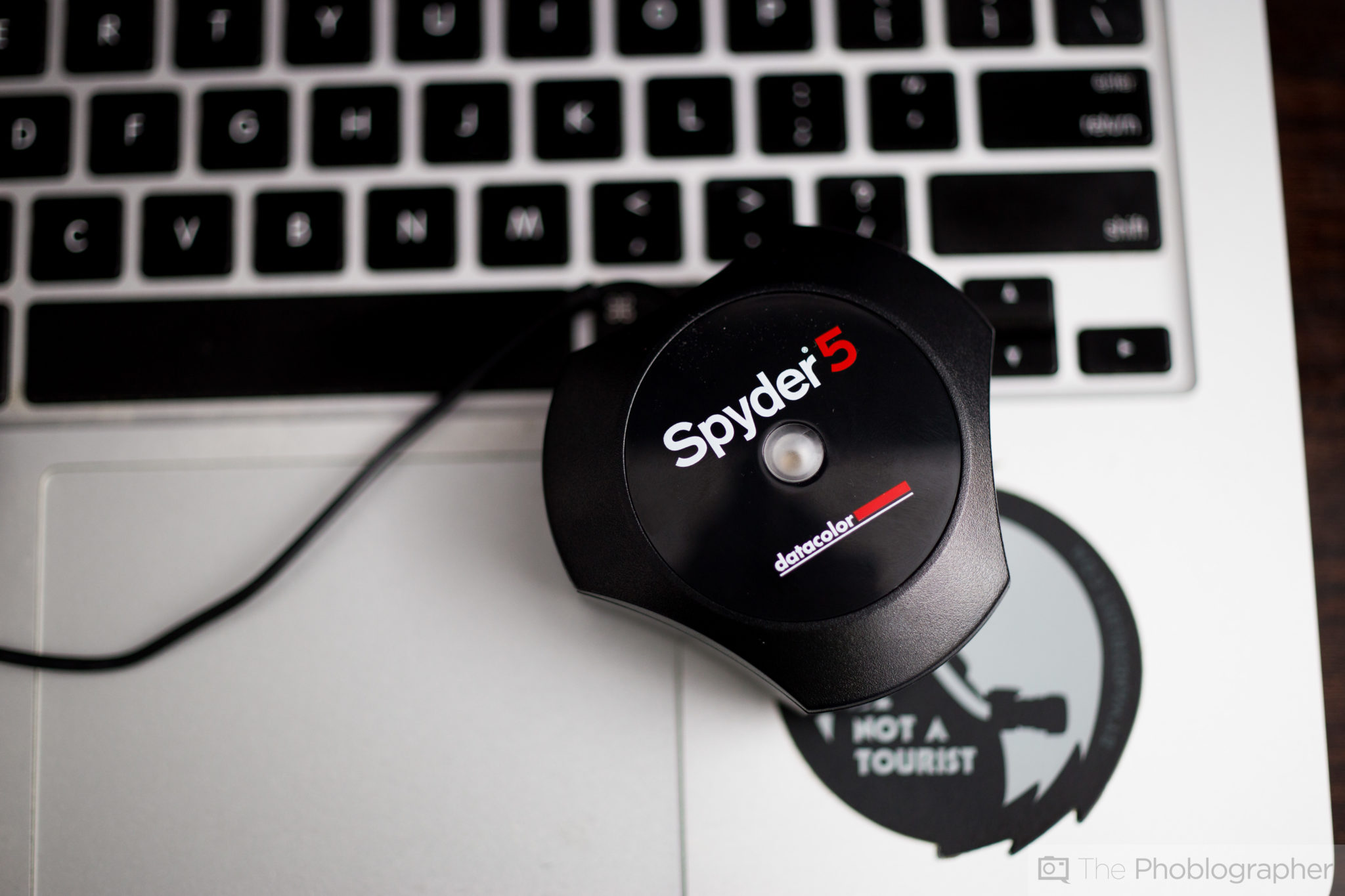
But so is the delivery–and ensuring that everyone has the same viewing experience. That’s where the importance of color calibration comes in. Everyone has a different monitor calibration for their own purposes (brightness, contrast, etc). Additionally, everyone also uses products from different manufacturers. That’s why effective color calibration can help ensure that your images make more of an impact from monitor to monitor–this is where the Datacolor Spyder5PRO comes in.
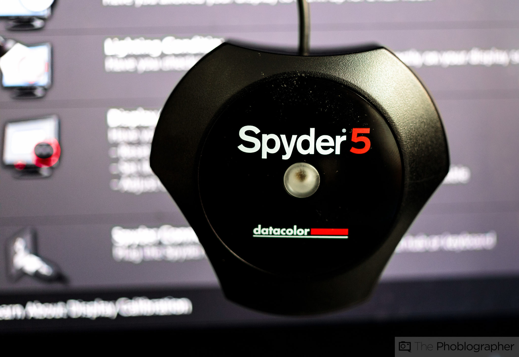
Editor’s Note: This is a sponsored post from Datacolor that was concepted, designed and worked on by Editor Chris Gampat of the Phoblographer. The words in this post were only given the approval of Datacolor and are otherwise the words of The Phoblographer LLC. Learn more about Datacolor Spyder Monitor Calibration here.
Before I even get into monitor calibration though, you should be aware that calibration of a monitor means that you have the same viewing experience time and time again when you go to edit your images. This translates into uniform image quality output from you, uniform print quality output from you, and makes you into an overall consistent photo editor. The reason for this is because you’ll be editing in true color and to a color standard.
As far as the editing process goes when working in Adobe Lightroom, the best way to do this is to do the following:
- In the basic adjustments panel, fix your white balance for a specific image.
- Add a bit of contrast, deepen the blacks a tad and up the clarity. This is all very based on what you like in the photo. This can make your images look sharper than they really are.
- Then scroll down in the develop panel to work specifically with the color channels. You’ll see luminance, saturation and hue.
- Tweak the luminance and saturation of the image’s primary colors and look at the results.
That’s it, except that when you look at these results on a calibrated monitor and a not calibrated monitor you’ll get completely different results that will be almost like night and day to you. I own a MacBook Pro 13 inch from 2012 and that has one screen but earlier this year I also purchased a 27 inch Asus monitor to ease problems with my worsening astigmatism when it comes to typing text and editing on the site. When I move Lightroom back and forth between the two monitors it’s clear that there is a difference. My Macbook tends to have more of a blueish cast and my Asus tends to favor the warmer side of the spectrum when they’re both uncalibrated.
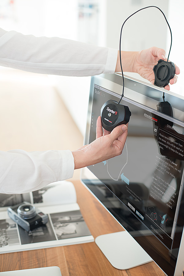
So what’s the problem? Well, considering I shoot partially for a living but mostly for this site, it can mean the images I upload to the Phoblographer may not be delivered in true color. But calibrating the two monitors to match one another the best I can helps a bit. Lots of different things affect the way that you see a monitor too: lighting in the room, ambient lighting from windows, presets from your monitor, etc. Ambient light is a big one, and the DataColor Spyder5PRO has an Ambient Light sensor that can tell you when there are changes in the lighting around you.
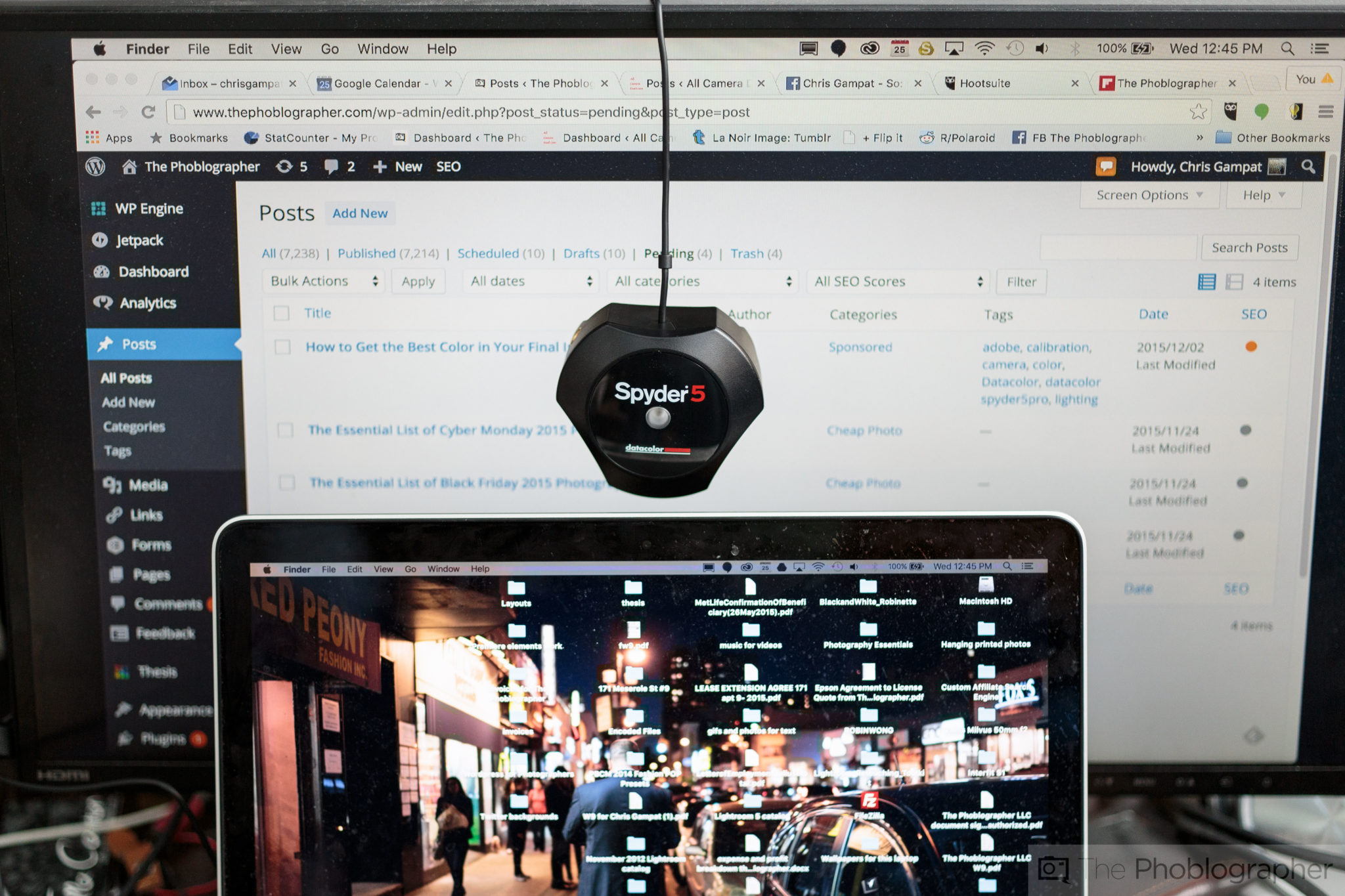
As stated before, since I work with two monitors, I need to calibrate them both to look the same.
So how do you use this thing? It’s amazingly straight forward and the process has been very simple for years. Once you download and install the software off of Datacolor’s website for your specific Spyder model, you plug it in, feed the program some settings about your monitor (which it reads for the most part anyway) follow the on-screen instructions and let it do its thing. It’s best to sit there in front of your monitor while it’s calibrating–and due to the way that it flashes colors at you, it’s probably the closest thing that you’ll experience to a vision quest while being completely sober. When it’s done, it will save a profile for you and you can tell it to remind you to calibrate within a certain period of time.
If you’re doing this with a desktop monitor, it will take an ambient light measurement to tell you whether the light in the room is appropriate for photo editing or not. Then it will give you suggested settings, calibrate and you’re all done.
The bigger benefit: your images will look significantly better and exactly the way you intended them to when you post to your Facebook page, Instagram, services like 500px, sending a client a proof, or even when it comes to printing. Beyond that, calibrating on a regular basis will mean that all your images look uniform when it comes to color rendition.
To be honest, I’ve been calibrating with Datacolor products for years now, it makes the whole process much more straightforward than anything I’ve experienced from X-Rite. And in the end, that helps me get back to creating better images and producing content for this site.
Get rid of the ads!
Did you enjoy reading this article as much as we enjoyed writing it? There's a way to support us and our reporting, getting ad-free navigation and more as a bonus. Subscribe to us for less than a coffee per month —just $3.99— or take advantage of our yearly subscription with a hefty discount for only $25.- An ad-free experience
- A free mystery box for Lightroom or Capture One
- All the books in our store
- 20% discount on Capture One
- 30% discount on Imalume Photo Theft Protection
- 20% off Herbs and Kettle Tea Company.
- 20% off your order from MPIX printing services.