One of the biggest features of a great food photo has to do with the way that the colors pop out and seem to grab you. Many photographers know that it’s all about the lighting, the textures, the props and any little touches that are added in to make the food even more scrumptious. One of the technical ways to create an image that makes your viewers hungry has to do with contrast. This is the reason why so many food photos have colors that are very dominant and others that add punch and grab your attention.
Here are a couple of tips to help you create more vivid and beautiful food photos.
Black and Whites (The Neutral Background)
To start this off, you’ll need to find a neutral background. Ideas for this are:
– Black paper
– White plates
– Wooden tables and cutting boards
– Parchment and food wrapping paper.
These all work well as they are associated with food in some way. If your kitchen counter is marble, then that works, too. Quite obviously, the food will contrast and stand out from the surface that everything is on. The reason why you need this has to do with the fact that it places a bigger emphasis on the food due to the way that the human eye works, but it also makes editing much easier.
If you’re photographing some beautiful red strawberries on top of a black or wooden surface, your eyes and the post-production software (like Lightroom) knows that there are different colors. While you know that the primary colors in the scene are black (for the paper), green (for the leaves and stem) and red (for the fruit) the software will most likely associate the black with purple or blue.
By having all of these colors in the gamut, you can work on editing the color channels specifically for luminance and saturation. We’ll get to this in much more detail later on, but here are some tips to hold you off.
Contrast in Colors
We started to get a bit into contrasting colors in the section above, but we didn’t get too deep into it.
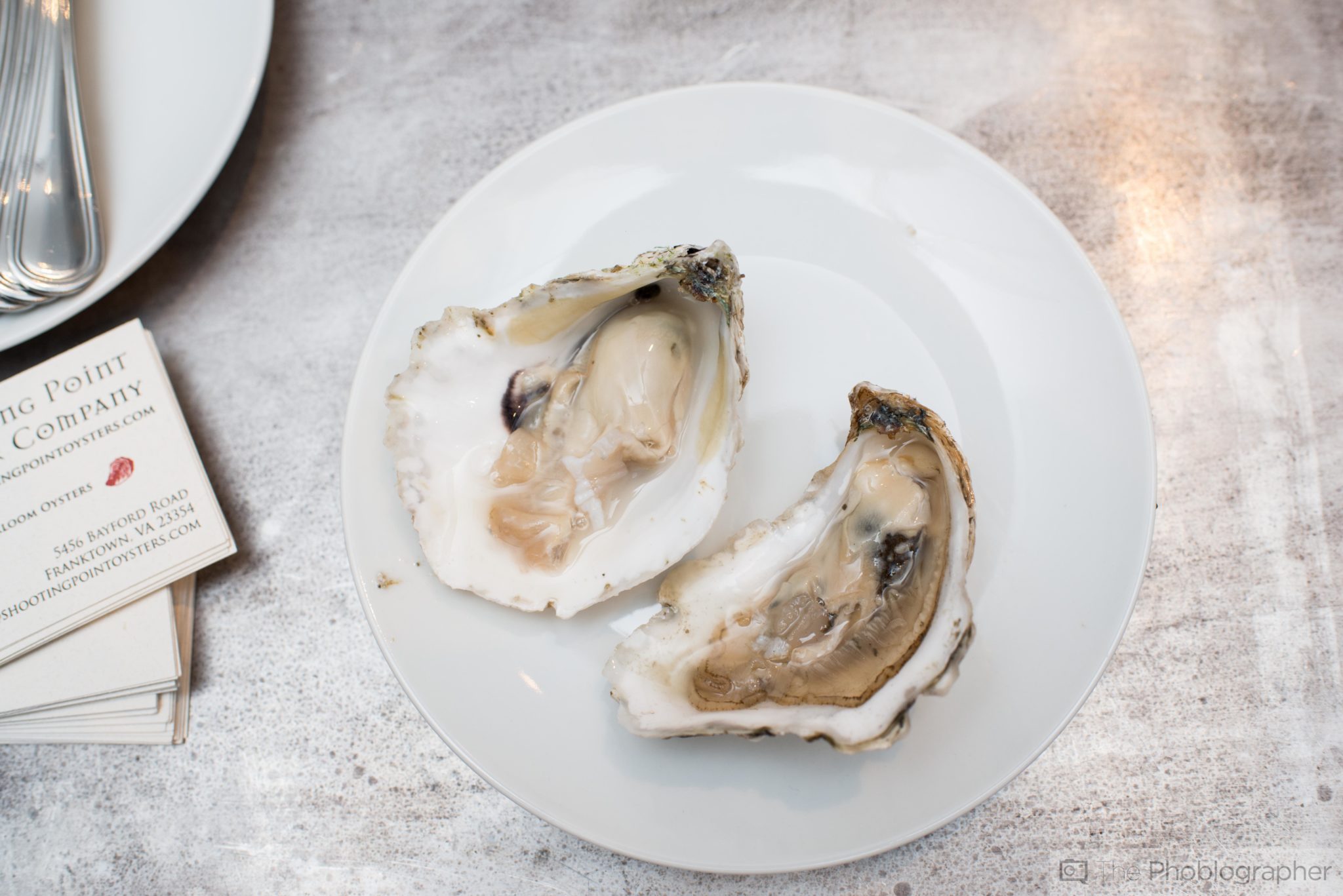
Take a look at the photo above: while it’s nice it could have been much better!
In the photo above, we have oysters and the primary colors in the scene are whites, yellows, oranges and a bit of red. Another punchy and contrasty color would have made this image much better. Adding a bit of green (parsley, cilantro, etc) as a garnish, a lemon or some red hot sauce on the side would have added even more punch to the scene and made it much better of a photo overall.
The contrasting colors would draw the eye into a specific area of the frame and with strategic placement make the eye focus on the oysters.
A scene can be too contrasty–and that’s why we state that a neutral color needs to dominate the scene and other colors need to be what draws the eye in.
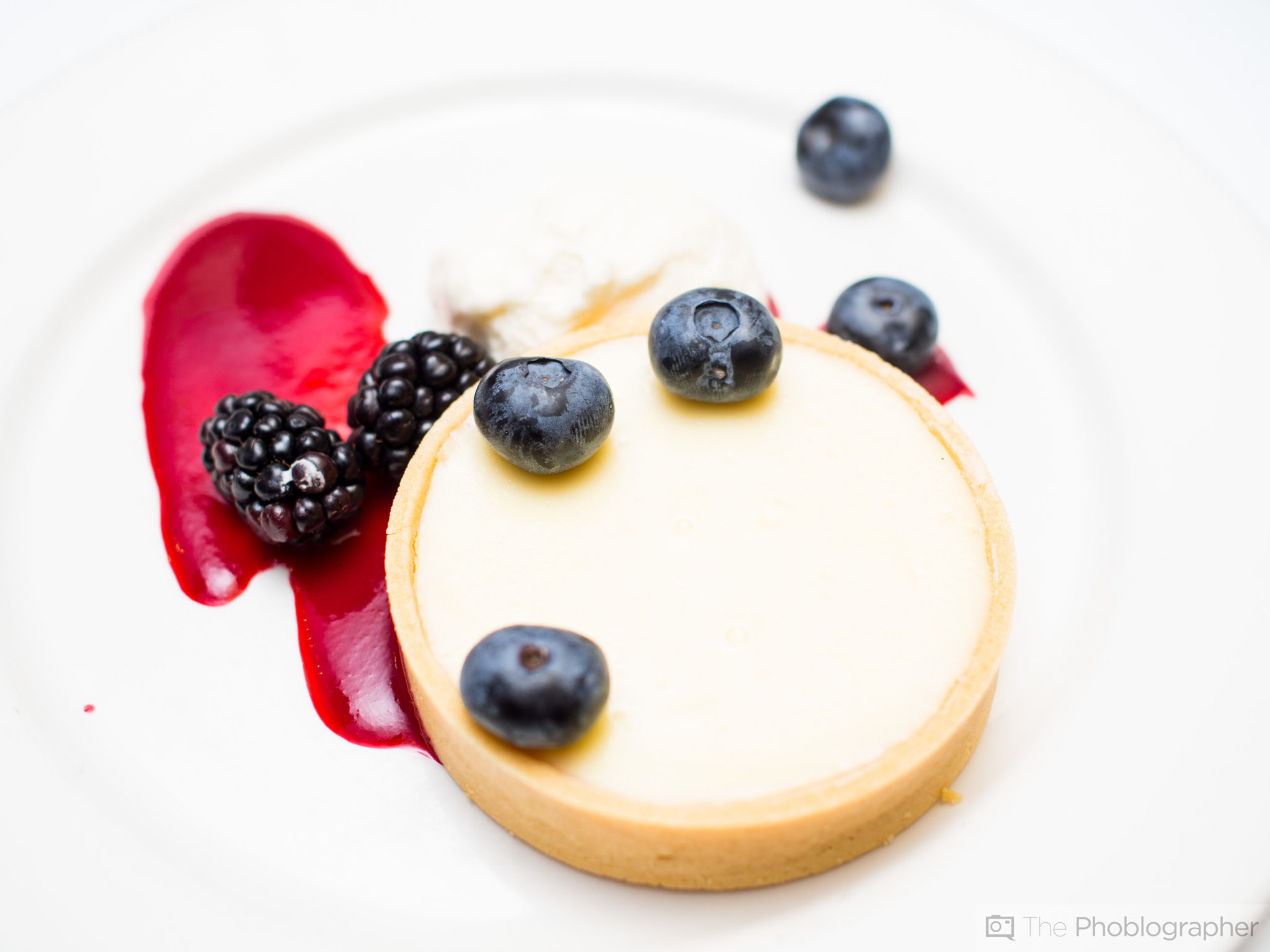
Saturation and Luminance of the Punchiest Colors
Contrast in colors and a neutral scene are what makes the image easier to edit and can help the photographer to put emphasis on what viewers should pay attention to. In the scene above, the primary neutral colors (the ones that we don’t care about) are brown and burgundy. But the food has totally different colors: red, yellow, orange and green. Because the background is so neutral, the food and color channels can be edited accordingly and not affect the entire scene. Instead, when you work with the color channels you’ll only be editing specific parts of the scene.

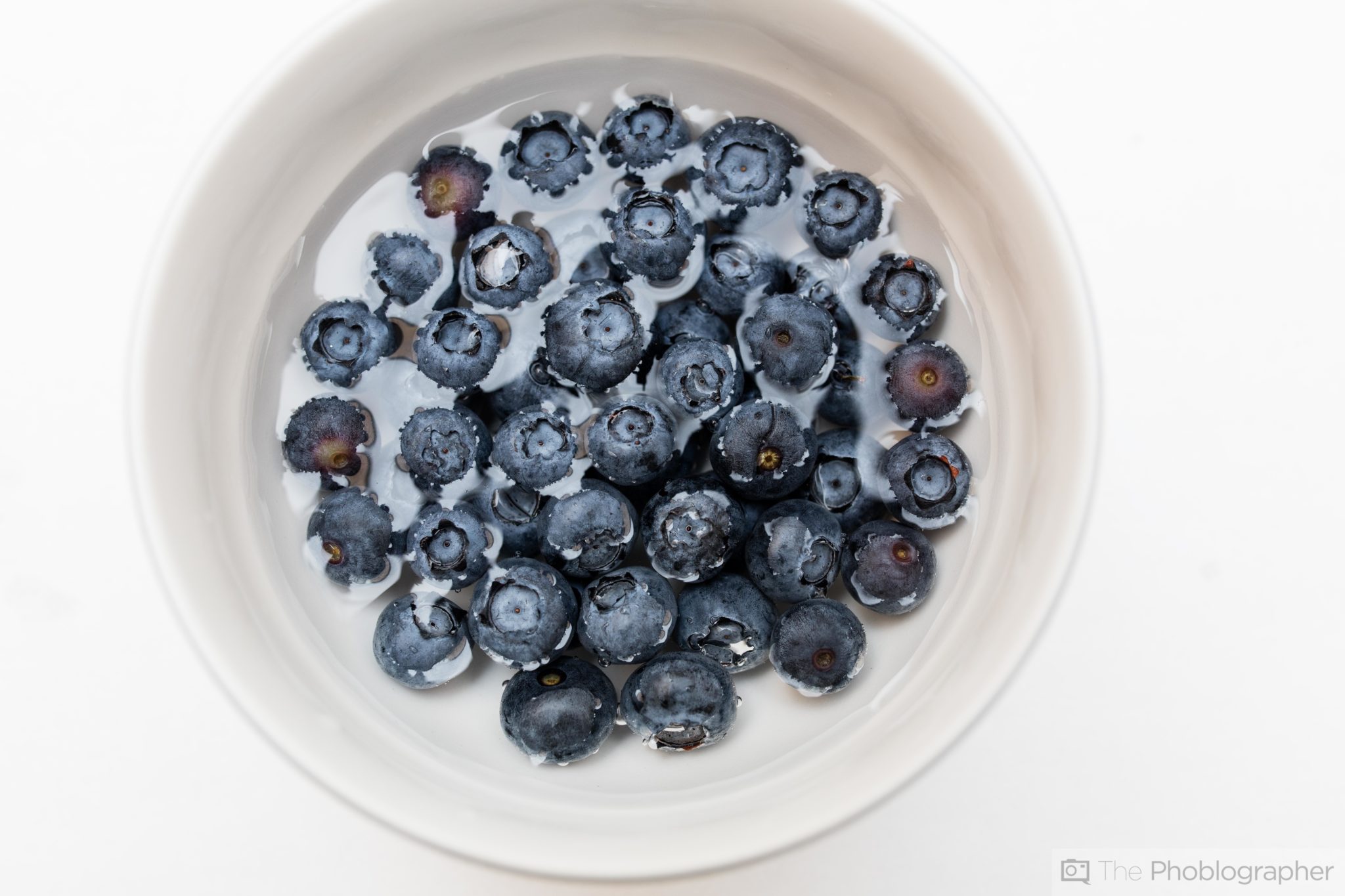
In this image above, you can clearly see this illustrated.
The neutral color: yellow (the wood)
The important colors: red, purple and blue (the fruit)
The major contrasting color: white (the bowl)
If the entire wooden section were painted red (like cherry wood) then tweaking the red color channel would affect the strawberry. This is why contrasting colors are so important in food and add to the vividness of the colors.
Get rid of the ads!
Did you enjoy reading this article as much as we enjoyed writing it? There's a way to support us and our reporting, getting ad-free navigation and more as a bonus. Subscribe to us for less than a coffee per month —just $3.99— or take advantage of our yearly subscription with a hefty discount for only $25.- An ad-free experience
- A free mystery box for Lightroom or Capture One
- All the books in our store
- 20% discount on Capture One
- 30% discount on Imalume Photo Theft Protection
- 20% off Herbs and Kettle Tea Company.