
An inherent problem happens when you’re an editor of a photography website tasked with reviewing the images of many people. Photographers from all walks of life tend to want to make us look at their images–and we are incredibly grateful for that. But at the same time, we find many websites to be seemingly made during the Geocities days only to give way to your Myspace. Website design and navigation has progressed further than this, and the problem is that many photographers don’t understand it.
Here’s the key: make your website simple to use and navigate and folks will want to go through it all.
Don’t be lazy. You’re better than that.
Horrible Navigation
A photography website should be really, really straight forward–whether it’s a Flickr, 500px, or your own professionally built site on Squarespace or Photoshelter. If I want to see your portraits, I should be able to go to a section of your website to see this. If a client wants to see portraits, they most likely want to see either actual portraits or headshots. The headshots should have its own single navigation area. And with this, you should also be a photographer that specializes. Specializing helps to not only make you show off only your best work, but it also makes the website navigation so much simpler.
If I want to see weddings, I want to see select images showcasing your absolute best work that my fiance and I can browse to get a glimpse of what your photos are like. We don’t want a wedding photo section broken down wedding per wedding–save that for your blog content. As a photo editor or as a potential client, if I wanted to see a full wedding I’d inquire about it.
If I want to see your landscape images, please do something similar by grouping them all up.
If I want to contact you, I’ll go to the contact section. But if I want to know more about you, then I’ll click your about section.
Similarly, if I want to see your blog, I’ll go right to your blog.
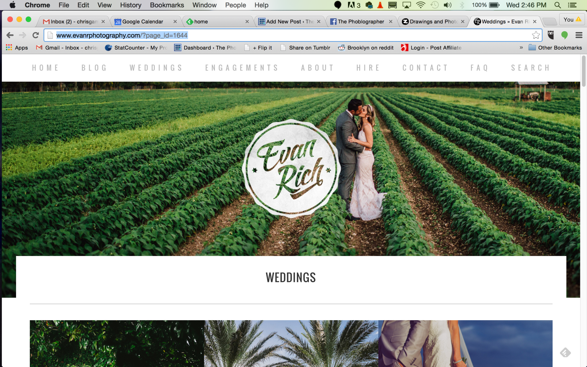
Want a great example? Look at Evan Rich: destination wedding photographer. Evan has a blog, engagements and weddings. When you scroll through weddings, you see loads of beautiful images. If you click the images, you can see more from that wedding.
Calvin Hobson also has an excellent site that shows off a glimpse of his work but otherwise makes the client interact with you. Providing you’ve got some very solid people and salesmanship skills, this can work out well for you.
Sub-Menus

I have this saying that my friends and colleagues know: when something annoys me, it makes me want to kill kittens. I don’t really kill kittens, I actually love. And puppies.
Anyway…
Sub menus on a site are one of the things that will make make me proclaim the intended murder of our feline friends–headshots should not be under your portrait section and your wedding section should not open up to individual weddings.
So where are sub-menus appropriate? If you’re a documentary photographer that has done many, many projects. But even then, if you’re a documentary photographer there are simpler ways to do this. One of the best ways is by Daniel Zvereff. Each project has a lead image, a drop down menu for more info and then you can click into it. Dan puts a major emphasis on the photography overall.
Lack of Organization
A terrible organization of your images is something that particularly goes out to all the folks on Flickr and 500px that send us their pages. Your food photos are probably spectacular, but how the heck am I supposed to find them amongst the giant mashup of photos of your cat, kids, and other random things on your site. Why the heck haven’t you put them into folders and albums?
Got a Tumblr? Then organize your images via the pages feature to section off your images and make the main site your blog content. The same goes for a WordPress site.
Even worse: this comes off as a complete nightmare on the mobile experience.
Random Stuff that Doesn’t Need to be There
Lastly, the biggest problem with many websites has to do with the addition of so many random things that don’t belong there. You don’t need a random section of your website. If you’re trying to become better as a street photographer even though you shoot portraits, then either create a brand new website for it or put in a specific street photography section. But don’t even bother creating the section to begin with until you have at least 10 images that you’re very happy displaying.
Get rid of the ads!
Did you enjoy reading this article as much as we enjoyed writing it? There's a way to support us and our reporting, getting ad-free navigation and more as a bonus. Subscribe to us for less than a coffee per month —just $3.99— or take advantage of our yearly subscription with a hefty discount for only $25.- An ad-free experience
- A free mystery box for Lightroom or Capture One
- All the books in our store
- 20% discount on Capture One
- 30% discount on Imalume Photo Theft Protection
- 20% off Herbs and Kettle Tea Company.