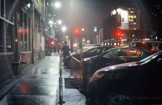
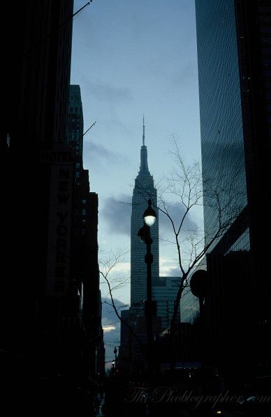
Kodak has been in the news quite a bit recently. Besides, declaring that they are out of the camera industry, they’ve also been under lots of pressure to change and restructure. Because of this, we’ve known them for one thing for many years: film. I personally have been a lover of their film for years, and shed a tear like many of you the day that Kodachrome died. Further, I’m also a lover of Portra: having using it with some Zeiss lenses recently, during professional shoots, and even Gevon loves it.
Like many of you, I dread the day that they kill Tri-x: especially with the look it gives off with medium format cameras.
Kodak now often states that Ektachrome is the closest thing to Kodachrome that they have. And while that all depends on who you ask, one can’t deny that the film is indeed quite beautiful. Even though digital may come close, I still personally feel that it can’t totally capture the full look.
Gear Used
Kodak Ektachrome 100
Thoughts
Kodak Ektachrome is a bit more dangerous to deal with in terms of exposures. It is a chrome film, so even though the colors will be spectacular, you’ll need to make sure that you nail the exposures absolutely perfectly. This is unlike negative film that has an extremely great latitudinal range (dynamic range). What you switch off for is incredible color depth. I’ve stated many times that Leica’s currently M9 sensor is just like chrome film.
It is also already balanced to be quite cool; and therefore often means that it will perform best in warm lighting situations. Daylight, for example, is already very cool in terms of white balance. That means that to get the best performance out of this film, you’ll also need to gel a flash accordingly because flashes are balanced to daylight.
This also depends on how you process it though. A photo I shot of a date I went out with came out extremely warm; but we were in warm light to begin with.
The film overall also has an extremely nostalgic look to it. In that way, it indeed does remind me a bit of Kodachrome, but still can’t capture Kodachrome’s wonderful colors. If I really had to compare it to Kodachrome though, it would probably be most akin to one of its higher ISO variations (and they didn’t go very high to begin with.)
Like all professional films, this one is sharp. But sharpness in film is totally different than sharpness in digital. Something that is very soft in digital might be extremely sharp in film. Film may also make a portrait subject’s skin look much better than in digital.
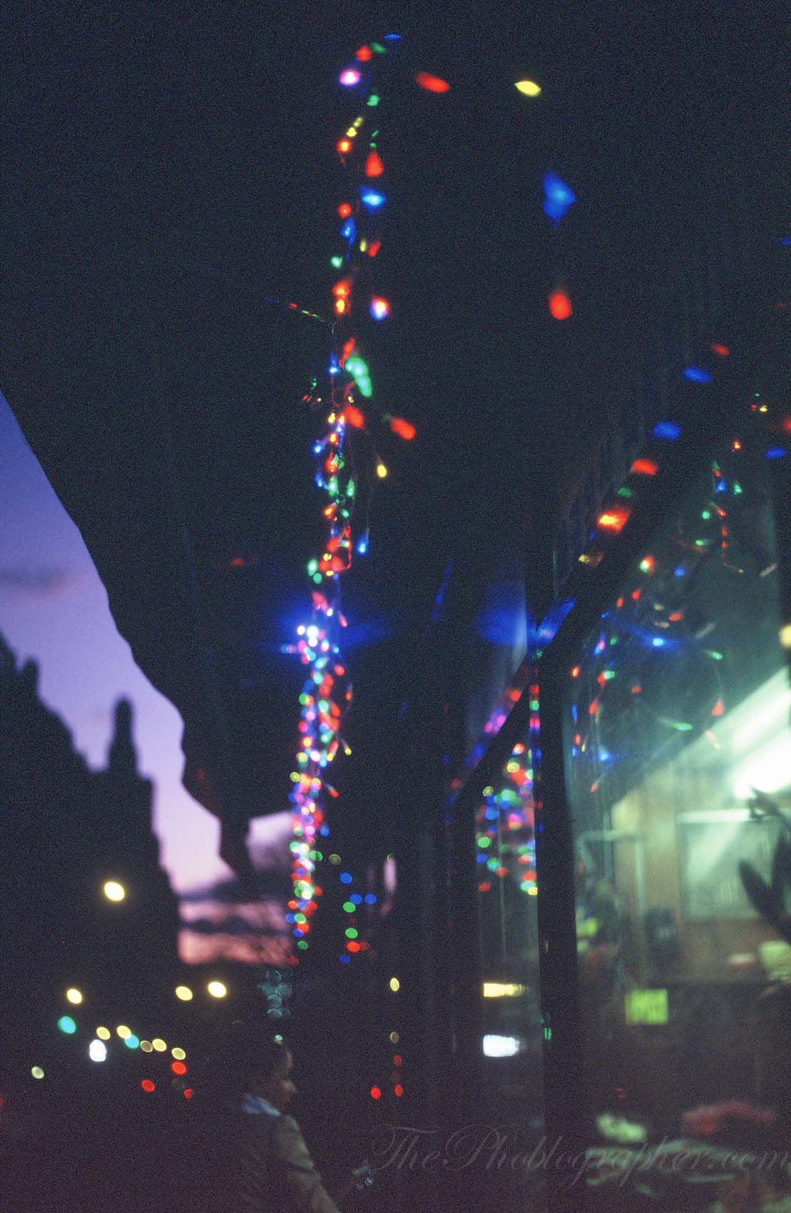
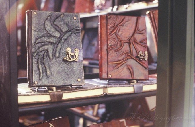
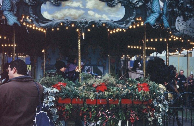
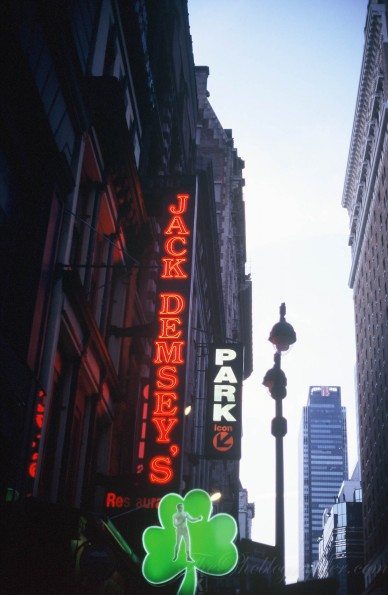
It’s major characteristics are low contrast, high color depth, medium saturation, and a tendency to shift itself more towards the bluer end of the color spectrum. Still though, it looks plenty better than what Instagram may spit out from your camera phone.
This color depth may not only suit portrait photographers very well, but indeed also come to be loved by street photographers. In both cases though, you’ll need to once again ensure that you properly nail the exposure. Otherwise, you’ll be in quite a bit of trouble when it comes to fixing the images.
One problem that I’ve seen with Ektachrome is that the negatives fade over time. That means that the only time that you’ll really get the best scans or prints may be right after the film is developed. The fade in colors is quite heart breaking because that means that if I want to come back and look at the negatives in three years, they’ll look nothing like they do as I’m writing this piece.
Kodachrome wasn’t like that.
With the fading kept in mind though, it begins to make me wonder what some of my images will look like 10 years from now if I pull the negatives out. Even though I stated earlier on that the dynamic range is lacking in chrome film and that it makes up for it with color depth, film’s overall dynamic range still makes it better than digital in some ways. The photo above could not look the way it does with my 5D Mk II; or at least you’d be pushing it quite a bit.
Additionally, most modern papers and monitors don’t have enough dynamic range to support all that film and digital can do overall.
Here are some other photos I’ve shot with this film. But overall, Ektachrome is one of my favorite films if not my favorite. While Portra holds an extremely big spot in my heart, Ektachrome’s look is too nostalgic and beautiful to give up.
And though Kodak states that their film business is profitable, my only hope is that photographers still continue to embrace the history of their art form while also realizing and embracing the current and the future.
Please Support The Phoblographer
We love to bring you guys the latest and greatest news and gear related stuff. However, we can’t keep doing that unless we have your continued support. If you would like to purchase any of the items mentioned, please do so by clicking our links first and then purchasing the items as we then get a small portion of the sale to help run the website.


