
There’s been a longstanding myth that matte paper is best for black and white prints while glossy is best for color. But that’s not necessarily true. In fact, a matte print can look really beautiful with color ink. Think of it like looking at a matte screen or a glossy screen. Most Apple users look at glossy screens all day. But when you switch to a matte display, things change so much more — especially for your eyes. So, in this article, we will briefly talk about lighting a matte print.
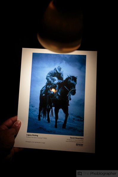
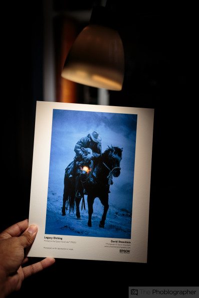
To light a matte print, you should really have the light shining directly onto the print. If you shine it from above, the colors won’t pop as much. They’re already being muted by the nature of what a matte print is. You need to give it a lot of light with a matte print. If you’re hanging one in your home, place it in a spot where it will receive a lot of window light. Better yet, use museum glass to minimize the reflections on it.
A few years ago, we did an article about this and much more. You can find that article at this link and explore it in a much more deep dive style.
When do you print on matte vs glossy? Quite honestly, that’s a question that not many folks can answer. Sometimes, it must be experienced in person and felt to understand how it might be rendered with one paper type vs. the other. A matte print can make a color photo look much like a painting. At the same time, a glossy print can really bring out the extra clarity and details in a black-and-white image. Typically, if you really want to showcase the details of an image, a glossy print is superior. If you instead want to showcase artistic beauty, a matte print is sometimes a better decision.
We’ve written a longer tutorial on this a few years back in our premium publication, La Noir Image. You can read the syndicated article here.
Part of choosing a matte print over a glossy print involves the lighting you’re using.
In most cases, it’s safest to print a photo on canvas because it’s so incredibly versatile and can go everywhere. But a matte print is nice if you’re looking for something kind of like what you might find in a photography book. Honestly, sometimes I print a photo and think to myself that it would’ve looked better on a matte print more often than not. I typically use luster-style paper — which is like a soft gloss. Some images just look better on matte, and there is no reason. It’s truly a feeling you need to experience, like comparing one movie theater screen to another. The first time you see an IMAX or 70mm movie, you can tell how it differs from standard movies. It’s also like seeing something in 3D. I will forever have it etched into my head how Superman looked in the Justice League movie with his awful editing in 3D.
This is kind of like looking at a matte print or a glossy print, but with movie theaters, there are experiences that are just better than others. With prints, that’s not the same case. Instead, it’s about personal taste, depending on the print.
We think that photographers need to get back into printing and make people experience their photographs just as they are — without the interactions of a platform.
Get rid of the ads!
Did you enjoy reading this article as much as we enjoyed writing it? There's a way to support us and our reporting, getting ad-free navigation and more as a bonus. Subscribe to us for less than a coffee per month —just $3.99— or take advantage of our yearly subscription with a hefty discount for only $25.- An ad-free experience
- A free mystery box for Lightroom or Capture One
- All the books in our store
- 20% discount on Capture One
- 30% discount on Imalume Photo Theft Protection
- 20% off Herbs and Kettle Tea Company.
- 20% off your order from MPIX printing services.
- 5% off Viltrox Products via their eCommerce store.
- 10% off all film developing, printing and scanning services from Blue Moon Camera and Machine
- 15% off 7Artisans products: The lens and accessory maker is offering a sweet discount for Phoblographer's readers.