Everyone and their mother typically tends to go for glossy prints when they print photos–and if they don’t know any better then it’s a default choice. In some ways, it’s a terrible decision if you don’t know jack about lighting. Like in photography, one needs to be a great judge of how lighting is affecting the scene in order to determine how light will also affect the viewing experience of printed photos. To that end, the power of a well done and well lit print is extremely powerful.
This tutorial pools the knowledge of printing veterans in the photo industry and is designed to give you the knowledge of how to carefully place printed photos in your home for the best viewing experience for your guests.
Different Types of Paper
Before we even start to go into the specifics of lighting, you should know that pretty much all paper falls into three big categories:
Matte: Absorbs light. This type of print is typically associated with being almost like cardboard and holiday cards.
Glossy: Really, really reflects light. Most prints you get from WalGreens, CostCo, etc are printed this style.
Luster/Satin: Reflects light, but not to a high degree. You can argue that these are a bit more uncommon.
Of course there are other variations, but to make this simpler let’s focus on these. Each of these papers have different properties based on the manufacturer. Different papers also have different lifespans. Depending on how important the print is to you, you’ll want to make the appropriate selection.
Lighting
When it comes to lighting a print, specific factors affect the viewing experience. “My suggestion is to position the lighting and pictures where you think the most people will be looking at them.” says Eddie Murphy, a Marketing Specialist from Epson–and a super knowledgeable guy about prints.
So what does that mean? Well, it depends on the layout of the room. If you live in a small apartment the way that I do, then you probably use prints to decorate the place and have them on the walls in your living room, bedroom and kitchen.
Not only does the viewing experience matter, but so too does the placement of the windows and light in the room. Like in photography with a white balance and mixed lighting situations, you’re going to get a different viewing experience because of how the eye always tries to find its own white point. Various factors affect the lighting experience in any given room:
- Bulb colors
- Painting on your wall and how the light reflects off of that
- The color of your floors
- The glass for your windows–which isn’t actually clear. Instead, glass is green.
- Furniture colors
According to Eddie, various factors affecting the outside light also affect the viewing experience such as trees, the color of the sunlight (think daytime vs blue hour vs golden hour light), street lamps shining in, etc. Plus, consider the fact that most folks don’t like daylight color lights and instead prefer warmer colors.
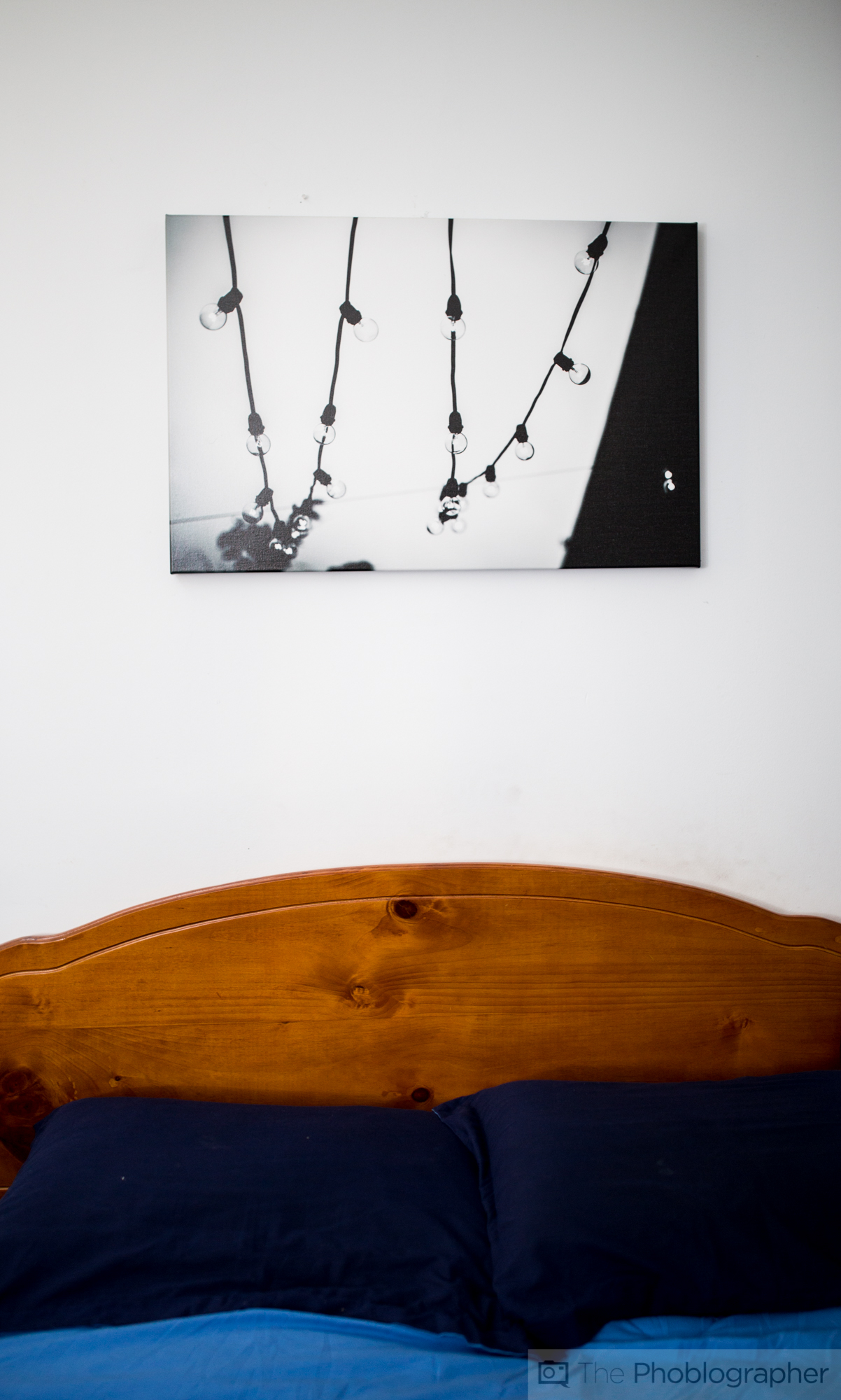
With all this in mind, one would think that color prints are tougher to light, but Eddie believes that black and white prints have their problems too. “Black and white are more susceptible to color casts with the caveat that your eye automatically adjusts to a white point in addition to the light available.” Indeed, I personally experience this with the black and white canvas prints in my apartment. But these color casts aren’t too terrible because I printed on matte canvas.
So does this mean that lighting is tougher than you think? In some ways, yes–it is. But in other ways, it just takes careful planning and placement. If you know how to use light to your own advantage (strobists) then you’re essentially applying the same skill set but with constant lighting instead.
Paper Choices and the Rules of Lighting
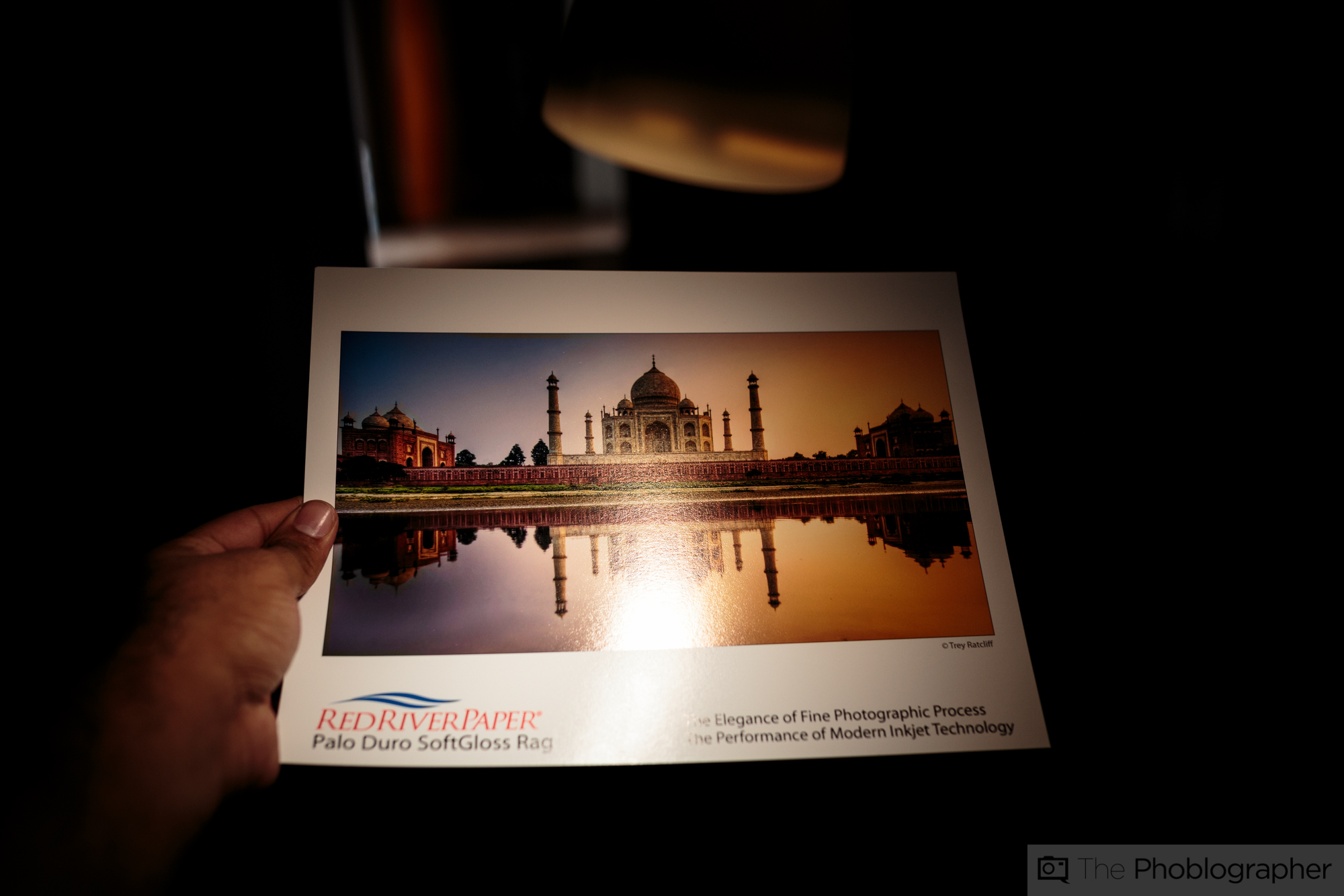
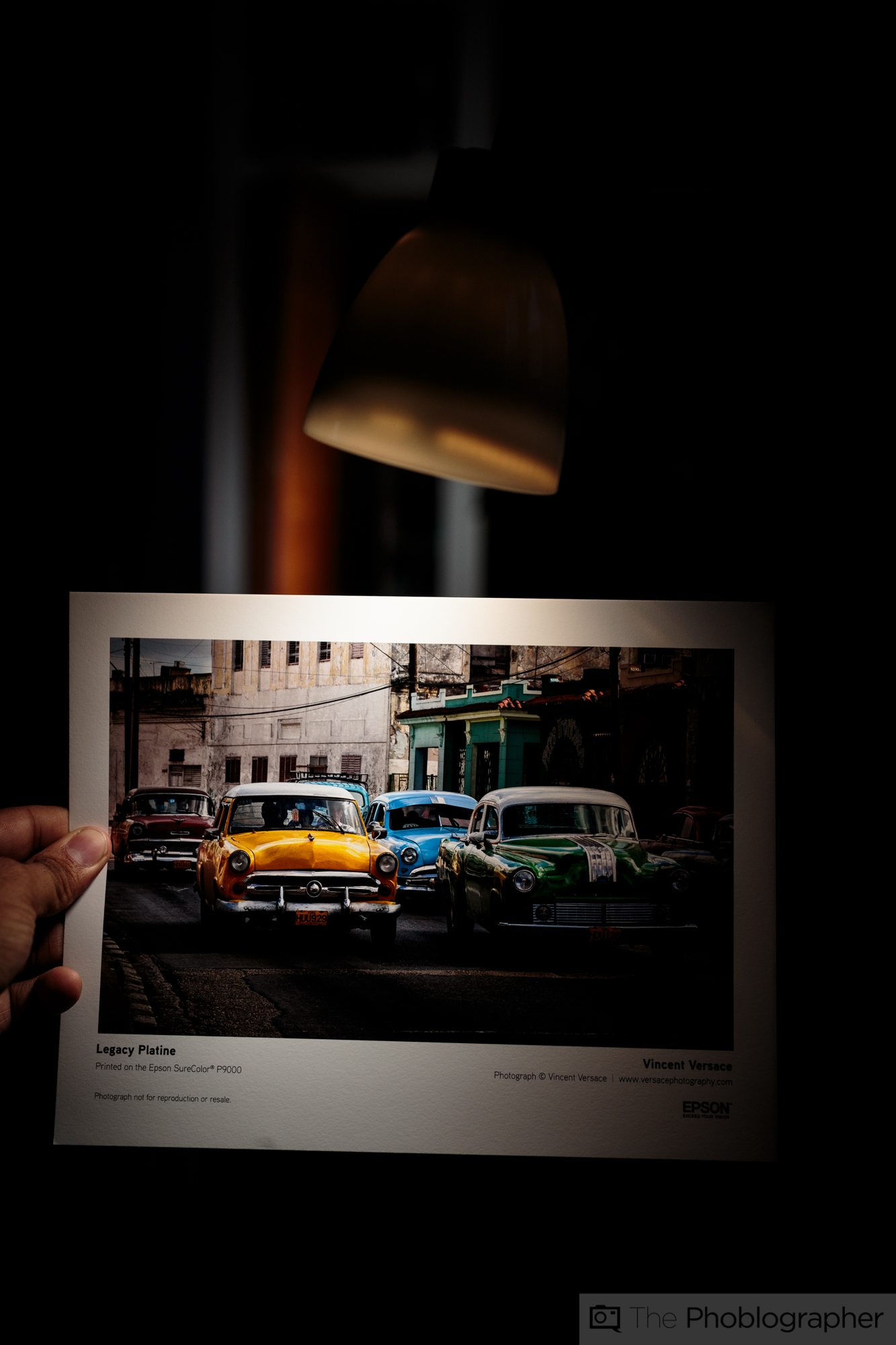
“I can tell you that satin and luster papers are by far the most popular surfaces. They combine the critical benefits of saturated color, protection from handling, and good sharpness.” says Drew Hendrix of Red River Paper. “Lighting angle should be from above but it is hard to badly light a satin print. The textured surface does a good job of diffusing reflection.” Red River even has a guide on which inkjet papers may be best for you based on the subject matter that you’re shooting.
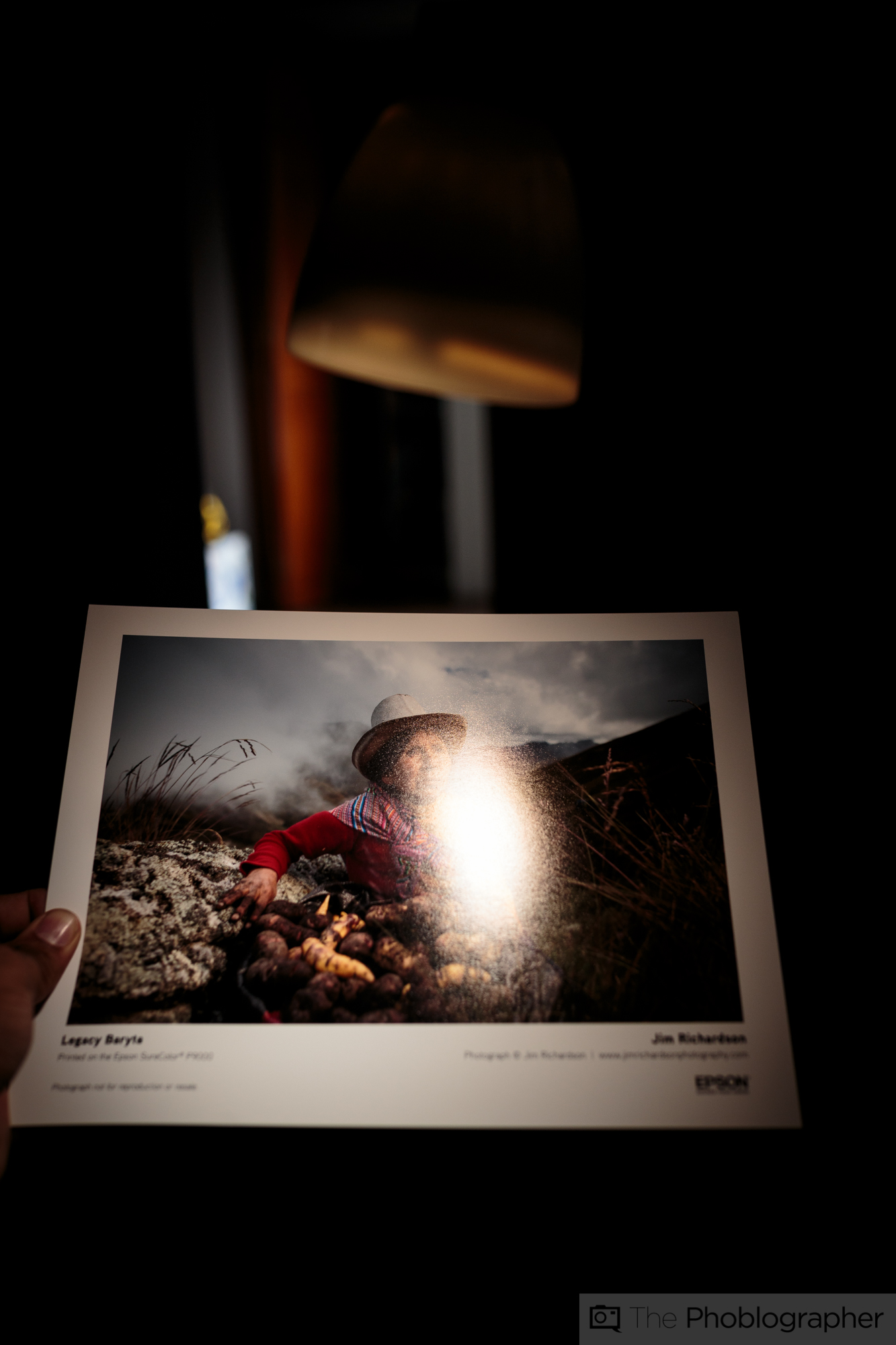
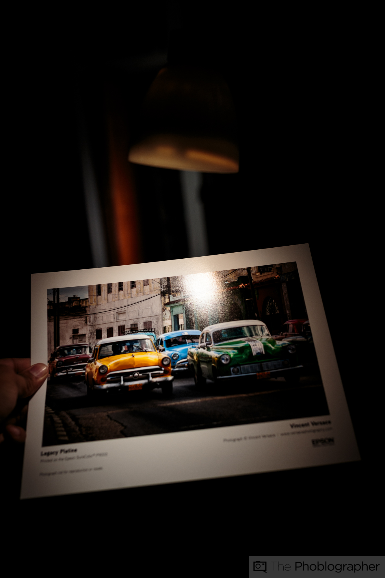
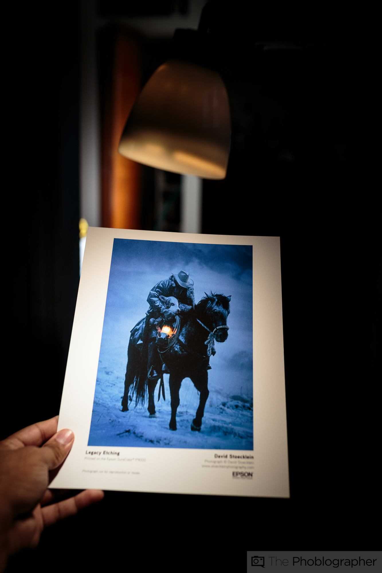
“If something is blown out or too harsh, it could be the lighting,” says Eddie about reflective surfaces in regards to prints, and adds to the statement that Luster prints should be lit from above. This makes complete sense if you’ve ever looked at a reflective image only to get an annoying glare that kills some of the details and doesn’t let you view the image as a true whole.
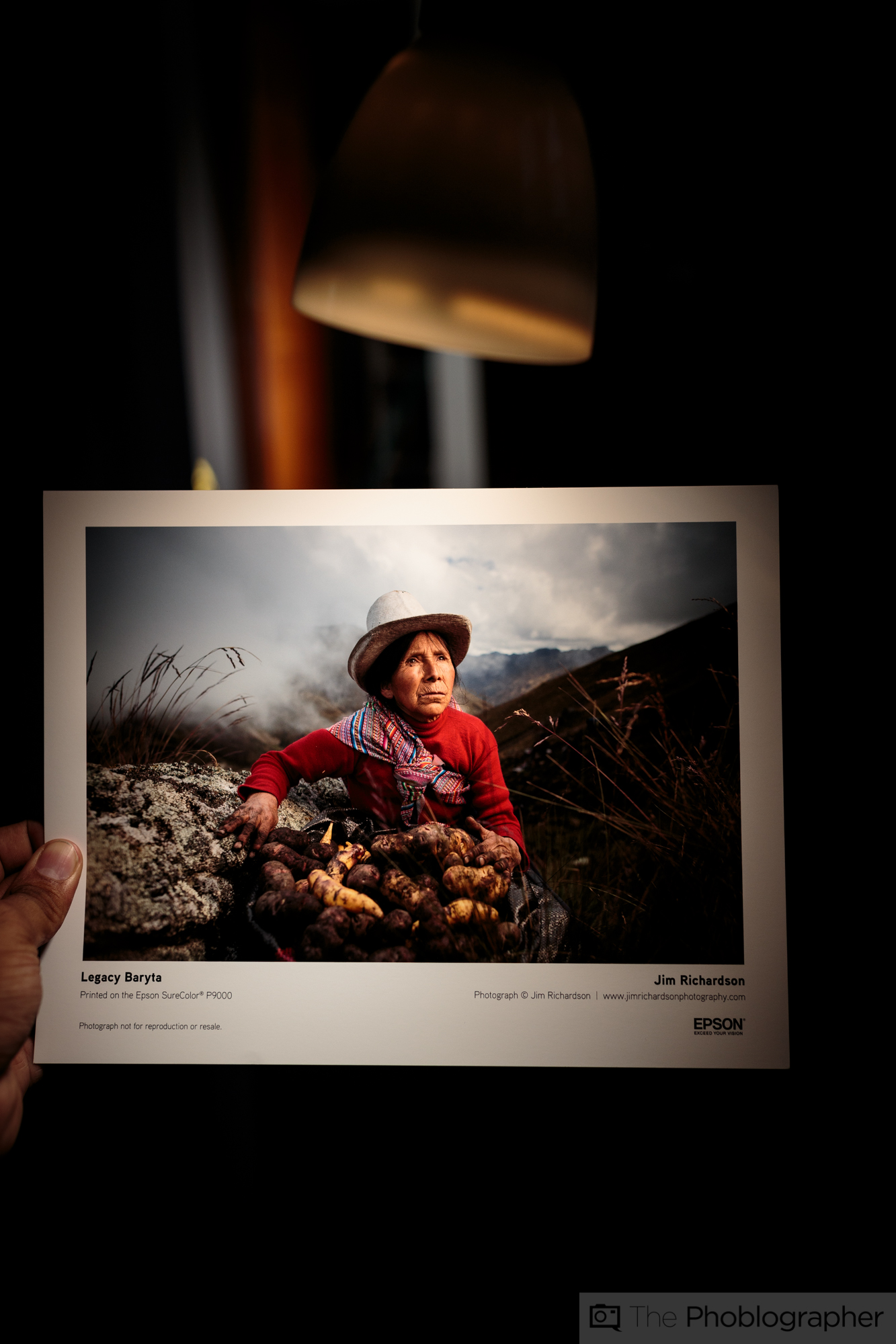
On the other hand, matte paper and prints are much different. Matte paper tends to absorb lighting much better with little to no reflections as Drew tells us. But as a result, matte prints require more light to look their best. They also require more work from you to get them just right if you’re printing these images at home with your own printer. “Another side benefit is that under glass, most viewers cannot distinguish a properly lit matte image from one printed on satin or gloss.” says Drew.
“If [the print is in a spot where it’s] not getting a lot of ambient light then you want to brighten the image and keep saturation up.” states Eddie. “If they’re above a mantle or shelf or someplace with lots of overhead light then you want to make sure you hit it with enough peripheral light but not blow it out. This is print specific.”
He continued to add that anything that is fine art or matte paper will absorb more light and therefore be more challenging to light it. What I do is position these prints nearer to a window.
Essentially:
- Reflective surfaces should be lit from on top
- Matte surfaces lit directly
- Watch the colors of the light in the roof, the surfaces that the light is reflecting off of, etc.
The Effects of Lighting on Specific Print Types

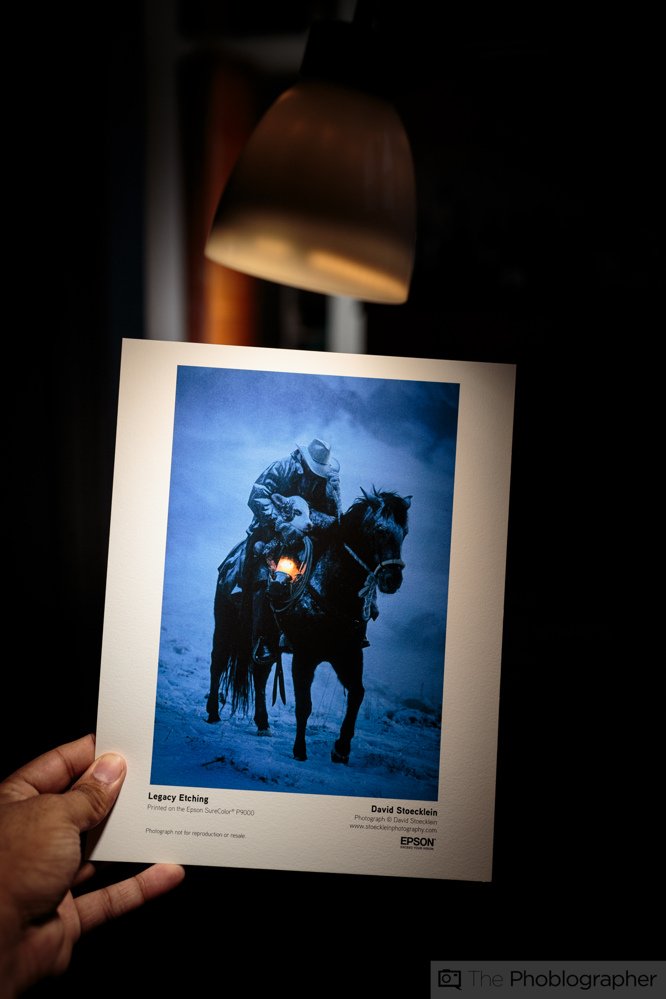
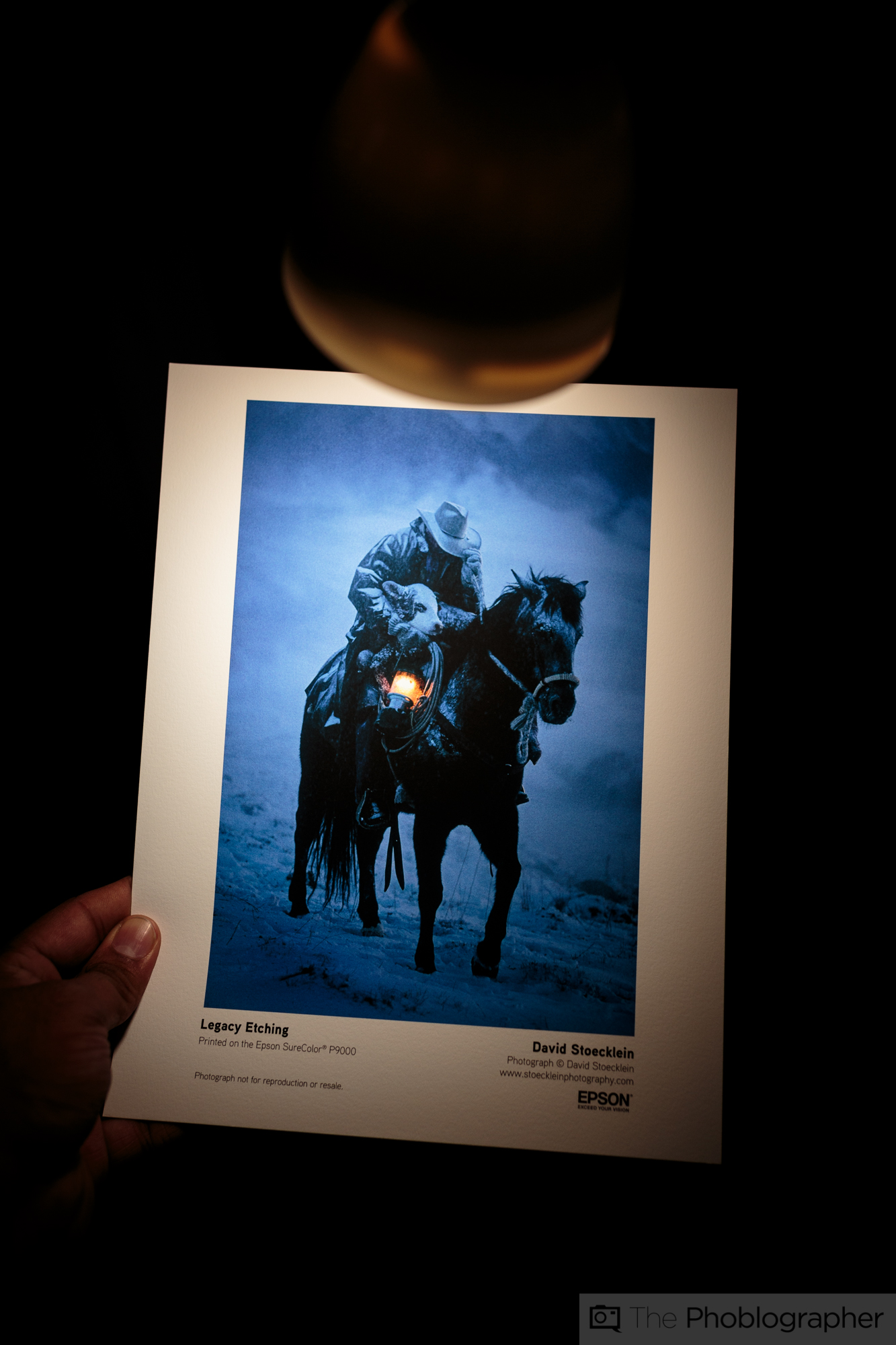
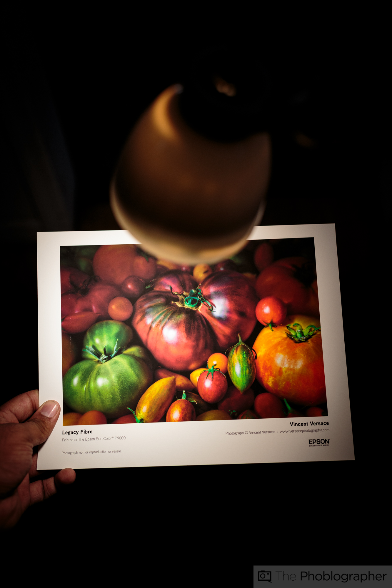
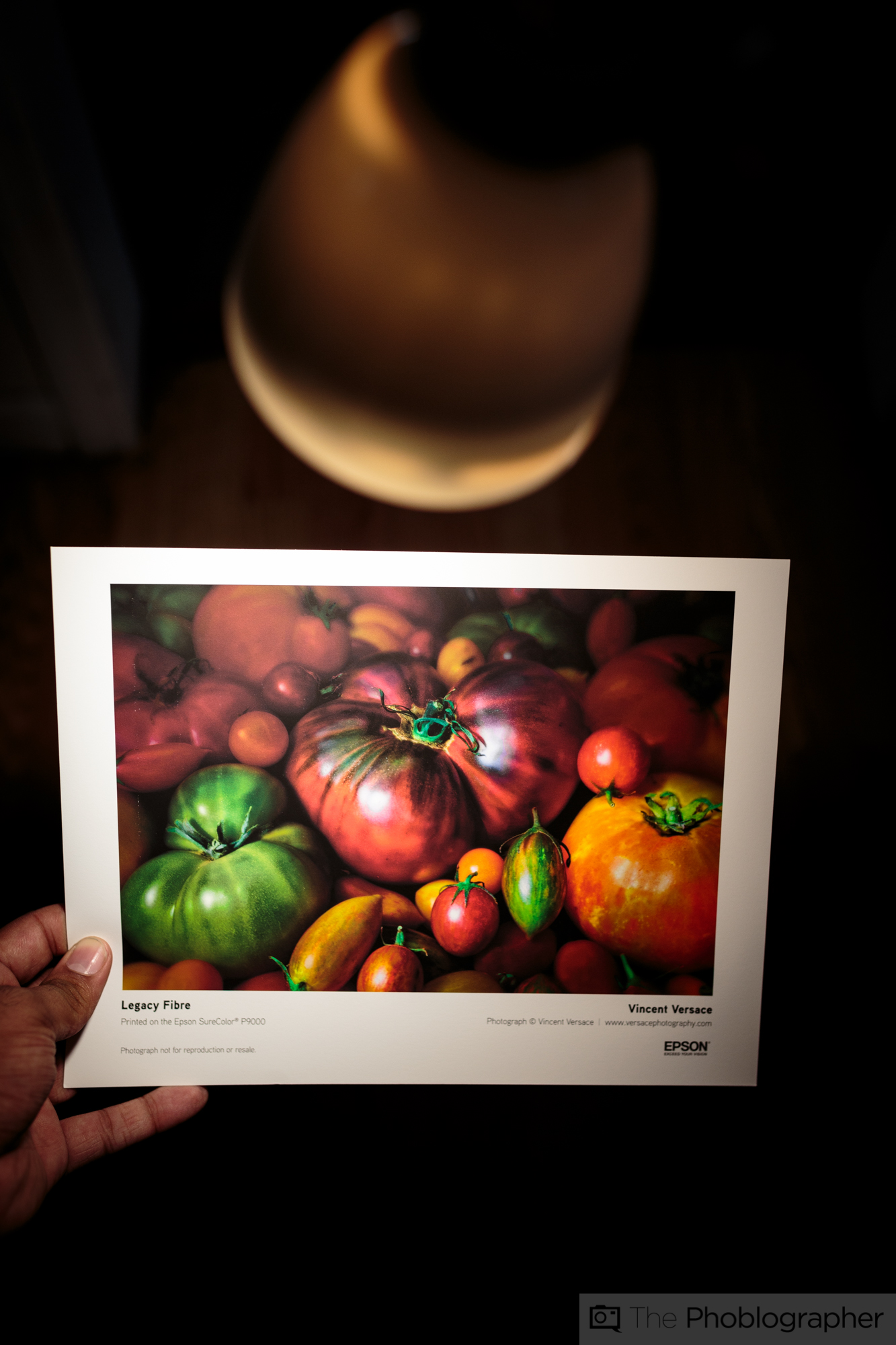
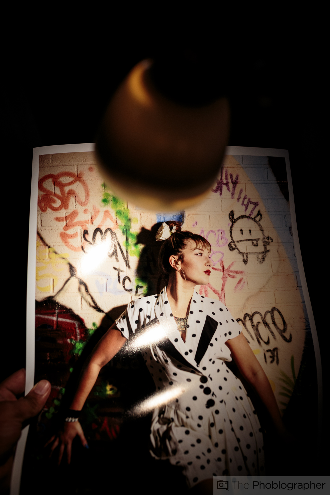
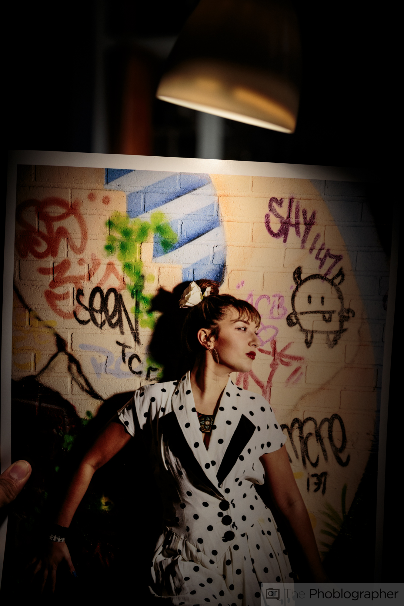
To demonstrate how lighting affects the way that your images will look when printed, Epson sent me a WAC Light unit that they use in their own labs involving the use of Solux bulbs rated at 4100 Kelvin.
For the demonstration, the light was placed above the print and onto the print and then the effects are shown when the print is tilted to show how easily is reflects light or not. The prints in this section of this article were mostly samples sent to me from Epson and Red River with the exception of the image above (from my P600 review) and the Canon prints–which are part of a review I’m working on.

Get rid of the ads!
Did you enjoy reading this article as much as we enjoyed writing it? There's a way to support us and our reporting, getting ad-free navigation and more as a bonus. Subscribe to us for less than a coffee per month —just $3.99— or take advantage of our yearly subscription with a hefty discount for only $25.- An ad-free experience
- A free mystery box for Lightroom or Capture One
- All the books in our store
- 20% discount on Capture One
- 30% discount on Imalume Photo Theft Protection
- 20% off Herbs and Kettle Tea Company.