
If you’re reading this article, you’re probably saying to yourself one of two things. First, you might think that not a lot of street photography is in black and white. This might mean that you mostly digest street photography online and not from classically accredited sources like photo books. If you find that most of it is in black and white, then you’re probably looking at different sources, such as books found in stores and libraries. Indeed, color street photography is a thing to be taken seriously — and we can partially thank Joel Meyerowitz for pushing the idea that color photography can be taken seriously. That has only a little bit to do with why so much street photography you consume might be in black and white.
The Obvious: Time Period
Much of classic street photography done by the OGs in the genre was in black and white. That’s because it was a norm to use black and white film film back then. The people I’m speaking about are Garry Winogrand, Vivien Maier, Gordon Parks, Robert Frank, Henri Cartier-Bresson, etc. Photography, as it is, has struggled to be considered one of the fine arts alongside paintings, sculpture, etc. With that said, there was often a problem with photography not being taken seriously unless it was in black and white.
Others, like Meyerowitz, embraced the idea of color and pioneered it. Saul Leiter, Martin Parr, Bill Cunningham, and other career-long photographers have used color in their work. Society accepted and used color film more often over time. And with digital photography, the norm is to use color whether you’re using your camera or your smartphone. Our society has embraced the idea of color in our images even if we like to keep it simple.
Despite this, there are many street photographers who shoot in black and white or edit their work to be black and white.
The Not-So-Obvious Answer
The truth about so much street photography is that it’s often done out in public in big cities. Cities are often littered with buildings that have drab colors. Here in NYC, I like to joke that Hudson Yards is a crystal city within the rest of NYC. It lacks the historic buildings that midtown has and the color of the West Village. These environmental colors don’t truly do anything for good color photography straight out of the camera.
Couple into this the fact that many people don’t often wear stark colors in NYC, and you’ll have drab colors on top of drab colors. So, if all the color in the scene is drab, it doesn’t matter because it’s not an important part of the composition or story.
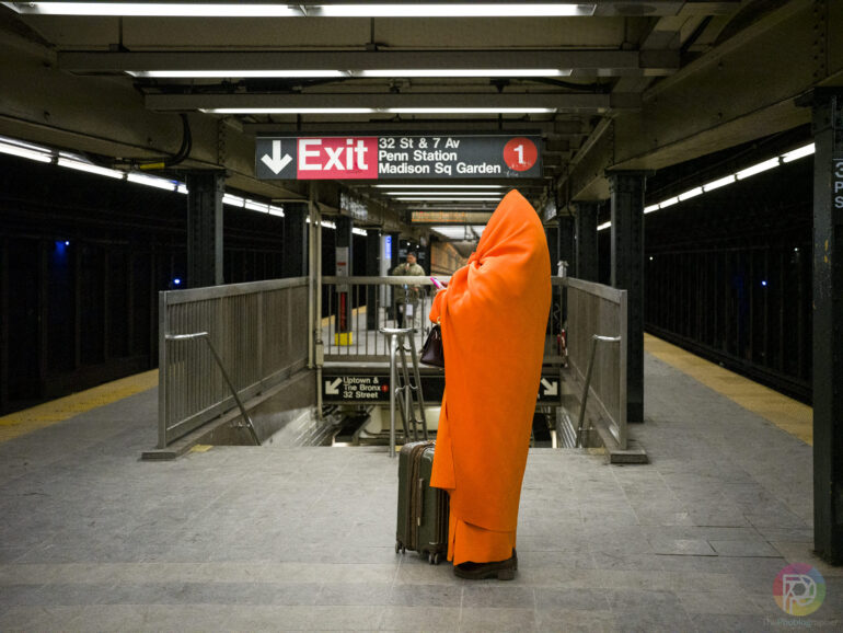
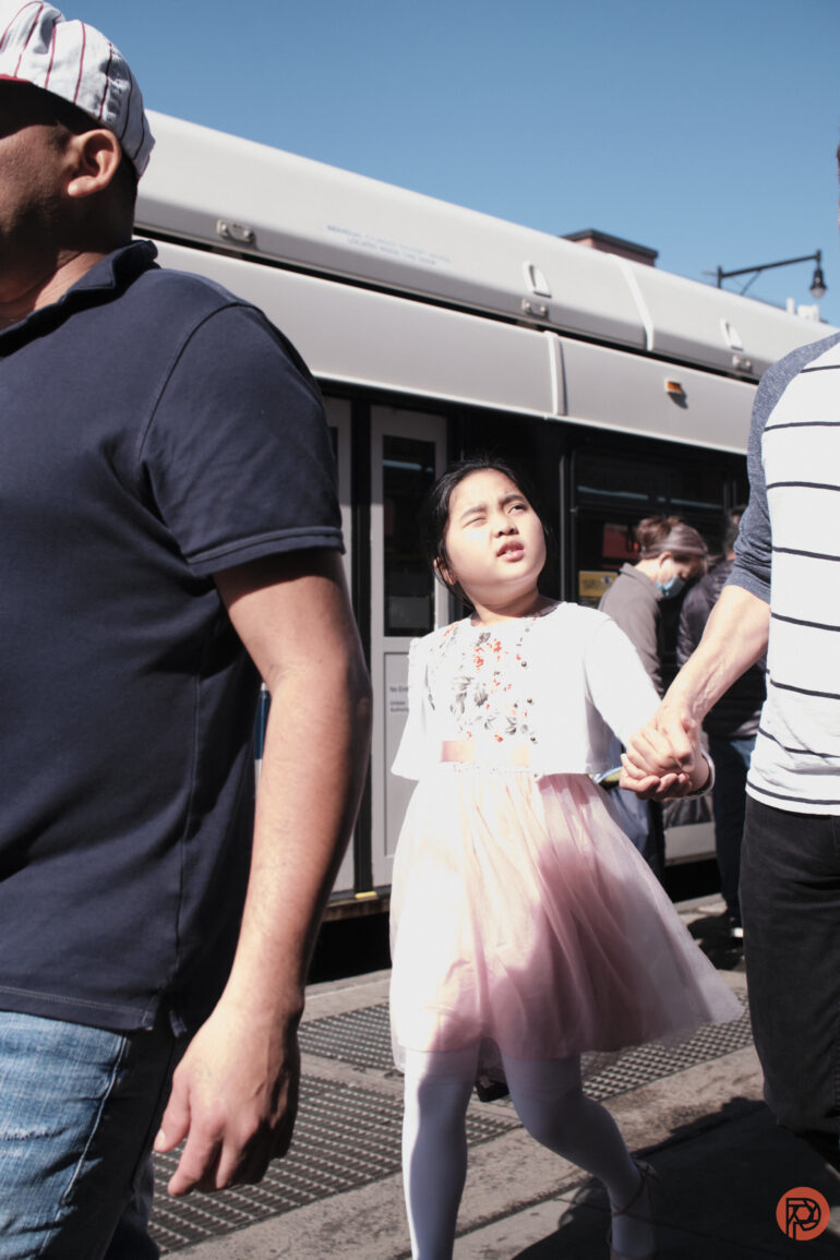
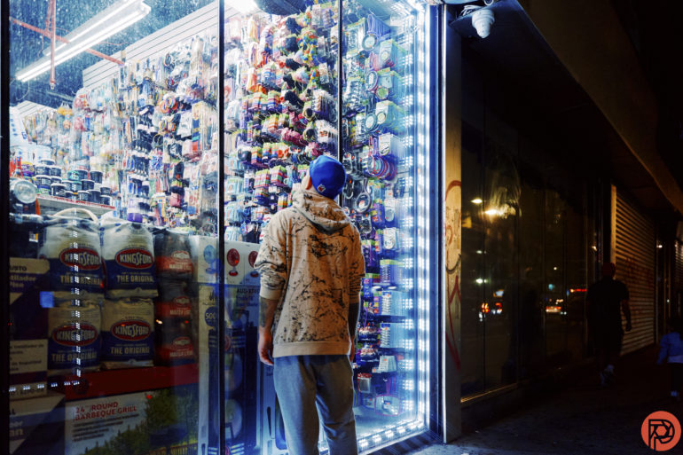
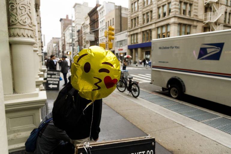

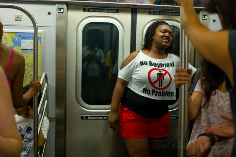
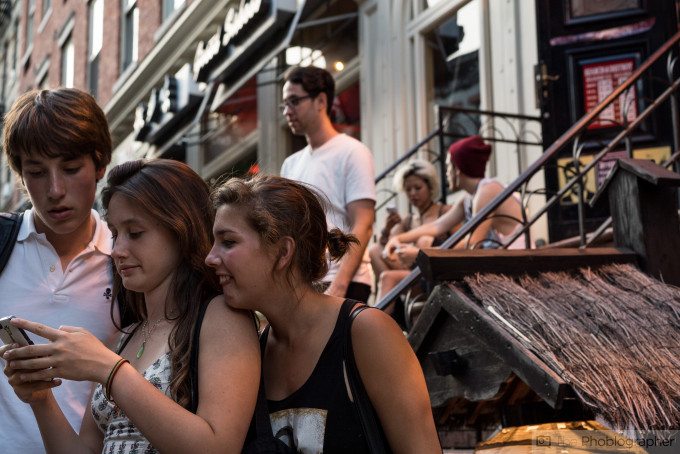
In the above slideshow, we can see example photos where color is important. Color is used in street photography for several reasons. But primarily, you can use it to tell people where to look in the scene. To break that idea down, certain colors help with the composition of the photograph and break the norms put in place by the rule of thirds. That’s because of how human eyes are designed to work. If a color stands out in the scene, then we’re going to automatically pay attention to it in the same way that spotlight effect works.
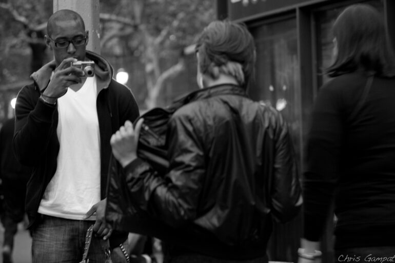
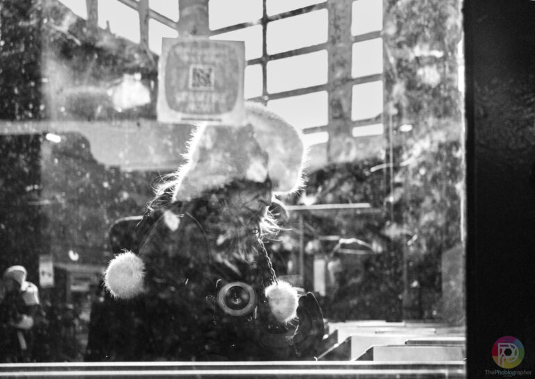
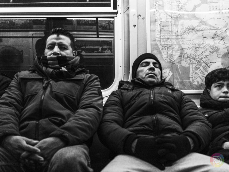
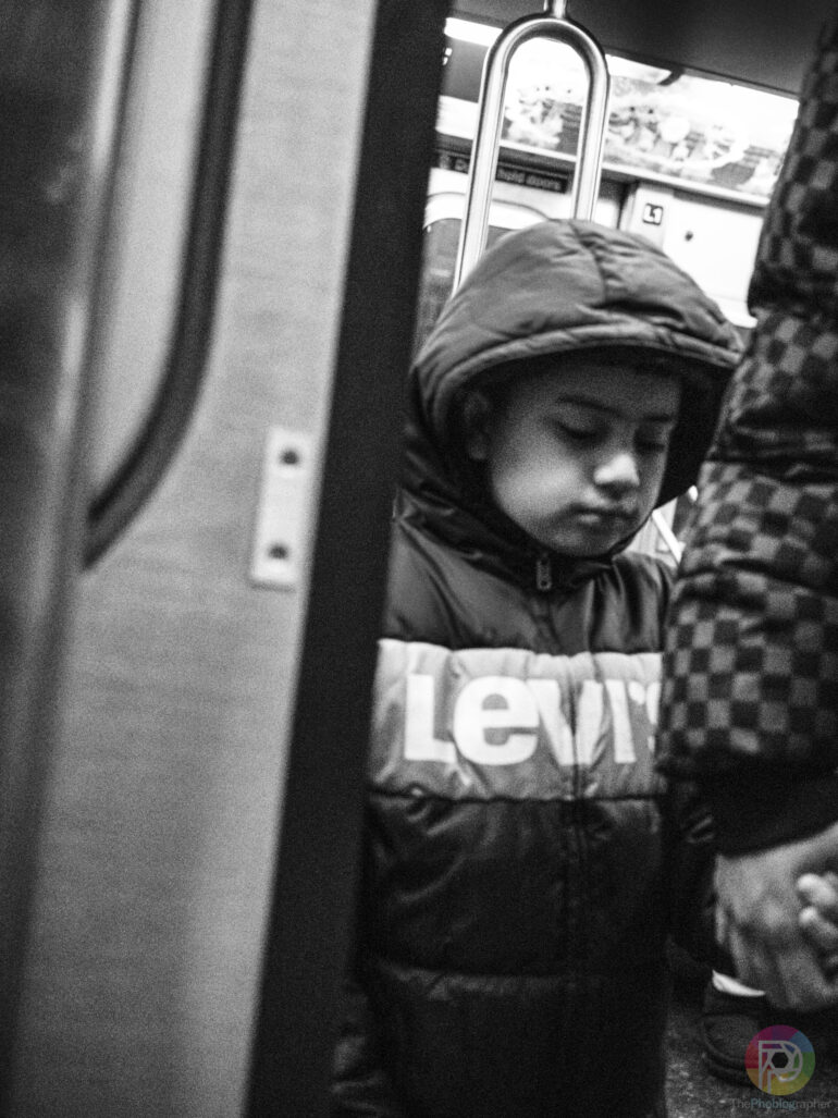
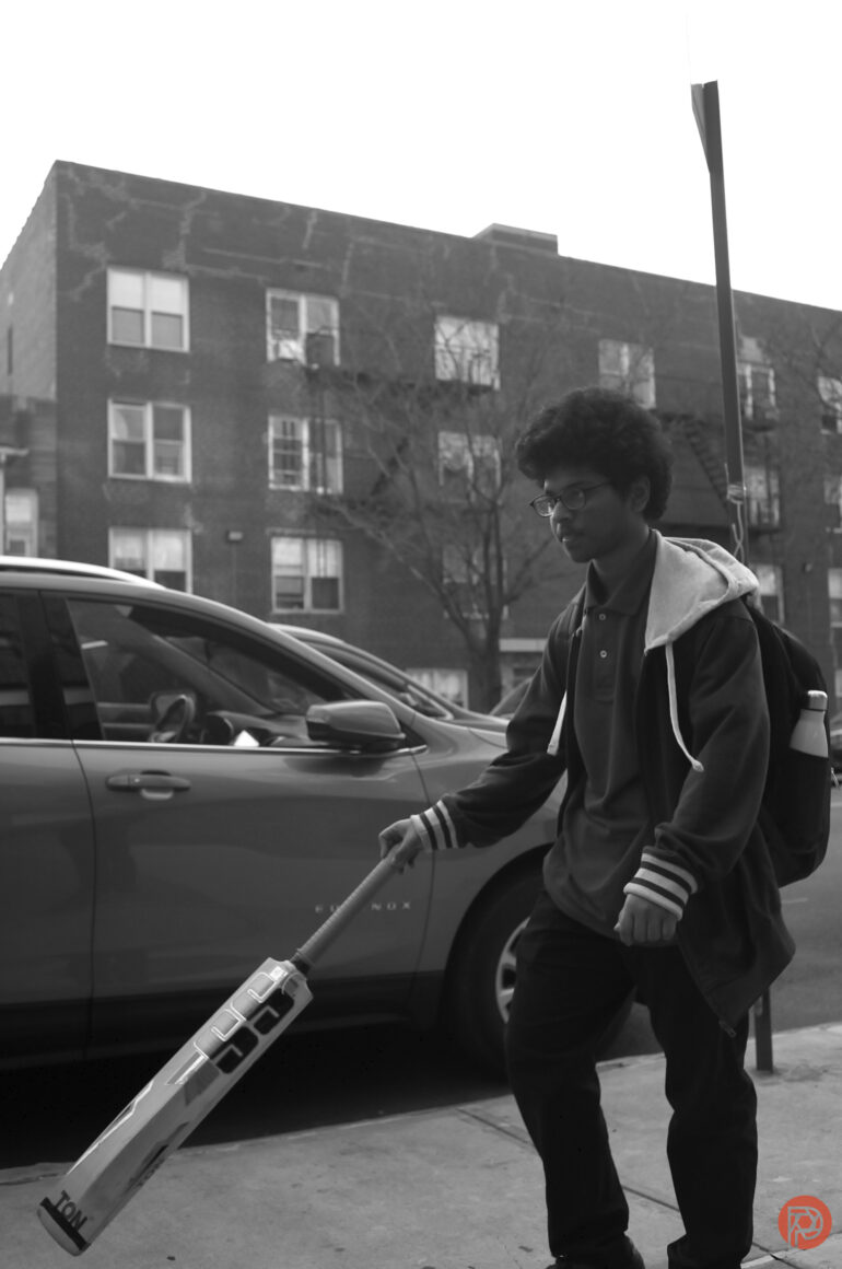
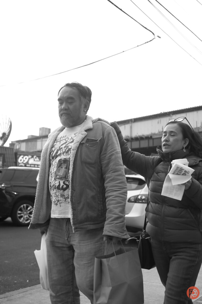
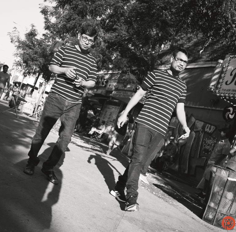
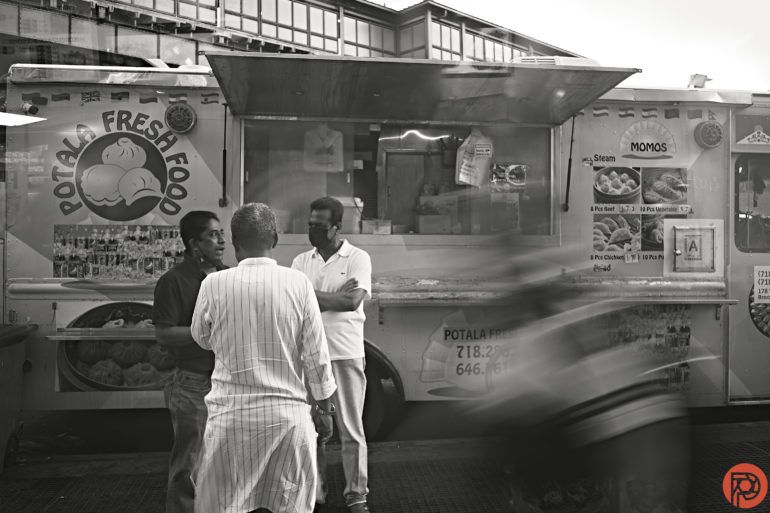
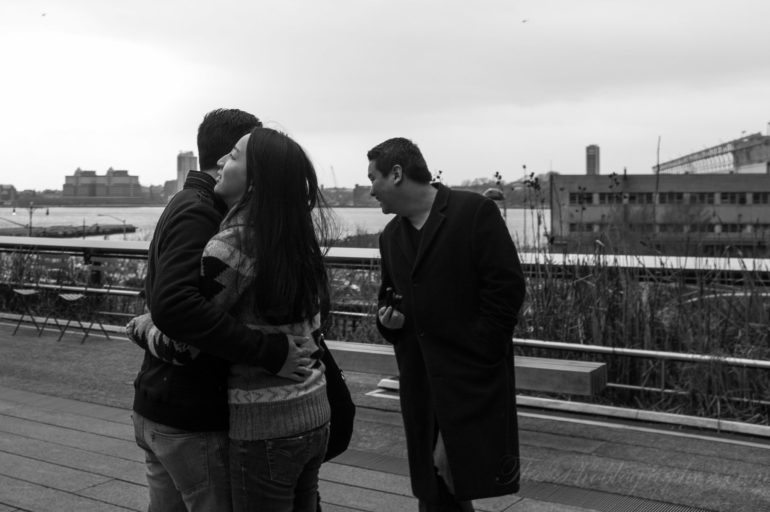
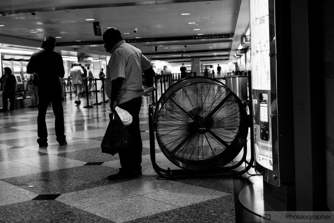
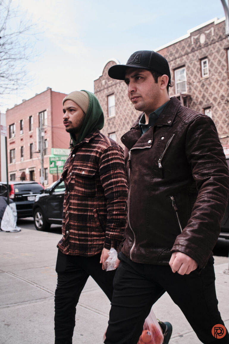
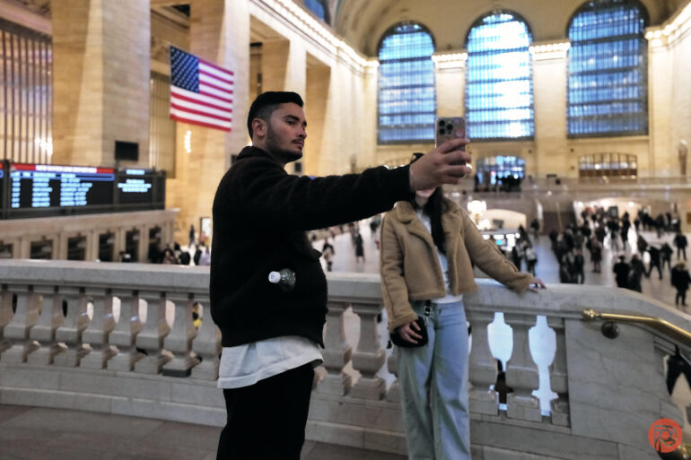
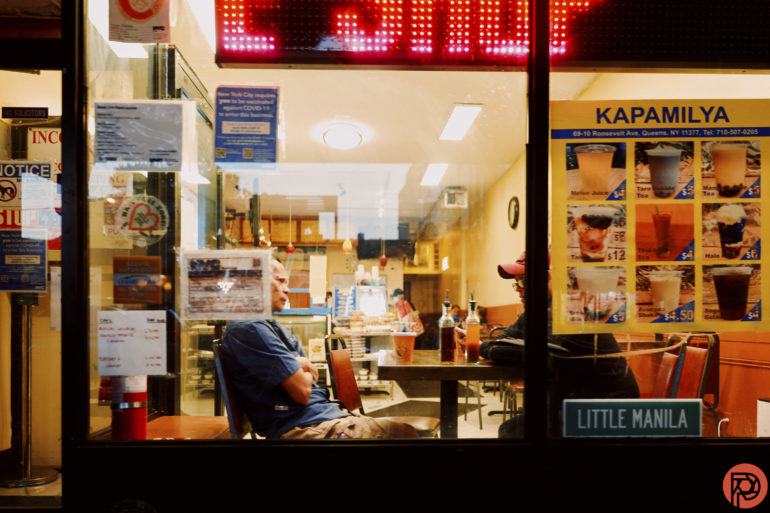
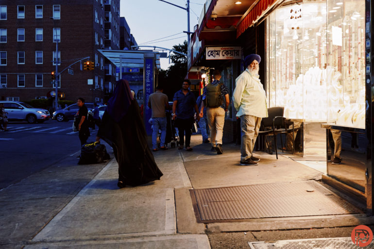
In the images seen in the slideshow above, we see how color isn’t necessarily important to the scene. However, the images use other compositional elements. There’s depth of field, mysterious elements, and effective lighting leading our eyes to a specific part of the images. Black and white imagery works fine for these.
Color or Black and White?
Truly, both color and black and white are very valid when it comes to street photography. But the more important thing is that you capture the moment. Good street photography is about emotions in a scene.
Get rid of the ads!
Did you enjoy reading this article as much as we enjoyed writing it? There's a way to support us and our reporting, getting ad-free navigation and more as a bonus. Subscribe to us for less than a coffee per month —just $3.99— or take advantage of our yearly subscription with a hefty discount for only $25.- An ad-free experience
- A free mystery box for Lightroom or Capture One
- All the books in our store
- 20% discount on Capture One
- 30% discount on Imalume Photo Theft Protection
- 20% off Herbs and Kettle Tea Company.