Photographer Chris Burkard is positively incredible. In-person, he radiates an aura that will make any photographer in the room both envious and in awe. That aura permeates through his images and his words about said images. For years, I’ve only ever known or seen his work online. Recently, he released a new book entitled The Oceans: The Maritime Photography of Chris Burkard. For $80 on Amazon, your coffee table can be adorned with its latest decoration that’s well worth talking about.
Chris is no stranger to our online magazine. We’ve featured him several times, and he’s worked with several other publications. Anyone who cares about the environment is a winner in our eyes. But is this book really worth $80?
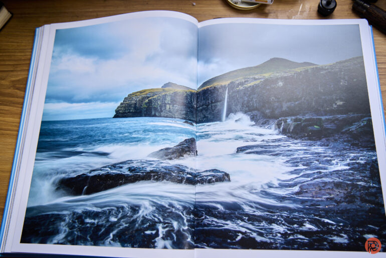
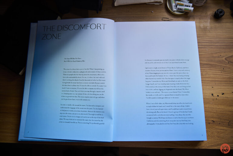
I realize the irony that some of you believe you read in that previous statement. The truth, though, is that e-waste creates a bigger problem than deforestation of trees does in the creation of this book. And more importantly, that’s probably the best part of The Oceans. The paper that this book is printed on some of the best paper that I’ve experienced within a photo book. More importantly, it makes color photos look great even without a ton of gloss. That’s right, the paper is a matte paper with a very soft gloss. It’s hard to hate on it — and aesthetically, it makes the book a page-turner simply because you want to feel the paper over and over again.
More importantly, you need to view this book in soft lighting to really see the colors pop.
The photojournalistic side of me loves to look at images of the environment, landscapes, and all that go along with it. I even purposely set MacOS Sonoma to show me landscape videos instead of rotating through my own photography as the screensaver and background. To that end, I think that this book does a great injustice to Mr. Burkard’s work.
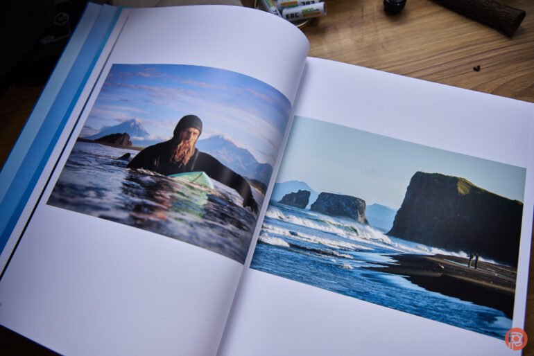
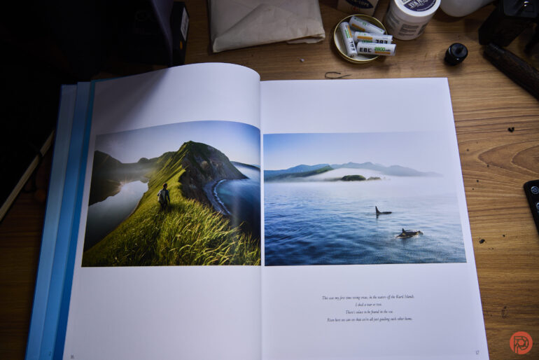
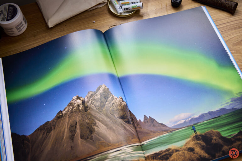
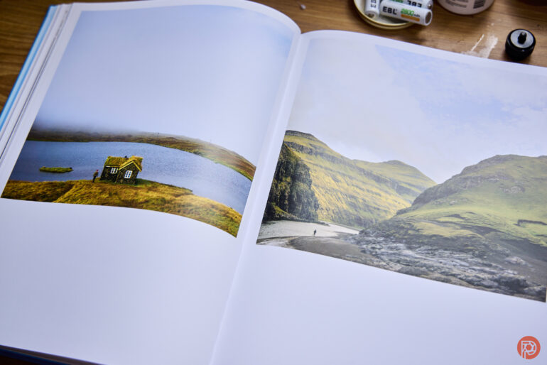
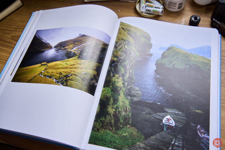
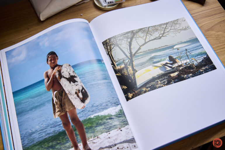
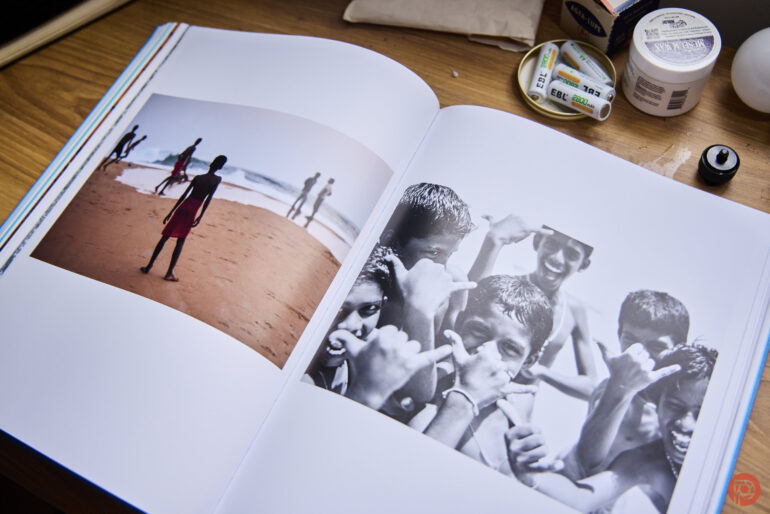
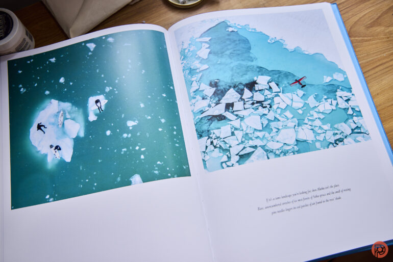
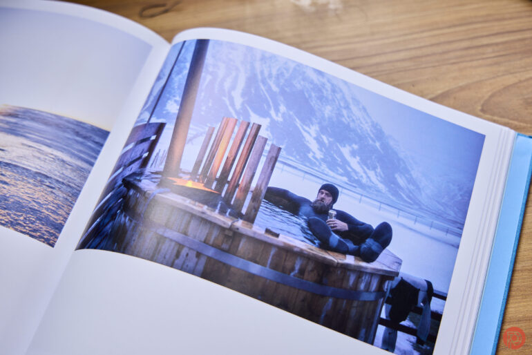
It starts with the curation. Chris’s work in this book is beautiful, and I haven’t seen lots of it before. But the choices don’t lend themselves to the layout and the orientation of the book. Those choices should’ve either been totally substituted for other photos. But The Oceans is portrait-oriented and, therefore, vertically oriented. This results in lots of photos either being fairly small with too much white space or lots of the photographs being split right down the middle. Chris’s photographs deserve to take up the entire space of the paper or even to have a little bit of a white border. Instead, they’re squished into the middle as you turn the pages or they’re split down the center. The interruptions of the book seam feel like having someone play third-wheel on a date.
It’s maddening to the point of my wanting to direct disappointment at the production artist. And if I saw it before final print, I’d be angry about it.
As I went through the book, I had another major question in mind: were these images ever made with the intention to print? Hear me out on this: years ago, photographers shot with the intention of the print. For that reason, they also shot on specific formats. Hasselblad cameras — with their square format — were important to that. So, too, was the 6×7 format and how it was used for headshots. You can easily say that images can be adapted to the printed form. But the layout of the images, as well as the selection of the photographs, don’t lend themselves to that.
In and of itself, the book doesn’t suck. It’s very awfully laid out. And that’s where I’m torn. The images are beautiful — especially in the right lighting such as by the window on a cloudy day. But the layout breaks my heart enough to make me not want to talk about the book all that much. If you’re a fan of Chris’s work, get the book. But I hope that in the future, they do a better job.


Get rid of the ads!
Did you enjoy reading this article as much as we enjoyed writing it? There's a way to support us and our reporting, getting ad-free navigation and more as a bonus. Subscribe to us for less than a coffee per month —just $3.99— or take advantage of our yearly subscription with a hefty discount for only $25.- An ad-free experience
- A free mystery box for Lightroom or Capture One
- All the books in our store
- 20% discount on Capture One
- 30% discount on Imalume Photo Theft Protection
- 20% off Herbs and Kettle Tea Company.