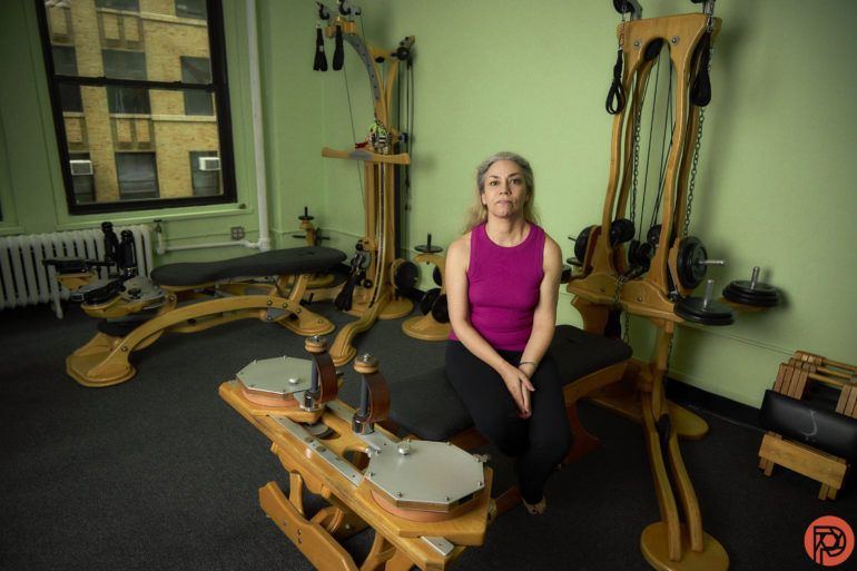
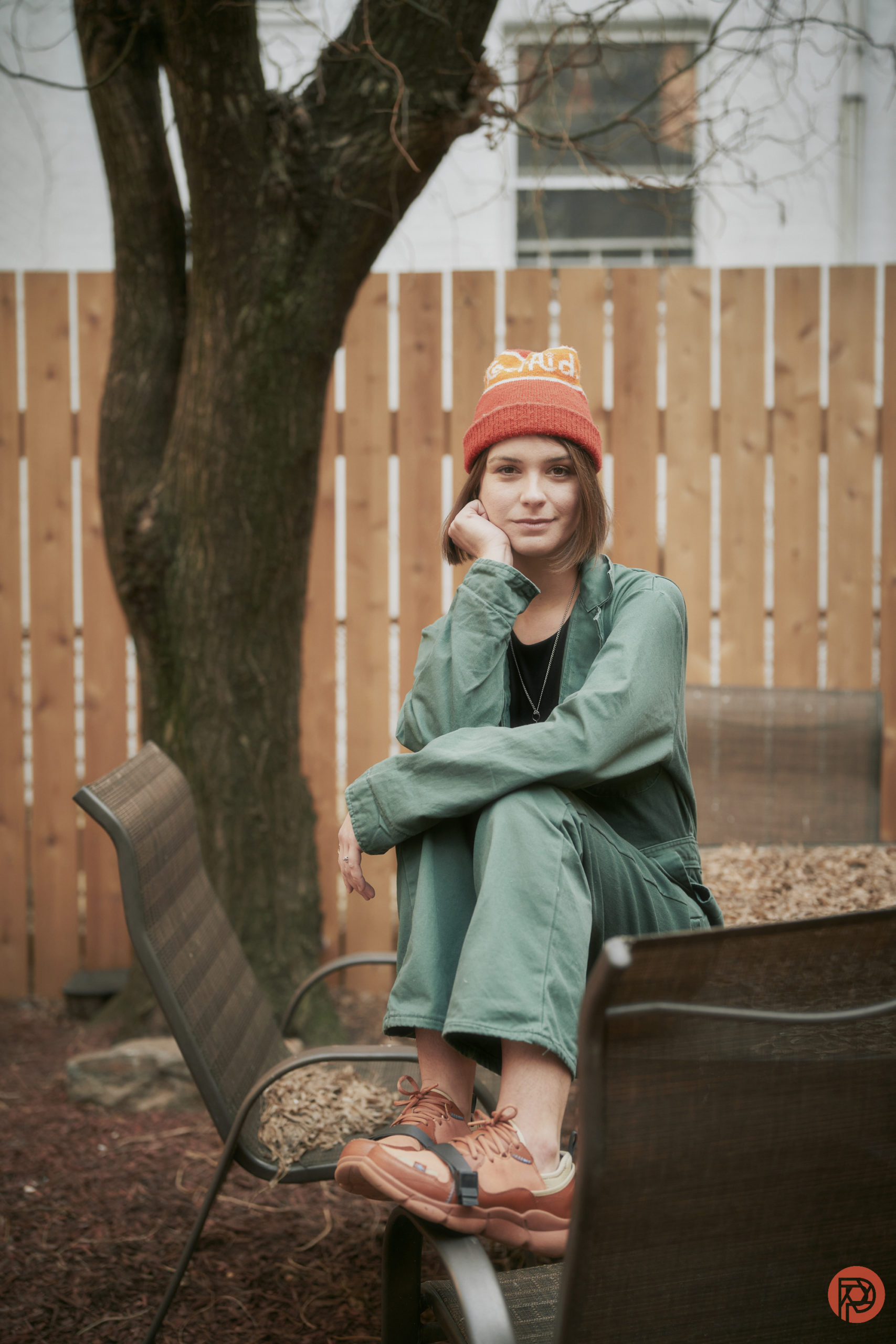
Every photographer knows that the colors black, gray, and white can go with everything. In fact, there’s a joke about photographers and NYers only ever wearing the color black. Truly, they’re just easy colors to work with in so many different ways. But there’s another color that I think every photographer completely underestimates: green. Some folks may not like it. And a lot of photographers may not ever give it any thought. Green is the ultimate color in so many different ways. Don’t believe us? Well, just look at nature.
The inspiration for this article comes from both fashion and nature. If you look at the color spectrum, green is right in the middle of ROYGBIV. So green can go with pretty much any color as it’s right in the center. And this is confirmed by nature. Here are a bunch of examples:
- Green and red go together for roses, watermelons, and other plants.
- Green and orange go together for trees, tulips, parrots, etc.
- Green and yellow go together with flowers and trees like bananas.
- Green and blue go together by looking at rivers and how greenery is often right besides the waterfronts.
- Indigo pairs with green because of natural flowers.
- Violet, well, look at violet flowers!

Because these colors go so well together in nature, they just make sense to go well together in photography. And so you can use this in portraiture, surreal photography, conceptual photography, product photography, and more. Lots of photographers think of green screens to replace things that you’d randomly see in a background. But we’re talking about organically using the color green in photography.
Here’s a list of photographers that we’ve featured that use the color green really well:
- Tom Hegan: his aerial photos of gardens showcase how green blends together so well with various other colors.
- Michael Schauer: Shows how green works well in nature
- Sydni Indman: shows how green works very well in conceptual portraiture.
So why is all this important? Well, there’s the 3 color portrait rule that helps photographers keep their portraits simpler and easier to make look more aesthetically pleasing. Though we can say that those rules are probably about to get broken really hard due to how AI is generating photos. Photographers are going to need to respond quite differently and start creating in totally different ways.
What’s the 3 Color portrait photography rule? Essentially, it means that you’re working with three main colors in the scene: the subject’s skin, the background, and the wardrobe. This makes the image much easier on the eyes to digest. And there are a myriad of ways that you can make this combination.
There are also ideas of composing by color, which says that the eye more or less ignores the color black. But maybe you can use the color green more often as a replacement for the color black.
Still confused? Well, here are a few ideas that we think you can and should try:
- Use green lights in a scene and then combine them with motion blur.
- Use green as a backdrop or with cloth in your next product photo shoot
- Use green lights to add separation when shooting a portrait subject
Truly this list could go on and on, but you have to find ways to break the rules of photography and stop making it all about clinical sharpness. Go out there and just play. Mess around with various other colors, or even try messing with things like green food coloring. We don’t want to dictate your creativity at all.
If you head to Behance, search by photography, and then sort by the color green, there are tons of ideas. You just need to put your own spin on them.


