
Last Updated on 08/31/2020 by Mark Beckenbach
Every photographer loves the Pastel look: here’s how to get it.
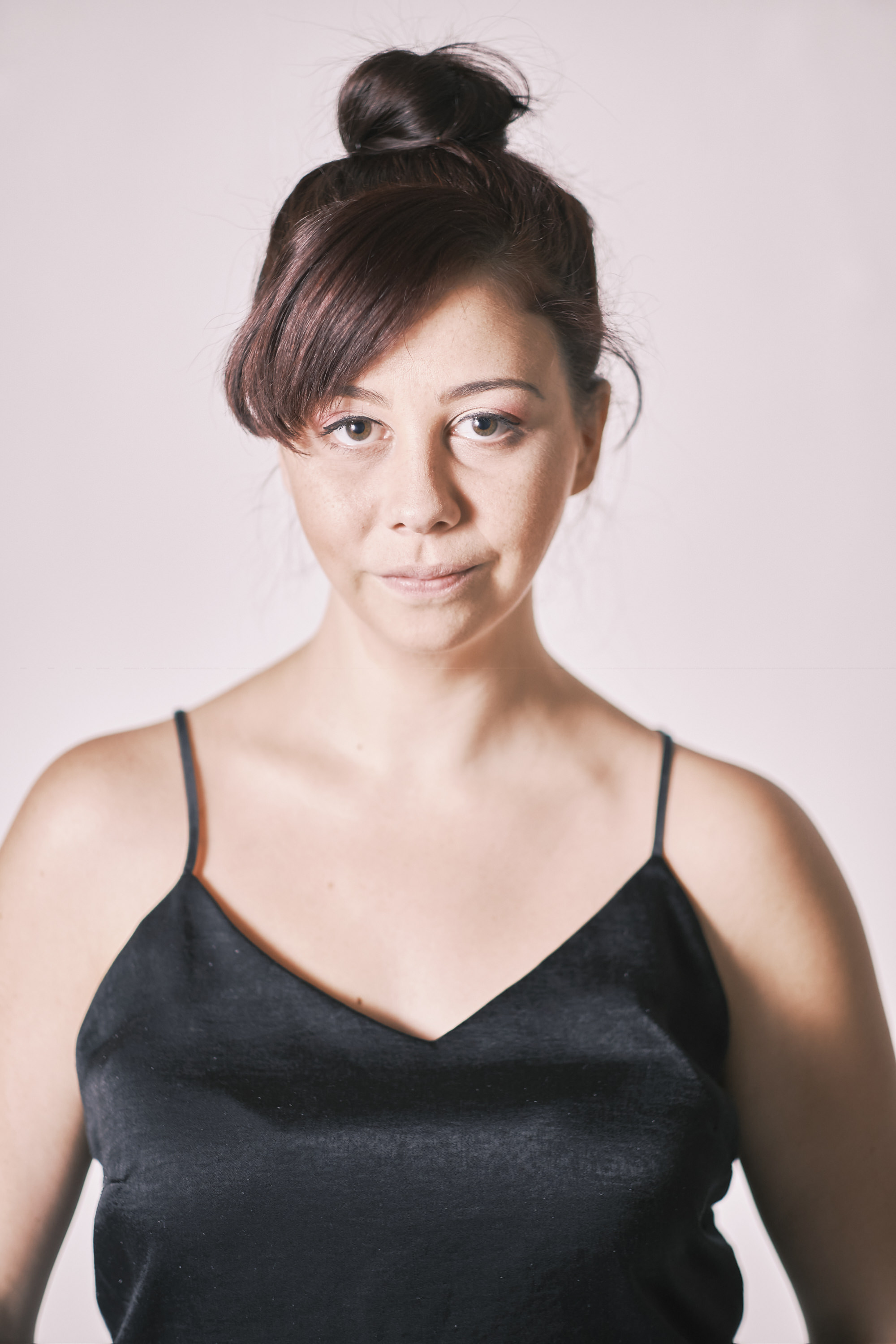
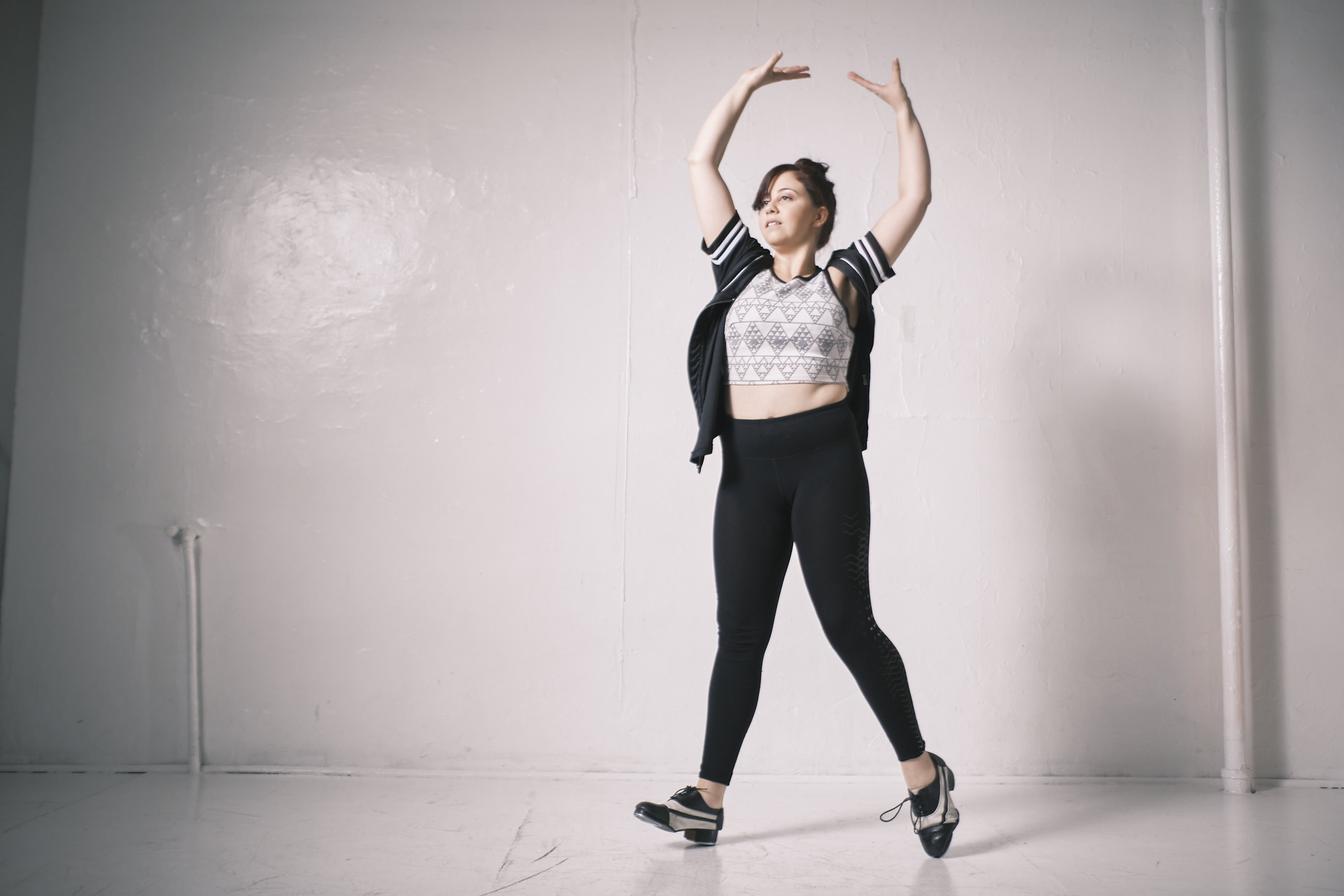
We get it–you’re one of those photographers who love the film look, but you don’t want to shoot film. First off, I’ll be the first to tell you that shooting film is about much more than just the final image. But, if you’re looking to get only that same quality, it’s a bit tricky. A part of it is done to taste, but we know how to get you there pretty much 90% of the way. This method works no matter what Fujifilm camera you’re using. However, you’re going to get better results with the later sensor offerings. But if you’re looking to have that beautiful pastel look in your photos, then read on.
First Off, It Won’t Always Look Great
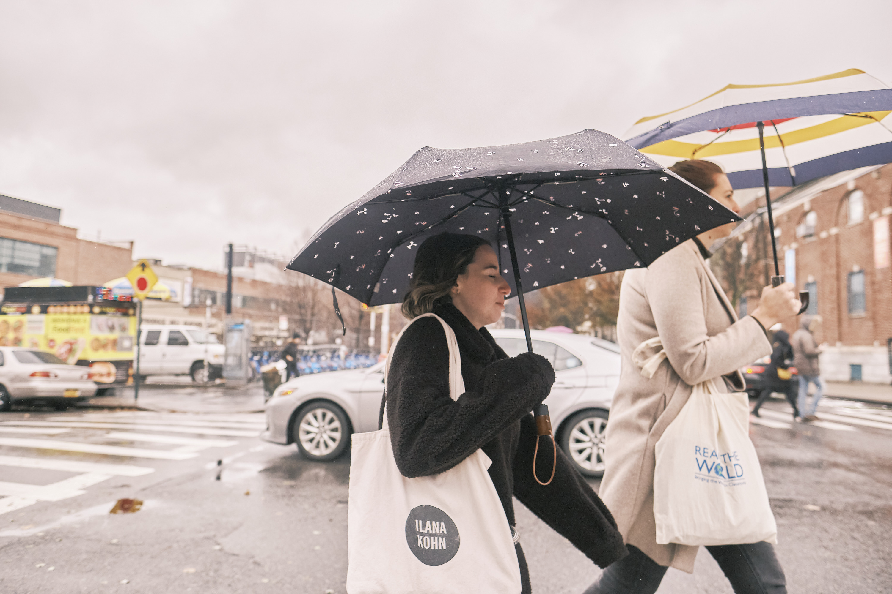
Let’s start this off with perhaps the most significant thing; the Pastel look doesn’t look good for everything. It’s all about an aesthetic and a feel. Sometimes, you need to think ahead a whole lot. You need to think about this in a similar vein as you would with stuff like black and white. Not every photo looks good in black and white. And not every image will look great in Pastel (at least not until you tweak it). But even so, that might be difficult. For example, I don’t think I’d ever shoot our product images in Pastel, but I’d totally do a portrait with that method.
Overexpose the Image
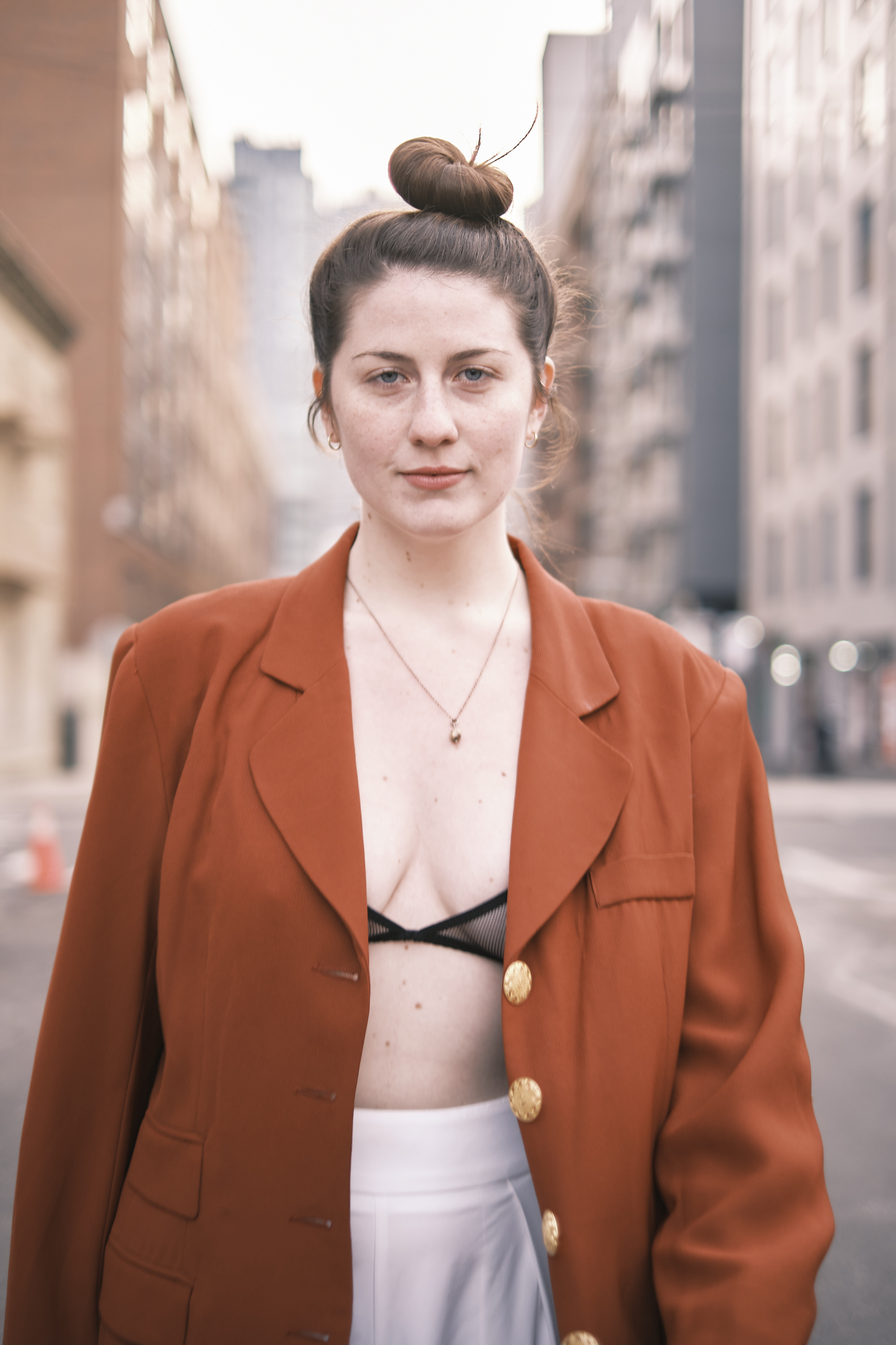
To start, you’ll need to overexpose the photo. Fujifilm sensors are excellent, so you can do it in-camera if you’d like or work on that in post-production. But you’ll be overexposing the image to negate a bit of the saturation in the scene. These images have a very muted tone to them. So overexposing the scene by 1.5 stops is a great place to start. Specifically, I’d say work with spot metering and your subject matter. If you care most about a portrait subject, then meter for their skin. Of course, this is a starting point. But it’s a great one. It’s also much easier to do than the raise the luminance of every color channel.
Boosting the shadows helps here too!
Fun Fact: When shooting this in film, you also overexpose the film quite a bit.
A Mid Range of Tones
One often thinks of clarity with mid-range, but that’s not what we’re talking about here: we’re talking about white balance. You want to stay in the middle. I’d go no cooler than 3200K and no warmer than 7100K. The most ideal spots for this filmic look are at 5200K and 3200K. But you can adjust this to taste. Sometimes the cooler pastel look is more attractive than the warmer look.
Pro Tip: If you have Classic Negative, start with that. Otherwise, HiContrast Negative or Standard Negative may be the way to go.
Less Contrast
Less contrast is super important here. Lots of modern photographers love to add lots of it. But you’re taking that idea and slapping it in the face. The Pastel look embraces a low contrast film look. So if anything, I’d lower the contrast all the way and work with the white and black levels individually.
Less Clarity, More Sharpness
Clarity doesn’t really do a whole lot to this look. In fact, I’d say that it takes away from it. The Pastel look is supposed to be soft. Instead of adding the extra mid-tone crunchiness that clarity affords you, use actual sharpness instead.
Dynamic Range
The last tidbit here is about dynamic range. You’ll get a lot of it here, but you’re not going to create the look of something Trey Radcliff told you to make. Instead, you’re going to be pretty subtle about it. Embrace the fact that highlights will get blown out. Adore the fact that shadows may be lost. But at the same time, try to nerf the highlights. The Pastel look uses the incredible highlight tone rendering of the film. Arguably, it’s better than digital. Try nerfing the highlights and boosting the whites. After that, just adjust it all to taste!
Nerf lights and boost whites
Get rid of the ads!
Did you enjoy reading this article as much as we enjoyed writing it? There's a way to support us and our reporting, getting ad-free navigation and more as a bonus. Subscribe to us for less than a coffee per month —just $3.99— or take advantage of our yearly subscription with a hefty discount for only $25.- An ad-free experience
- A free mystery box for Lightroom or Capture One
- All the books in our store
- 20% discount on Capture One
- 30% discount on Imalume Photo Theft Protection
- 20% off Herbs and Kettle Tea Company.
- 20% off your order from MPIX printing services.