
Color, the latest Garry Winogrand exhibit at the Brooklyn Museum, parades the great street photographer’s work for the Instagram generation.
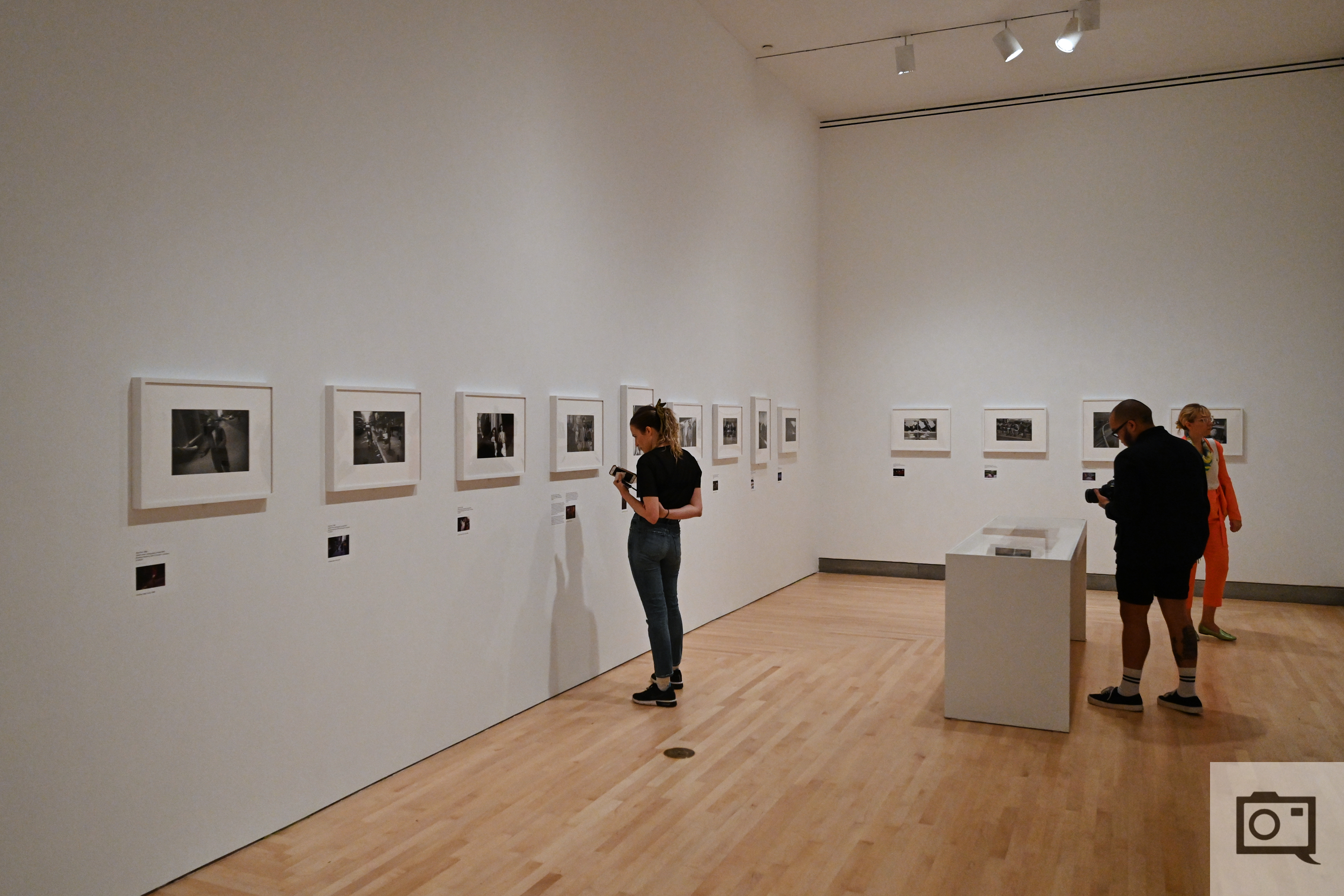
Those who head out to see the Garry Winogrand’s Color slide work at the Brooklyn Museum will most likely be photographers; and those photographers will be given a fantastic treat for most of the exhibit. While Color showcases a number of these images with incredible justice to the great street photographer, I spent some of my time in the exhibit scratching my head with a number of questions. I’ve personally had a very on and off relationship with Garry Winogrand’s work–and Color has done a lot for further selling me on his photography. While my problem with the exhibit isn’t the way that most of the images are portrayed, attendees will spend most of the time in a particular, single room.
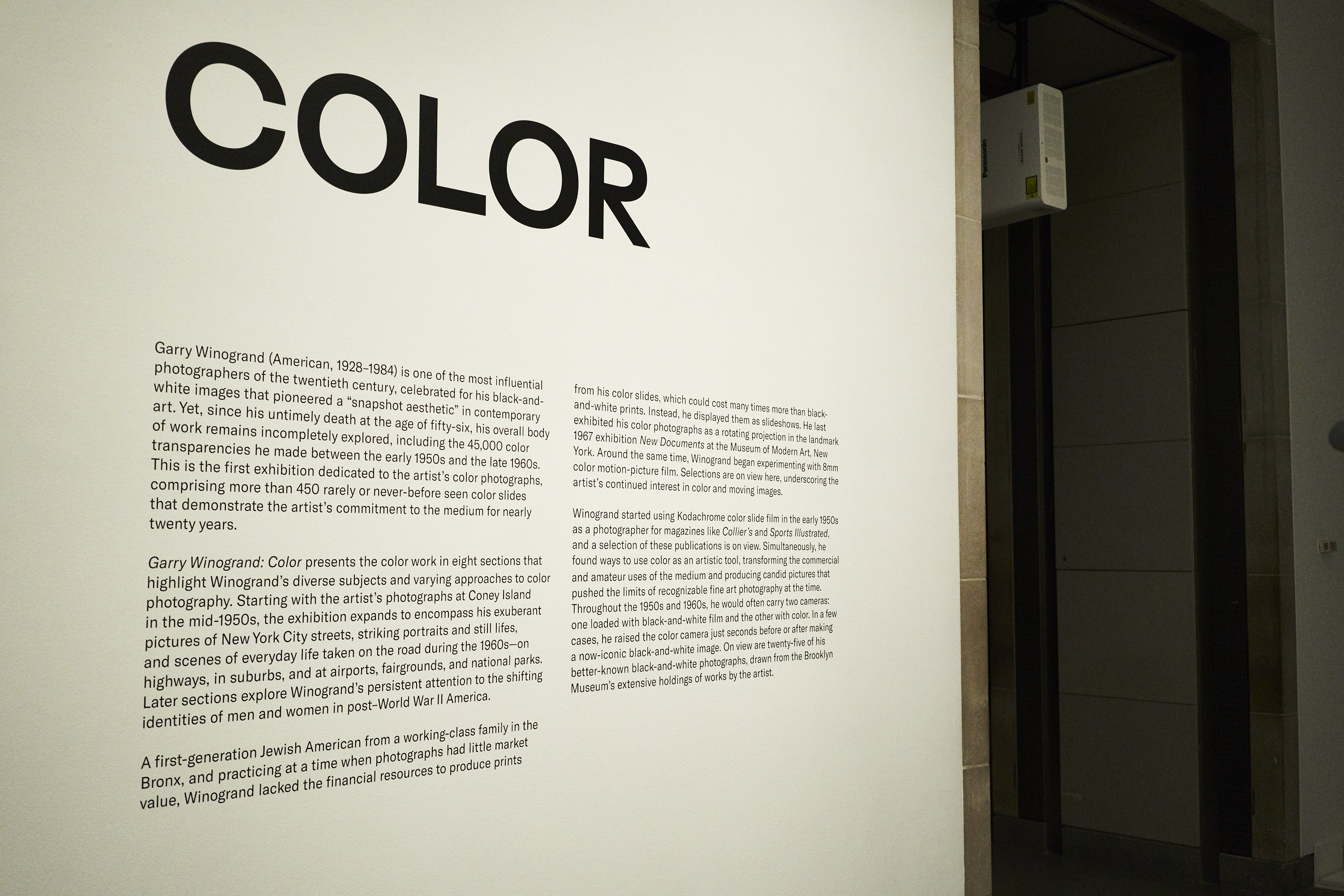
When you enter Color, you’re given a massive description of the images–which are a showing of many of his 35mm slide film photos. Garry’s most prominent work are his black and white photos but these images go even further to show off what he was able to do over the years. When you look at the images in color, you start to think about his compositions and exposures in a completely different way. Some of these images are shone on a wall via a very small projector. Quite frankly, you can skip this part of the exhibit lest you be stuck standing there for a long time awkwardly taking it in as other attendees stick around for a bit and then move on impatiently.
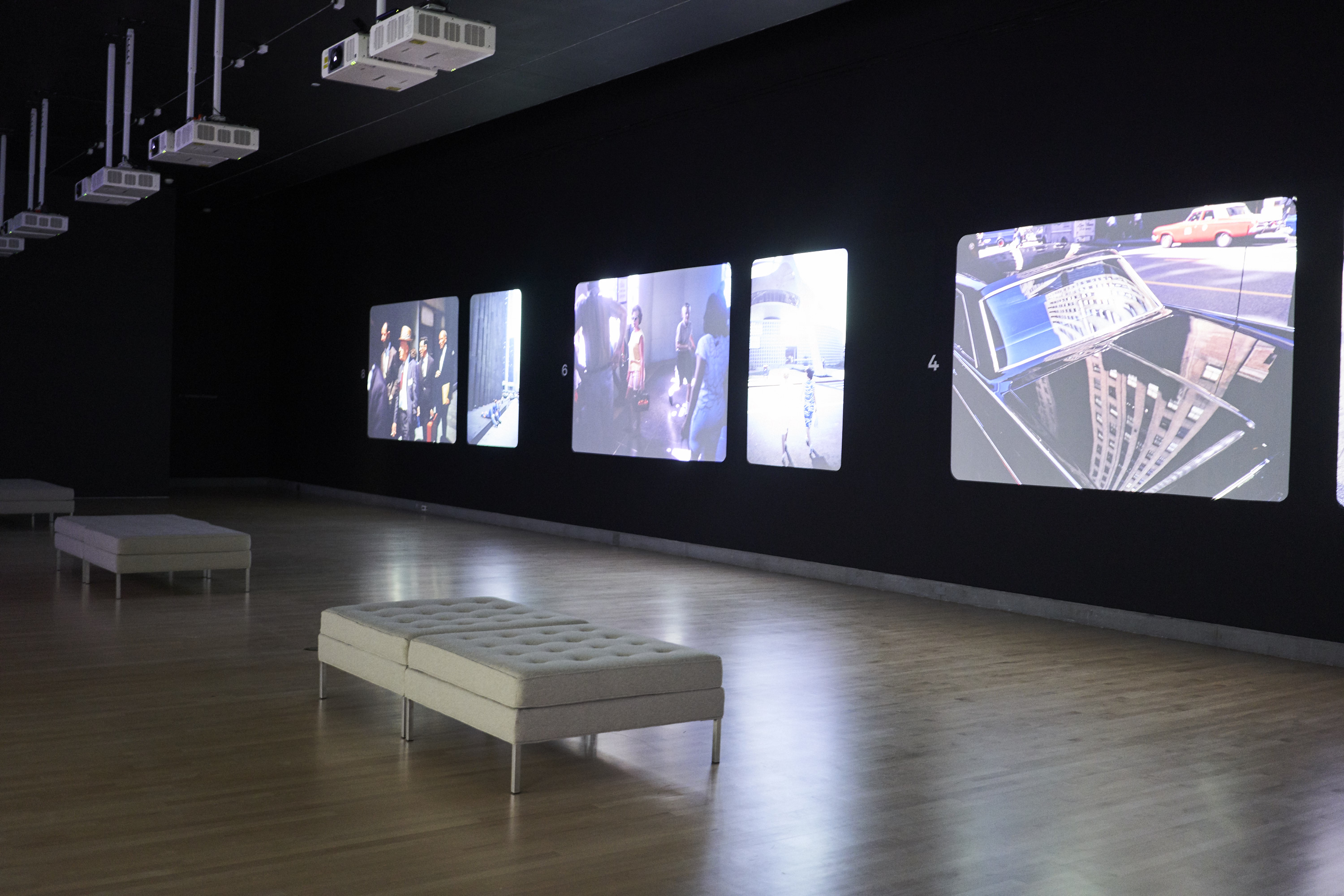

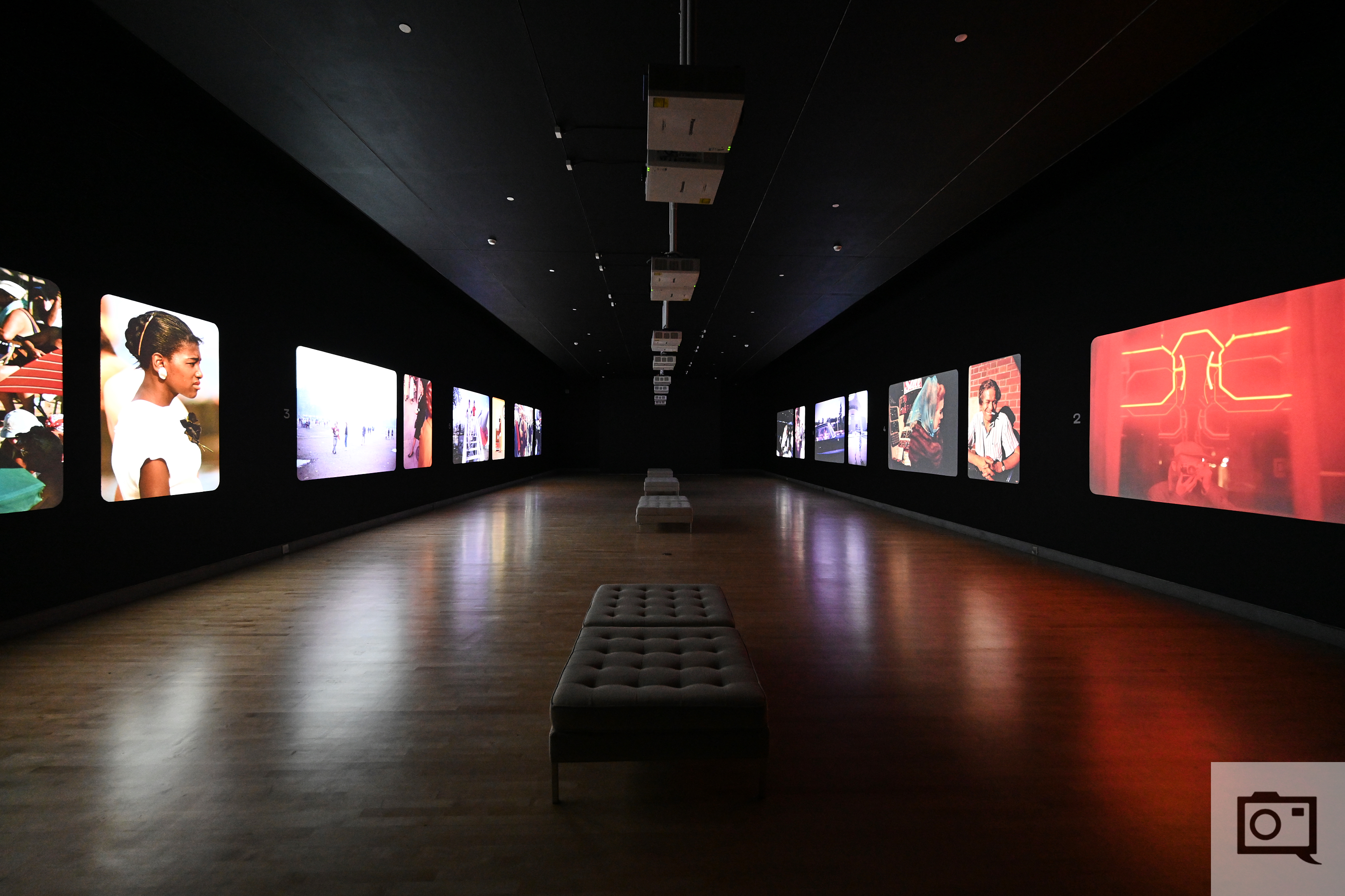
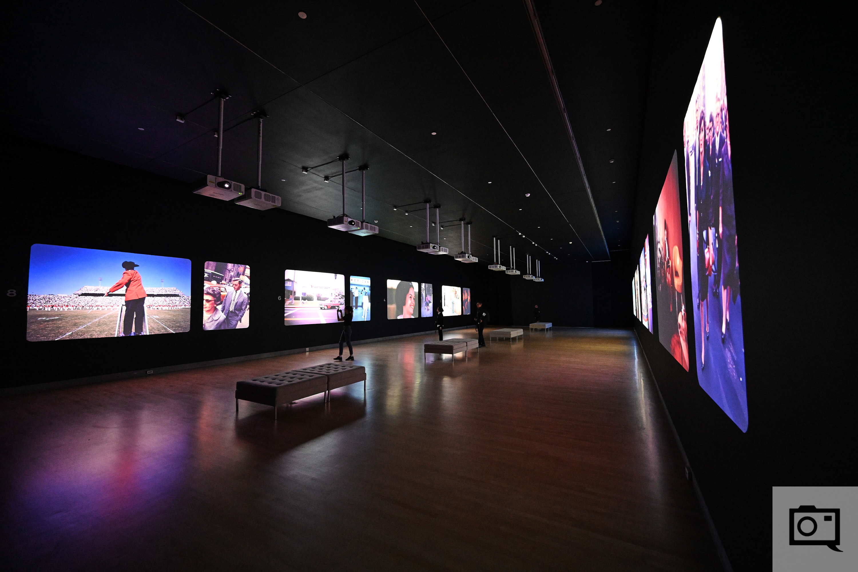
Where much of the action takes place though is in the middle room. This room is the largest of the bunch and uses projectors and a ton of darkness to really showcase Garry’s images in a lifesize fashion. This is what slides were essentially made for, and the Brooklyn Museum does incredible justice to this work. In fact, they take the prize for conveying images in a way far better than even International Center of Photography and the MoMA have done. Those New Yorkers and transplants gawk at traveling to Brooklyn will miss out; and in my opinion–good riddance! This room will be best serves with very small groups. The more people get into this room, the more chaos there will be and the more distractions and interference will happen. In fact, Reviews Editor Paul Ip suggested that the Brooklyn Museum limit the amount of people allowed in the room at a time–and I wholeheartedly agree. The last thing that I want to see next to me is a photo session happening as someone stands against the images being projected onto the wall.
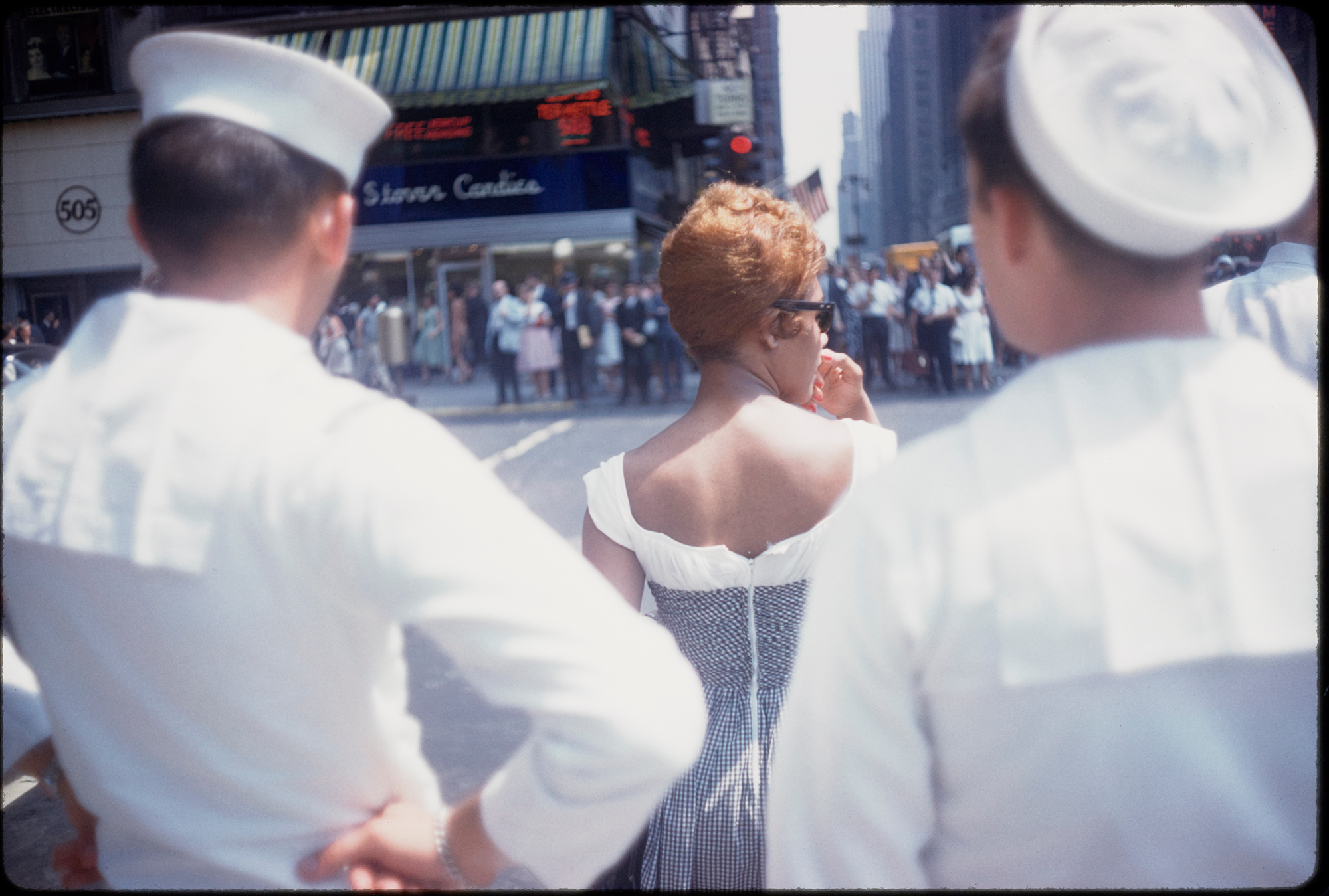
1960. 35mm color slide. Collection of the Center for Creative
Photography, The University of Arizona. © The Estate of Garry
Winogrand, courtesy Fraenkel Gallery, San Francisco
posthumous reproduction from an original 35mm transparency
This room is large and therefore designed to both accommodate a lot of people and do justice to Garry’s Color photography. There is ample seating for attendees to sit and take in the images. Many of these photos are from Coney Island, Manhattan, and other travels. While many are great, I question the curation of some of these images. A few of these photos are simply of the back of people. That brings up a big question of mine: photos of someone’s back aren’t highly regarded in the community. But simply because these images are from Garry Winogrand, does that make an otherwise mediocre image suddenly much better? Does it justify the probable five figure price tag that may be attached to a print simply because there is an image of a person’s back that Winogrand captured? These images and others at times had me scratching my head and even frustrated me. The message that this is conveying to attendees at times is that mediocrity is fine–which I strongly disagree with. In a world where tech bros are trying to develop all sorts of AI to make photography more accessible, we should be striving to use our brain and skills to create and capture better work that the old masters have. Afterall, successors should be better than their predecessors.

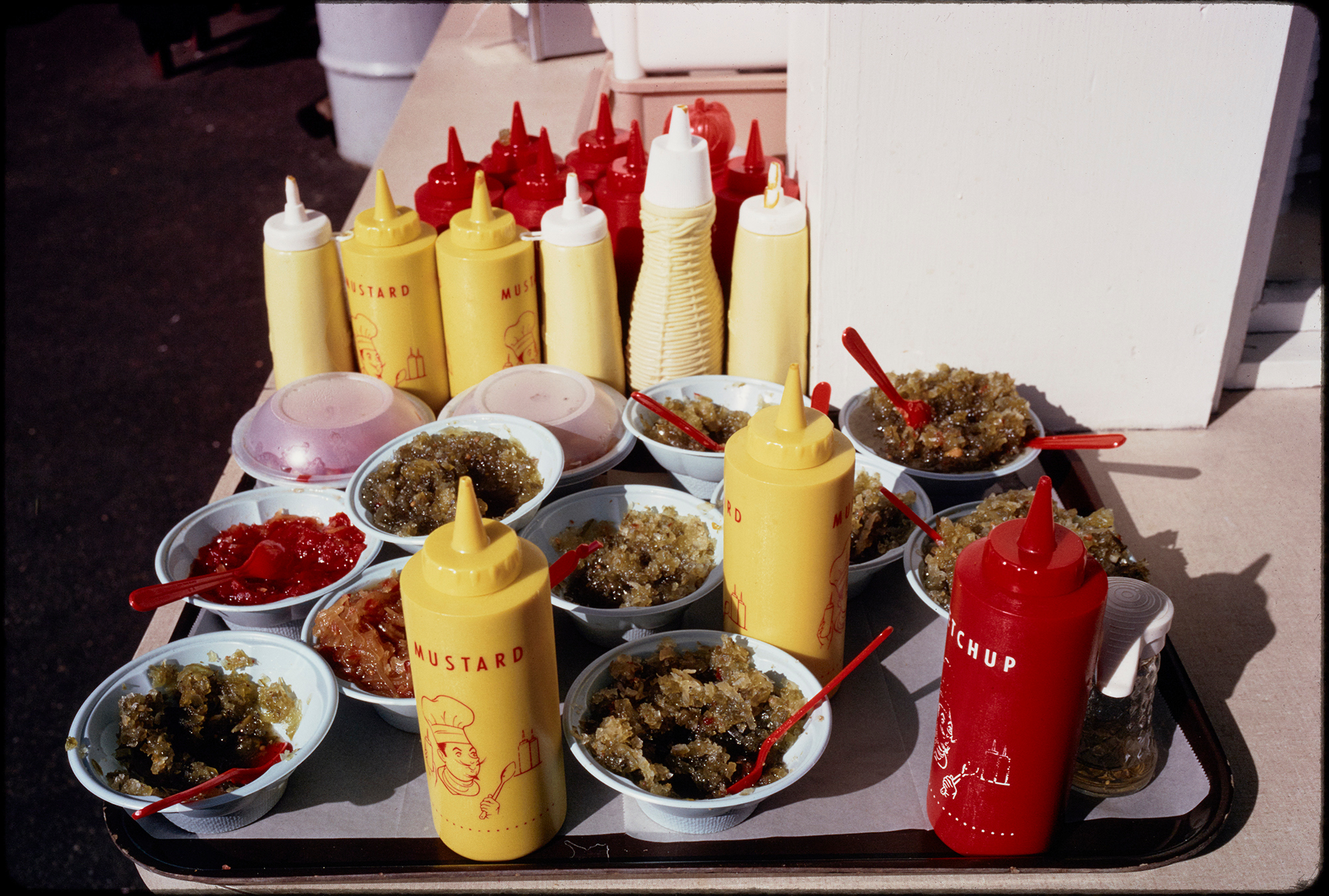
circa 1965. 35mm color slide. Collection of the Center for Creative
Photography, The University of Arizona. © The Estate of Garry
Winogrand, courtesy Fraenkel Gallery, San Francisco
posthumous reproduction from an original 35mm transparency
The last room is in some ways, completely useless. It’s a string of Garry’s work along the wall with black and white images made reasonably large and itty bitty color images made small underneath. The color photos, which are the ones you really want to see, aren’t even at eye level. So what this in turn causes the user to do is look at the eye level image and then bend down to look at the other color image. But most folks will perhaps just browse through quickly and move on. This room is also awfully lit and there are tons of reflections on the work.
35mm color slide. Collection of the Center for Creative Photography,
The University of Arizona. © The Estate of Garry Winogrand, courtesy
Fraenkel Gallery, San Francisco
posthumous reproduction from an original 35mm transparency
Overall though, I could spend an eternity in the middle room where you can look at lots of Garry’s work in a grand scale. However, I’d go on an off day–not the weekend when it’s bound to be flooded with tourists. Instead, go during a quiet time–you’ll do yourself a big favor.
All images by Garry Winogrand used with permission. Garry Winogrand Color is at the Brooklyn Museum and will be on display until December of 2019. Additional images by Paul Ip.
Lead Image Caption:
Garry Winogrand (American, 1928-1984). Untitled (New York),
circa 1965. 35mm color slide. Collection of the Center for Creative Photography, The University of Arizona. © The Estate of Garry Winogrand, courtesy Fraenkel Gallery, San Francisco
posthumous reproduction from an original 35mm transparency
Get rid of the ads!
Did you enjoy reading this article as much as we enjoyed writing it? There's a way to support us and our reporting, getting ad-free navigation and more as a bonus. Subscribe to us for less than a coffee per month —just $3.99— or take advantage of our yearly subscription with a hefty discount for only $25.- An ad-free experience
- A free mystery box for Lightroom or Capture One
- All the books in our store
- 20% discount on Capture One
- 30% discount on Imalume Photo Theft Protection
- 20% off Herbs and Kettle Tea Company.