
Last Updated on 04/12/2018 by Mark Beckenbach
If you’re an amateur photographer, don’t worry about things like image grain too much
Image grain and sharpness are two things in the photo community that, when you get into the more old school circles of thinking, is frowned upon. You’ll always hear, “You should’ve gotten it in focus,” or, “You should’ve shot at a lower ISO setting.” It’s ingrained (pun intended) into the heads of so many photographers out there and that mentality continues to spread to others. But the truth is the technical matters of a photo are second to the subject matter.
Let’s visit some examples of this:
- Every film made before IMAX and even HD video still looks great and Pulp Fiction will always be Pulp Fiction. It’s still a fantastic film.
- The photographers of Magnum have all shot great images that still stand out even today.
- Photographers such as those who shot classic concert images created images that didn’t necessarily become terrible because time went on and someone may have done something better. They’re still great images.
Why? Why does all this make sense? It’s because of the content. If you’re able to capture a moment that’s very heart warming and can put a smile on someone’s face, then they’re bound to care about that image much more than they would something else. Content is king and always will be. Now, that means the subject matter still needs to be clearly visible; but it doesn’t need to be 100% visible. If a face is very slightly out of focus that can work well enough most of the time.
These arguments and ideas are what I like to call petty problems. These petty problems are typically manufactured rules that work in theory, but there are times when they can be broken and exceptions can be made. I’ll list for you below a number of petty things folks may say.
“Why is the sky blown out?”
“Uggghhhh, why is this so grainy?”

“Why did you blow out the sky?”
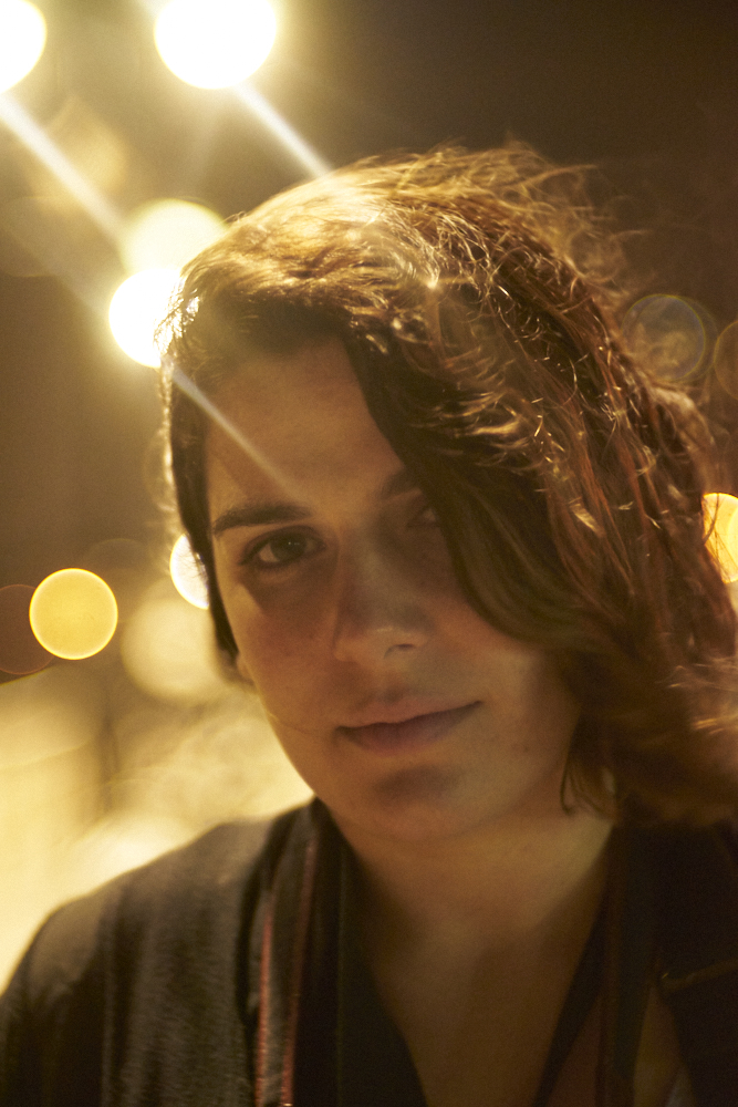
“Why is there lens flare?”

“Why is there image grain?”
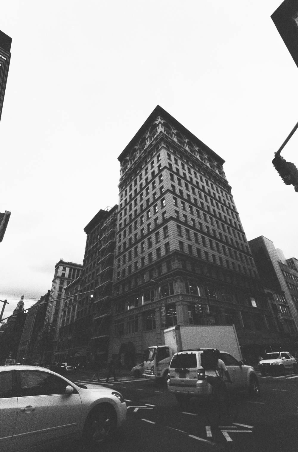
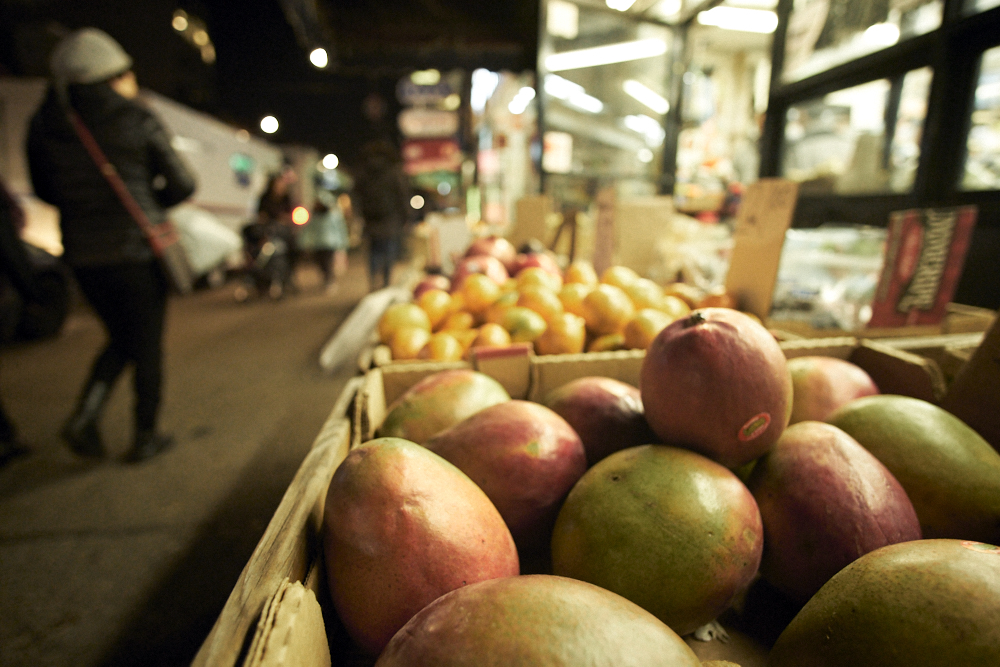
In all honesty, no one cares about any of these arguments when they look at it as a print or on a small scale device such as a phone or a laptop. They only care about these things when they enlarge them at 100%. The images above are a mixture of alright and mediocre content. And more than anything, that’s what’s making the image not so great. But let’s take a look at some better images.
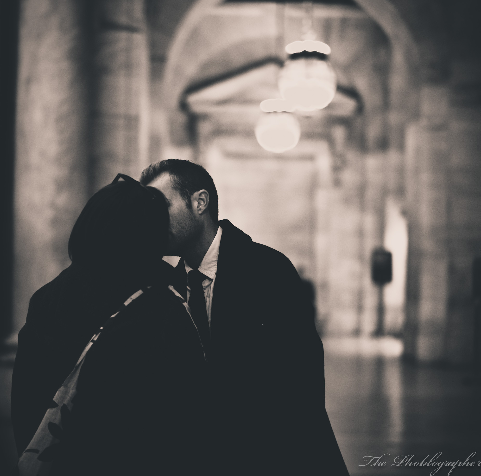
It’s easy for someone to sit there and complain about the following:
- It’s black and white
- It’s sepia
- Their coats are so dark
- It’s a square photo
In reality, the black and white is being used because the colors aren’t important, the black and white emphasizes the coasts being dark and forces you to pay more attention to what’s happening, and the square composition places them in just the right spot. So artistically, the photo works for many reasons. But many of those made up ideas and conventions are often the concoctions of a select few who wanted to dictate what should and shouldn’t work. It’s often a result of wanting to stay on top of others and in control.
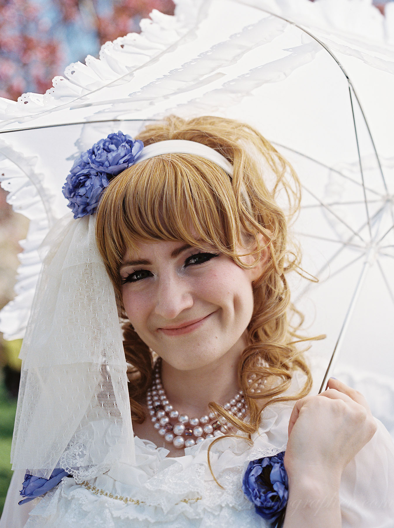
Someone that sees this image is bound to ask, “Oh, well why are the highlights blown out?” And the response is, “Who cares?” Look at the rest of the portrait and focus on the person.
In the same way that a set designer may create a scene and put a major emphasis on just the subjects (the content), you’ll want to do that for your images.
Get rid of the ads!
Did you enjoy reading this article as much as we enjoyed writing it? There's a way to support us and our reporting, getting ad-free navigation and more as a bonus. Subscribe to us for less than a coffee per month —just $3.99— or take advantage of our yearly subscription with a hefty discount for only $25.- An ad-free experience
- A free mystery box for Lightroom or Capture One
- All the books in our store
- 20% discount on Capture One
- 30% discount on Imalume Photo Theft Protection
- 20% off Herbs and Kettle Tea Company.
- 20% off your order from MPIX printing services.
- 5% off Viltrox Products via their eCommerce store.
- 10% off all film developing, printing and scanning services from Blue Moon Camera and Machine
- 15% off 7Artisans products: The lens and accessory maker is offering a sweet discount for Phoblographer's readers.