
Last Updated on 07/15/2024 by Chris Gampat
Where I Find Myself by Joel Meyerowitz is a mixed bag of heartstopping and confusion
Where I Find Myself by Joel Meyerowitz was sent in for review to me a while ago, and I put off writing about it until I had the time to sit down and take the work in. It’s Joel afterall, and his work deserves some serious contemplation and thought. Where I Find Myself is thick, and contains a lot of Meyerowitz’s life’s work. It is designed to be a beautiful coffee table book for everyone who is a fan of the photographer. While it has a whole lot of good, there is also a whole lot of bad–or more importantly, a lot of injustice I feel is done to the great photographer’s work.
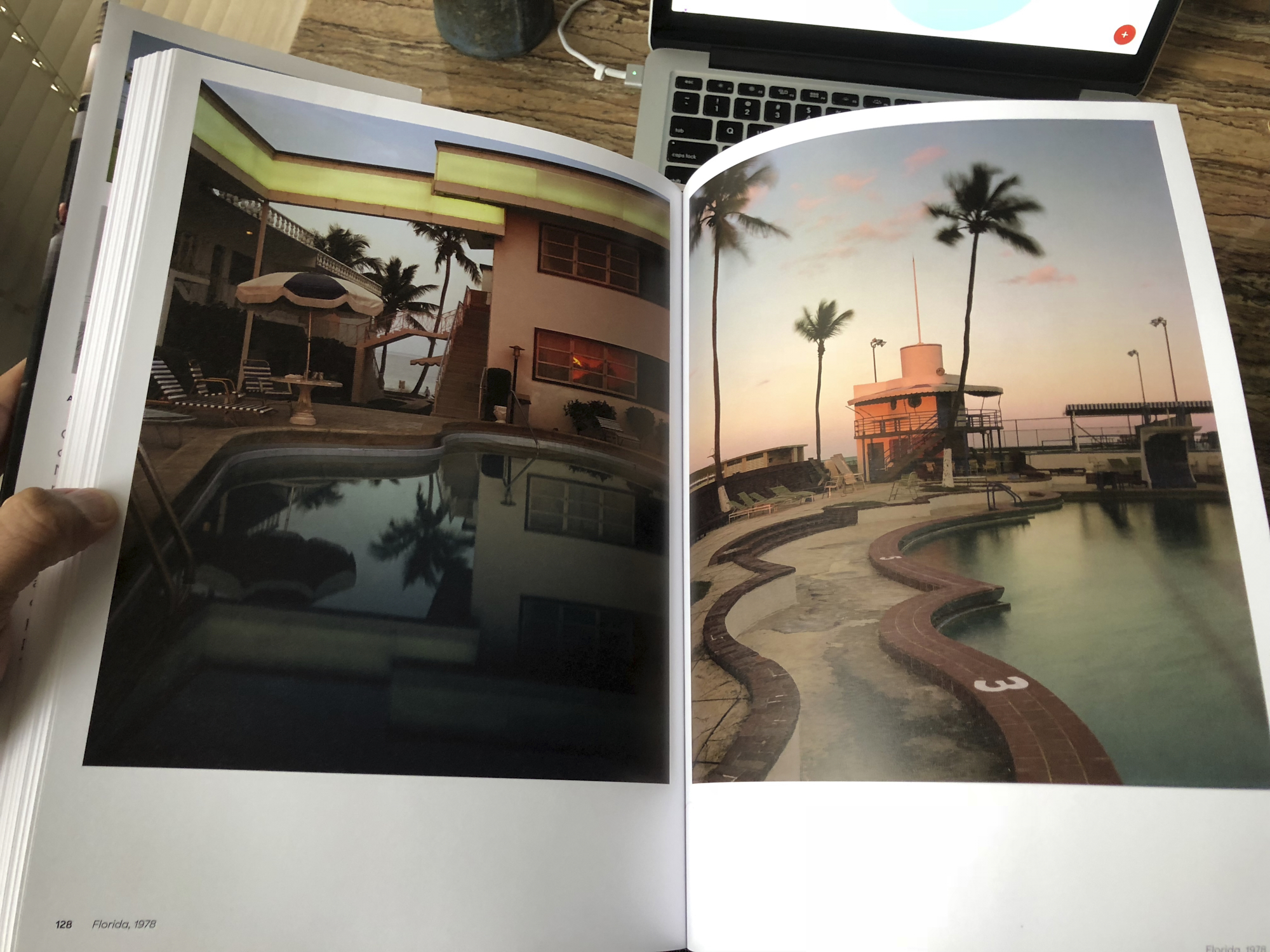
Where I Find Myself starts out with a combination of his more famous works and some photographs we wouldn’t necessarily know were made by Joel. There are landscapes, his coverage of the fall of the World Trade Center, and more landscapes. At times it feels like an incredibly slow Japanese horror movie: it takes awhile for the book to really get good and inspiring.
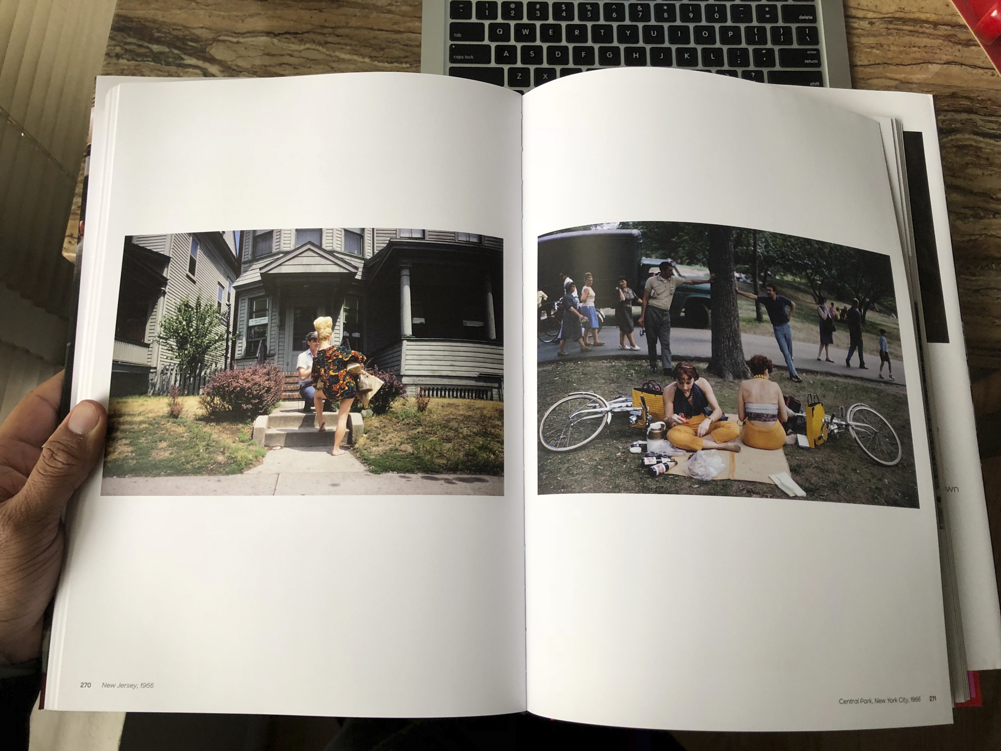
Before I go on, these images are from Joel Meyerowitz. Quite obviously there are some fantastic images in this book: the most fantastic being ones that he’s famous for. But when it comes to other images, I wonder how the curation of these photos went in addition to the pagination, arrangement, and how the editors decided to actually put them in the book. The landscapes for example are a mix of both fantastic and blah: when you look at some of them they don’t seem to have that signature Joel Meyerowitz feel to them. What makes things worse is how they’re arranged and placed in the book. Editors who choose to put landscape images across two pages with a massive seam in the middle (such as the case with this book) should genuinely reconsider the way they do their jobs. I’ve felt this way and heard others speak about it, and when it came to putting together my own book, I understood it even more.

Accompanying many of these landscapes and other photos is text written in perhaps the smallest font I’ve ever seen. With that said, it doesn’t really help the text that these images are on a matte paper with just a bit of sheen to them. However, said paper helps the images quite a bit. With that in mind, I strongly recommend viewing the book under soft, diffused light near a window. Additionally, I really wish that the text were larger in spots like this.
What doesn’t help the images is the shape and size of the book. To have made this book better, I believe that it should have been square. This would give the most balance to the portrait style images and the landscape style images of Joel’s.
Further, the book features many of Joel’s projects over the years, but they’re presented without any major rhyme or reason except that it is in reverse chronological order. For me, I’m not sure this makes for the best experience as you progress through the book. You’ll go from the World Trade Center to landscapes, to portraits, to cities, and some sort of randomness. Combine this with the me being unsure that all the images represent how fantastic Joel is as a photographer, and I’m scratching my head even more.
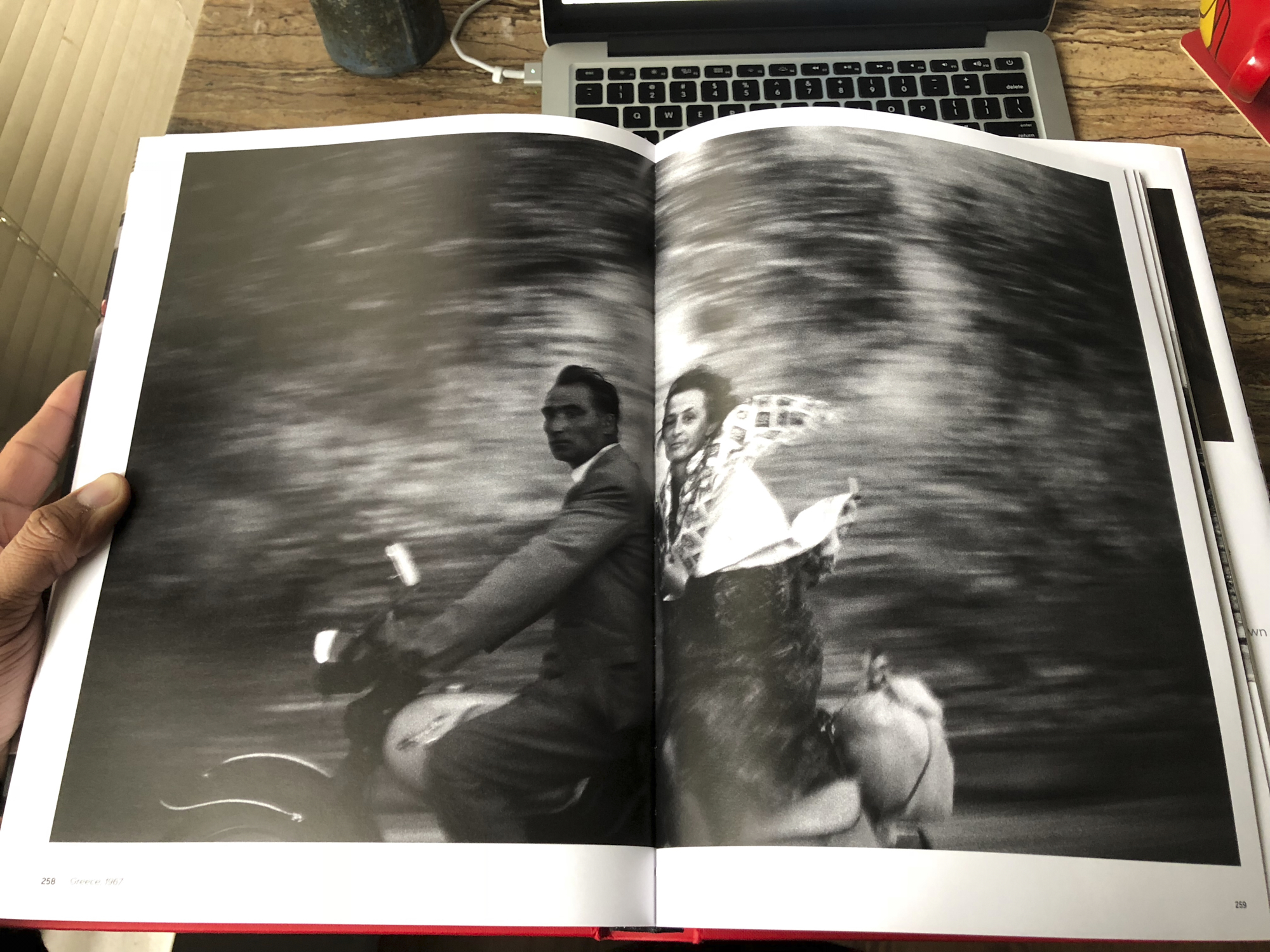
As you go through the book though, you’ll come across a number of gems such as much of Joel’s black and white street photography, his absolutely fantastic portraits (which are well worth studying), and some of his work that looks otherwise, well, pedestrian. There are a number of images in here that, when you look at them, you’ll say to yourself, “I could’ve shot that.” And in truth, you didn’t shoot it. But then there are lots of images none of us could have gotten. Besides the World Trade Center series, that work is presented in the street photography that is put forward in Where I Find Myself.
Where I Find Myself by Joel Meyerowitz can be had on Amazon for around $51. Given what I know about printing, I think that is well worth it: in fact, it’s a steal. But at the same time, I’m not sure that it’s putting most of Joel’s best work forward in the best light.
Get rid of the ads!
Did you enjoy reading this article as much as we enjoyed writing it? There's a way to support us and our reporting, getting ad-free navigation and more as a bonus. Subscribe to us for less than a coffee per month —just $3.99— or take advantage of our yearly subscription with a hefty discount for only $25.- An ad-free experience
- A free mystery box for Lightroom or Capture One
- All the books in our store
- 20% discount on Capture One
- 30% discount on Imalume Photo Theft Protection
- 20% off Herbs and Kettle Tea Company.
- 20% off your order from MPIX printing services.
- 5% off Viltrox Products via their eCommerce store.
- 10% off all film developing, printing and scanning services from Blue Moon Camera and Machine
- 15% off 7Artisans products: The lens and accessory maker is offering a sweet discount for Phoblographer's readers.