
Last Updated on 07/19/2016 by Chris Gampat
Hey folks, we’ve finally got the winner of our Natural Light Portrait mission with EyeEm! Before I go on, I recommend that you download their app and give it a bit of exploring. You’ll find that you may like it more than Instagram when it comes to working with actual creatives.
The Winning image is the lead photo for this article and it’s by photographer Carl Jeffers. Congrats! Shoot us an email at editors[at]thephoblographer[dot]com for an interview, though we’ll try to reach out to you too.
Our runners up and the reasons why we chose them are also after the jump.
Winner
Carl’s photo is an incredible one that in many ways breaks the typical rules of composition. It chooses to center the subject but instead of using traditional lines to make the eyes go to a subject, it uses colors and lighting effectively to do so.
For this reason, Carl’s photo is the winner.
Runners Up
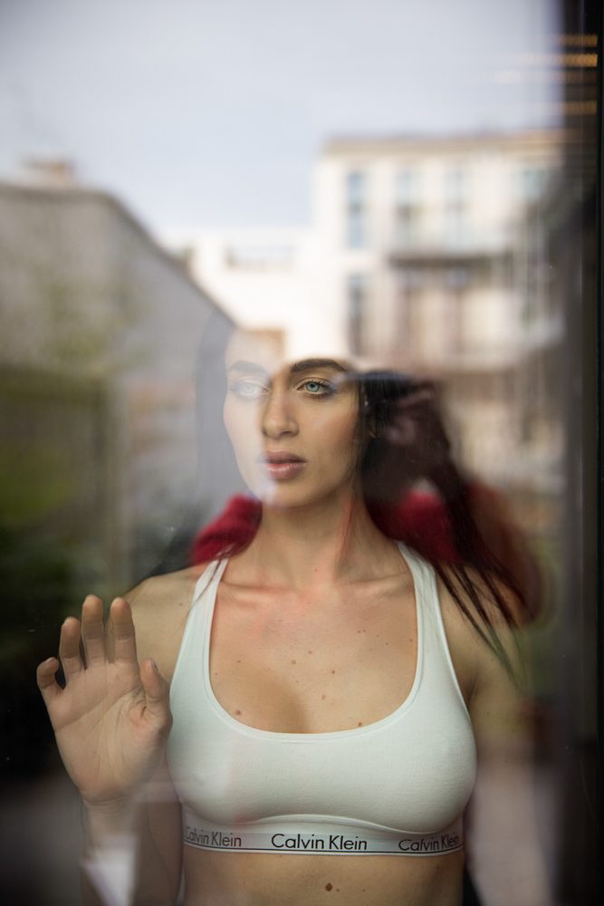
This image by Gilbert is an interesting on that plays with the ideas of colors, layers and composition. We see that the woman is behind glass. We also see a reflection of what she is looking at, but only a bit of it. Then add in the way that the two frame each other and how the color details tend to stay just out of range of one another.
It’s a seriously creative and fabulous image.
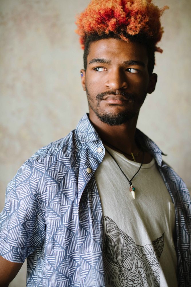
This image by Bobbi Jo Brooks is one that also uses lighting, composition, and colors very well. The image tells us a bit more about the man’s alternative styling by using composition to show off key elements like his choice of clothing, the hair, the necklace, etc. The look in his face shows slight frustration with something and he pops out of the background using both colors and depth of field.
This method is one that Steve McCurry uses often: keeping the colors simple and using an effective composition.
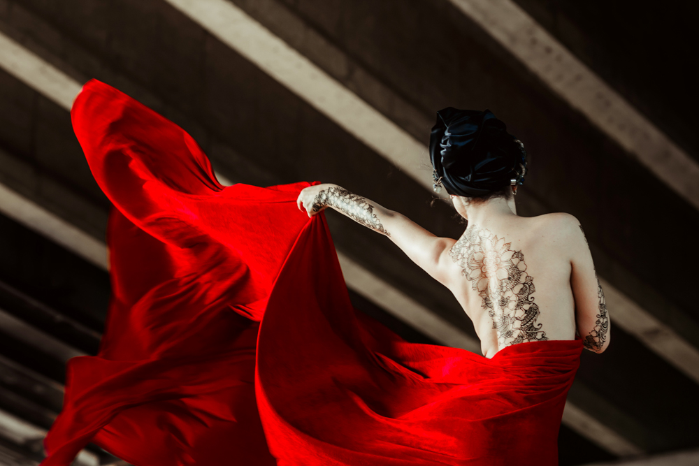
This image by Inna Art is honestly one of my favorites for the use of creative composition not only by the standard rule of thirds but also again by color. What’s really cool here is how the background has brownish/greenish/black with white going across. Then put that behind the subject whose skin tones almost match the white in the back but is given a bit more lifting with the use of effective lighting coming from camera left. What also helps to separate her are the tattoos.
Then finally, add in the red linen being thrown around and also given just enough light to really punch out and you’ve got an incredible photo.
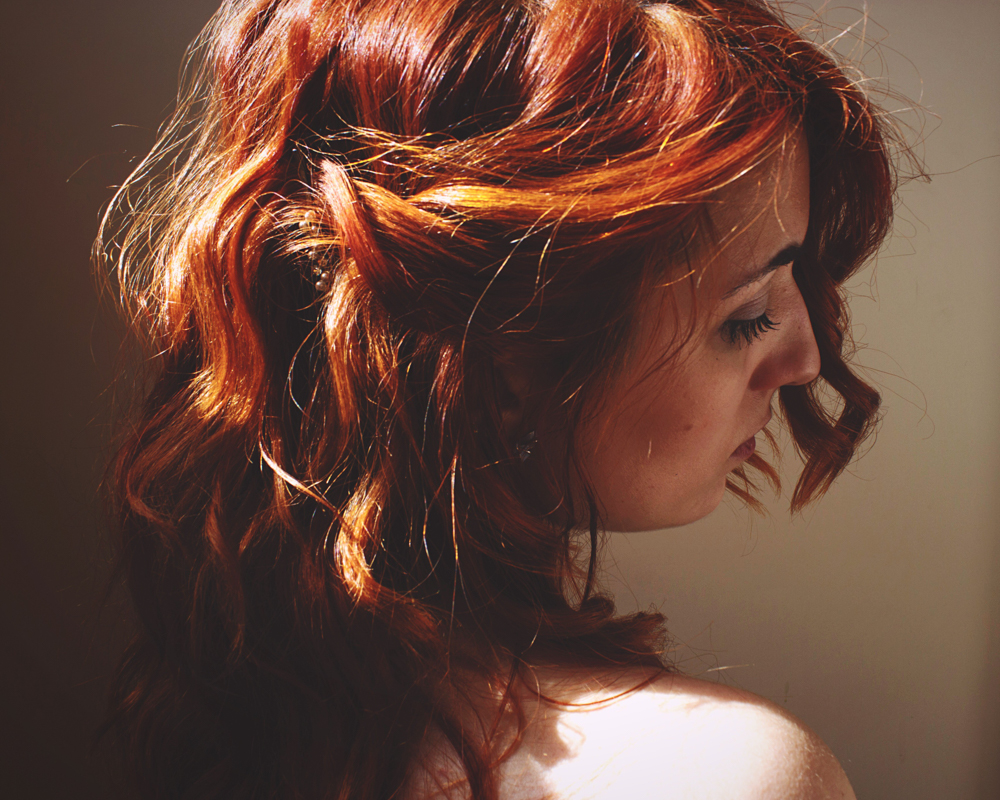
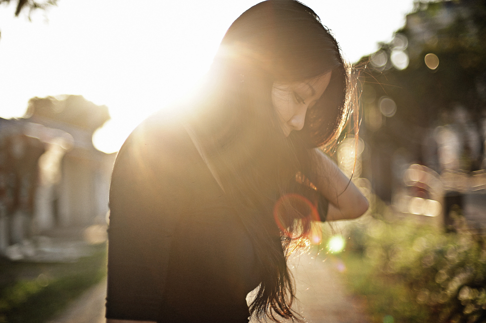
This photo by Elisa was chosen because it’s an ode to the more simple idea of portraiture but instead makes us focus on other elements of the woman like her hair. The light, textures and the fact that we don’t have any sort of connection with her eyes also adds something that’s just magnetic about the image.
Last on the list is this image by TYLim. I chose this because of the effective backlighting that gives us light on not only the subject but also the surroundings. It’s an overall beautiful shot.
Get rid of the ads!
Did you enjoy reading this article as much as we enjoyed writing it? There's a way to support us and our reporting, getting ad-free navigation and more as a bonus. Subscribe to us for less than a coffee per month —just $3.99— or take advantage of our yearly subscription with a hefty discount for only $25.- An ad-free experience
- A free mystery box for Lightroom or Capture One
- All the books in our store
- 20% discount on Capture One
- 30% discount on Imalume Photo Theft Protection
- 20% off Herbs and Kettle Tea Company.
- 20% off your order from MPIX printing services.
- 5% off Viltrox Products via their eCommerce store.
- 10% off all film developing, printing and scanning services from Blue Moon Camera and Machine
- 15% off 7Artisans products: The lens and accessory maker is offering a sweet discount for Phoblographer's readers.