
Let’s be honest: people love capturing photos of tea and coffee before they enjoy them. They’re probably one of the more popular items that you see online as you peruse your various social media feeds. Both of these drinks are very personal to us all of–they elicit emotions by getting us excited, they help us out in many ways, and they mean a lot of us. If you took someone’s coffee away, then they’re bound to be miserable.
Capturing better images of that stuff though really isn’t that tough to do.
The Human Perspective
When you talk about lenses and focal lengths, it’s easy for us to get caught up and talk about the human perspective. Generally what this refers to is something like a 35mm or 50mm focal length equivalency. But that’s not what we’re talking about here. Instead, we’re talking about simply how something looks from the way humans typically look at their coffee and tea. This takes into consideration human behavior.
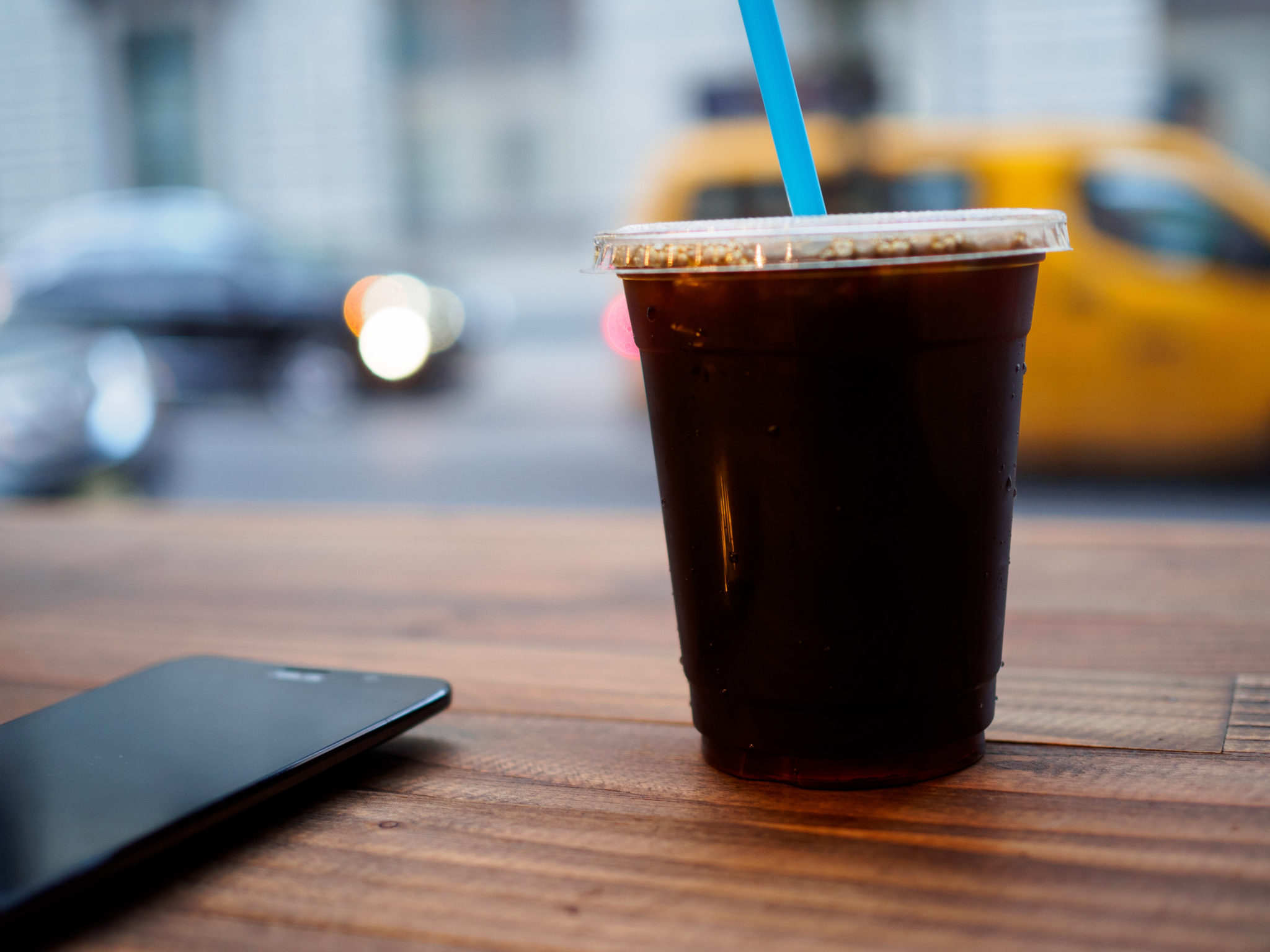
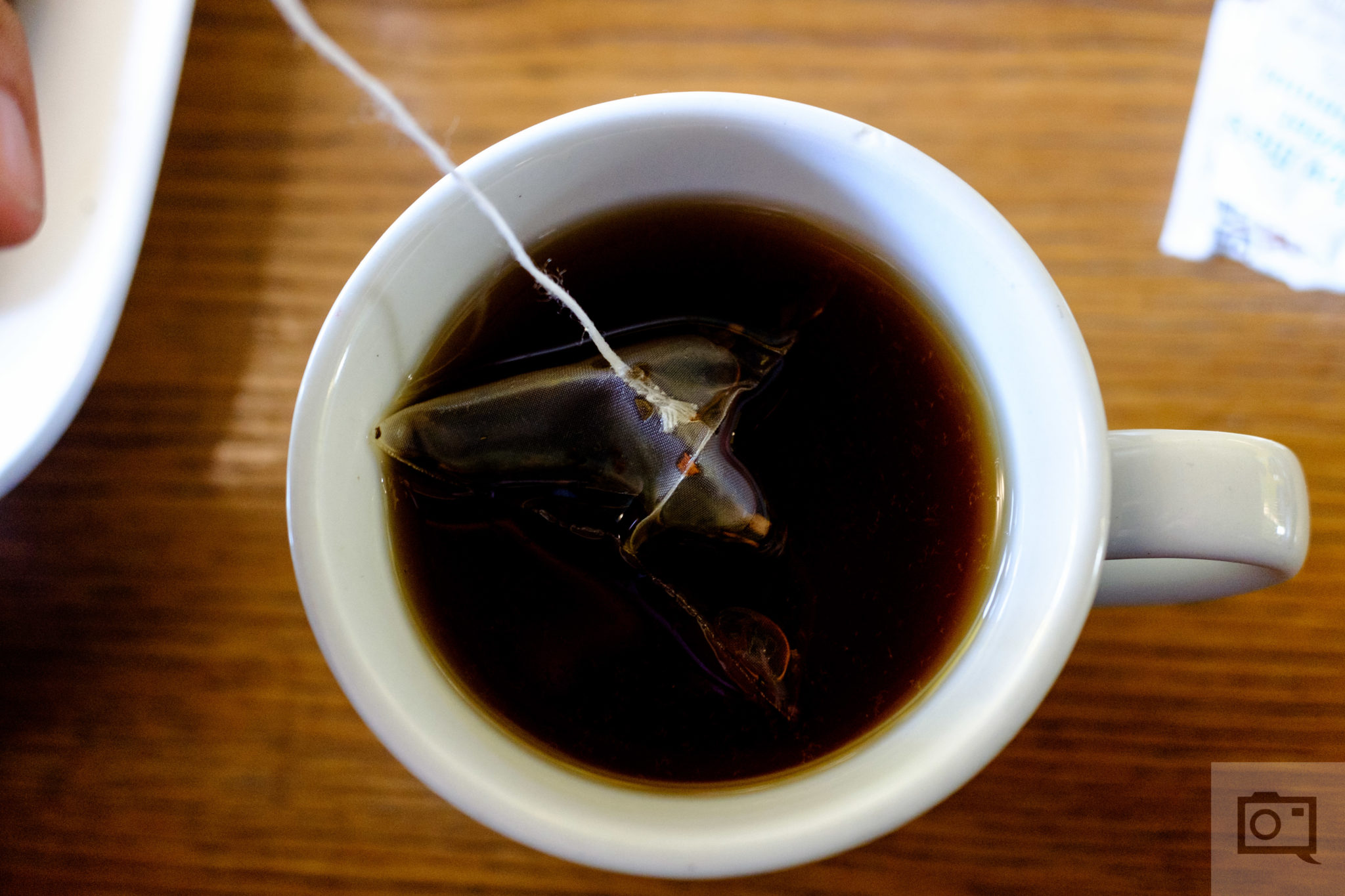
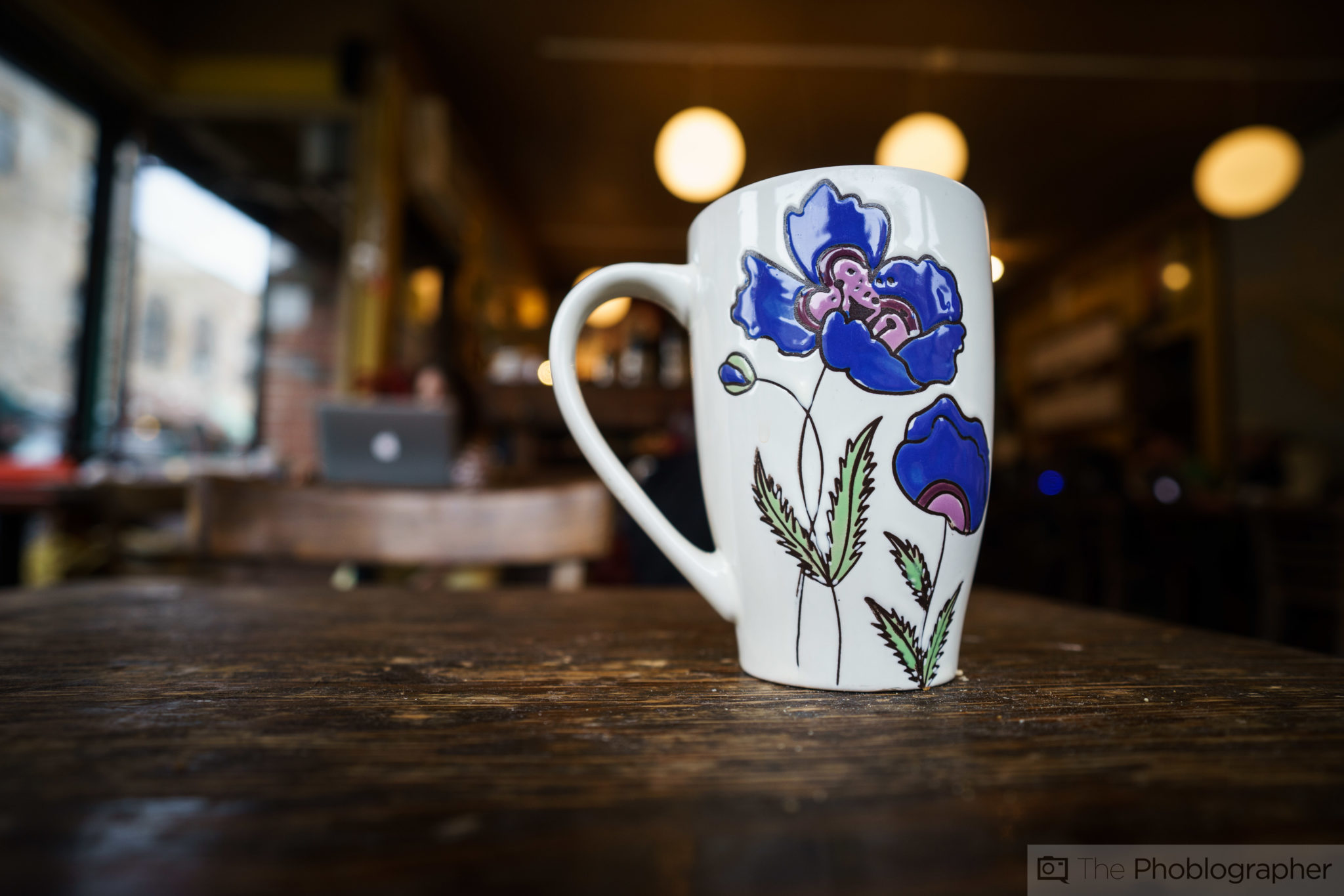
The image above isn’t exactly from the human perspective, if someone is sitting at a desk they’ll almost never see a scene like this. However, the first image in this section totally qualifies. When you sit down at a table to consume your drink, you can easily look down at it with ease.
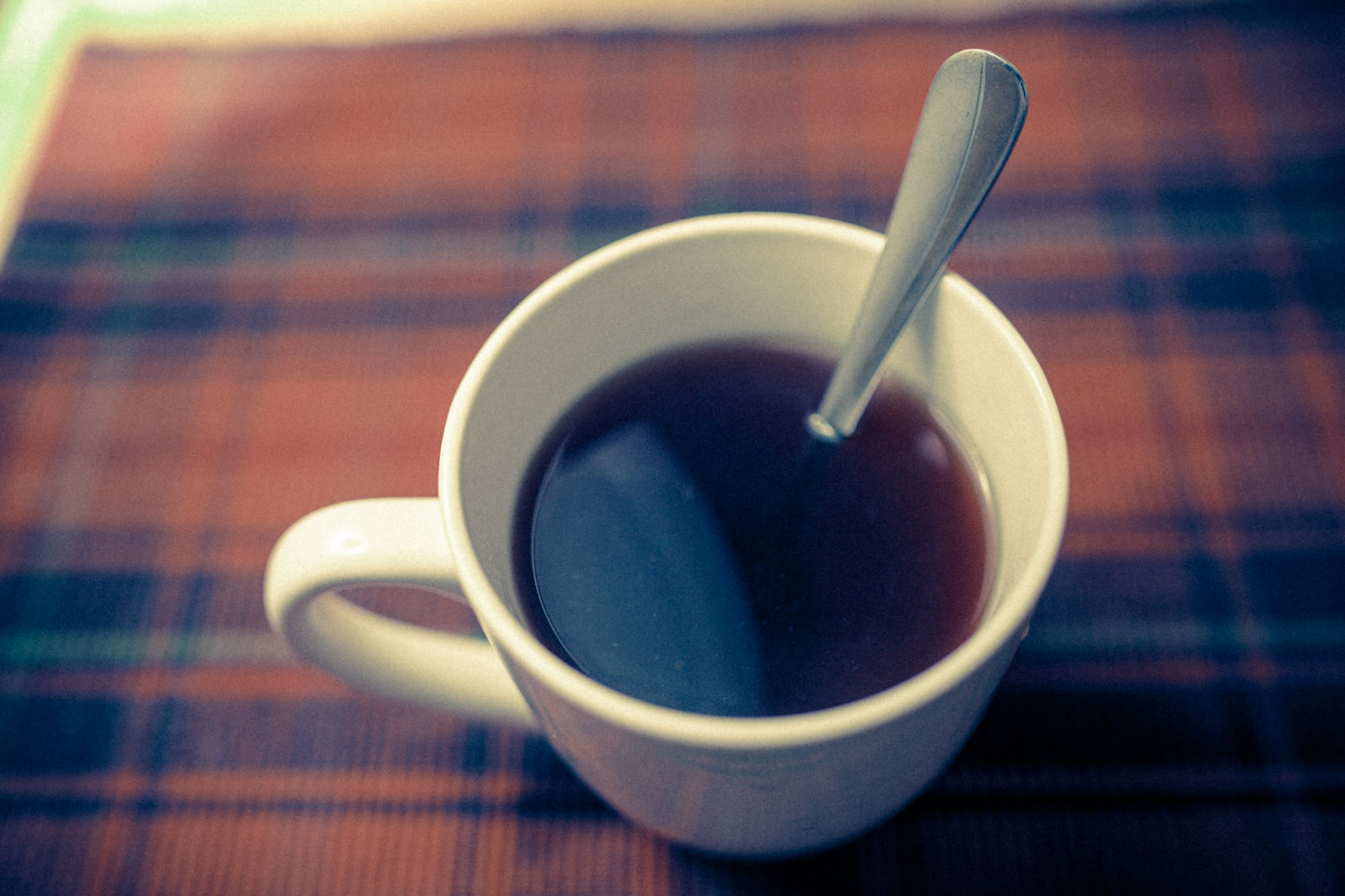
Here’s the ultimate example of what a person sees when they look down at their table with coffee present; but it’s not something that focuses on just the drink. Aim to go for the very close up, personal, one-on-one look!
It’s All About Contrast
One of the most important things about good coffee photography and tea photography has to do with contrast in the scene. For example, look at the image above: we’ve got white and blue separating the brown table and the blackish inner area of the cup–which is where the tea is.
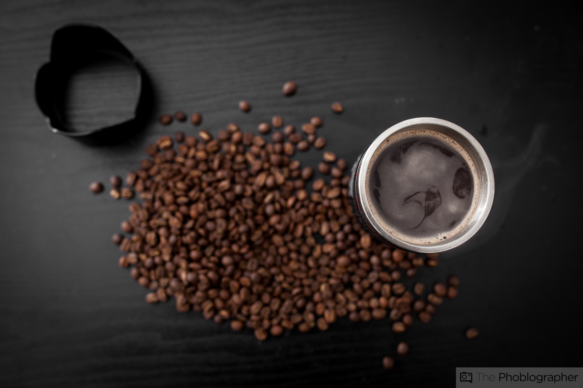
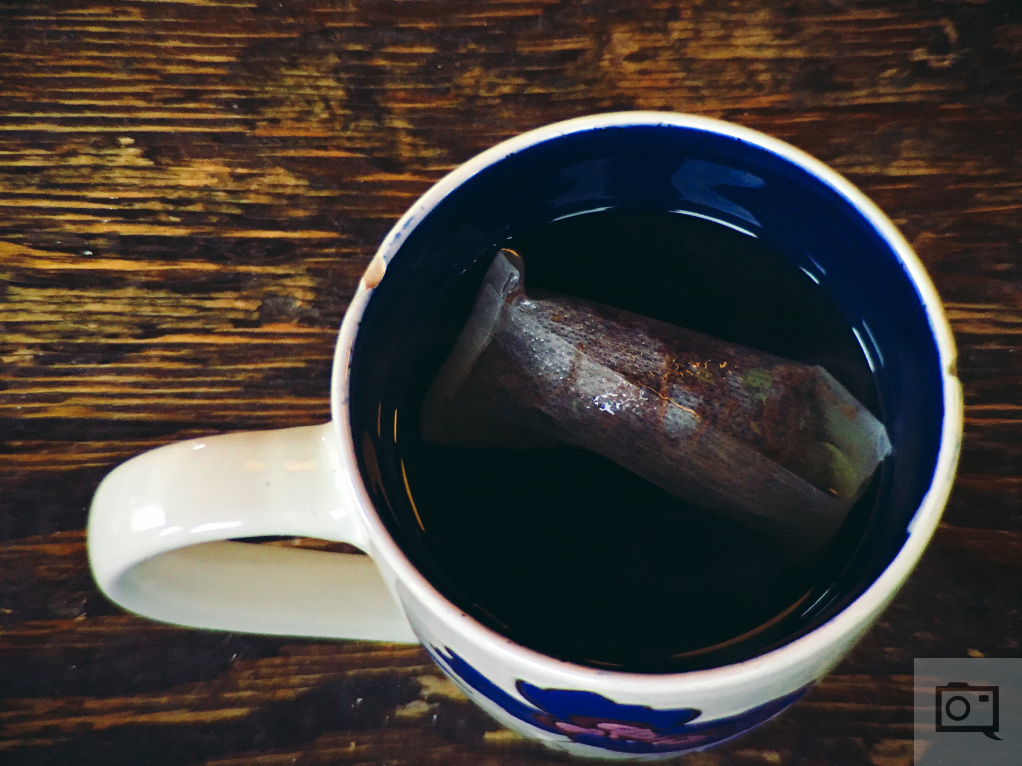
In contrast, this image above sticks to around the same color palette but uses tones to make it all different. The image could be much more effective with a different colored background, table, or by adding something like coffee cherries into the coffee beans.
Let’s delve a bit deeper into contrast, because we’re specifically talking about colors here: the colors are ROYGBIV. Red and orange are closer together and more similar than red and Violet are. So to add the most contrast, you’d probably want something like a green, blue or even a violet.
Makes sense?
The other alternative for the image I showed earlier in this section is this: which represents what a child may see. It offers a lot of contrast–but it’s not something that an adult may really relate to.
Big Windows and Natural Light
Most cafes have very big lights in the form of giant windows that let in a lot of light. To get the most appealing photos overall, combine the natural light from the windows with the contrast in colors and the human perspective.
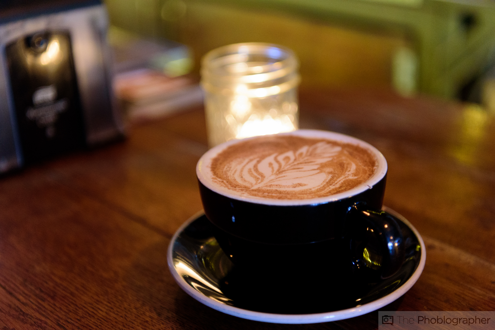
What makes this image a bit more effective is the single candle behind it–but otherwise all the color tones are very similar and otherwise tough to tell apart otherwise.
Keep these all in mind when you go for your next serious cup of brew!
Get rid of the ads!
Did you enjoy reading this article as much as we enjoyed writing it? There's a way to support us and our reporting, getting ad-free navigation and more as a bonus. Subscribe to us for less than a coffee per month —just $3.99— or take advantage of our yearly subscription with a hefty discount for only $25.- An ad-free experience
- A free mystery box for Lightroom or Capture One
- All the books in our store
- 20% discount on Capture One
- 30% discount on Imalume Photo Theft Protection
- 20% off Herbs and Kettle Tea Company.