Last Updated on 11/24/2015 by Chris Gampat
A while back, I wrote a piece about how the Phoblographer’s staff shoots product photos, the mentality and the guidelines. The product photography was more of a general idea; and it’s evolved since then. This time around and due to popular requests on Twitter, I’m walking you through a full product photography shoot. Earlier in the morning, I went about photographing images for a review I’m completing of 4V Design ALA Leather Strap strap.
Now before I go on, I’m going to preface this with one big statement that I will talk about and hit home on many times throughout the review.
My product photos are less about the gear and more about the concept, composition, and colors. Again, VERY LITTLE OF THIS HAS TO DO WITH THE GEAR. In all honesty, I could do this with pretty much any camera, lens or light but I’d need to modify my workflow accordingly depending on the variables involved.
Concept
The concepts behind my shoots usually are very lifestyle in the approach and my thought process involves finding a way to both inspire the viewer, make the product look beautiful, and also place it in a familiar setting for the person. If a company happens to license the images, even better!
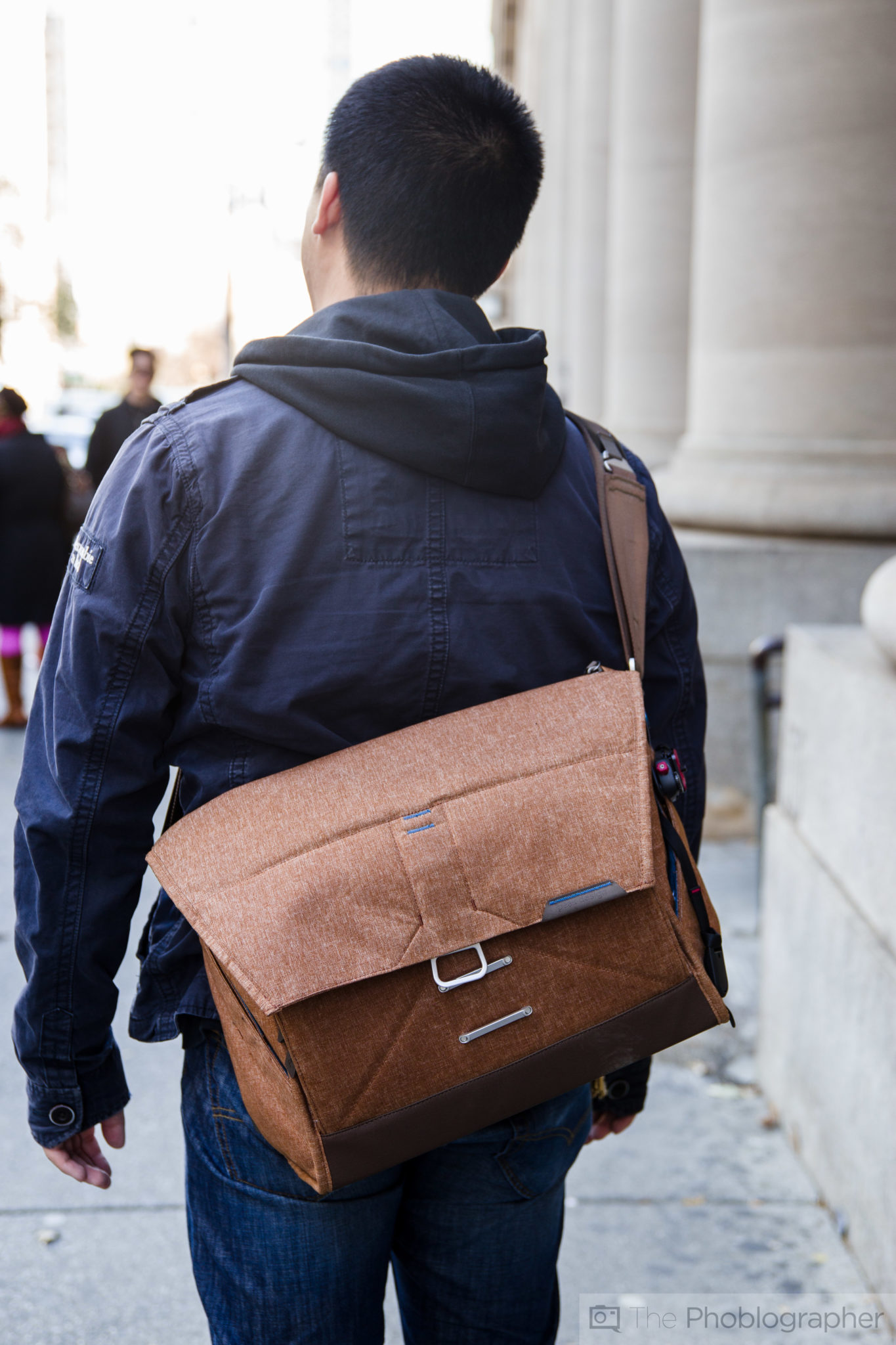
For the Peak Design Everyday Messenger Bag review done earlier this month, I tried to find a way that folks will relate to the bag while also showing off specifics about it. To do that, I needed to find the angles that folks would be interested in or would be familiar to them. When walking down a city street, it isn’t uncommon for folks to take a look at someone’s bag.
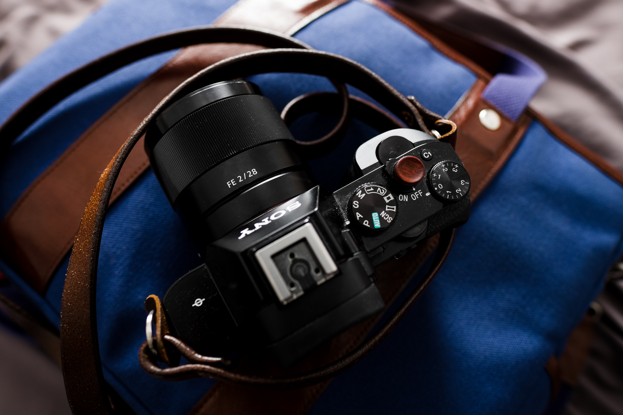
The Sony 28mm f2 review is a great example. Would you have believed that these photos were shot in my bedroom? Lots of photographers that are hobbyists keep their gear in their bedroom and the idea of seeing their camera on top of their bag with window lighting is a very familiar and homely one. To that end, it’s one that they can relate to.
This isn’t about the gear. I just explained a concept.
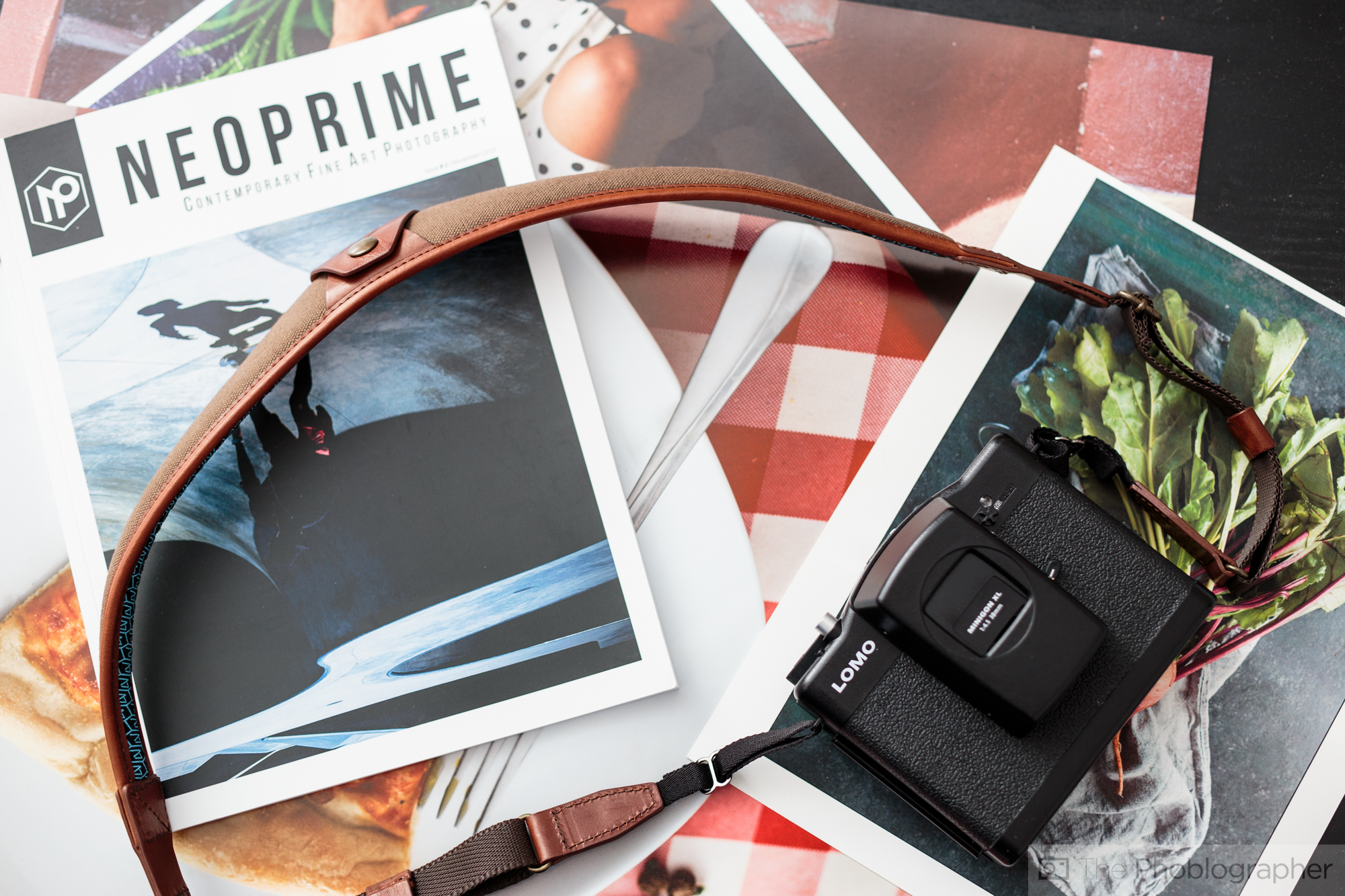
Considering that I’ve done a 4V Design strap shoot before for a previous review, I tried to use similar elements but give this shoot a different look. Here are the ideas involved:
- A beautiful analog camera that many have heard of or are very interested in. I recently purchased a Lomography LCA 120 as I genuinely believe it to be the best street photography camera when it comes to film shooting. Giving me a 6×6 negative is huge.
- The strap simply pairs well with the camera. I could have used a thinner strap but the 4V ALA works.
- I’m in the middle of doing a lot of print work because I’m reviewing products from both Epson and Canon, so there are lots of prints right now in my apartment. There is no reason why I shouldn’t use them and printing is something that I feel is genuinely important to the art community as a whole.
- Marius Vieth, a good buddy of mine, just launched a new magazine called NeoPrime. I got it this past weekend and it’s inspiring me. The reason why is because next year, the Phoblographer is getting into print (details to be released on December 1st 2015.) But in addition to that, it’s just a beautiful publication that I genuinely want to take around with me. Using what inspires me in an image helps me to inspire others. So the magazine was used in this product shoot.
- Put the connotation of the camera, the prints and the strap together and you get a cohesive idea of a product photography shoot. Us photographers care about prints, and the site’s readers care about aesthetics.
- The black IKEA table is a staple in my apartment. It’s been used for dinner parties, Cards Against Humanity games, coffee table books, product shoots, etc. It just works and when I add things to it then other layers come in effect
I just spent a long time explaining my concept and way of thinking. This had nothing to do with the gear I was shooting with and everything to do with focusing on the idea of the product, the Phoblographer’s audience and integrating elements and layers into an image.
Gear
For this shoot, what I used is:
- Canon 6D: not the newest and greatest camera but by favorite Canon DSLR. There are better cameras out today, but I don’t need the latest and greatest cameras or lenses to impress people.
- Sigma 35mm f1.4 Art: an incredible lens though there are newer options out today
- Adorama Flashpoint Zoom Li-On flash: an affordable manual flash with a radio trigger. Cheap, effective, and generally all I need. I use the manual Non-TTL version.
- Zeiss 50mm f2 Milvus: I’m reviewing this lens. I’ve done every other Zeiss Milvus lens so far and this is the last one. I may as well continue the testing by shooting this product with it.
So here’s the thing, yes I’m using nice gear, but I could have easily done these images with a Canon Rebel, a 35mm f2 lens, a Yongnuo flash, and maybe Sigma’s older 50mm f1.4. Heck, Canon’s nifty 50 could have worked too, but this is just what I happen to have around my apartment.
In fact, I’ve even done product shoots with the old Olympus OMD EM5. Not a single one of you have ever complained about the product imagery either.
The Lighting
If you’ve been a reader of the site for a while, you probably know that I like augmenting natural light and making images look like they’re being lit by a window. To do this, I use flash. Here’s what I’m talking about below–the video above shows how this idea works for food photography.
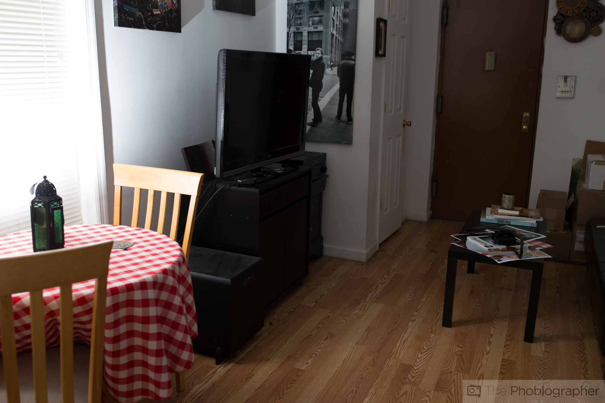
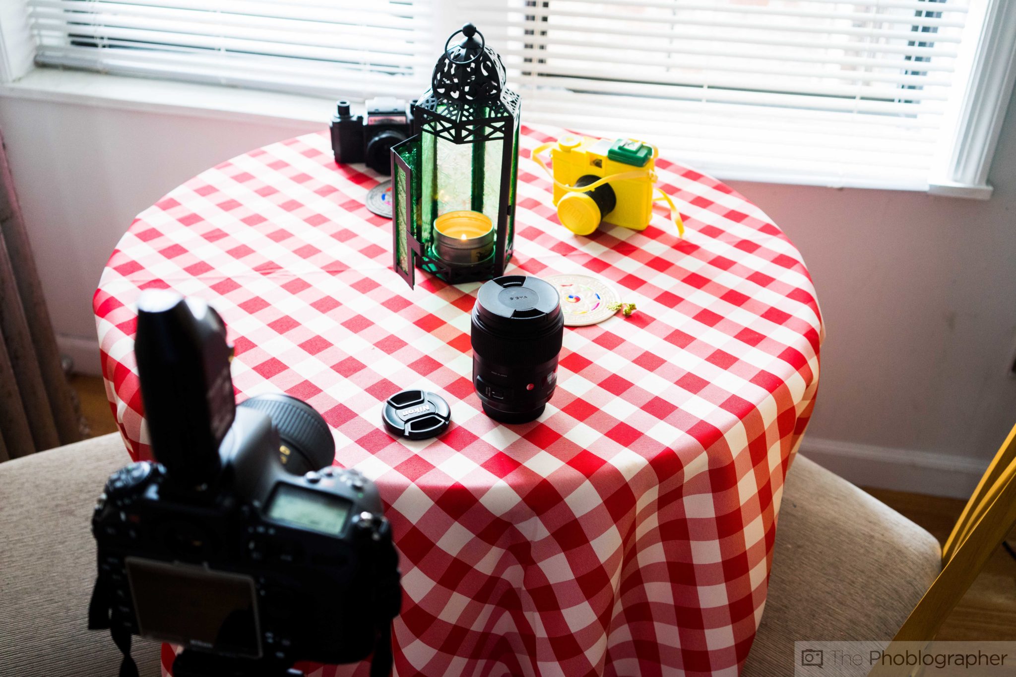
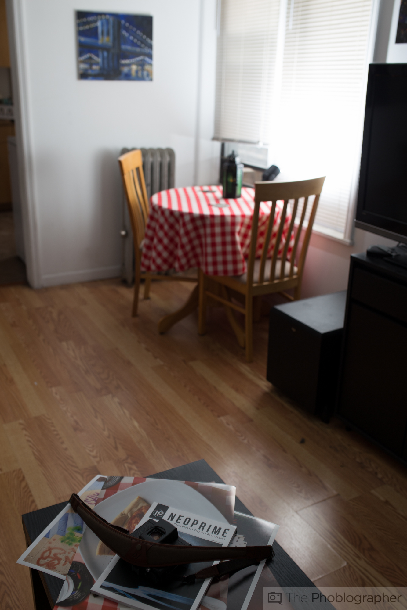
Here’s one view of what I’m working with in my apartment. I have the typical, small Brooklyn apartment that I share with a roommate and this is the living room. The table that I’m shooting the products on are on the right side and the window on the left is giving off the light. The lighting isn’t actually that strong, the flash is hidden behind the lantern.
Pretty nifty, huh? You can kind of see the flash.
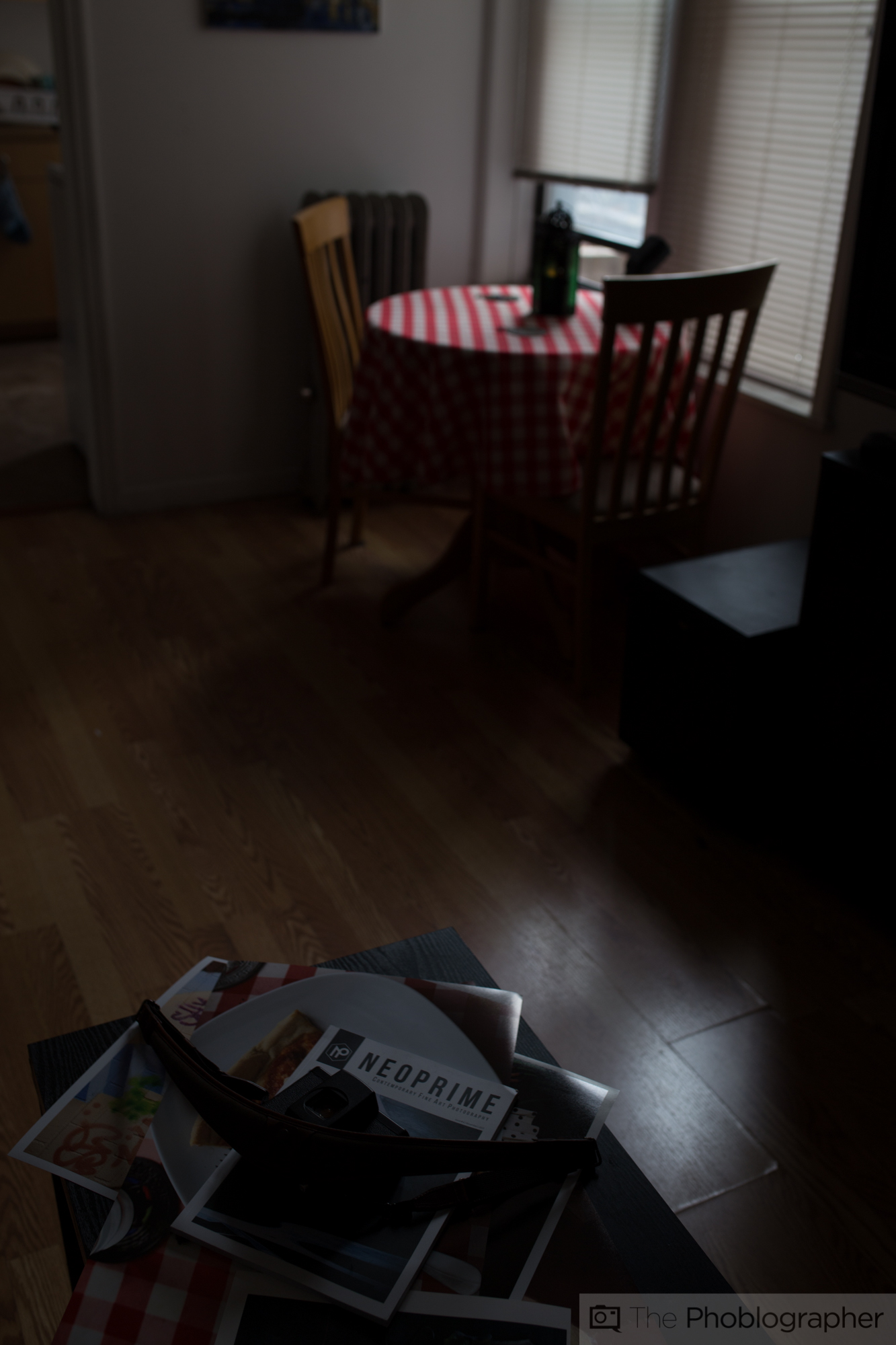
Here’s another view shot at ISO 100 with no flash. Obviously way too dark. My options at this point are raising the ISO levels but then I’d need to theoretically raise them to ISO 6400. Images shot at ISO 6400 doesn’t give me the most detailed photos and they don’t render as sharp and contrasty on a screen.
Plus, if you consider the fact that I shoot with the possibility of attracting advertisers to the site and possible licensing sales, it makes a lot more sense to shoot at a lower ISO. With that said though, the actual shoot was done at ISO 400–but I’ll get to that in just a minute.
This is what happens when the flash is added to the scene. The exposure for both images is ISO 100, 1/30 sec at f3.5. That one flash in the right spot makes a big difference.
THIS DIDN’T HAVE MUCH TO DO WITH THE GEAR. I COULD HAVE DONE THIS WITH ANY FLASH THAT CAN OUTPUT AROUND 100 WATT SECONDS OF POWER AND MOST MODERN HOT SHOE FLASHES CAN DO THAT.
Again, the gear here is irrelevant: what matters is that I have that extra lighting to work with and produce the image that I need to develop.
Walkthrough of the Shoot
Above is a photo of the entire scene that I’m working with. In order to give you the most thorough tutorial I’m going to show you all the images I shot for this product shoot and explain my reasoning for why I made those creative choices. It’s something I talk about with artists often in the interviews done on the site.
It’s about creative decisions and choices to make an expression of self.
First off, I started this shoot at ISO 100 and believed it to be too dark. So I had a couple of options here:
- Raise the power of the flash to compensate, and possibly use more battery power
- Open the F Stop and lose the slightly deeper depth of field that I wanted
- Raise the ISO and allow that to give me better results closer to what my mind’s eye wants.
I ended up raising the ISO to 400; which is still pretty low and gives me lots of details in the images. If you’re wondering why I didn’t change the shutter speed is because of flash sync and shutters control the ambient light, not flash exposure. The flash is the key light here.
Before I go on and to clarify about details: What I’m essentially talking about is giving me results that are good enough for possible print. I wouldn’t really risk a product shoot like this to be above ISO 400 but on the rare occasion I do go above that.
THE FOLLOWING IMAGES HAVE NO POST-PRODUCTION EXCEPT RESIZING FOR THE WEB.
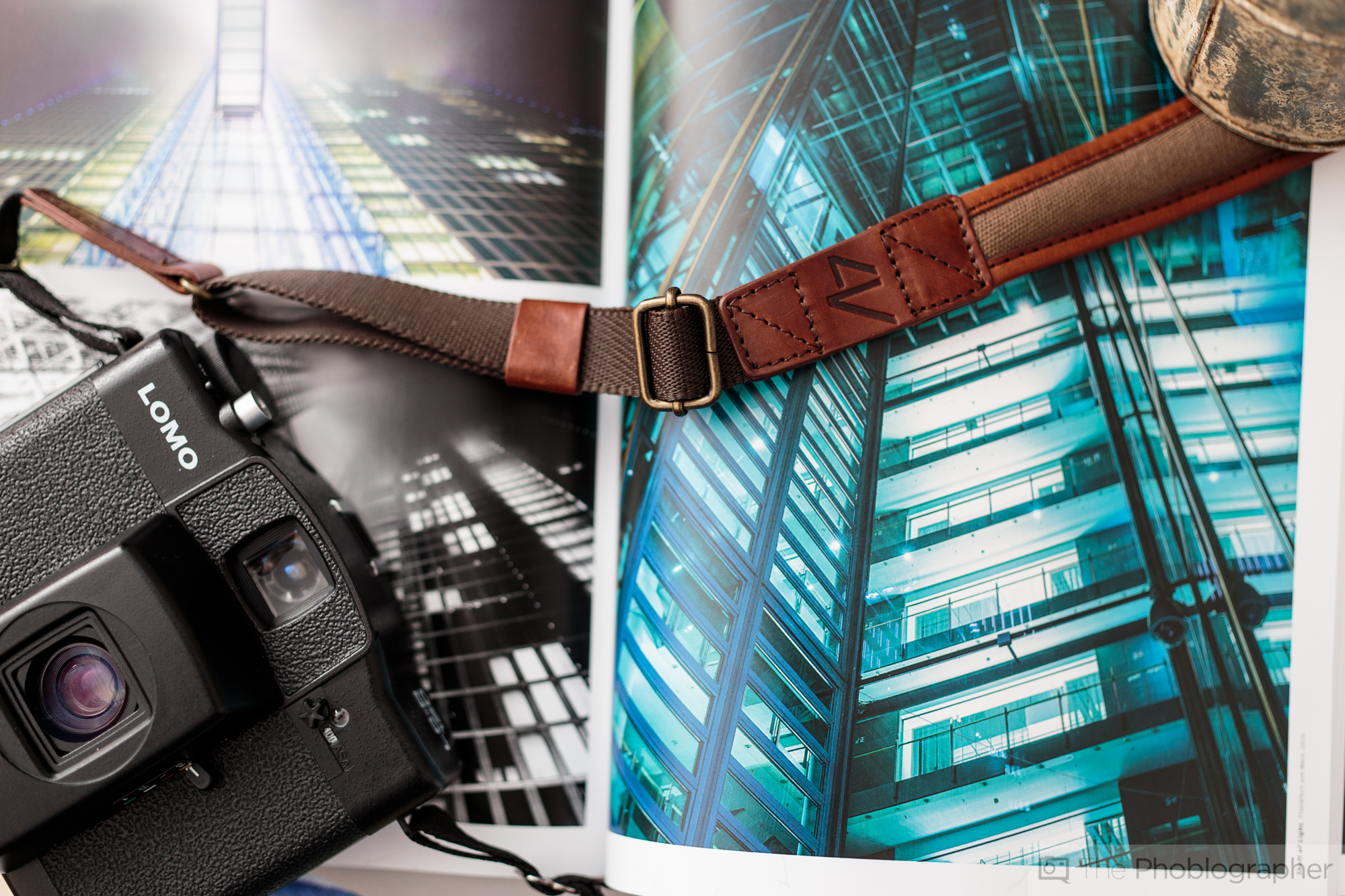
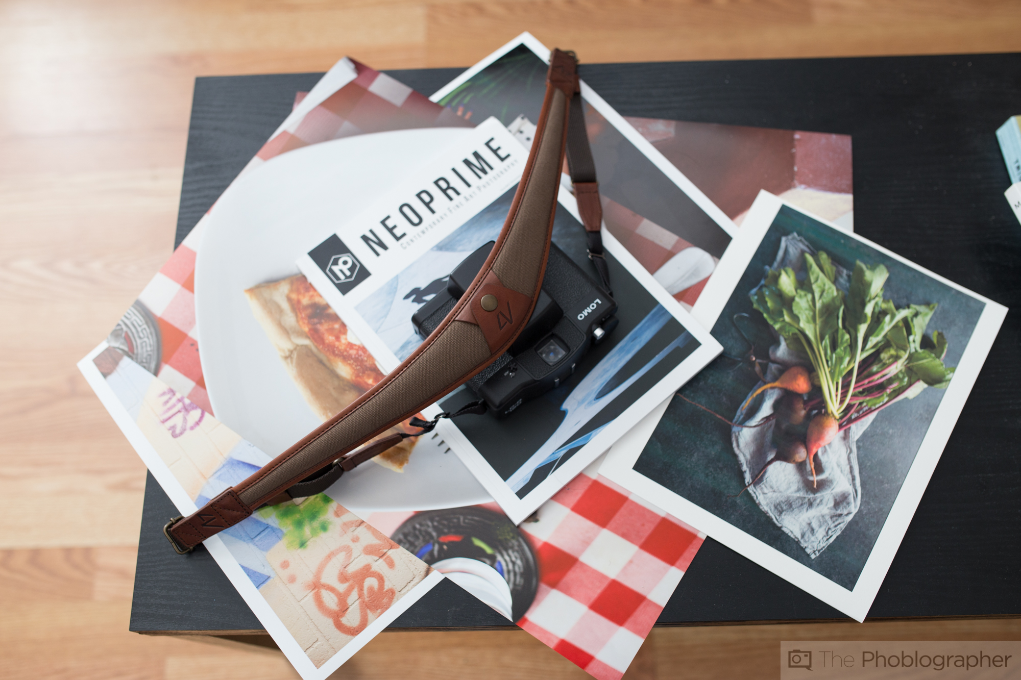
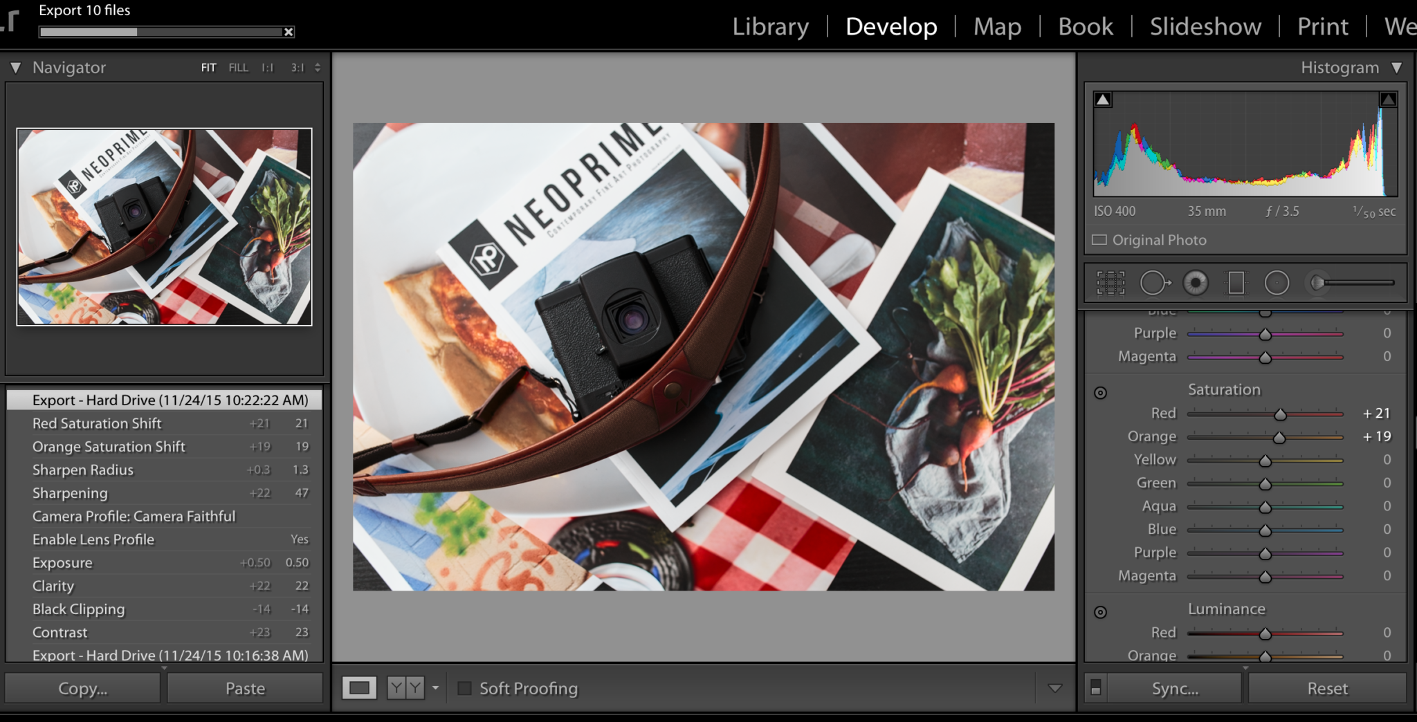
Here’s the same image shot at ISO 400. Now I’ve created a more usable image. It doesn’t give me all the details of the front of the strap, but I can get that in my post-production or I don’t have to use the image at all.
Notice the layers here too: Neoprime, prints I’ve done with different papers and how all the colors are working together. That took careful arrangement and works on case by case basis.
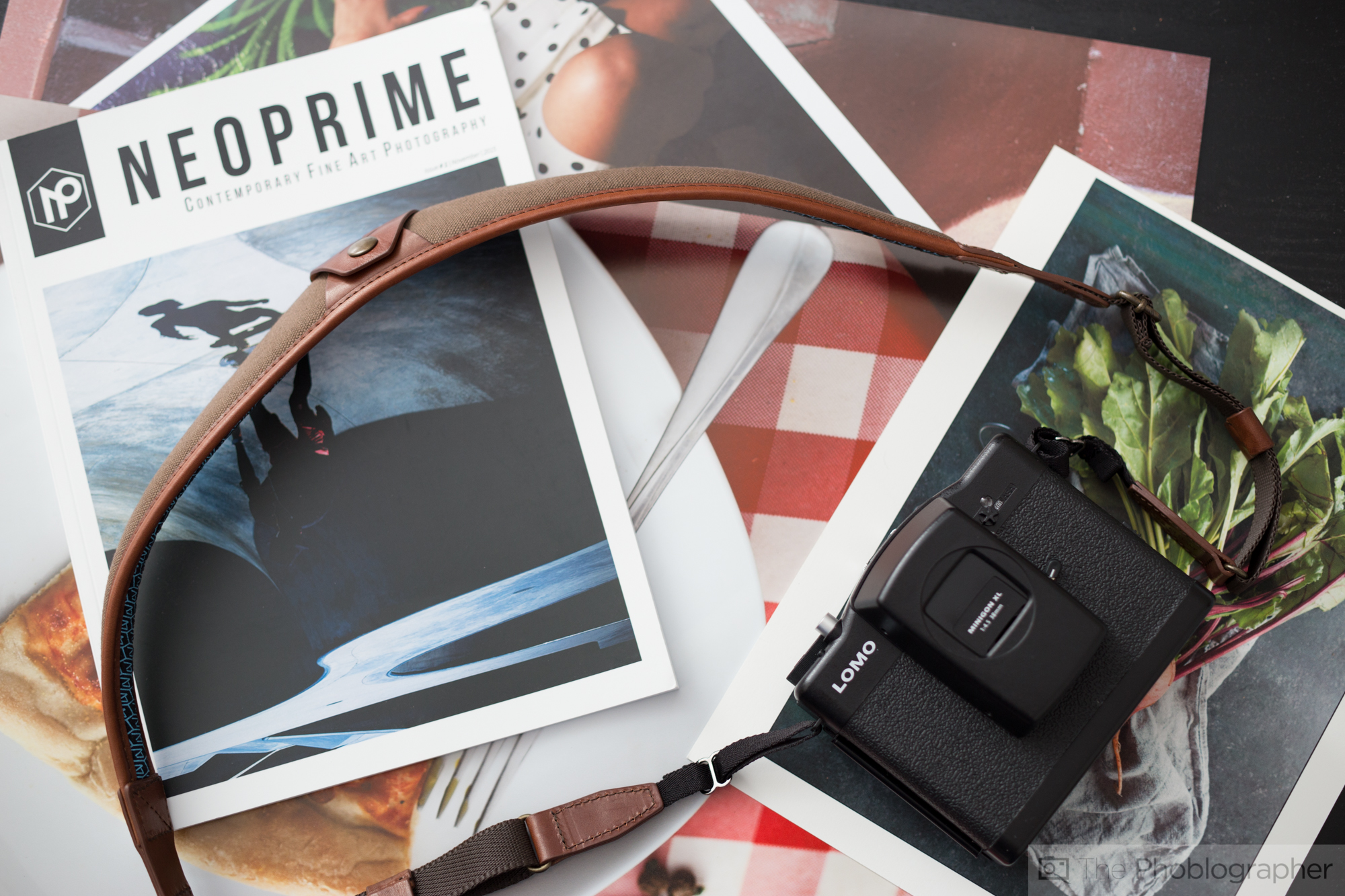
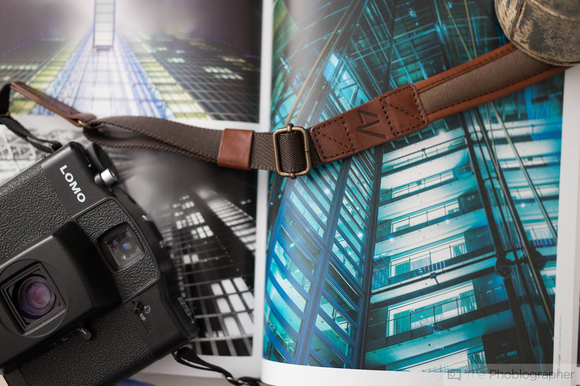
Knowing that I wasn’t totally happy with that image, I started to just play around and mess with ideas, compositions, etc. The NEOPRIME sign brings your eye to the strap and when your eye follows the strap, you then get down to the camera.
After that, you take in the entire scene.

Marius’s magazine provides me with different visual and placing the strap and camera in different positions leads to variety in the shoot. So while shooting a different setup, I needed to go through the magazine and choose scenes that I genuinely liked. At the same time though, I let the other prints be in the scene to give the impression that this is a busy photo desk with prints and materials for an editor to go through.
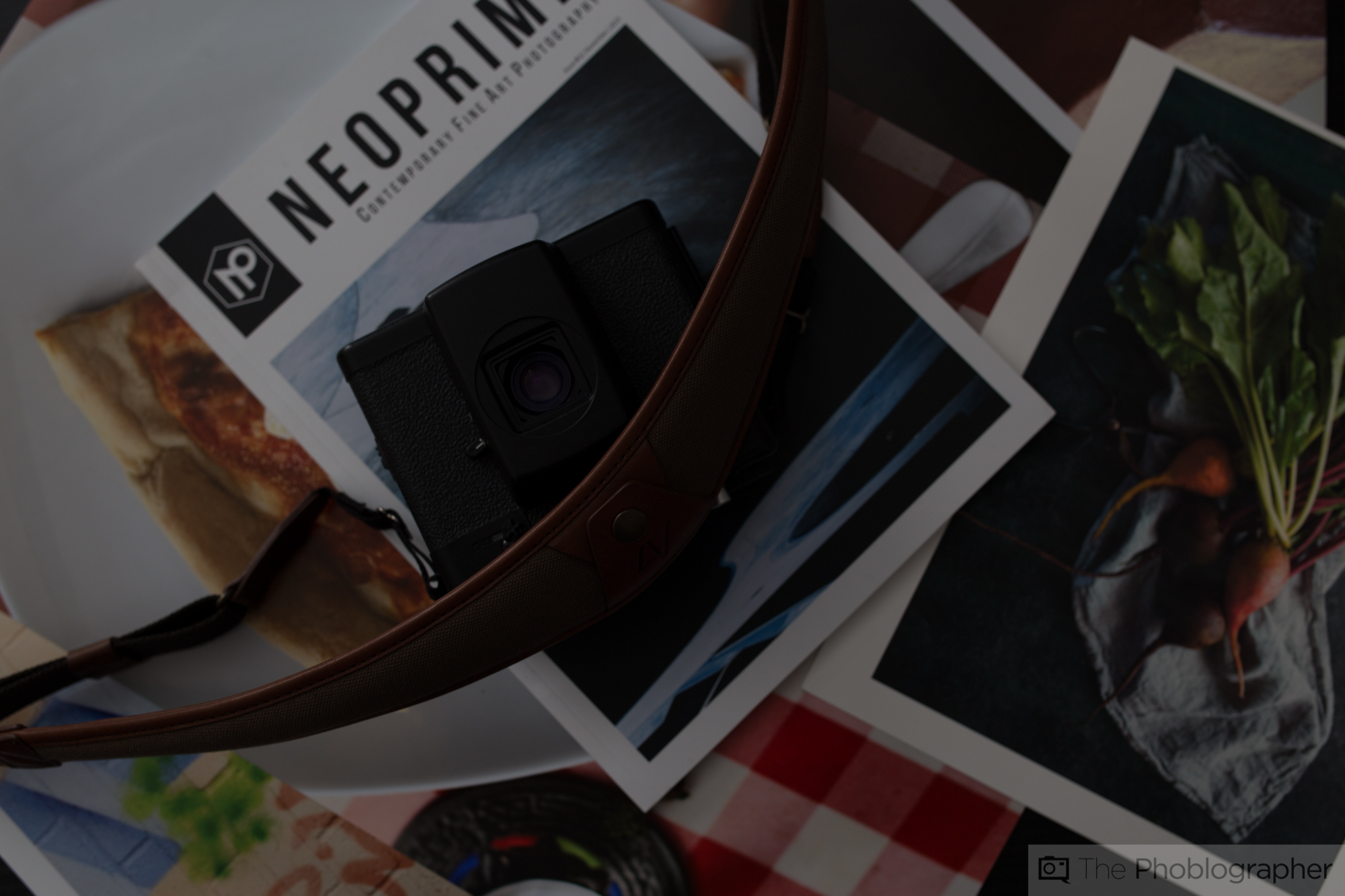
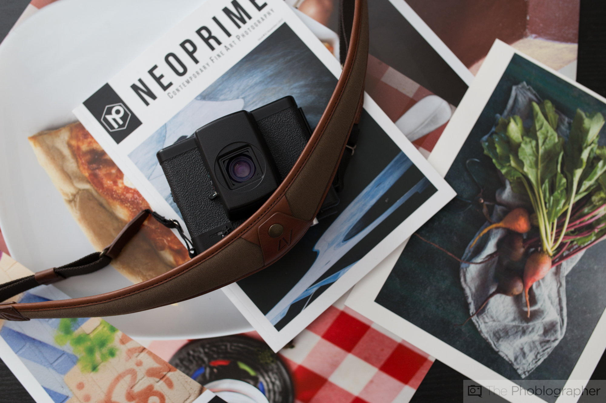
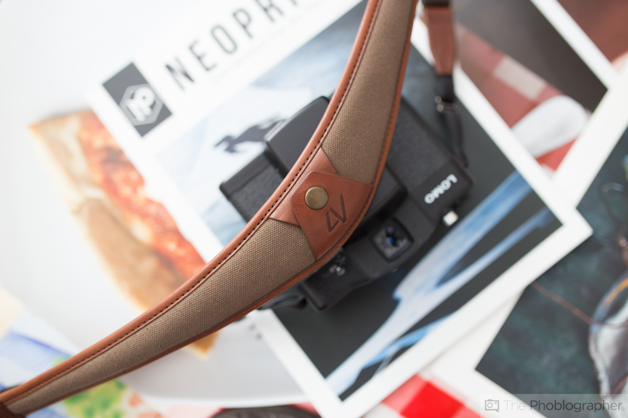
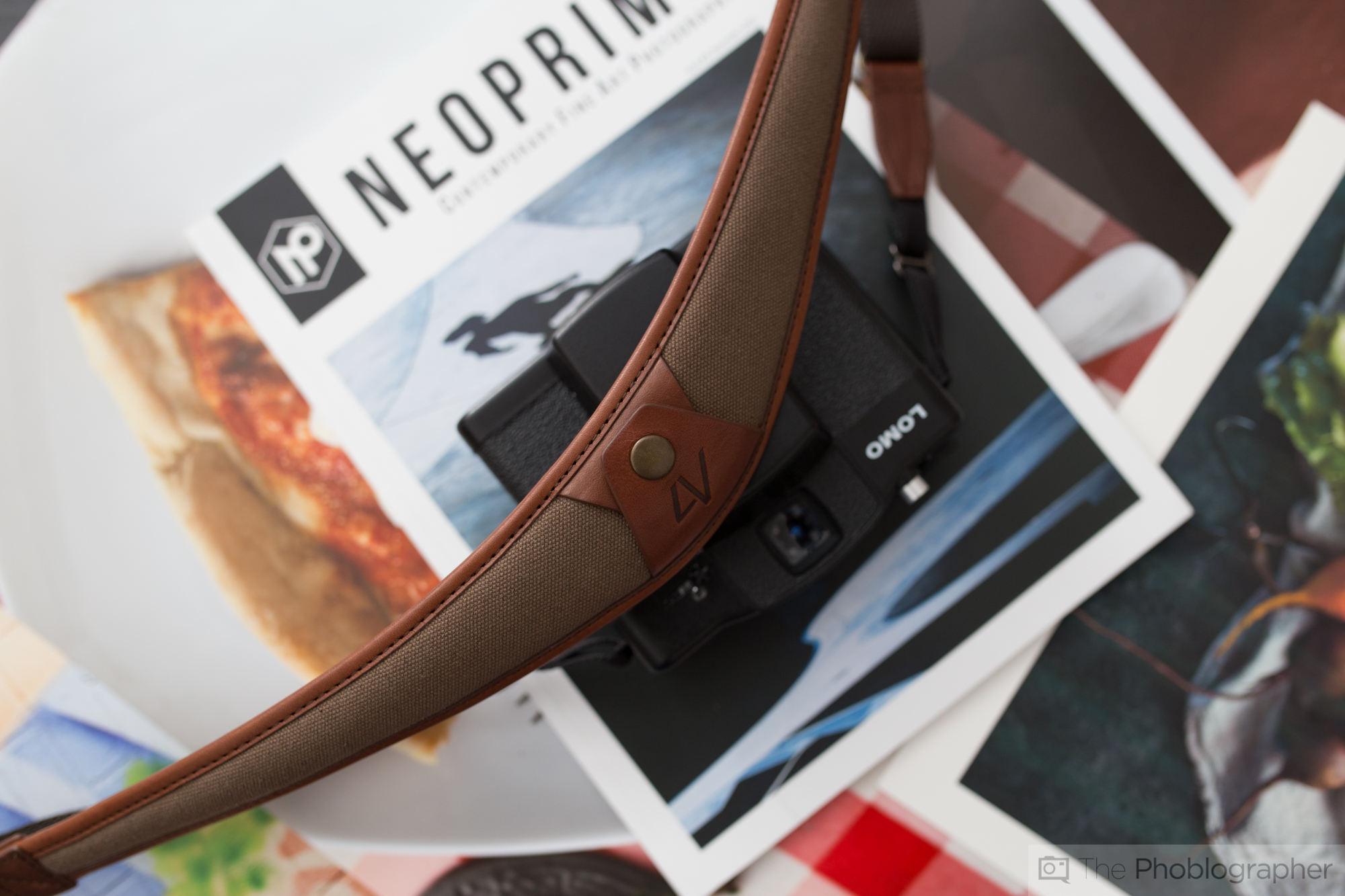
The strap has a bit of stiffness to it, so I needed to find ways to show that off while giving the viewer more of an idea of what the product is.
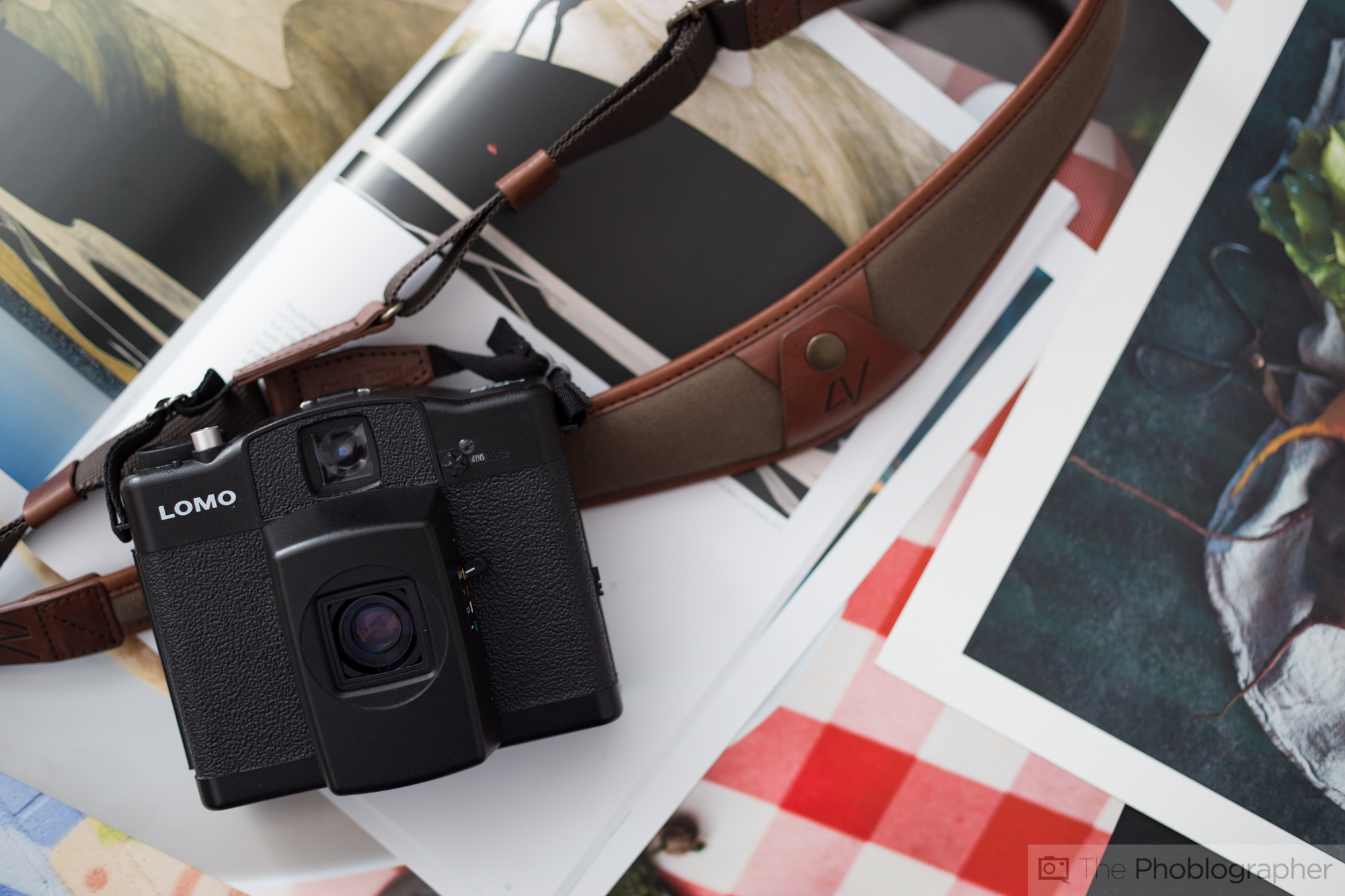
This shot was done with the intention of getting more details on the front of the strap while also trying to create a photo that leads the reader’s eyes around the elements of the photo. Again those are:
- The strap
- The analog camera
- The layers of printed images
- The magazine
All of these elements come together in a much more visually interesting way than if I just shot on a black table.
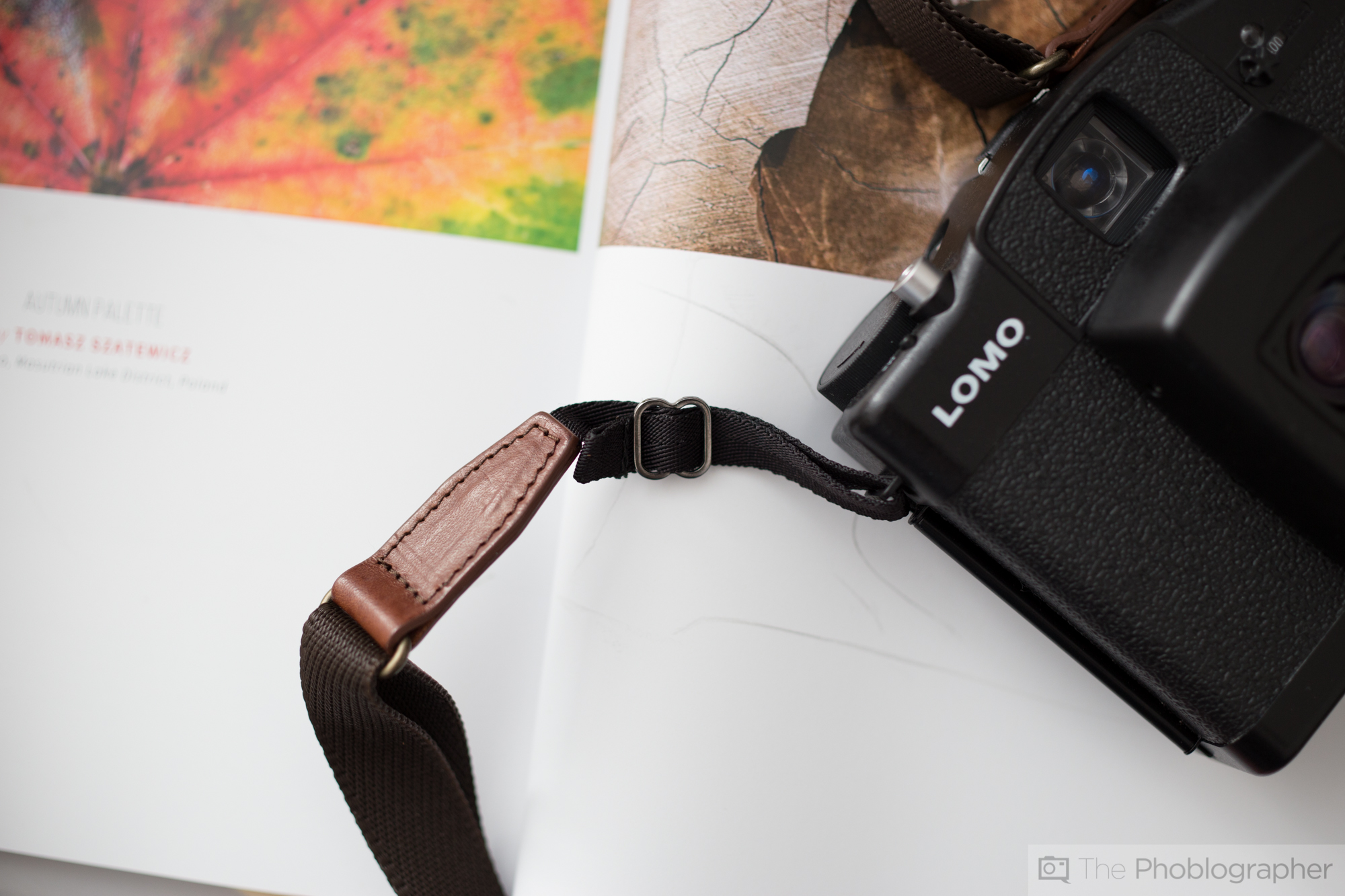
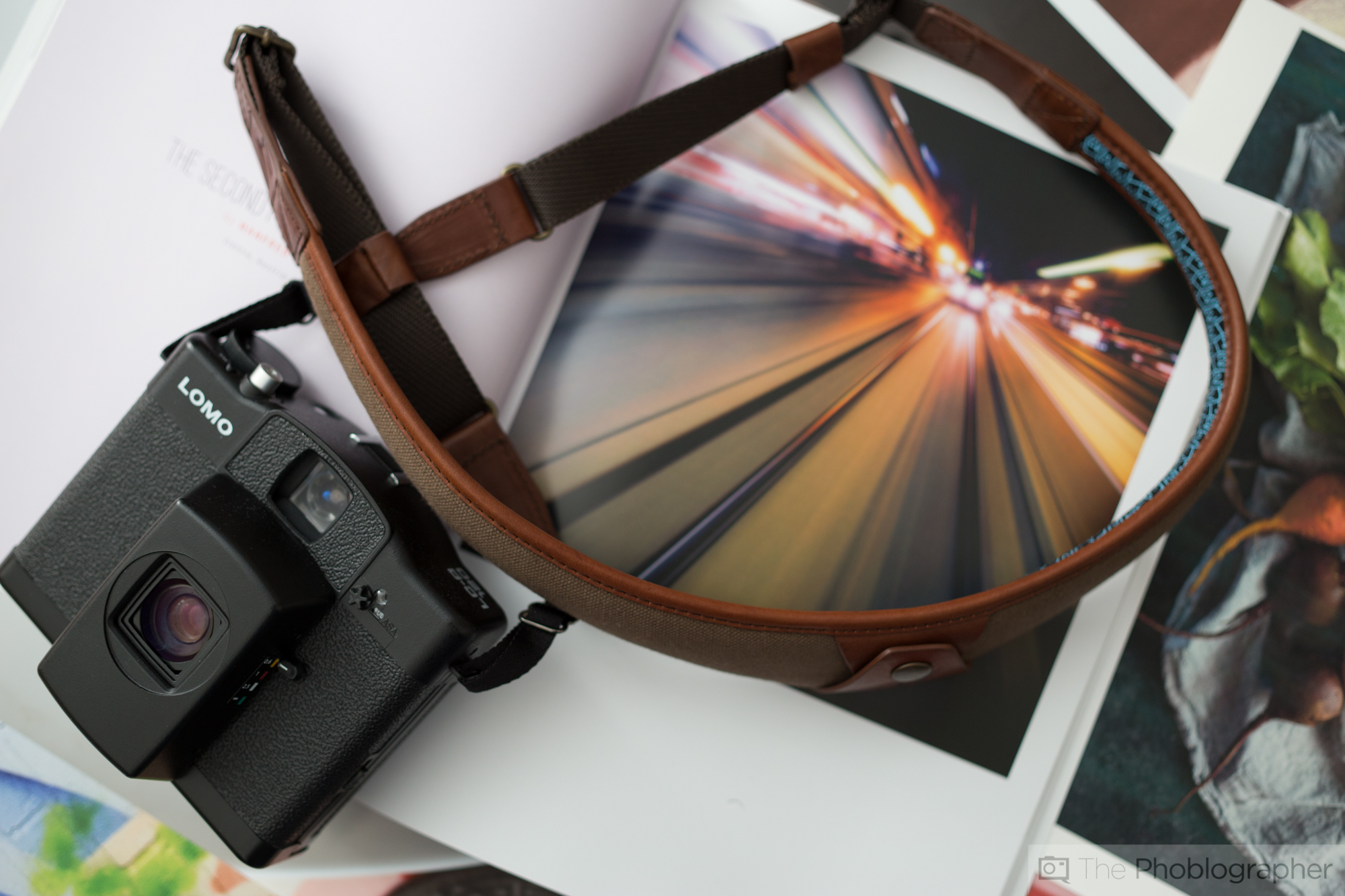
This photo was shot to show off the way that the strap connects to the camera. It was chosen to be shot on mostly white to give the reader a better idea of how it works with the camera. However, as you can see it’s still connected to the camera–which is important. Beyond that, the dashes of color are just a bit extra.
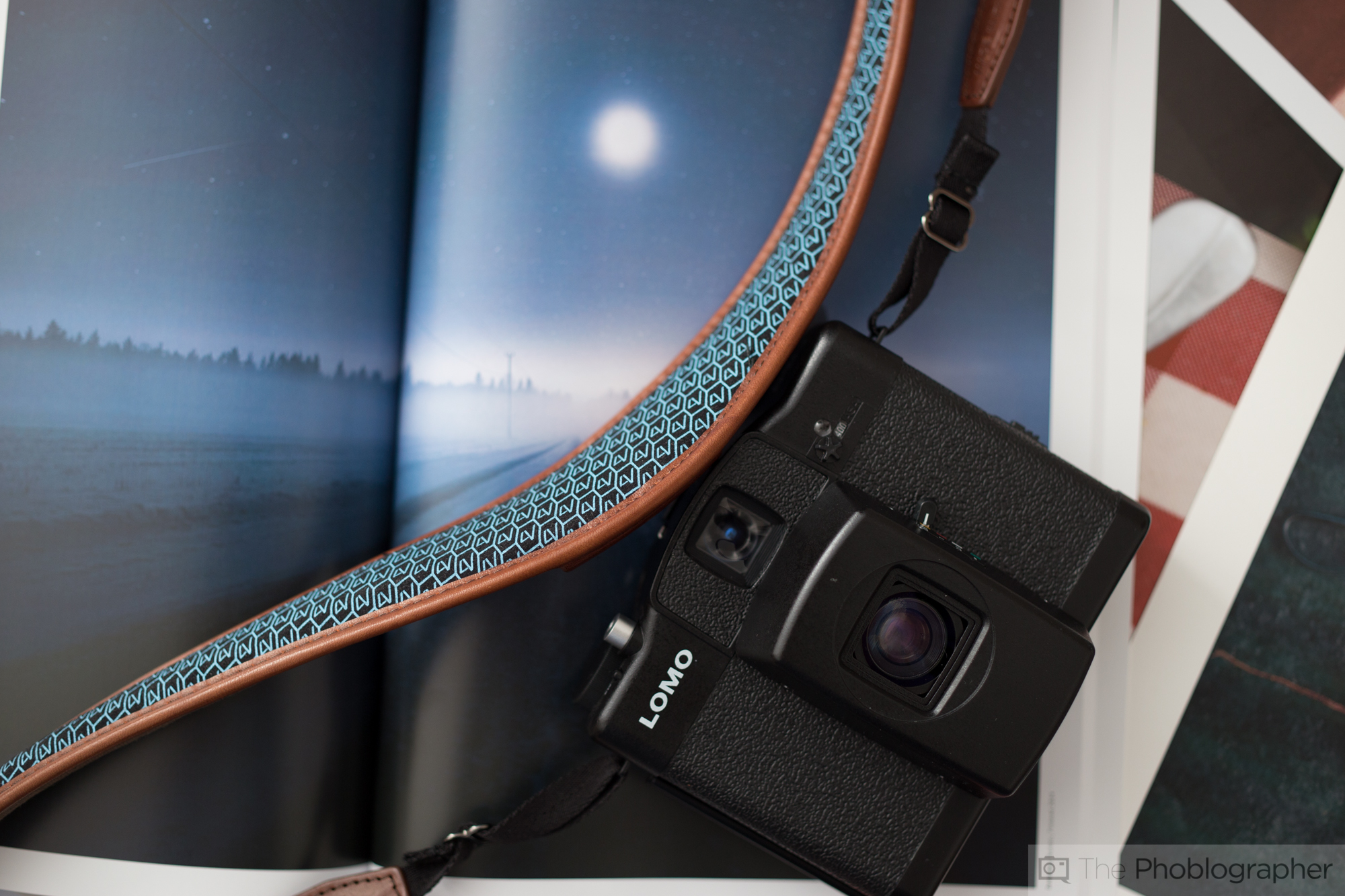
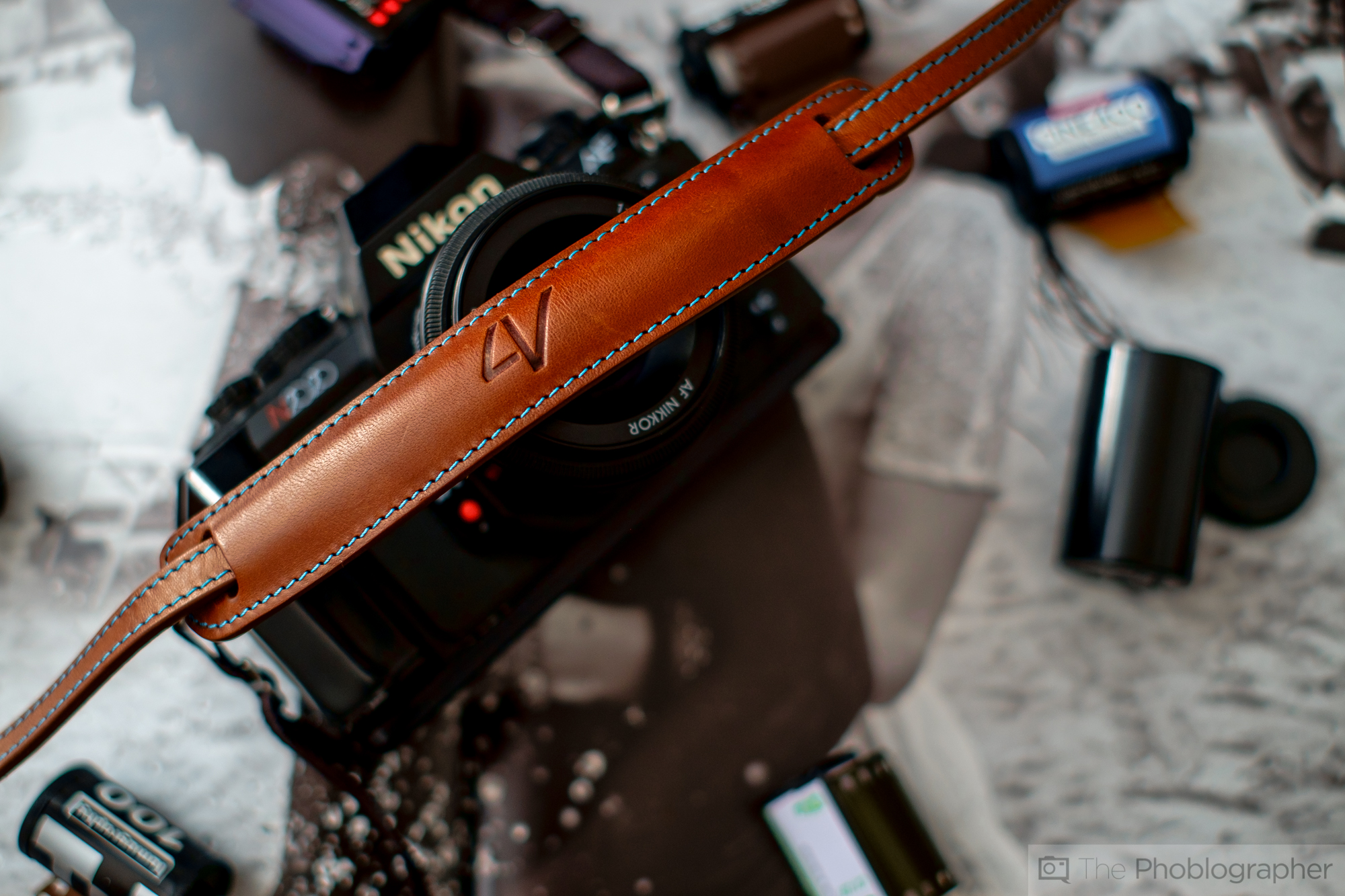
This photo was created to show the blue underside that one can get as an option. It will be talked about more in the review.
So why blue on blue? Well, it’s not really blue on blue as there is some brown involved with the strap in the photo above, but with this image you get a better idea of what type of blue it is.
Again, the camera and the idea of shooting with this strap connected to the camera is still in effect here.

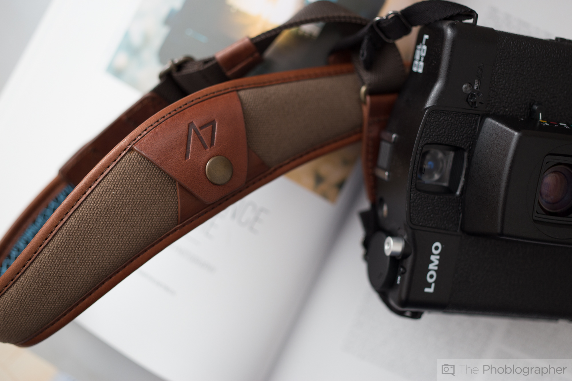
This photo was purposely shot to show that I’m cheating a bit here to keep the strap down and show off the details. The light blue was chosen to contrast against the dark brown leather and canvas.
This is the image otherwise but even then I may crop it a bit more. Using the background I can show off details like the brass hardware, the 4V engraving, the canvas, the leather, etc. Again, this strap is connected to the camera to emphasize shooting with the camera and strap together–the whole idea comes together once again.
BEFORE I GO ON: Note that all of these photos are being shot with the same lighting setup that I talked about and showed off before.
All of the elements and ideas that I’ve been talking about for this entire post are still here but just showing off a different detail.
Again: another detail, contrasting colors, different shape to lead the eye around the composition, etc. As you can see, the magazine and the prints came in big handy.
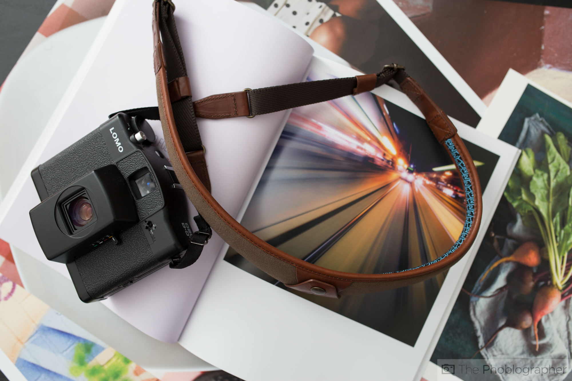
Same photo as before but backed up a bit to show off even more of the scene.
Another detail shot. I switched between the Zeiss and Sigma for either bigger scenes or more specific details while focusing closely.
NOTICE HOW MUCH I TALKED ABOUT CONCEPTS, LAYERS TO THE IMAGES, COMPOSITION, ETC AND LESS ABOUT WHAT THE GEAR DOES.
Post-Production
The editing process starts with calibrated monitors to ensure that the quality that I’m putting out is consistent. Then it mostly has to do with culling the images and ensuring that the ones that I choose do the following:
- Show a detailed look at the product that can be enjoyed on the desktop, tablets and phones. Around 80% of the site’s traffic comes from mobile devices.
- Look nice
- Are in focus enough. I don’t need super tack sharp images all the time. No one is pixel peeping these.
- There are no screwups in the final batch.
Then since the lighting, elements and scenes are pretty much the same but just different enough, I do edits to the lead image, select all the images that I want to export, sync the settings, go through each and maybe do a touch up here or there and then export with appropriate file names and keywords built into the images.
THIS HAS LESS TO DO WITH THE GEAR AND MORE ABOUT ENHANCING MY SPECIFIC CREATIVE VISION.
Final Thoughts

As you’ve seen, this method is what I do with many of the images though it varies from room to room and situation to situation. But if you see a set of images shot in a similar way, then that’s the setup I do. The image above was done with the same exact setup.
Finally, all of this can be done with pretty much any piece of gear. What’s really critical here is the:
- The visual concept
- The knowledge of lighting
- The specific knowledge of how to get the extra details you want in Adobe Lightroom
- The emphasis on making sure that your vision is brought to the readers
- The ideas of layering and composition
- Understanding who you’re tailoring the images for and how to create something that they’ll like.
That’s all.
Now get out there and go shoot.
Get rid of the ads!
Did you enjoy reading this article as much as we enjoyed writing it? There's a way to support us and our reporting, getting ad-free navigation and more as a bonus. Subscribe to us for less than a coffee per month —just $3.99— or take advantage of our yearly subscription with a hefty discount for only $25.- An ad-free experience
- A free mystery box for Lightroom or Capture One
- All the books in our store
- 20% discount on Capture One
- 30% discount on Imalume Photo Theft Protection
- 20% off Herbs and Kettle Tea Company.
- 20% off your order from MPIX printing services.
- 5% off Viltrox Products via their eCommerce store.
- 10% off all film developing, printing and scanning services from Blue Moon Camera and Machine
- 15% off 7Artisans products: The lens and accessory maker is offering a sweet discount for Phoblographer's readers.