Want more Useful Photography Tips? Click here.
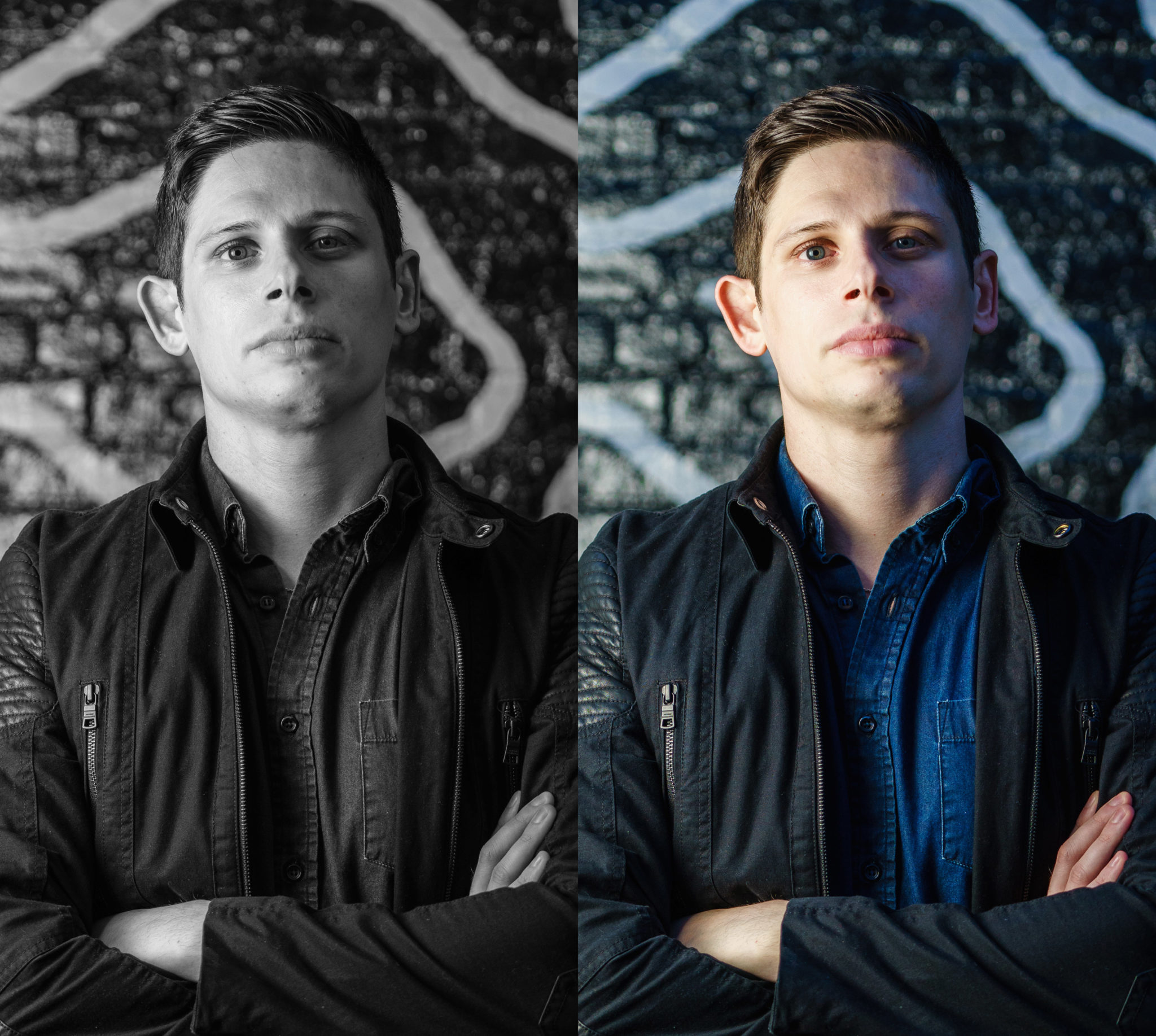
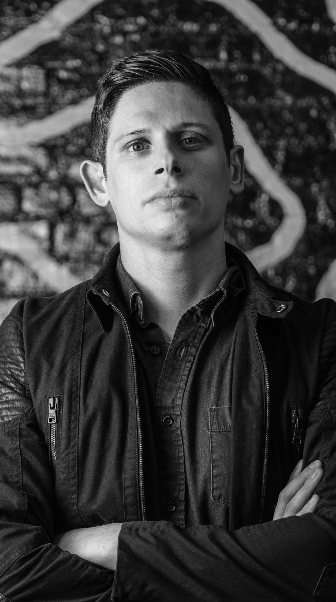
A while back, I posted a short tutorial on the secret behind sharper photos; to this date it’s one of the site’s most popular posts. But as I’ve been experimenting more and more with black and white photography, I’ve noticed something different. In that secret to sharpness post, I talk about the black levels and how deeper blacks help the eye to perceive that you’ve got a sharper image. It’s part of the idea behind the manipulation of contrast and mid tones in Adobe Lightroom.
While I’m not suggesting that everyone always shoots in black and white, if you want an image to appear sharper, you should convert it to black and white. But at the same time, don’t use this as a crutch to not getting good lighting and a sharp image to begin with. Just use it as a way to enhance the experience if you absolutely care about a critically sharp image that will make people on DPReview’s forums order Vaseline and Kleenex.
In general, high contrast and overly sharpened black and whites generally look much better than images in color.
You can view the images individually after the jump.

Get rid of the ads!
Did you enjoy reading this article as much as we enjoyed writing it? There's a way to support us and our reporting, getting ad-free navigation and more as a bonus. Subscribe to us for less than a coffee per month —just $3.99— or take advantage of our yearly subscription with a hefty discount for only $25.- An ad-free experience
- A free mystery box for Lightroom or Capture One
- All the books in our store
- 20% discount on Capture One
- 30% discount on Imalume Photo Theft Protection
- 20% off Herbs and Kettle Tea Company.
- 20% off your order from MPIX printing services.
- 5% off Viltrox Products via their eCommerce store.
- 10% off all film developing, printing and scanning services from Blue Moon Camera and Machine
- 15% off 7Artisans products: The lens and accessory maker is offering a sweet discount for Phoblographer's readers.