Want more Useful Photography Tips? Check them out here.
We recently received an email asking us about how we get our images to look expertly sharpened–specifically mine. It’s quite an interesting question one that we’re positive that many are curious about. The answer is actually quite scientific and doesn’t require sharpening masks or anything at all that is super complicated.
For starters, it begins with a calibrated display and using Adobe Lightroom 5. I’ve been using Lightroom for five years now and know a lot of the ins-and-outs of the program. I use the Spyder4 Elite calibrator once a week on a MacBook Pro Retina Display 13 inch laptop.
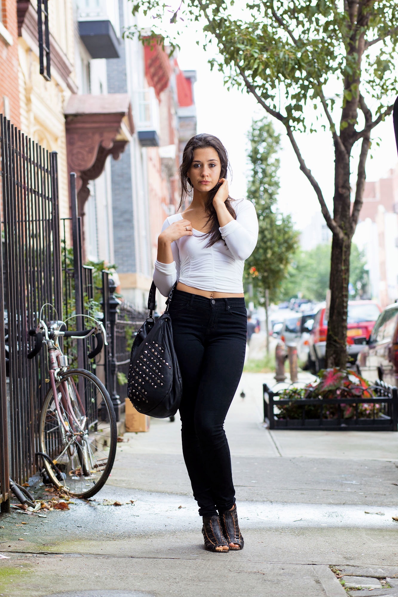
Then there is the actual image creation. Something that I harp on in lens sharpness tests is the need for the use of a flash to create specular highlights–which are little extra details that come out when a strong light source is added. Right out of the camera, that gives us extra perceived sharpness and we haven’t even hit the post-production phase yet. Combined with accurate autofocusing, this is an absolute no brainer–and it is why I embrace strobism so much.
When I bring my images into Adobe Lightroom 5, I boost the clarity, and sharpening amount, radius and detail by 5-7 degrees. Sometimes I even go to 10, but that’s rare honestly as modern day lenses and cameras are resolving so much detail with good lighting that it’s a tad ridiculous.
Then there are the very unconventional things: to start, I make the black levels darker until we like the way they look. The deeper the blacks are in your image, the sharper the eye will perceive them because it focuses more on other areas by default. After this, I boost the contrast. Added contrast is nice because it makes a larger difference between the darks and the blacks–which means that your shadows get darker and your highlights get brighter. This is also why I love Sigma and Zeiss lenses; because their contrast is stronger than typical lenses.
Then it’s about the luminance and saturation of specific colors depending on the scene. I often saturate and nerf or boost the luminance of the dominant colors and desaturate other colors for emphasis. It all depends on how I want the final image to look.
Lastly is the export process. If the image is going to the web for my portfolio, it is exported at 2000 pixels on the long side at 72ppi though I’ve gone as high as 120ppi with no issues on a Retina display. If the image is for a review for a reader to see sharpness, we only make it 72ppi and make the file size at 2MB. The reason for this isn’t to save bandwidth, it’s because quite frankly American internet speeds suck. And so we want to provide a smoother viewing experience more than anything. And if you’re a photographer, the last thing you want is your client waiting for an image to pop up.
And just remember–not every image needs to be pixel peeped. Your clients aren’t zooming in on their pores.
Get rid of the ads!
Did you enjoy reading this article as much as we enjoyed writing it? There's a way to support us and our reporting, getting ad-free navigation and more as a bonus. Subscribe to us for less than a coffee per month —just $3.99— or take advantage of our yearly subscription with a hefty discount for only $25.- An ad-free experience
- A free mystery box for Lightroom or Capture One
- All the books in our store
- 20% discount on Capture One
- 30% discount on Imalume Photo Theft Protection
- 20% off Herbs and Kettle Tea Company.
- 20% off your order from MPIX printing services.
- 5% off Viltrox Products via their eCommerce store.
- 10% off all film developing, printing and scanning services from Blue Moon Camera and Machine
- 15% off 7Artisans products: The lens and accessory maker is offering a sweet discount for Phoblographer's readers.