Last Updated on 05/26/2015 by Chris Gampat
All images concepted by Studio Hands. Used with permission.
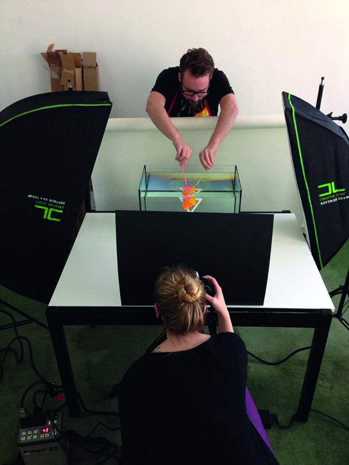
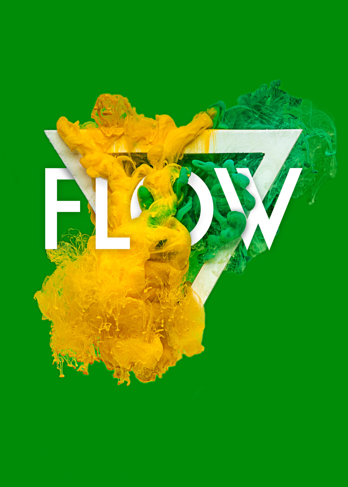
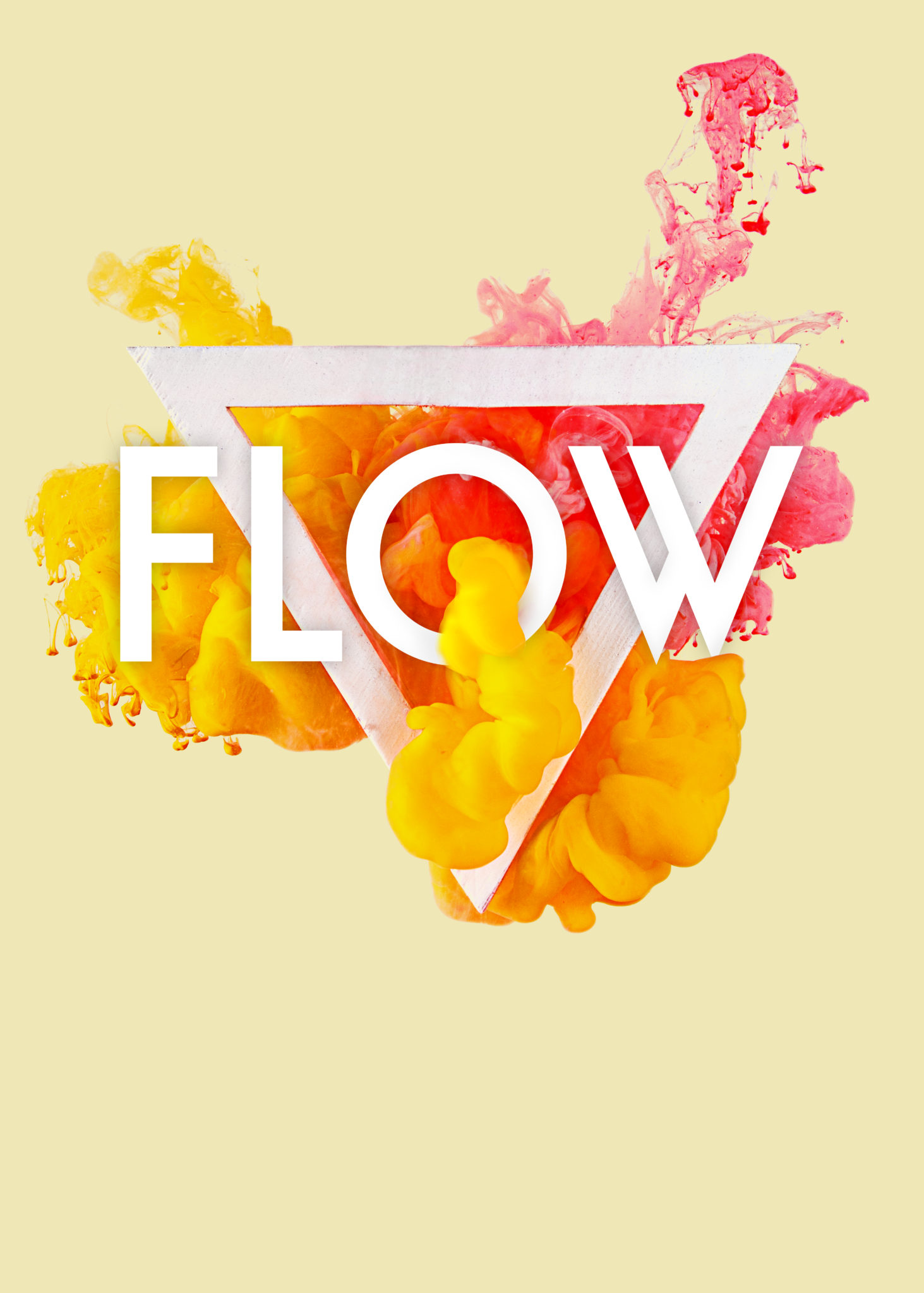
When a company approaches you to create a new logo, what are some questions that you’d ask first? The folks over at Studio Hands started concepting and playing with words while exploring creativity to help FLOW, a house music culture company that s all about marketing to youth interested in the scene. With the help of photographers Sabine Metz (who did the retouching and shooting) and Johnny Van Bergen (who did the set-up and technical work) they collaborated with the simple instructions “Make it flow” and “Use a triangle”.
From there, ideas came up. We talked to Hilmer over at Studio Hands about how they created the concept and logo for DJ Franky Rizardo’s company.
Phoblographer: Talk to us about your photo studio. What do you guys do?
Hilmer: We’re a creative studio focussing on graphic design and illustration, and photography is always a big part of our work. We would like to call ourselves story-tellers; we develop campaigns and visual identities (e.g. branding) for a wide array of ambitious clients. Clients such as stand-up comedians, festivals, dj’s, schools, IT-proffessionals, product designers and many more.
Phoblographer: Talk to us about how the project started. You were approached by Flow, and they wanted a design. But where did the ideas come from?
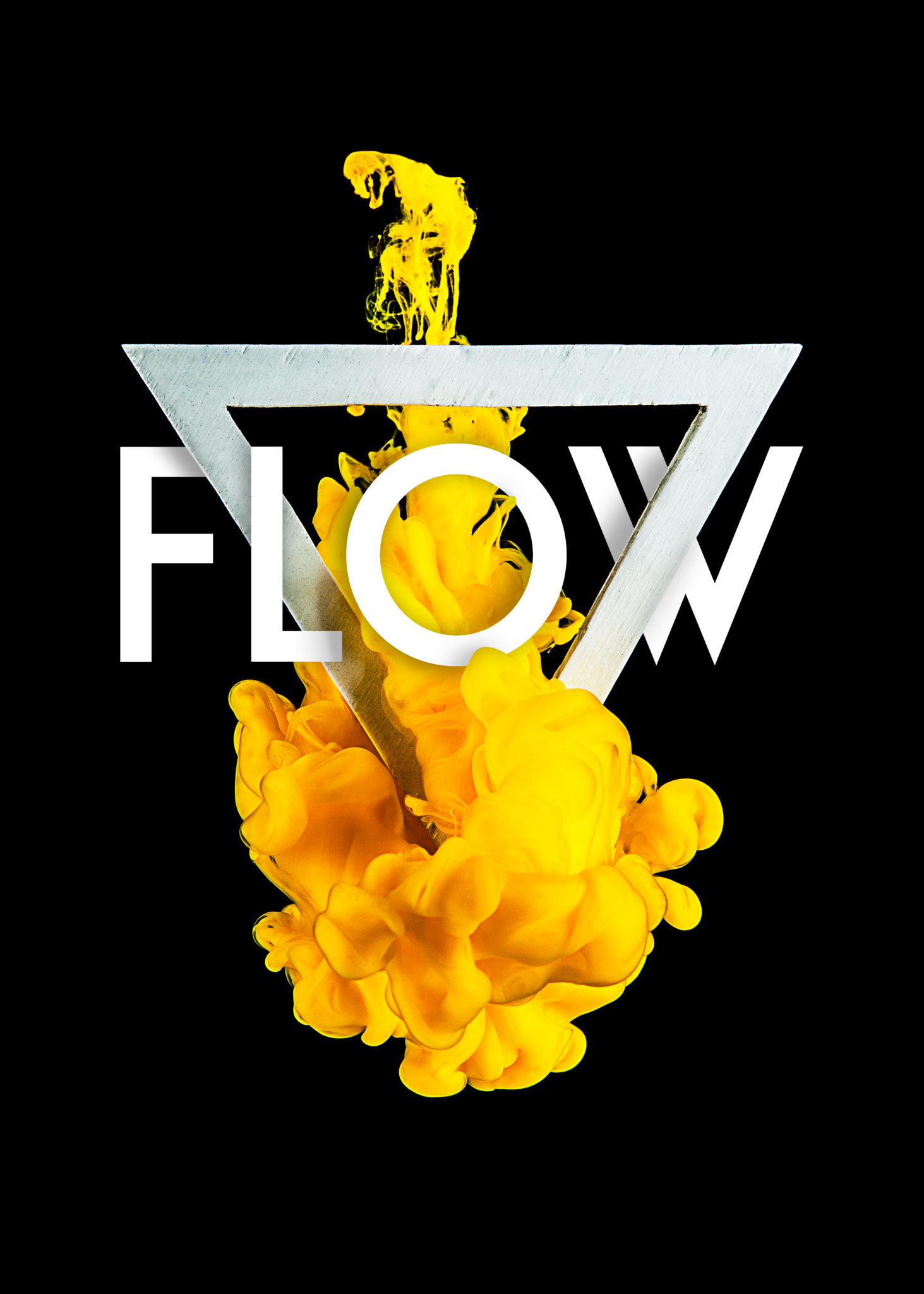
Hilmer: We had already developed the identity for DJ Franky Rizardo, who is the initiator of FLOW. He was proud of the work we did for his own brand and wanted us specifically to work with him on the FLOW project. His wish of using a triangle was basically the briefing he gave us for the project. ‘Make it FLOW’ and ‘Use a triangle’ wraps his briefing together pretty well I think. The triangle originates from the three genres the FLOW brand stands for; house, deep-house and tech house. The brand tagline became ‘House music must have FLOW’, which originates from the seemingly virtuosity the three genres blend together in FLOW podcasts and on FLOW stage hostings at festivals.
Phoblographer: Why the idea to drop ink into water and how do you feel it works in conjunction with the house music scene? We’re assuming that you guys listened to a lot of house music for creative inspiration, right?

Hilmer: Both Sjoerd (the partner I started Hands with) and I are big music fans in general since we were young, basically. At our studio, we have music playing all day, all week. House music (amongst other genres) is no exception. Franky provides us with a nice update on house music every week with his FLOW radio show on Dutch radio SLAM!FM.
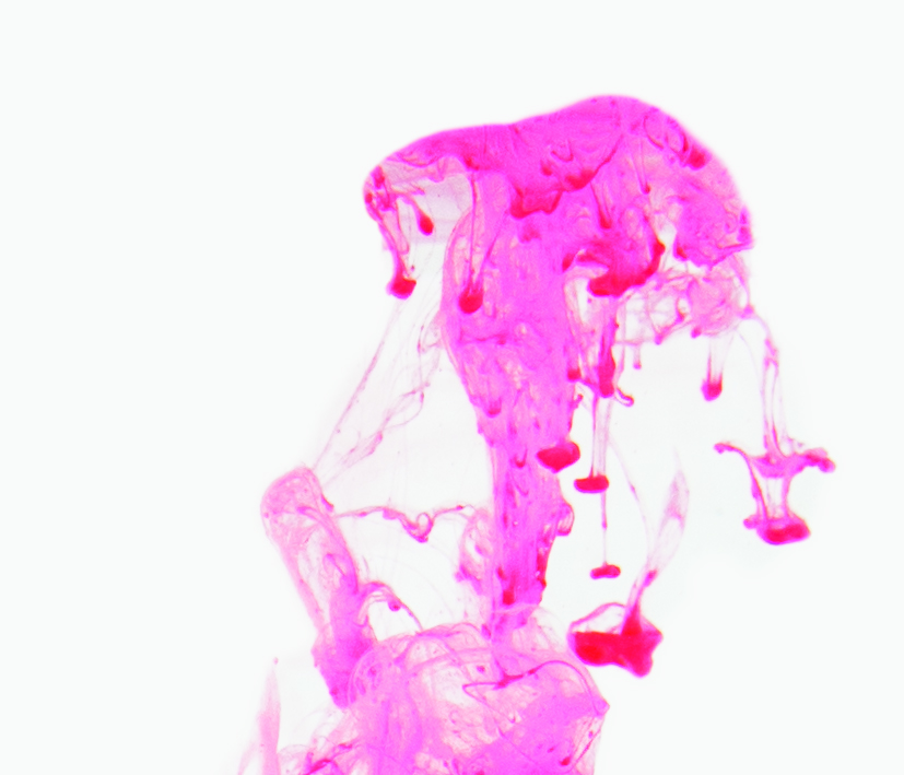
We had always loved the idea of materializing a logo and bringing it to life. FLOW gave us the opportunity to do just that. We had the triangle made from wood and exposed it in a water tank to all kinds of ink and paint. I think the colors match really well with the festive feeling you get listening or dancing to this particular music.
Phoblographer: Were the colors chosen to specifically reach out to aspects of house music culture? How so?
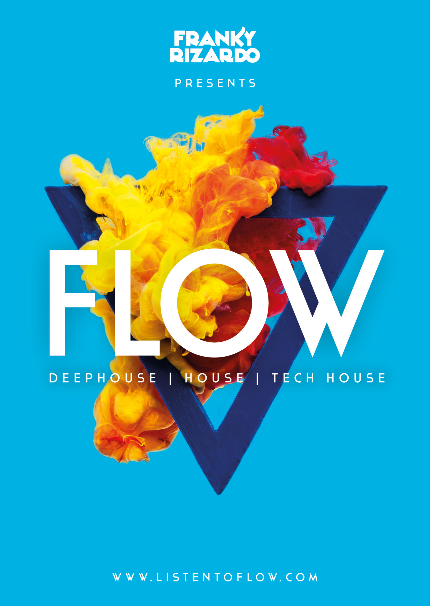
Hands The color schemes actually match the colors of the festival hostings FLOW was booked for, and then we did some extra combinations. For Dance Valley there was the pink/yellow one, for Amsterdam Dance Event there was the black/yellow/white one, and so on.

Phoblographer: What other ideas did you guys have and how did you know that the idea to have ink in water would be the best one?
Hilmer: A bit of history: We were really inspired by the BBC2 idents, we love how the ‘2’ really goes through a lot of stories year after year. We would love to develop our own take on that with the FLOW project.
Of course we also had a lot of different ideas, such as making the logo from jelly, using smoke instead of ink and making the logo out of mirrors instead of wood. The sky is the limit on this project, we think. As long as it matches the emotion that comes with the music.
Phoblographer: Talk to us about the technical setup for this. What gear did you guys use and how was it accomplished?

Hilmer: We had two days of shooting. One day for photography and one day for video.
For the photography we have worked together with photographers Sabine Metz and Johnny van Bergen, who used a Canon 5d Mark II with the 24-70 2.8 lens.
For the video we had worked together with Koen Berkhout from The Bache, using a Sony FS700 video camera with Canon 24-70 F2.8 L Lens, that shoots somewhere around 200 frames per second in full HD.
Flow 3 – ADE – BlackWhiteYellow from The Bache on Vimeo.
Phoblographer: You guys did this with lots of different types of colored ink and using the flow logo. What was the culling and editing process like? That’s usually the toughest part of any shoot.
Hilmer: The most work was in preparation, actually. Trying out different kinds of ink, (not all colors worked right away), also getting the lighting right was tricky with all the reflections on the water tank, then filling the tank and emptying it every time we had shot a color setting. Sabine is an expert on post production photo editing with roots in portrait and fashion photography, so we asked her to do most of the retouching. You should really check out her portfolio because she is definitely a talent.
Phoblographer: You guys also have the slow-motion video, in terms of a creative package to deliver to a client, how do you feel this added value?
Hilmer: This was something we just did because we thought it would be cool. The underwater movement of the ink in the tank is really cool and graceful. We didn’t know what we’d be using it for, beforehand. The video’s turned out to be very useful as VJ backdrop material on big led walls stage hostings and in clubs, and also for online promotion with short clips on Facebook, instagram and so forth.

Phoblographer: If this idea wasn’t approved by flow, what other ideas would you have tried?
Hilmer: I guess we would have tried making the logo from a large array of materials, such as jelly, wood, bubblewrap, mirror, concrete, anything.
Get rid of the ads!
Did you enjoy reading this article as much as we enjoyed writing it? There's a way to support us and our reporting, getting ad-free navigation and more as a bonus. Subscribe to us for less than a coffee per month —just $3.99— or take advantage of our yearly subscription with a hefty discount for only $25.- An ad-free experience
- A free mystery box for Lightroom or Capture One
- All the books in our store
- 20% discount on Capture One
- 30% discount on Imalume Photo Theft Protection
- 20% off Herbs and Kettle Tea Company.