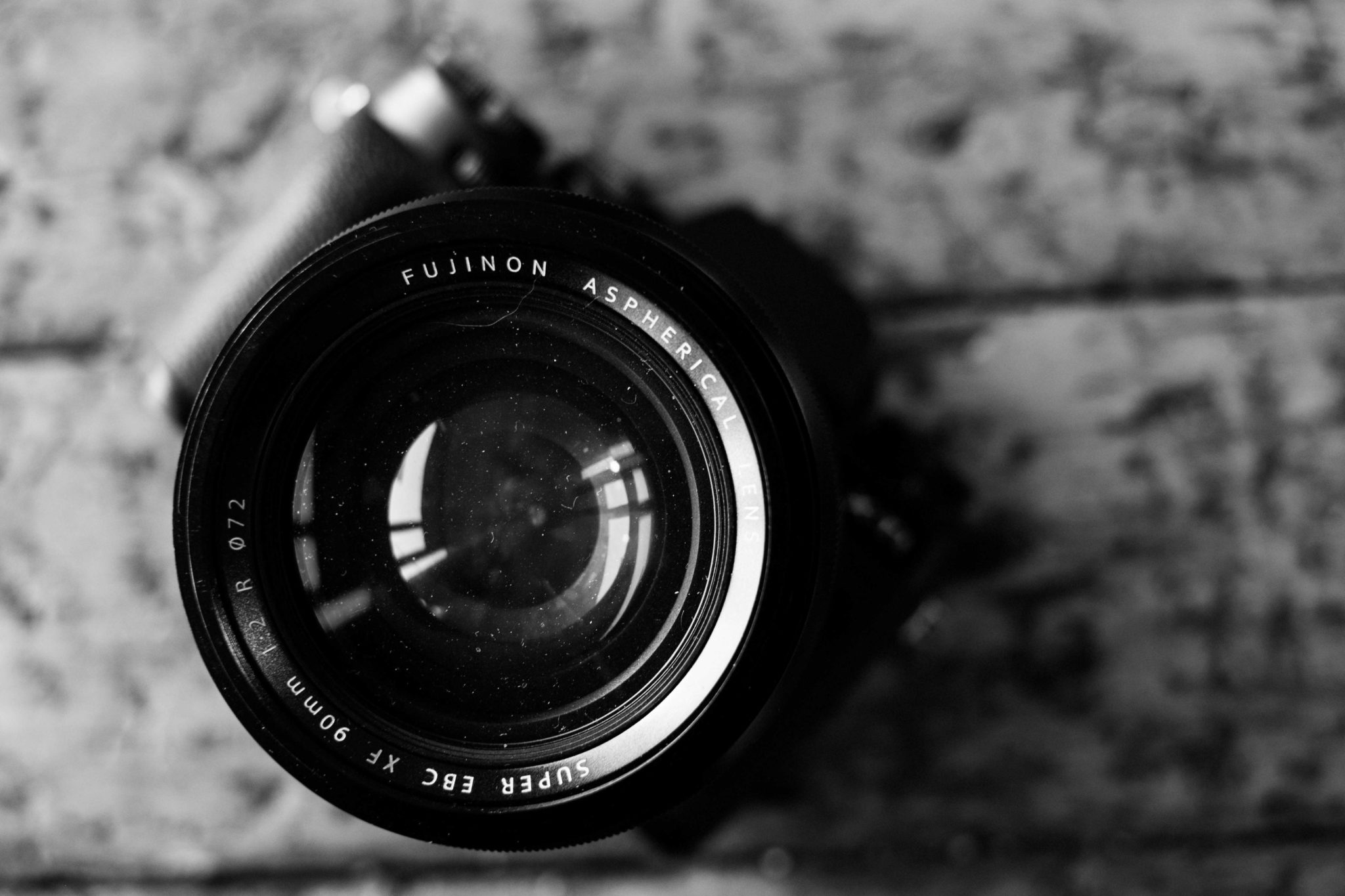
In the past couple of years, we’ve seen lots of use of black and white in both films and photos as a creative story telling element. While this has everything to do with the lighting, it has even more to do with the contrast in a scene. Over and over again, we’ve seen loads of subjects simply pop off the screen or paper all because of a solid high contrast black and white image. As we’ve explained before, the deeper your blacks are the sharper an image can be perceived by the human eye–as is well demonstrated in the image above.
But here is how high contrast black and white takes that idea and puts it a step further.
Better Emphasis on Subjects
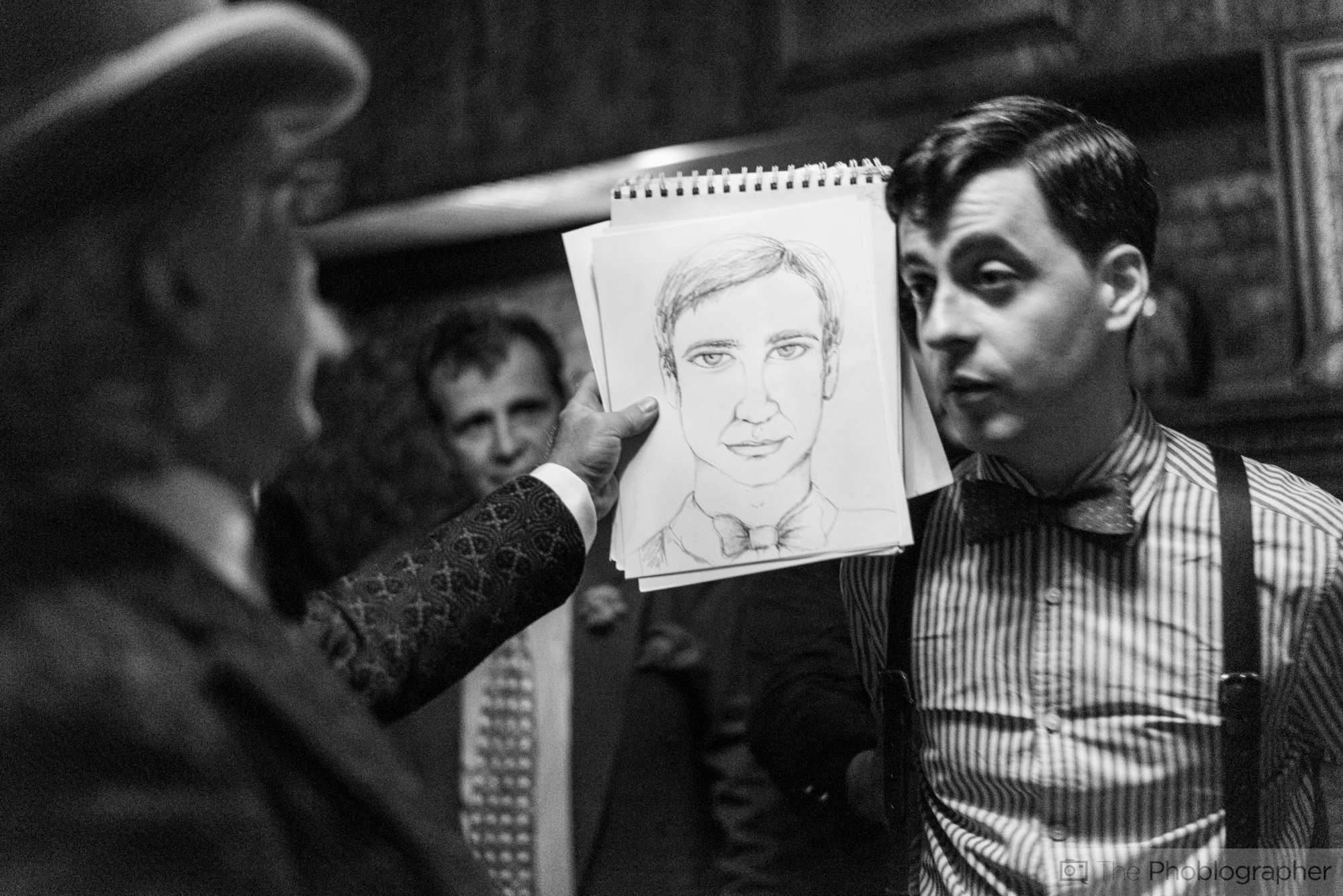
When an image is in color, the human eye tends to scan a scene and takes in all of the colors in addition to the content based on the composition of the scene. Photographers tend to expose for the subject that they’re shooting, and so when you expose for this subject and then convert to high contrast black and white, you put even bigger emphasis on them to make them stand out.
High Contrast black and white really tends to kill the midtones and instead includes the absolute brightest brights and the darkest darks. The area in between is often highlighted or shadowed by the two and brings the human eye to focus on them primarily.
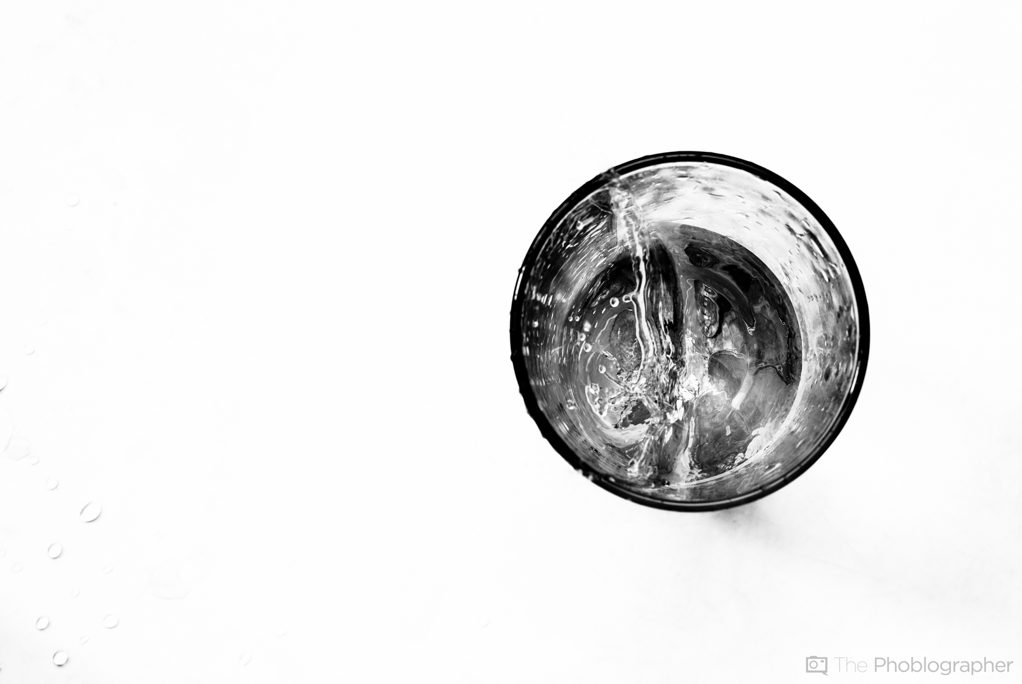
The Simplicity of Only Two Colors on the Eyes

Let’s face it: black and white images are just simpler for us to look at. Our eyes just have to process shades of black and white, and the subject then throws out all the rest of the information.
High contrast images tend to make this simpler by directly leading the eyes where to look because of silhouettes, overexposure or general shaping. In low contrast black and white, the eye tends to look all over the scene because it’s all relatively the same color scheme even though the use of depth of field, composition and more can help.

Essentially what we’re saying is that low contrast images are like a tiny poke while high contrast is more akin to a strong punch.
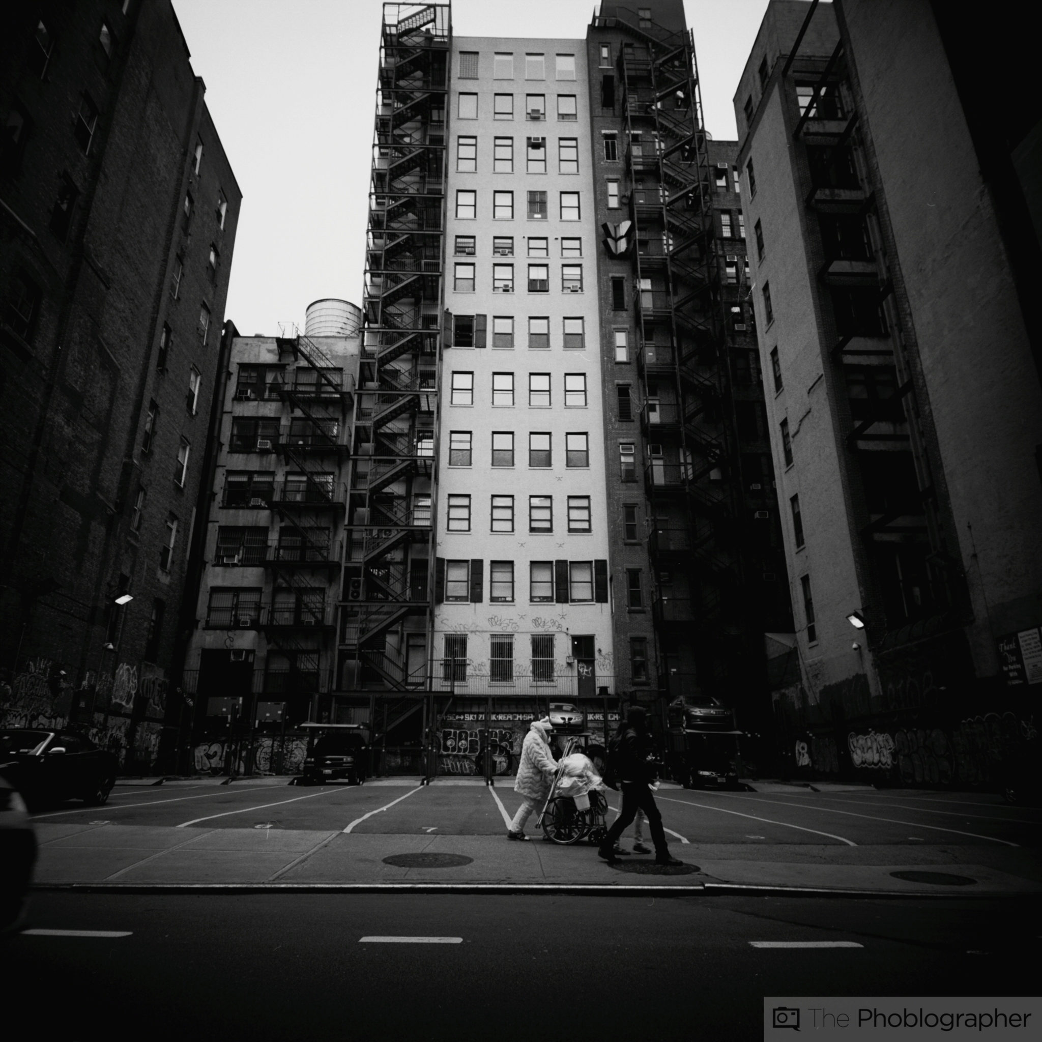
Geometry
Think about this:
– When the rules of composition are followed, the human eye tends to scan the specific intersections of an image
– Add in even more lines and grids and you’ll have people who stare at your images even longer.

Every photographer’s goal is to create images that people stare at for long periods of time. It’s an insult when someone simply flips through your portfolio and doesn’t feel anything from the images. Good ones grip people and force them to stare. While one of the simplest ways to do this is to add text to your scenes, it’s also really easy when you just add lines that eventually lead people to your subjects. Combine this with the simplicity of two colors and you create something that is far more beautiful than it could be in color.
Get rid of the ads!
Did you enjoy reading this article as much as we enjoyed writing it? There's a way to support us and our reporting, getting ad-free navigation and more as a bonus. Subscribe to us for less than a coffee per month —just $3.99— or take advantage of our yearly subscription with a hefty discount for only $25.- An ad-free experience
- A free mystery box for Lightroom or Capture One
- All the books in our store
- 20% discount on Capture One
- 30% discount on Imalume Photo Theft Protection
- 20% off Herbs and Kettle Tea Company.
- 20% off your order from MPIX printing services.