There’s been a challenge making the rounds on Facebook lately: a 5-day black & white photo challenge in which you post one black & white image a day for five days. With each post, you nominate someone else, who can either accept or reject the challenge, and it seems to be a mixed bag, with folks either accepting or forgetting they’ve been nominated. It seems, based on general experience, that a good number of them don’t typically shoot in black & white, so the challenge is, in fact, a challenge, a way to shake up one’s routine. What’s unfortunate is that shooting in monochrome has become niche enough to warrant making it a “social media challenge” when it was the standard for so many years.
To go with or without color is a key aesthetic choice in any project you take on, and it needs to be a reasoned choice, one that you can support when asked about it. The challenge seems to be monochrome for monochrome’s sake, when many of those images would be far better in color. It’s important to step outside your mode, particularly if you tend to stick to one side of the color divide.
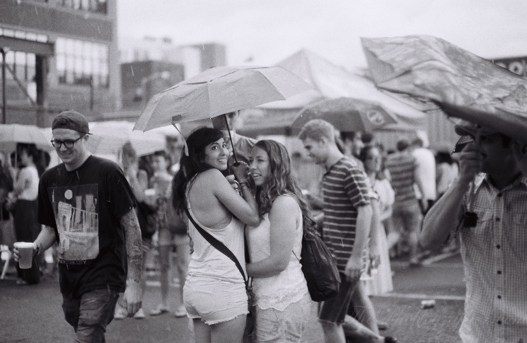
Both color and monochrome have their limitations. Poorly deployed, color photography can be inescapably distracting, drawing attention away from the focus of your image, making the frame a visual mess. Conversely, monochrome runs the risk of making everything blend into each other, making the eye travel all over the frame in search of the subject. Part of this has to do with the way that the human eye and brain work together in conjunction. It also has to do with sharpness of an image–as images with deeper blacks can often look sharper than others when not looking at the image at 100%.
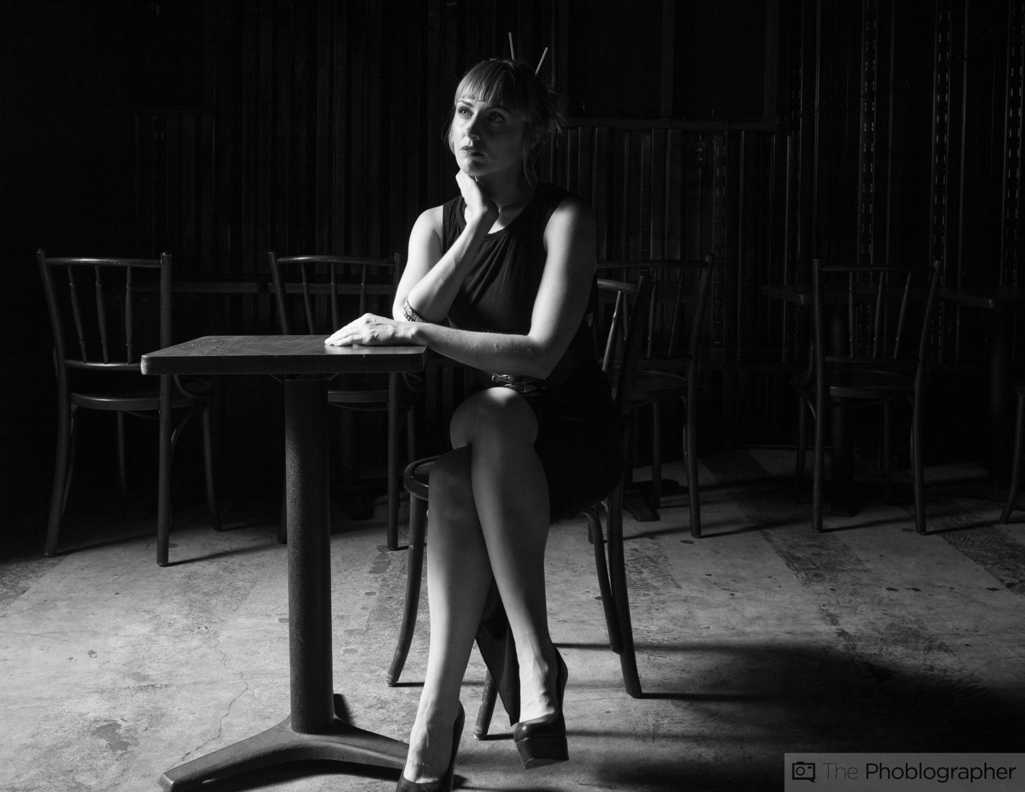
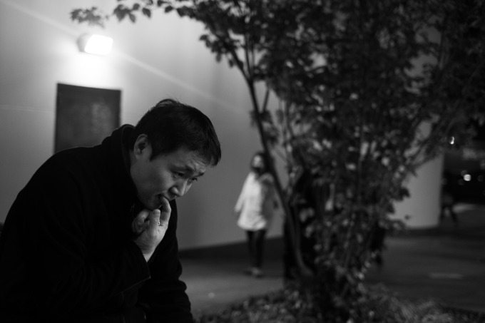
What monochrome does exceedingly well is put emphasis on the subject of your image. Removing color can heighten tension and emotion, and it draws attention to the image as a photograph. It reminds the viewer that what’s being presented is a particular vision. The reason for this has to do with contrast and the fact that there are only two tones. It’s easier for the brain to process a scene in black and white because it tends to focus on certain subjects more than others. This is also one of the reasons why films like Kodak Tri-X and Ilford Delta were so popular for many years and still are today. Their lack of color with a splash of film grain are beautiful and not distracting.
You will almost never hear someone say, “The bokeh is distracting” with a black and white image.
Color, however, can put the viewer in whatever’s being presented. It’s a reproduction of life beyond the lens, and it works particularly well when color is an integral part of the composition. Color bridges the gap between the viewer and the scene.
For many years when digital high ISO results weren’t good enough for many photographers, they would simply convert their images to black and white. But as technology got better, that went away and shooters started to embrace the colors.
Now don’t get us wrong, we’re not saying that you should always limit yourself to shooting in black and white and limit yourself, but give it a try. Explore the medium to see if it’s in line with your artistic vision. Otherwise, try processing the image differently in the post-production stage. Juxtapose the same image in color and black-and-white when you’re editing.
Before you set out on a new project, you have to decide whether you’ll shoot in color or black & white, though that’s not a binding agreement. That can change over the course of the project, and it’s not unheard of to mix the two. You just have to figure out works the best for the story you’re trying to tell.
And for that reason, we don’t think that you should discount the look of black and white.
Get rid of the ads!
Did you enjoy reading this article as much as we enjoyed writing it? There's a way to support us and our reporting, getting ad-free navigation and more as a bonus. Subscribe to us for less than a coffee per month —just $3.99— or take advantage of our yearly subscription with a hefty discount for only $25.- An ad-free experience
- A free mystery box for Lightroom or Capture One
- All the books in our store
- 20% discount on Capture One
- 30% discount on Imalume Photo Theft Protection
- 20% off Herbs and Kettle Tea Company.
- 20% off your order from MPIX printing services.