Last Updated on 05/29/2023 by StateofDigitalPublishing
Creating the Photograph is an original series where we interview photographers about a photo that they shot and how it was achieved. The results are some knowledge passed on to you. Want to be featured? Email chrisgampat[at]thephoblographer[dot]com
Photographer Andy Campos has an interesting story behind this Los Muertos shoot involving not only one heck of an excellent photoshop job, but also great key light and back light placement. Andy shoots on the side as a semi-professional with a day job in the IT world. He cut his teeth as a photographer shooting film in the Navy and now works in the digital realm.
When a local salon asked him to shoot some images for advertising, he decided to go above and beyond.
The Concept

The Dia De Los Muertos concept was decided up before the salon began looking for a photog to shoot it. Their intent was to have images to showcase for bringing in business for halloween make up/hairstyles etc.
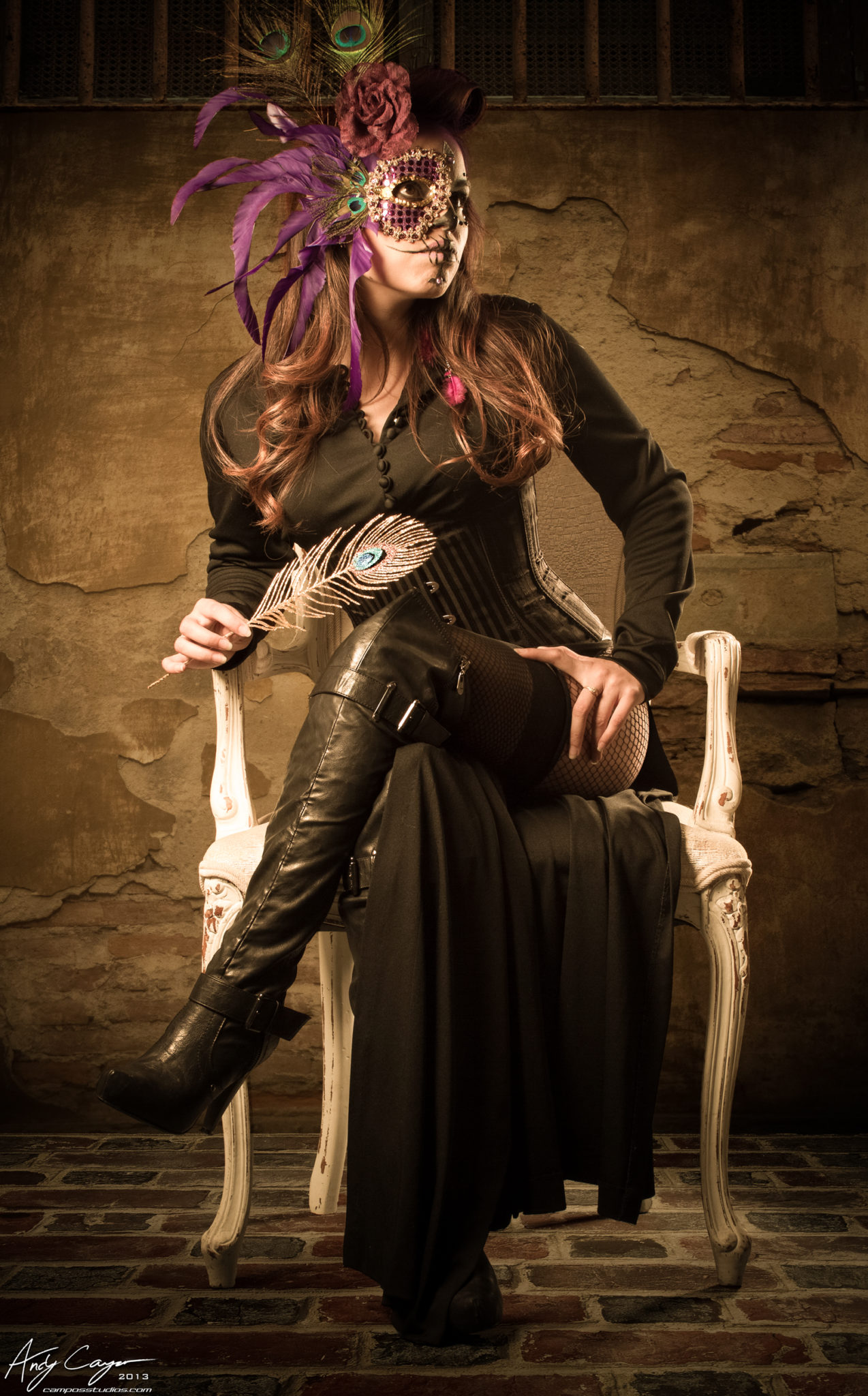
Shooting a Los Muertos theme is something that I have wanted to do for a while as I love the dark beauty nature it embodies, so I jumped at the chance.
I believe the salon expected standard model shots, but I wanted to give them something over the top. My idea or approach was to give them something that was a cross between a Dusk ‘Til Dawn (Robert Rodriguez) and something out of Vogue magazine. High Fashion meets dark beauty.
The Gear
- Canon 7D
- 50mm f1.2 L
- Paul C Bugg Cybersync Transceivers
- 53″ roll of thunder grey paper and backdrop stand
- 2 x Paul C AB800 strobes and stands
- 22″ Beauty Dish with sock
- 10×36 Strip Softbox
- I also threw in a couple of extension cords on a roll up rig with local plugs and breakers, to make sure I could bring power to where I needed it to be.
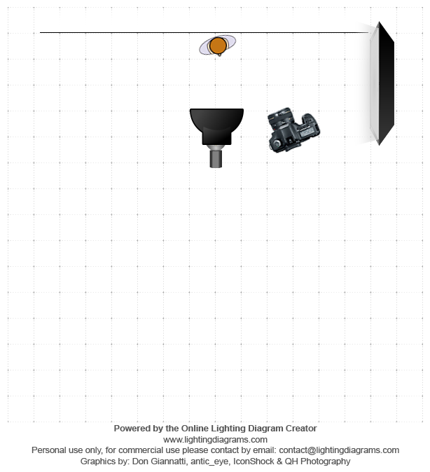
- The Main (with beauty dish) was left and front of the model at about 45 degrees from her. The 10×36 stripbox was back and left of her at about 45 degrees to give that nice edge light.
The Shoot
The shoot was divided up into two separate areas. I walked around the salon scoping out the potential shooting areas while the makeup artist was finishing up the first model, one of their rooms had a nice white damask pattern on the wall, and I thought this will be great for the clean Vogue style shots.
I planned on setting up the grey backdrop in the main salon area to get the shots for doing heavy lifting in photoshop later, lots of compositing.
While shooting one of the models in the white room, I began thinking, “stark white wall.. stark white dress…. this may be my first chance to get the blown out image I have been wanting to do.” After a couple of test fires, I hit her with a lot of light from the main, with the beauty dish, and even off the back of the camera her dress began disappearing into the wall…perfect!!! Finally the blown out look I have been wanting.
The white room was very tiny–a small hair washing area in the salon, still, I wanted to get different looks from this room. At some point I noticed this nice chandelier that was hanging above us, I tilted my 10×36 softbox up at it, grabbed a rickety stool, shoved it into the corner and climbed up on it. While trying to get the right angle to shoot through the chandelier in order to capture it in the foreground I began realizing this stool feels like its going to give way at any second. The shots of the thru chandelier I took were with a precarious balancing act on one leg, hand bracing my self against the wall and one handing a heavy gripped 7D with the gigantic 50mm f1.2, but the shots were worth the circus act.
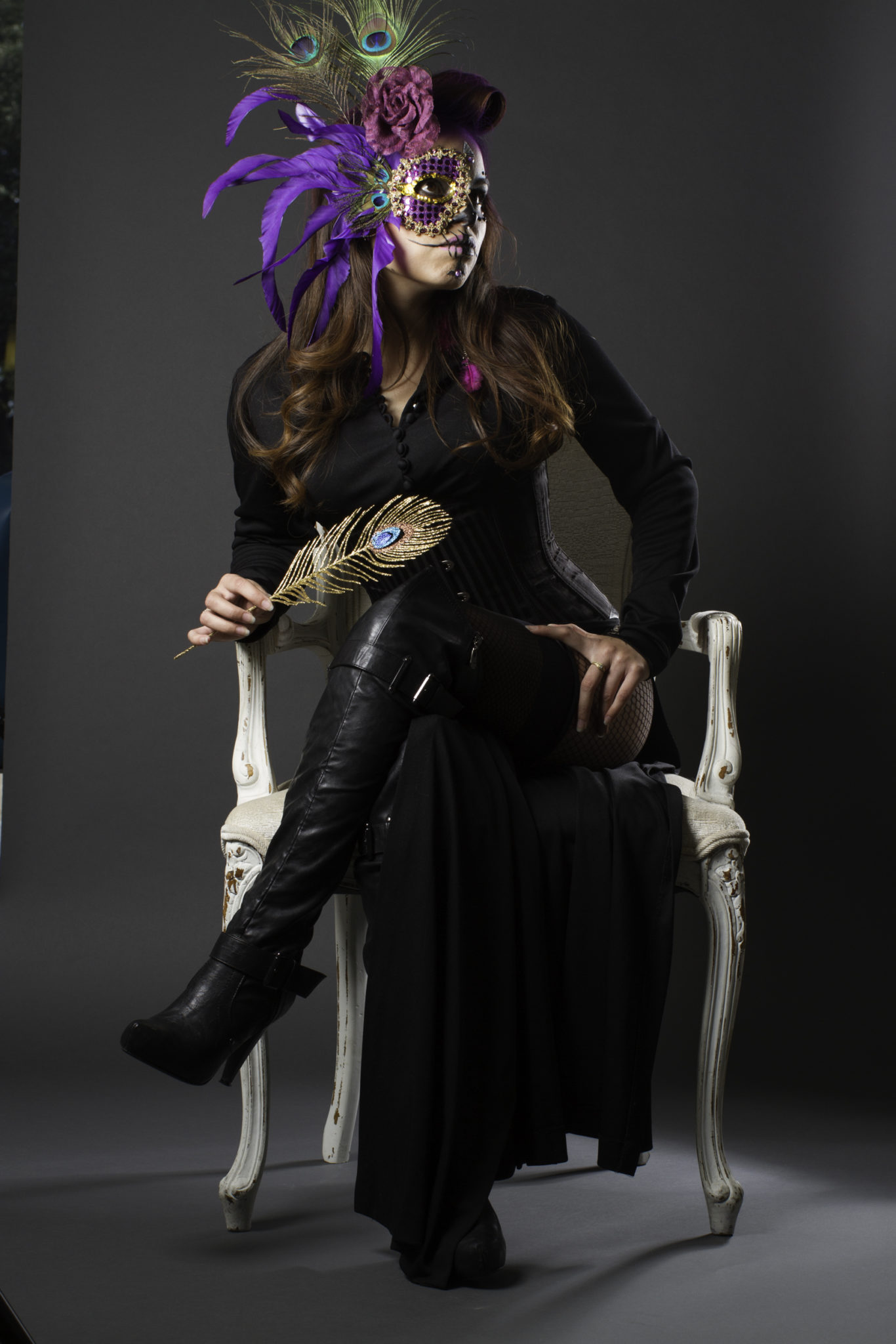
After shooting both models in the white room we moved on to the grey sweep that I had already setup in the main salon area. This part was pretty straight forward. The chair used in the shots were from the salon’s waiting area. The back of the grey sweep was facing the front of the salon, which is mostly glass, side walk out front, etc. It’s funny looking at some of the pre-edited shots as there are cars, taxi cabs, people walking by, etc captured on either side of the sweep, pretty out of the norm when you are used to shooting on your sweep in your studio.
At one point during the shoot on the sweep, I began looking around for props to add depth and interest to the shots. The makeup artist, Deyah, and I dragged a table and some candles over and started playing around with arranging them. Once I had the table and candle where I though it would look great and add the depth I was looking for, the model, Edna, asked the makeup artist, “Can I put my feet on the table?”. She said yes, and I immediately dropped to a low angle shot and that became one of the best shots that day.
Post Production

For the white room shots, my approach in post was make them look like they belonged on the pages of a fashion magazine, while still conveying the dark beauty and still utilizing the stark white feel of the room. For the blown out shot I mentioned earlier it was as simple as tweaking the highlights and whites a little to complete the blown out look, as some of the damask was still visible in the shot right off of the camera. I tweaked highlights and whites until the dress truly disappeared into the wall and there was no discernable edge to her arm.
The shots from the grey sweep is where I had the most fun. I used to shoot mostly on ultra white sweeps to do model cut outs and background replacements, until I ran across a german photog’s work that changed the way I do my composites. Its quicker, cleaner, and the results in my opinion are far more dramatic as you keep the original shadows from the shot, which really helps sell the belief the composite is real. The photog I am talking about is Calvin Hollywood. I have to give him a nod here because his work is stellar and his overlay technique changed the way I do my composites for the better.
The method is simple, but requires you to shoot on dark grey to pull it off. Once you have your shot in photoshop, drag your background texture in as a layer above the photo. Then change the blending mode for the texture to soft light. Voila! The texture covers the dark grey perfectly, your shadows are intact, and yes it’s on your model, too. For that, create a mask for the texture and brush away the texture from your model. It takes time but the results in my opinion are far better than the cut out method.
I manage my shoot in lightroom doing my picks, organizing, etc. Once I have found an image I want to run with, I use the LR develop mod to adjust the basics: temp, Exp, contrast, highlights, shadows,whites, blacks, basic cropping and lens correction. Occasionally I use ACR, but LR is already part of my flow, and the dev mod is essentially ACR. Once I have completed that I send it over to photoshop. Once in photoshop I start my skin smoothing, touch ups etc. One thing I do to help my photos really pop is adding some high pass to the clothes, shoes, jewelry, props etc.
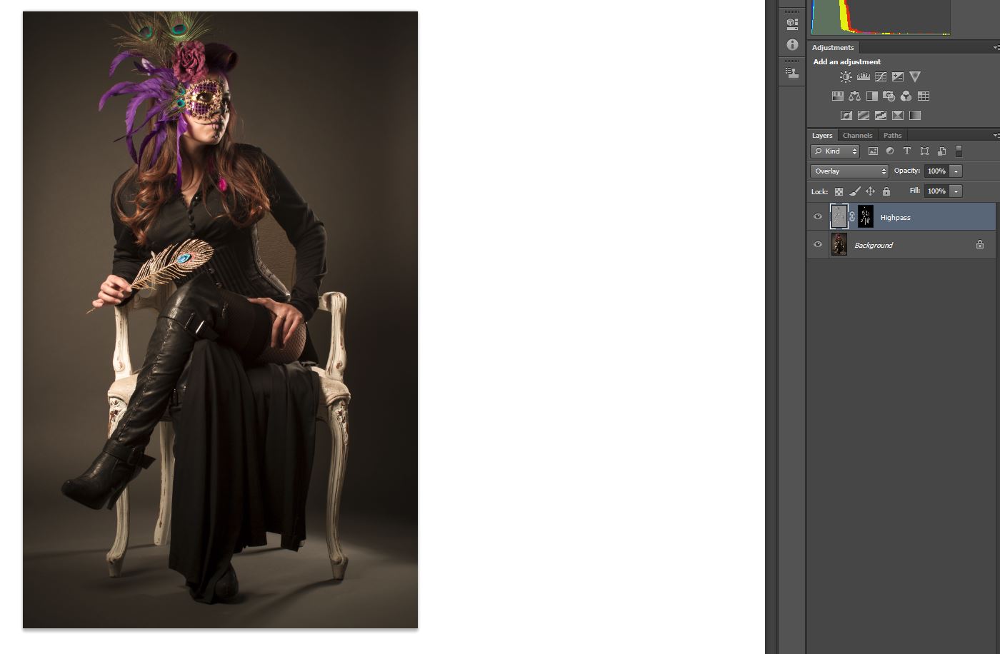
For the high pass portion I duplicate the image, and set Filter->Other->high pass. Then set the blending mode to overlay. I then create a mask for it, then invert the mask [CNTRL-I] this allows you to paint the high pass on where you want it. I usually do about 60-80% on key areas of the clothes, the hair, jewelry etc. After that is complete I merge the layers and move on.
When I am setting up my grey sweeps, one of the things I do is make sure I have a discernable line, slight curve where the paper curls from being a wall to a floor, versus a hard curve seen a lot when shooting an infinite background. This is critically import to compositing later. That line is how you know where to stop to wall and start the floor.
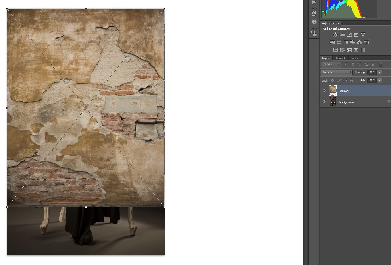
I sort through my textures to find the one that I think would best fit and drop it into photoshop. For the wall I drag the bottom to meet the line the paper is creating as I mentioned above. Then I change the transfer mode to Soft light.
The next step I create a mask, and begin brushing away the texture from my model. This can take quiet awhile to complete but again the results are astounding. I spend a lot of time zoomed way in with a small brush to get all the edges clean without creating a halo around the model. If you make a mistake accidentally remove some of the background. It’s as simple as hitting X to flip to white foreground color to paint it back in, then hit X again to flip back to black and move on without removing the texture from the model.

The floor for instance is the same principle however with one key difference, however, and that is perspective adjustment. You have to trick the eye into making the floor look like a floor. For this it’s the same thing, drop onto the image, blending mode softlight, but I go into Transform->Perspective and pull the image out and up to give it a 3d angle for the correct perspective. Then normally I will go back to free transform and push the image back in to keep the scale looking real.
Then once again its a matter of creating a mask, and brushing away the texture from the model.
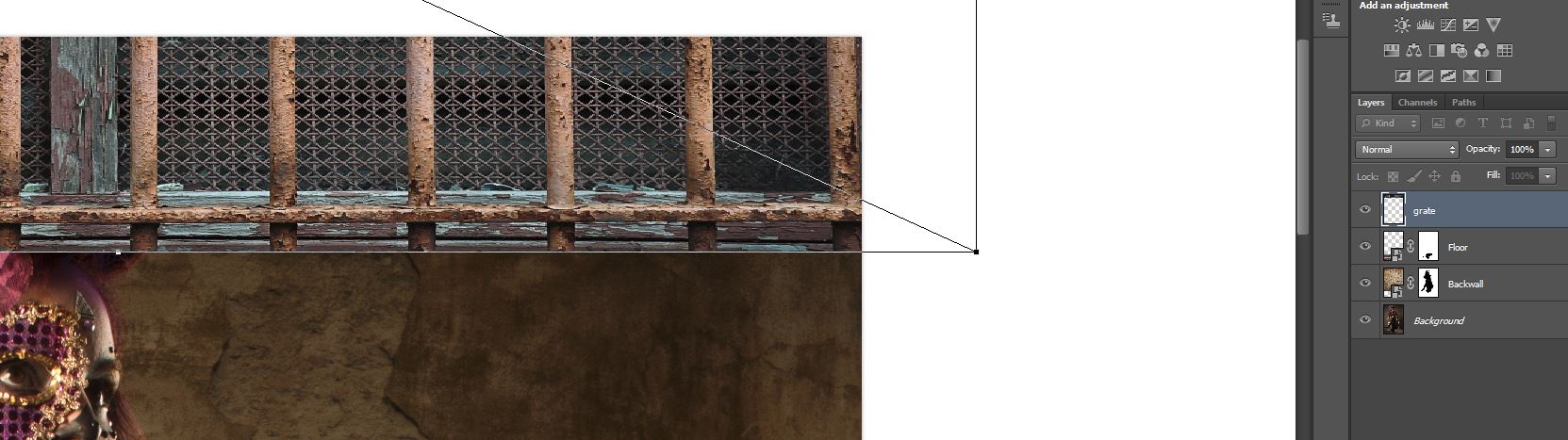
To give it a little more subtle edge I wanted to add a little more enviroment to the shot instead of just 2 flat textures so I dropped in a grate texture, same thing here, blending mode softlight. I then began brushing away parts of the grate to give it a clean edge so that it looked like it belonged on the wall.
Before and After
Be sure to check out more of Andy’s work at his Facebook, Website, Instagram, Twitter and his Tumblr.
Please Support The Phoblographer
We love to bring you guys the latest and greatest news and gear related stuff. However, we can’t keep doing that unless we have your continued support. If you would like to purchase any of the items mentioned, please do so by clicking our links first and then purchasing the items as we then get a small portion of the sale to help run the website.
Also, please follow us on Facebook, Flickr and Twitter.
Get rid of the ads!
Did you enjoy reading this article as much as we enjoyed writing it? There's a way to support us and our reporting, getting ad-free navigation and more as a bonus. Subscribe to us for less than a coffee per month —just $3.99— or take advantage of our yearly subscription with a hefty discount for only $25.- An ad-free experience
- A free mystery box for Lightroom or Capture One
- All the books in our store
- 20% discount on Capture One
- 30% discount on Imalume Photo Theft Protection
- 20% off Herbs and Kettle Tea Company.