Black-and-white conversions from color pictures are easy–just convert to greyscale in the photo editing software of your choice, and you’re there. But is it really that simple? You may have already guessed where this is going: of course it’s not that simple. For a proper black-and-white conversion, you don’t start off with an already processed image, and you don’t just convert it to grayscale. To do it properly, you make the conversion from a RAW file, because that way you’ll have much more latitude for tweaking the colors. The colors, you ask? What colors? I thought we were doing black-and-white? Of course we are, but since we’re starting out with a color file, why not use the colors that are there to optimize the appearance of the monochrome image? How we do that? Read on past the break to find out.
The Basics: Color vs. Monochrome
So let’s start with the basics: the difference between a color picture and a monochrome picture. Mind that we’re talking digital here, so what is going to be said cannot be transferred 1:1 to film photography. So, what is the smallest element in a digital image? You might say, “that’s easy, it’s a pixel of course!” But you’d actually be wrong. Why? Because a pixel actually consists of three individual sub-pixels: a red one, a green one and a blue one. Their combined brightness values make up the color value of the pixel. So, for example, red and green only make yellow, while green and blue only make turquoise. Individual color shades are realized by small increases or decreases in each sub-pixel’s brightness. Now, what does this have to do with black-and-white conversions?
When converting a color image to a monochrome image, what happens is that you switch the color ‘off’. This is done by leveling the brightness values of the sub-pixels in each pixel, so that together they represent a monochrome shade somewhere between black and white, instead of a specific color. This combined brightness value changes when the values of the individual sub-pixels change. For example, when changing the white balance in a picture, or tweaking the saturation, brightness and hue of individual colors–both which is possible with RAW files–we can influence the look of the monochrome conversion.
Black-and-White Conversions: Pratical Applications
By simply taking an image and switching off the color, we will get a black-and-white image for sure, but it will probably look flat and boring. The trick is to tweak the colors in such a way that the monochrome conversion looks exciting, that it has definition and evokes emotions. In a landscape, for example, we want the greens and yellows to be bright and shining, while we want the blues of the sky to be dark and dramatic. In a portrait, we might either want to level the shades of skin color so that the skin looks soft and even, or we want to pronounce the imperfections of our subject’s skin, depending on the type of portrait we’re taking.
There are a lot of different scenarios for black-and-white conversions, and each scenario asks for a specific look. What it all boils down to, then, is that we need to tweak the colors that form the basis for the conversion in such a way that their corresponding monochrome shades will create a black-and-white image that has a look suiting the subject. Be that a landscape, a portrait, nature photography, product photography etc. In the following section, I will present some exemplary black-and-white conversion done with Adobe Lightroom, and will go into detail as to what specific settings I used for each picture.
Doing Black-and-White Conversions in Lightroom
Converting a picture to monochrome can often have a dramatic effect. By reducing the information to shades of grey (no pun intended here), our brain no longer has to deal with all the color information and can concentrate fully on the forms and shapes and the lights and shadows in the image. This helps to focus on the actual content of the image. Other times, especially with digital photography, colors may be all off due to a high ISO setting, mixed light or other factors that influence color reproduction. In these cases, converting to monochrome may help salvage an otherwise unuseable image.
Converting a Portrait to Black-and-White
As already mentioned, in portraiture converting to black-and-white can help to make a person’s skin appear more soft and even, since we’re able to balance out the different shades of skin color. In order to do so, there are three basic steps we have to take:
- Choose a white balance that helps reduce the contrast in the skin tones
- Adjust the levels of the individual skin color shades
- Adjust the overall contrast in the image
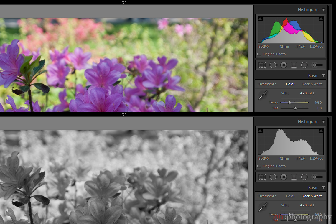
The starting point of course is to import the picture or select it from your Lightroom library. For this post I used Lightroom 5, my workflow software of choice, but the general principles should be the same in any photo editing software. Since the picture probably opens as a color version, we first need to select ‘Black & White’ in the ‘Basic’ options menu.
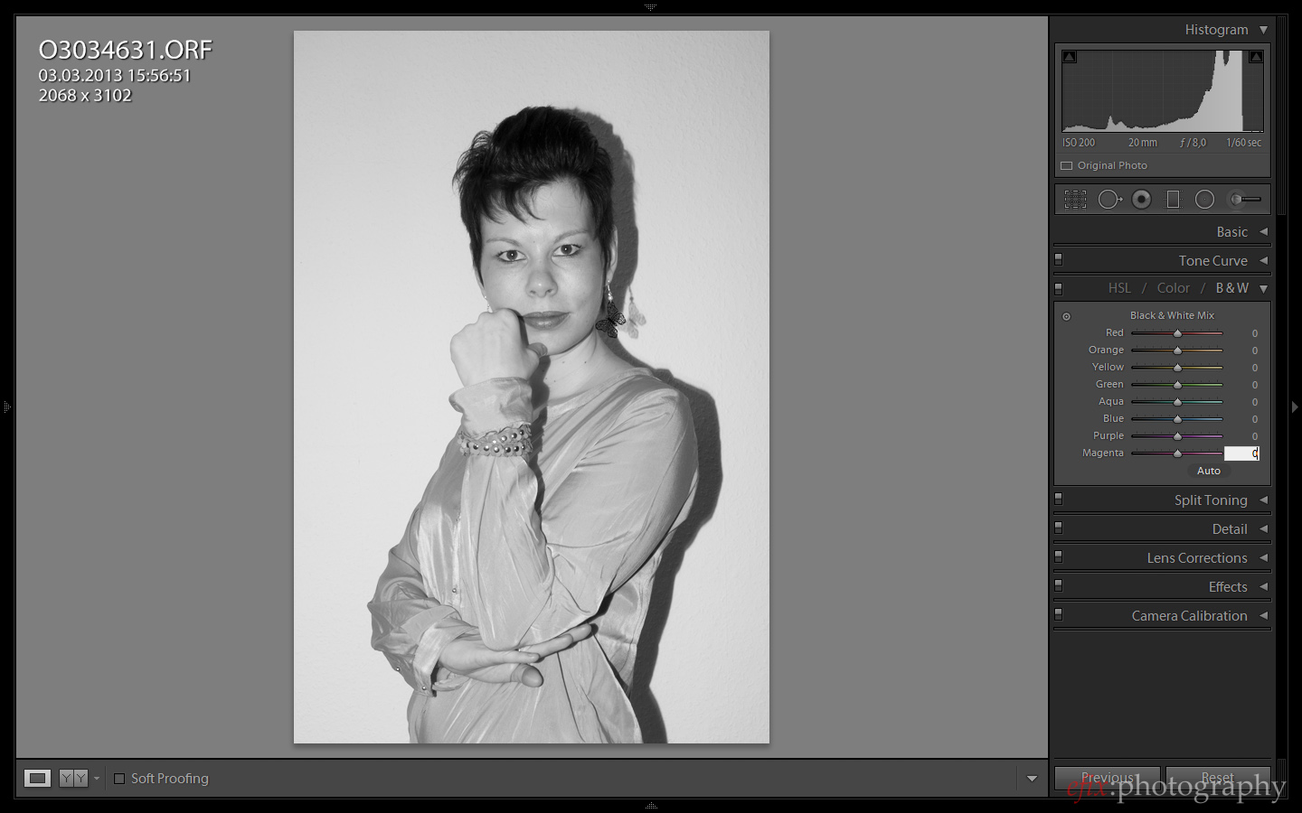
The next step is particular to Lightroom. Upon selecting ‘Black & White’, Lightroom automatically applies color adjustments to the individual color hues in the ‘HSL / Color / B&W’ menu. Since we want to manually adjust these later, we first need to set them all to zero. This also helps with choosing the correct white balance to start out with.
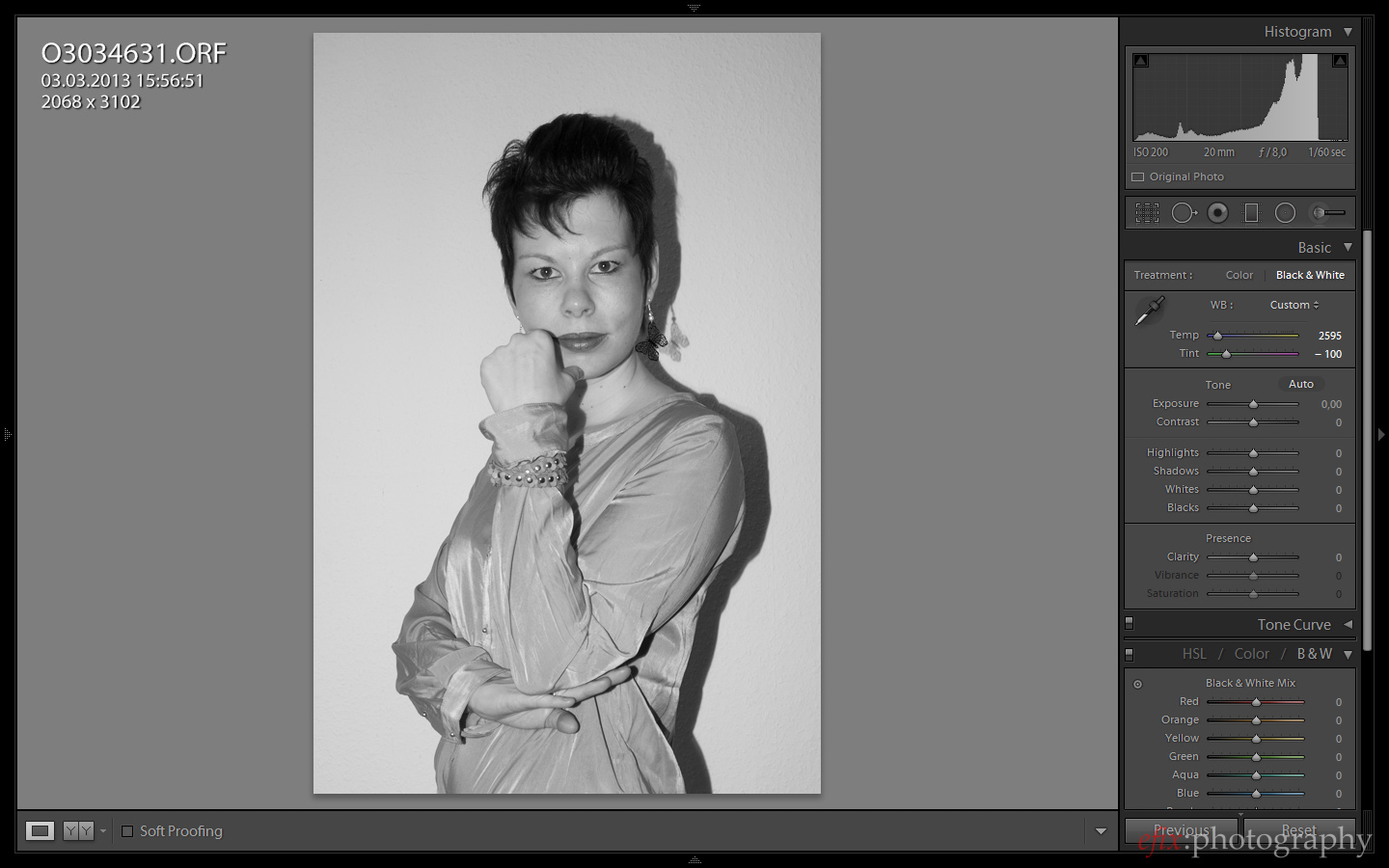
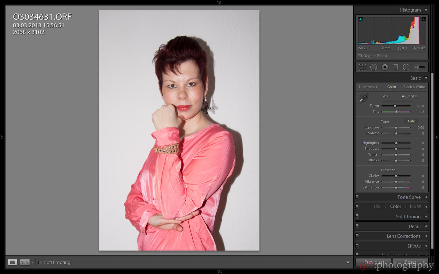
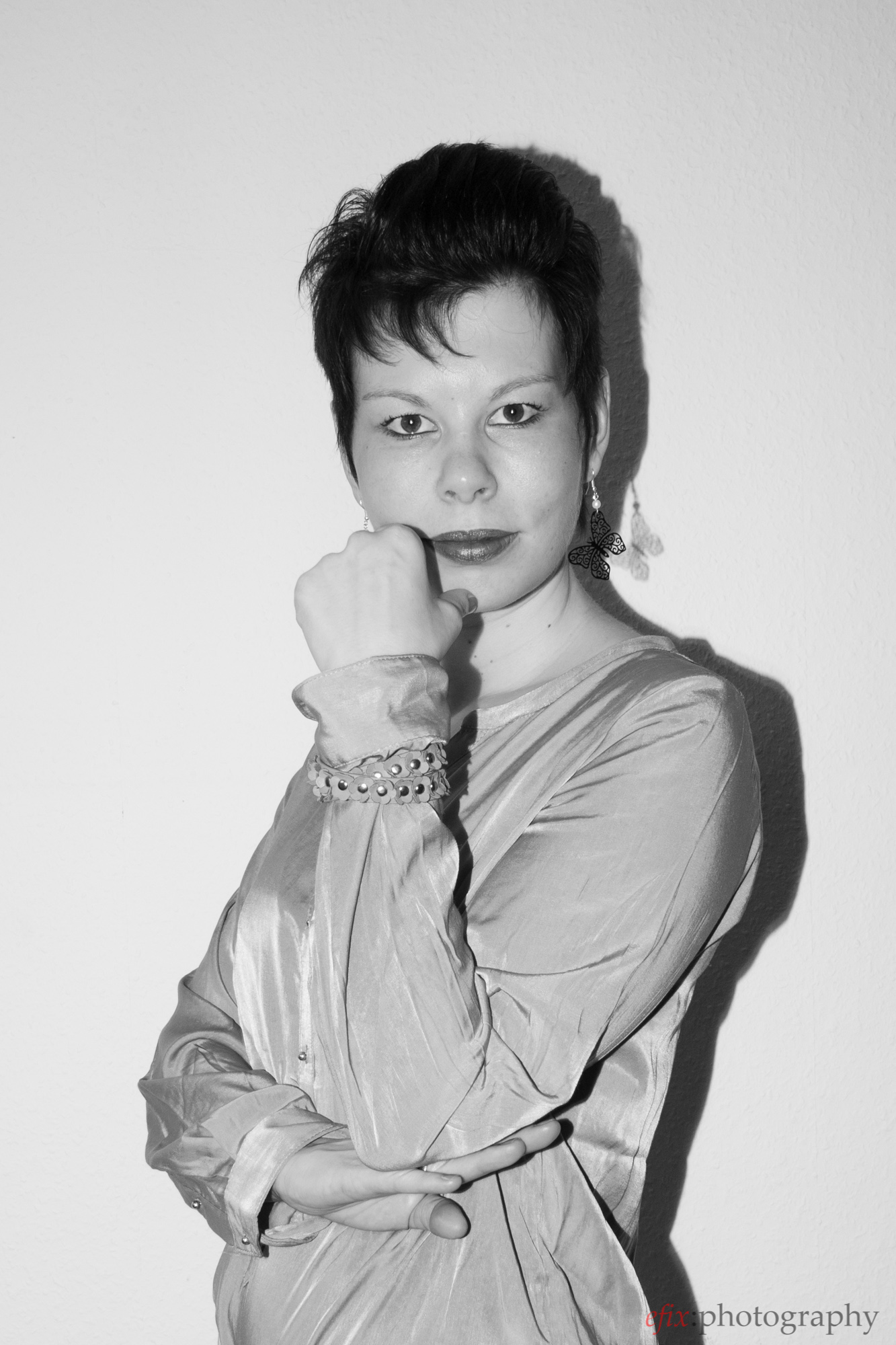
This particular picture would work very well in color, since the hues are all largely the same and the background is an even white. That also makes it easy to convert to black and white, since there aren’t so many different colors that respond differently during the conversion. The next step is to select a white balance that serves as a starting point for the fine tuning. In this case I chose a setting that both slightly levels out the skin tones and emphasizes the red of the lips as well as the eyes. Compare with the picture before to see the effect of the changed white balance.
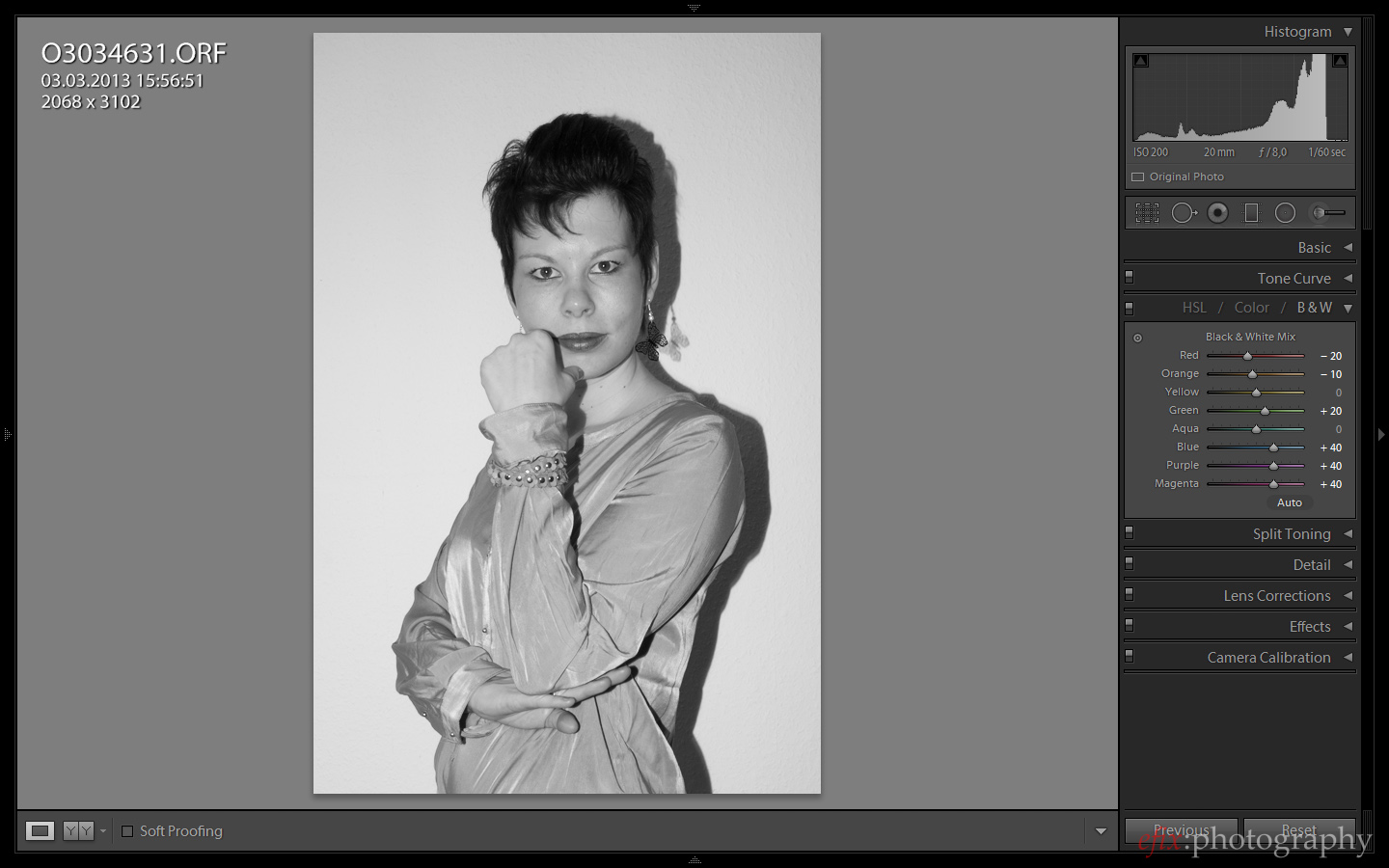
Next we adjust the individual colors. I chose to darken reds and oranges, which will emphasize the lips and eyes by darkening them even more. Greens, blues, purples and magentas are brightened in order to make the skin as well as the clothing appear brighter, and to create a contrast to the dark hair, eyes and lips.
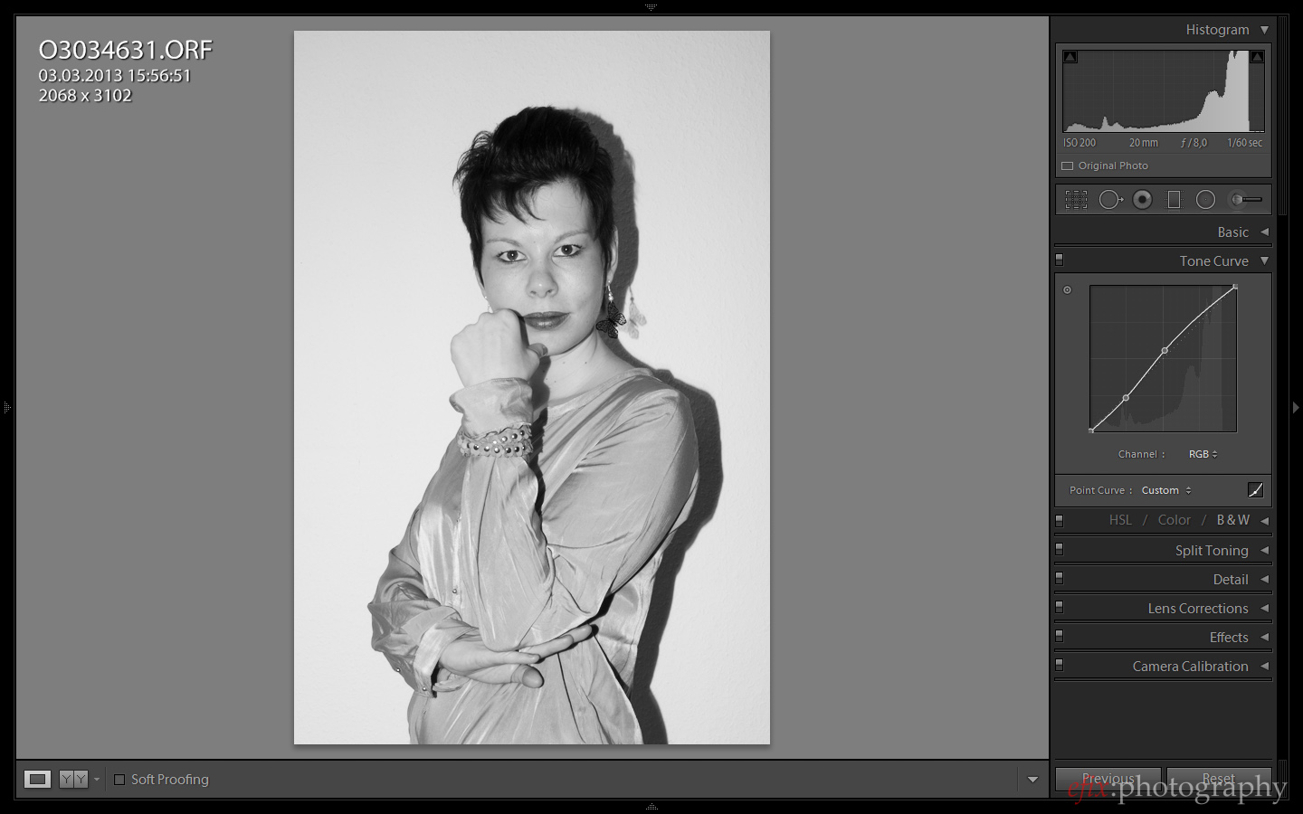
Finally, we adjust the tone curve in order to give the picture a stronger overall contrast. Since the contrast was relatively high from the start (due to my use of a strong flash pointed directly at the subject, and the fact that Olympus raw files usually start out with a relatively strong contrast already), I didn’t have to tweak the tone curve much in this case.

One more thing to note is that when doing b&w conversions is that not only the regular color will be converted to brightness values, but also the latent color noise, which is present in almost any digital image. This may lead to a more rough and grainy look, which may not be desired especially in areas that we want to be of even brightness. We need to dial in some slight color noise reduction thus.
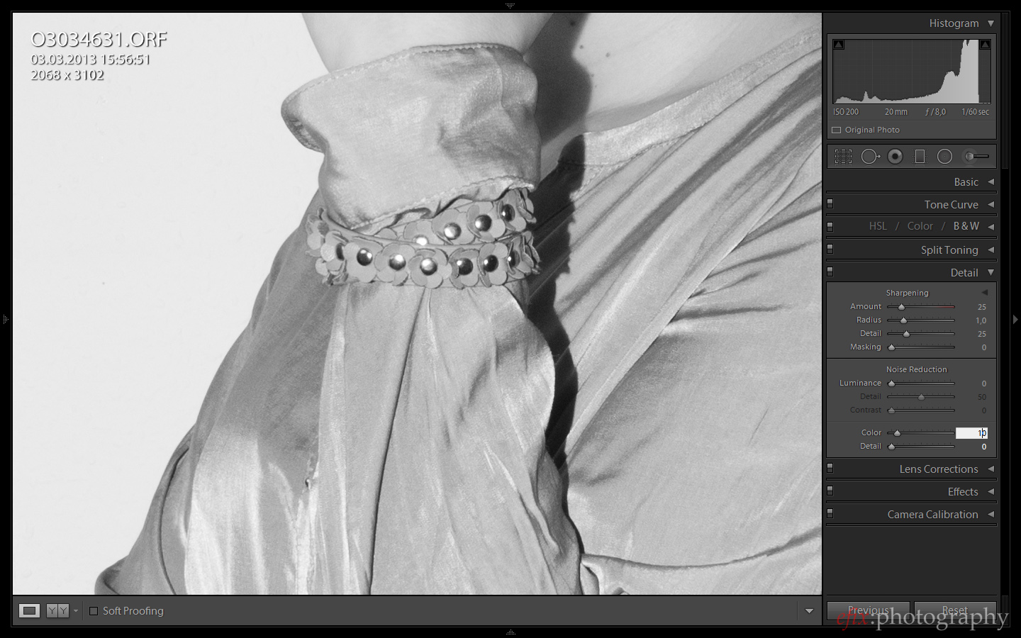
Since this picture was taken at ISO 200 and I didn’t boost the shadows at all, an amount of 10 for the color noise reduction was sufficient to remove any noise-induced artifacts. The result is a picture which has a much more dramatic look than the color version we started out with:
Converting a Landscape to Black-and-White
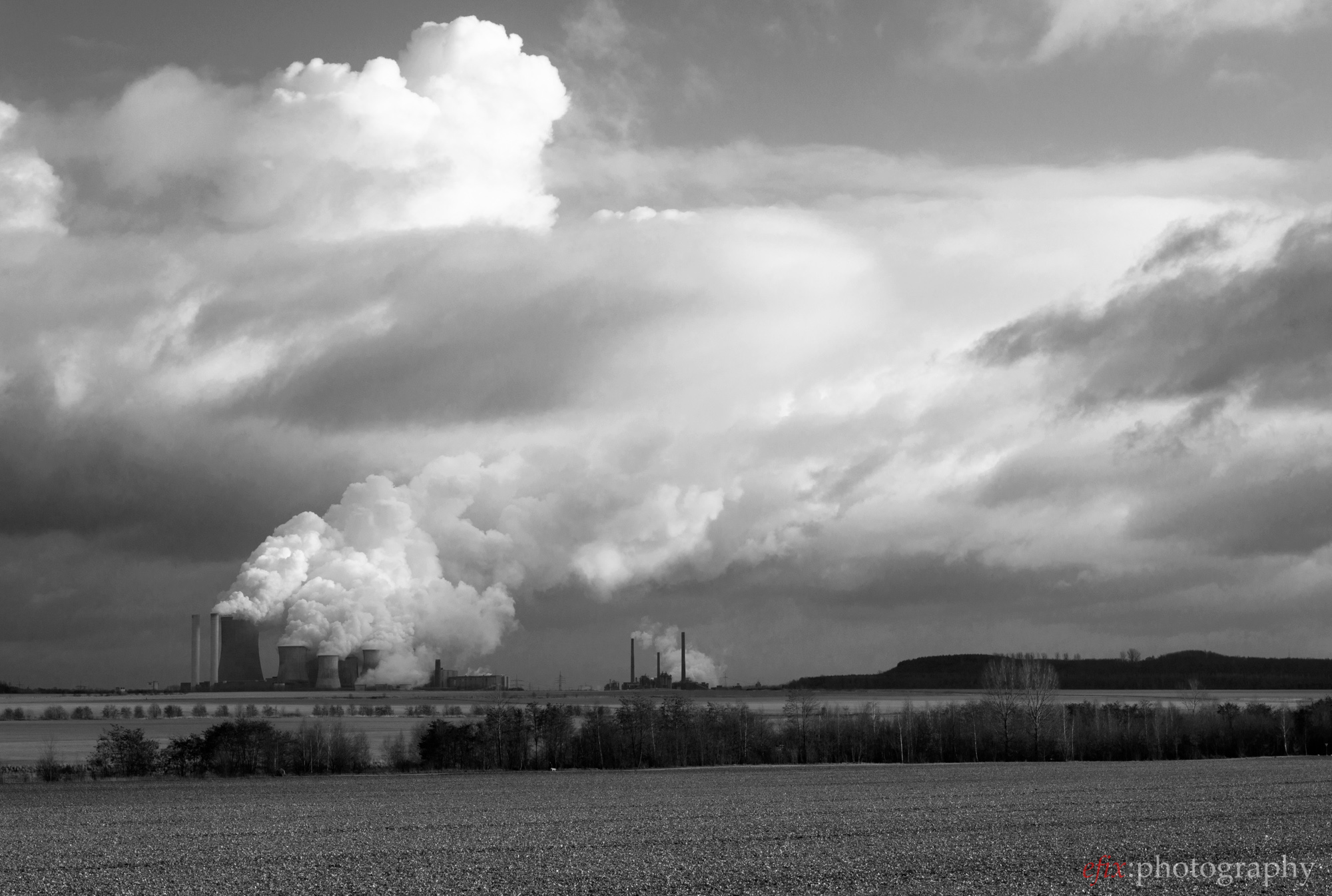
In landscapes, we don’t want even brightness levels like in portraits. Rather what we want is as much contrast between individual elements as possible. And this isn’t too difficult to achieve, since in ladscape pictures we usually have at least two color that we can contrast: green and blue. In addition, we also often find hues of brown, red, orange and yellow, as well as white if there are clouds in the sky.
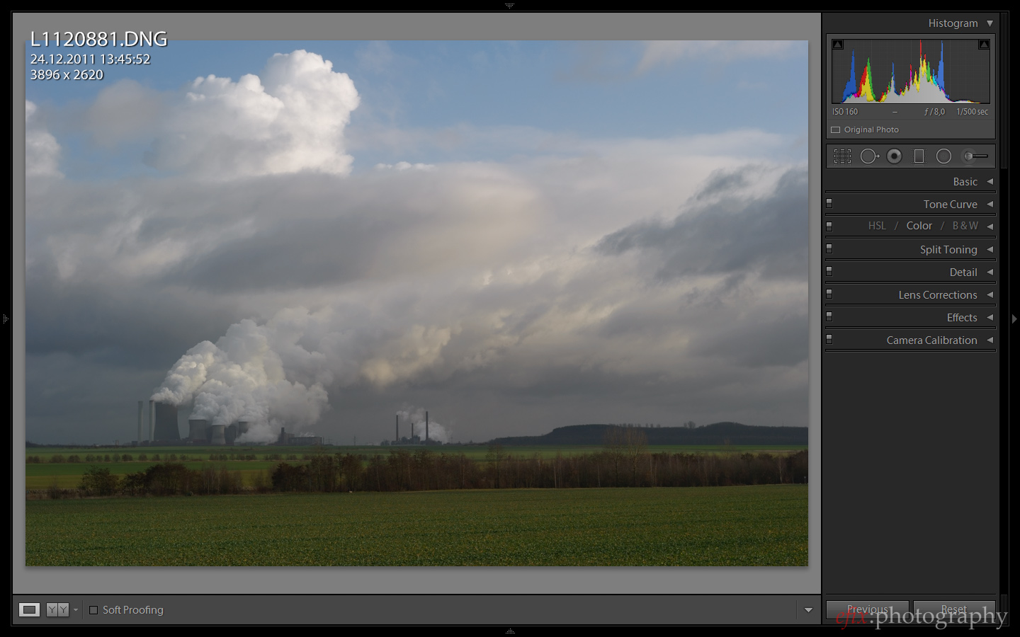
This may not be a typical landscape picture, more of a mixed industrial-landscape style. But still, it offers the usual color palette of landscapes as described above. You’ll notice that the picture looks rather flat and dull the way it came out of the camera. There’s not much contrast overall, and the color brightness levels are all pretty close to each other.
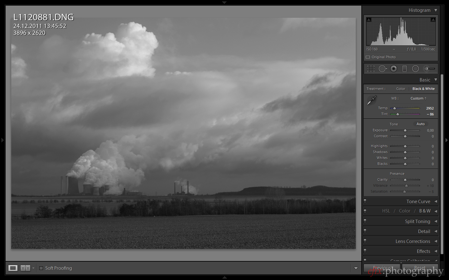
In this case I chose a white balance that emphasizes the greens and blues. The former we want to appear as bright tones in the final picture, to contrast with the blues, which we want to appear as dark tones so they contrast with the clouds as well as the foreground.
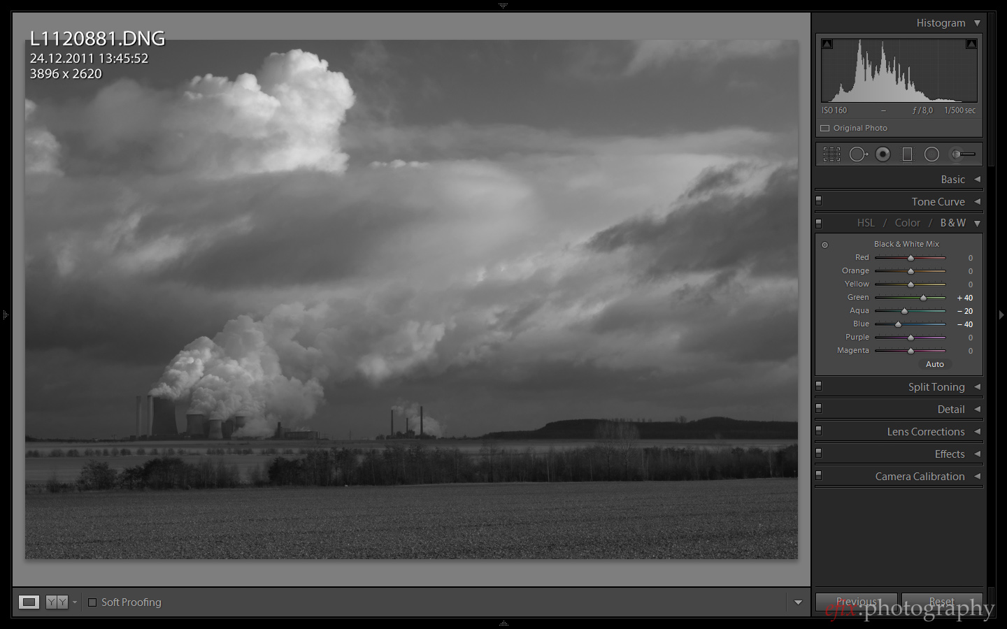
Just like with the portrait, we tweak the different colors individually. For this picture, I chose to brighten the green shades and to darken the turqouise and blue shades. The preliminary result is already much more dramatic looking than the plain black-and-white conversion we started out with. It’s still far from perfect, though. If you look at the histogram, you’ll noice that there are huge gaps at the shadow and highlights end each, and that most shades accumulate in the mid-tones. So in order to boost overall contrast, we use the curves tool.
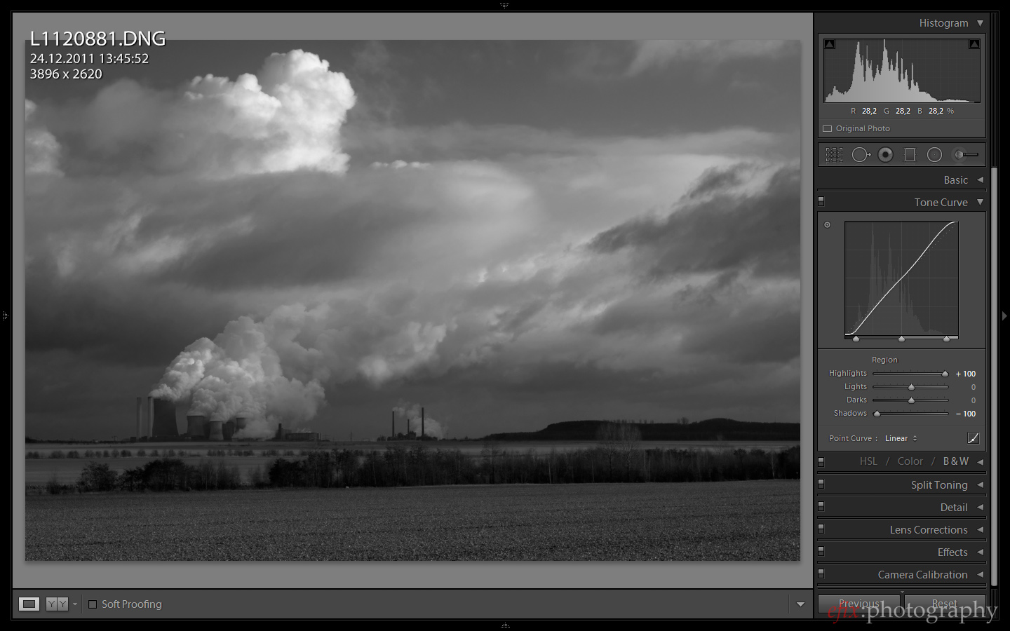
First, I pull down the shadow levels and pull up the highlight levels. This way the darkes shades get close to black, and the brightest shades get close to white. The picture is still very dark overall though, and lacks definition in the foreground.
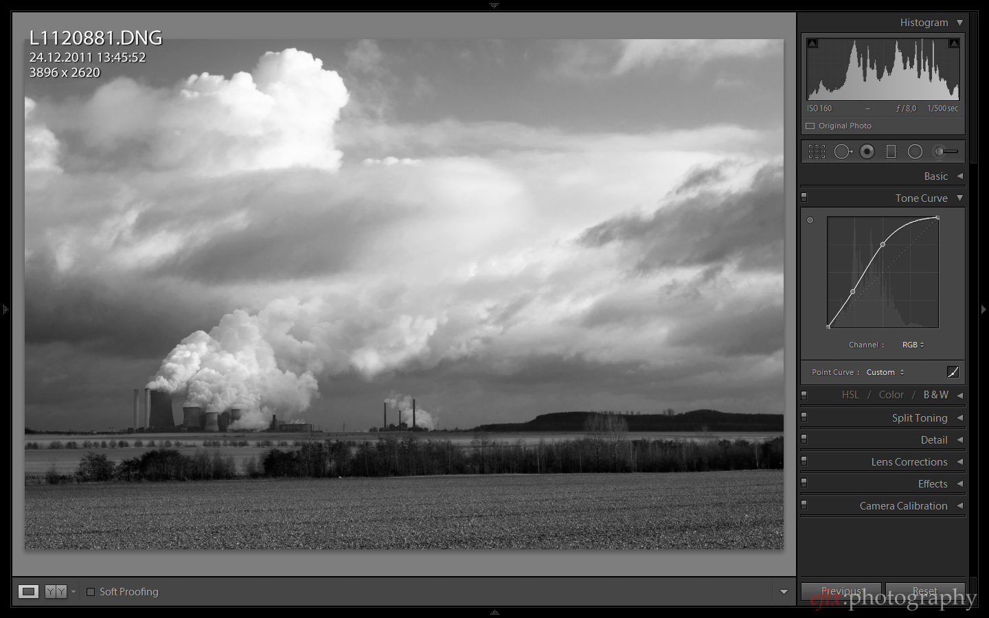
So for the final adjustment, I pull the mid-tones closer to the highlights to brighten up the picture overall. Now it’s evident what we did to the individual colors initially: the sky is relatively dark (though not unnaturally so), and contrasts nicely with the clouds. The green in the foreground, on the other hand, is relatively bright, and there is a lot of definition in the plantlife. The picture you see in the Lightroom preview above is identical to the picture I used in the header of this article.
Final Remarks
There are a lot of scenarios where a black-and-white conversion is preferrable over a color picture. Each scenario asks for a different approach to the conversion, however. In this article I demonstrated two possible scenarios: portraiture and landscapes. For portraiture I showed you how to achieve even skin tones, while for landscapes I demonstrated how to darken the sky and brighten the foliage. I also introduced you to the general technique that is needed for a black-and-white conversion from a RAW file. In the end, what matters most is your unique vision. It may take some trying and playing with the sliders, but you’ll quickly get a feel for how an image responds to tweaking the individual settings.
By the way, you can purchase Adobe Lightroom 5 from Adorama, Amazon or B&H Photo.
Please Support The Phoblographer
We love to bring you guys the latest and greatest news and gear related stuff. However, we can’t keep doing that unless we have your continued support. If you would like to purchase any of the items mentioned, please do so by clicking our links first and then purchasing the items as we then get a small portion of the sale to help run the website.
Also, please follow us on Facebook, Flickr and Twitter.
Get rid of the ads!
Did you enjoy reading this article as much as we enjoyed writing it? There's a way to support us and our reporting, getting ad-free navigation and more as a bonus. Subscribe to us for less than a coffee per month —just $3.99— or take advantage of our yearly subscription with a hefty discount for only $25.- An ad-free experience
- A free mystery box for Lightroom or Capture One
- All the books in our store
- 20% discount on Capture One
- 30% discount on Imalume Photo Theft Protection
- 20% off Herbs and Kettle Tea Company.
- 20% off your order from MPIX printing services.
- 5% off Viltrox Products via their eCommerce store.
- 10% off all film developing, printing and scanning services from Blue Moon Camera and Machine
- 15% off 7Artisans products: The lens and accessory maker is offering a sweet discount for Phoblographer's readers.