
When photographers generally shoot, they generally become satisfied simply by chimping the LCD screen of the camera and falling in love with the image they just created. But when you send it to the web, not everyone gets the same viewing experience that you have. Monitor calibration aside, there are ways that you can ensure that your images have a more uniform performance across the board–and that’s by working with Histograms.
How, you ask? Well, it’s about making readings and combining those interpretations with your own best judgement.
Why Use the Histogram?
There are a number of reasons that are very good in terms of why you should use the histogram when you may instead just opt for eyeballing an image, saying that it looks good, and going on with your life.
For starters, it has partially to do with displays. The way that a display works (such as a computer screen, a phone, tablet, etc) is that it adjusts based on what you set it to. Your settings vary based on the environment around you. My office may be lit differently than your office, home, etc. So in my apartment, you’ll get one viewing experience and at your apartment the same image will look different.
Generally this can’t be fixed because most people don’t have a clue as to how to calibrate their monitors and many folks just generally don’t do it. So to that end, monitors aren’t giving the same viewing experiences everywhere you go.
To that end, the steps that you can take to guestimate what the best generic viewing responses will be has to do with using Histograms. These charts give specific readings based on the image in front of you: so even though it may appear super dark on your monitor(s) it may not actually be so if you read the histogram.
What Does the Histogram’s Readings Mean?
Good editing and histograms start with shooting them to begin with. The image that we’re working with and that you’ll see later will show you exactly what happens when images are edited accordingly.
Here’s the basics:
- The left skews towards the shadows
- The right skews towards the highlights
- The middle is the balanced midtones.
Essentially what you want to get for a more uniform viewing experience is something that is very balanced all around. Of course, this also varies based on your own creative vision and whether you like the look of a super dark image or a super bright one. But keep all of this in mind as you edit.
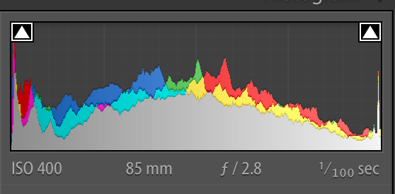
The Histogram above shows lots of information in the middle, not too much in the shadows and a fair amount in the highlights. It’s overall not a bad spot to be.
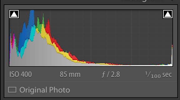
In comparison, this histogram was edited to be more balanced. There are more even levels all around in the highlights, shadows and the midtones.
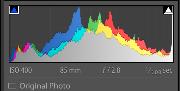
This histogram shows a lot of information in the shadows, some in the highlights and very little in the middle ground.
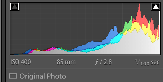
In contrast, this one shows a lot of information skewing towards the highlights and some in the middle. There is almost nothing in the shadows.
The Importance of Editing Accordingly and How to Do It
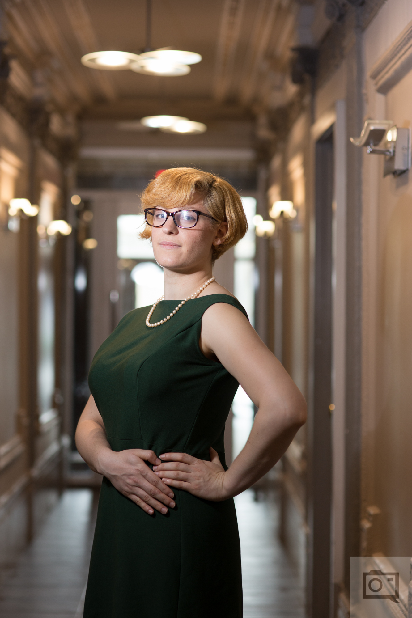
Here’s the original image that we’re working with here. Now let’s look at it in an editing interface.
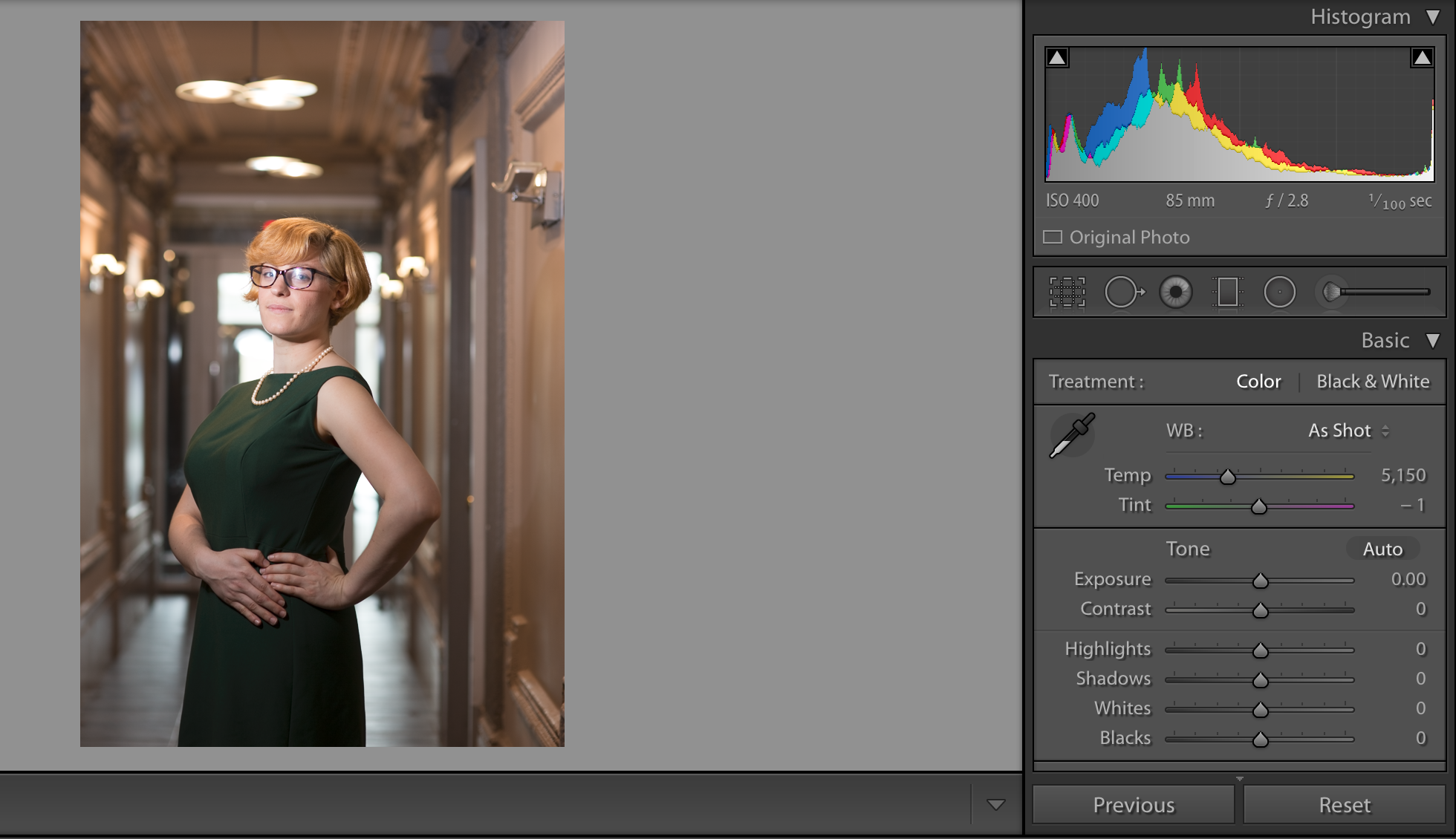
The histogram reading says that there is a lot in the shadows, some in the highlights and almost no midtones. That seems about right, so the plan of attack is to edit. When you change exposure levels, white balances, color channel levels, contrast, black levels, white levels, clarity and tint you generally tend to manipulate the histogram. By reading the color levels accordingly you can get a general idea of how the image will look on various monitors.
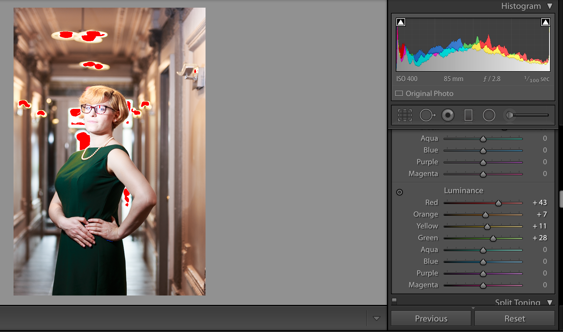
Just a little bit of editing (actually, a lot, because I tend to do that) yields me an overall more evenly spaced image. But the red areas of the image show us that those areas are way too bright. If there were blue areas, then that would mean that those areas are too dark.
To adjust this, I just need to nerf the highlights; if I lower the overall exposure, then I nerf everything when instead all that needs to be changed is the highlights.
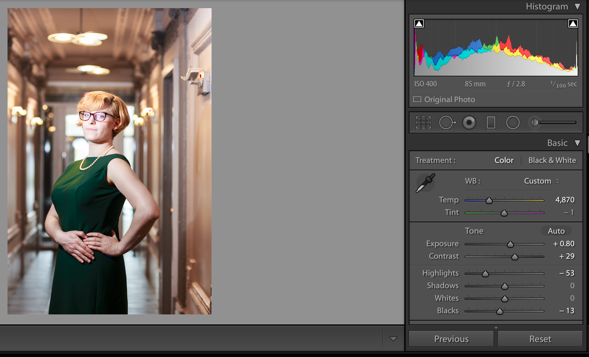
With that change put into place, I deliver a much more even photo overall.
According to the histograms, this is the image that will appear best overall on various monitors. A lot of this has to do with paying attention to not only the shadows, highlights, blacks, whites, overall exposure, white balance, tint, midtones, and the color channels–but also requires careful overall thought based on the image that you’re trying to put forward and a guess at the environment the person is viewing your image in. If you’re creating an image for a person whose computer is very bright and in a dark room, then you may want to skew a bit more towards the darker end if the person’s monitor isn’t calibrated. If your client is viewing the images on a phone, then you’ll generally have less trouble overall since phone screens tend to be very uniform accordingly.
Let us know if you have any questions!
Get rid of the ads!
Did you enjoy reading this article as much as we enjoyed writing it? There's a way to support us and our reporting, getting ad-free navigation and more as a bonus. Subscribe to us for less than a coffee per month —just $3.99— or take advantage of our yearly subscription with a hefty discount for only $25.- An ad-free experience
- A free mystery box for Lightroom or Capture One
- All the books in our store
- 20% discount on Capture One
- 30% discount on Imalume Photo Theft Protection
- 20% off Herbs and Kettle Tea Company.
- 20% off your order from MPIX printing services.
- 5% off Viltrox Products via their eCommerce store.
- 10% off all film developing, printing and scanning services from Blue Moon Camera and Machine
- 15% off 7Artisans products: The lens and accessory maker is offering a sweet discount for Phoblographer's readers.