
If you look through the work of photographer Steve McCurry, you’ll find several documentary-style portraits. He never said he did photojournalism — or at least that’s what he said later on when confronted about manipulation issues. However, you can see that he’s still a master portrait photographer in his images. To the untrained eye, the photographs might look plain — and some photographer is bound to say that they could’ve done precisely what he did. But Steve’s work is masterful partially because of the light and the subjects. And one of the biggest things he uses is a method that makes it so much easier to visually digest the image.
Table of Contents
Steve McCurry and the Three-Color Portrait Method
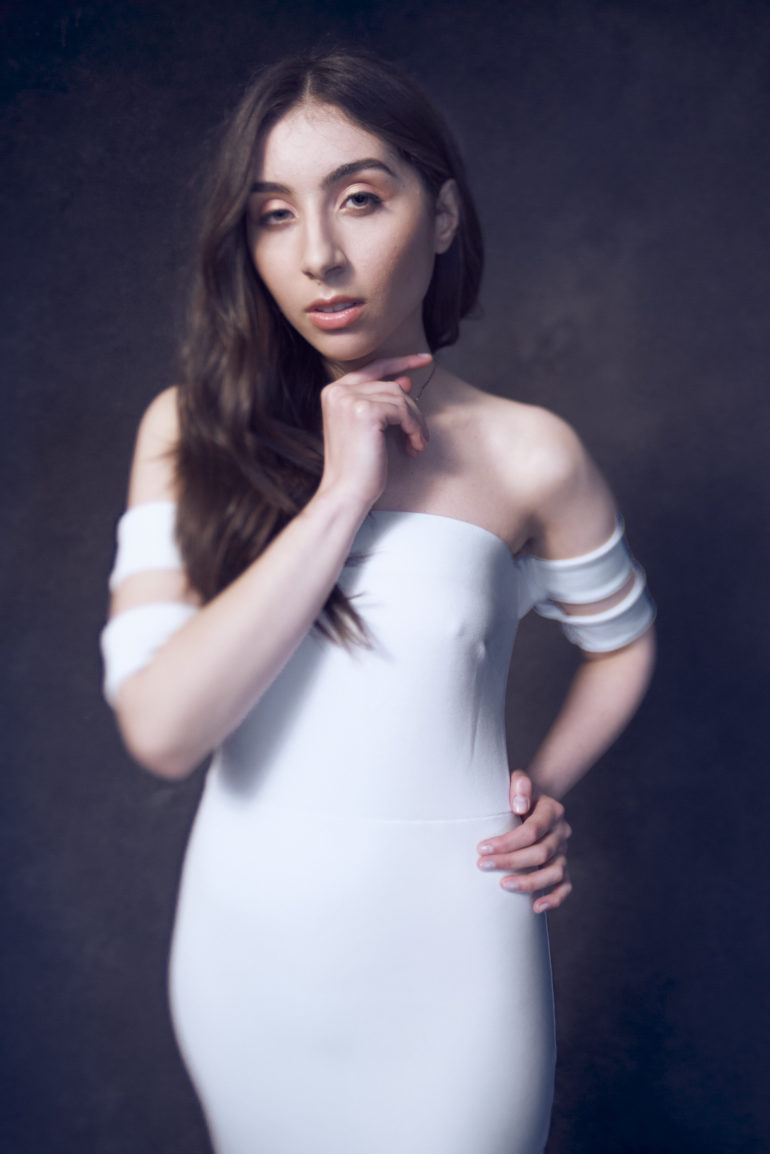
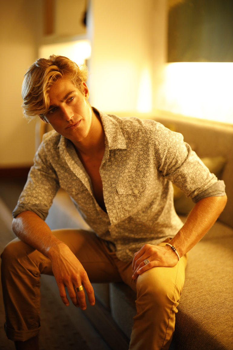
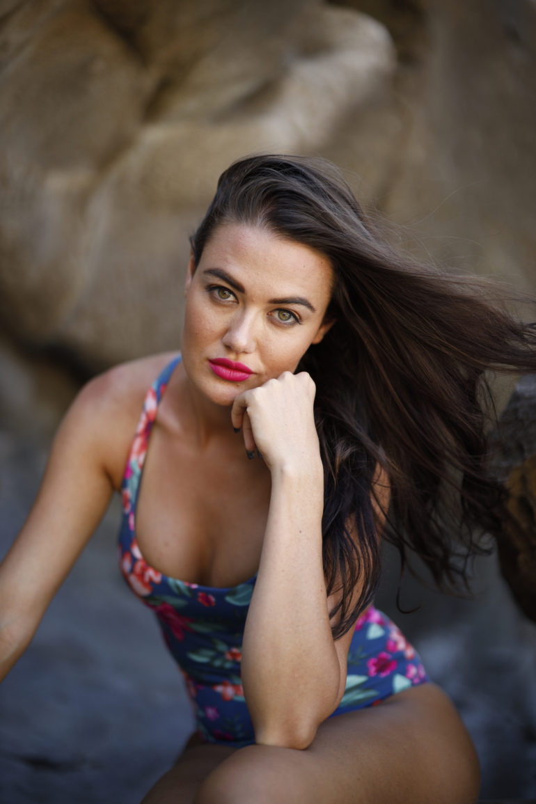
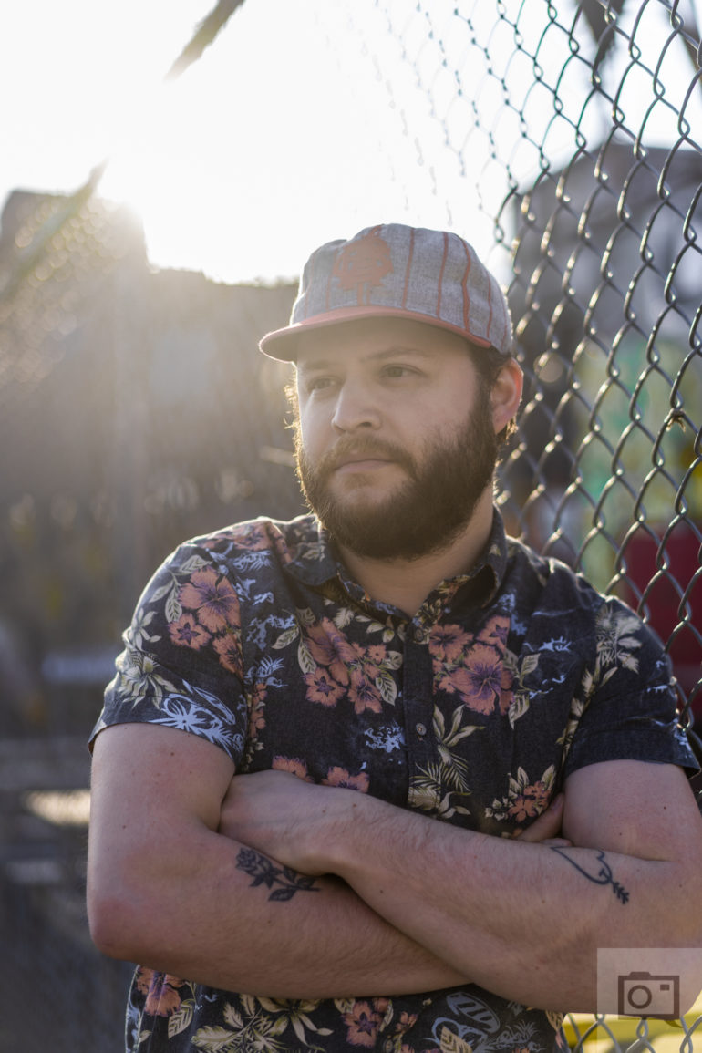
Steve McCurry is known for something called the three-color portrait method. This process more or less doesn’t include black or white in the method. Instead, it focuses on the ROYGBIV colors. It states that in order to not overwhelm the human eye, you have to make the colors pretty minimal.
Steve basically uses the following:
- The color of the person’s skin
- The color of the outfit
- The background color
And he makes them stand out from one another just enough. But he also uses light and depth of field to make the image even more effective at emphasizing the subject. By default, lots of his backgrounds are some shade of green. And the science behind that is pretty simple. Like black, white, and gray, the color green is found naturally to work with everything in nature. Here are examples:
- Red and Green: Roses, tulips, saffron
- Orange and green: Mandarin trees
- Yellow and green: Lemons and limes. Also flowers
- Blue and green: Seaweed. Landscapes alongside rivers.
- Indigo and Green: Spiderwort flowers.
- Violet and green: Violet flowers
With all this said, green is a color that you can easily try to make the background for every shoot that you do.

Using Lighting Effectively
Using lighting in a portrait is also a great way to add to the three-color portrait method. The right lighting and shape of the light can make one color seem super bright or very dark.
One color and light combination that majorly stands out from others is red. Dark red often doesn’t attract the eyes the way that bright red does. Bright red is wired into our society to be used to draw attention. We can see it in stop signs, traffic lights, neon signage, graded papers, etc. Even as I type this article, red underlines draw attention to my eyes differently than blue or green underlines.
Of course, it also has to do with how all the other colors seem to be working together. This obviously requires a lot of experimentation. And more importantly, it has to do with the context of what’s in the photo as well.
The Framing
A final note on composition. Composition tells your audience where you want them to look. It draws their eye to the parts of the image you want them to focus on, as much as lighting and color do. Which one you use when shooting and cropping is not that important as long as you use one. Most images that follow one compositional technique will also follow another. If you compose using the rule of thirds there is a reasonable chance it will also fit into the Golden Spiral and vice versa. Choose one and work with it and your images will look better.
An Introduction to the Golden Spiral
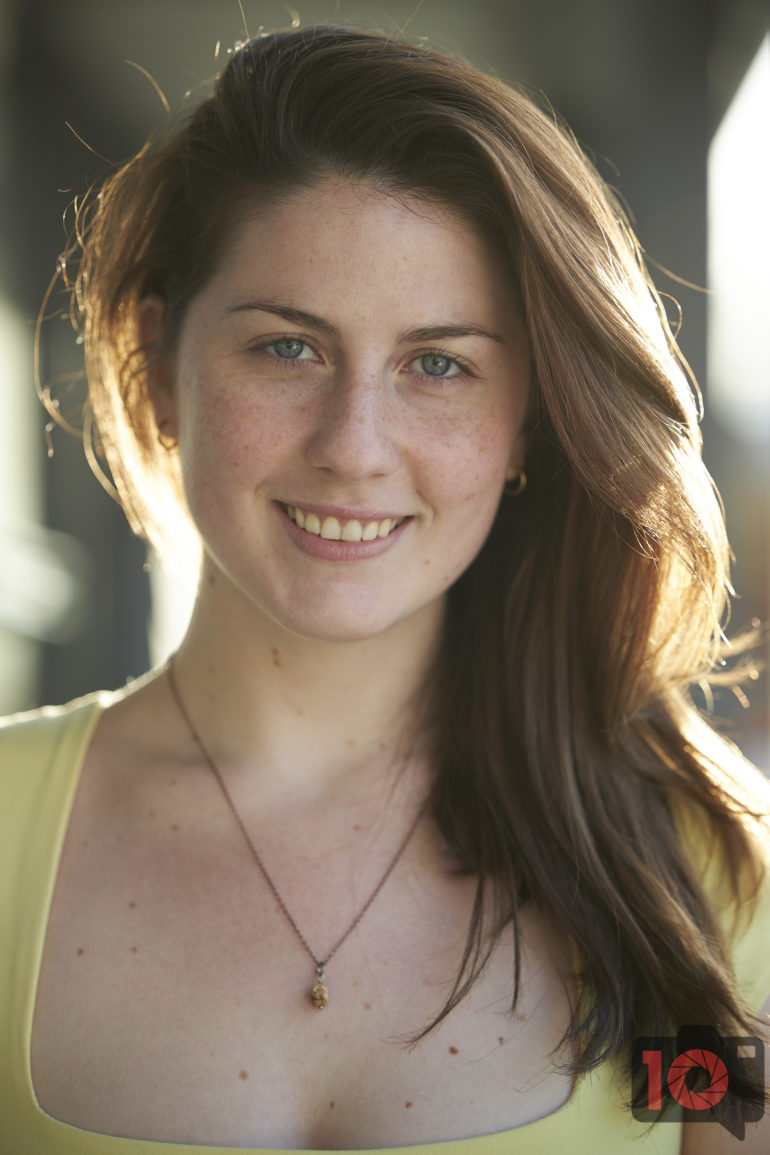
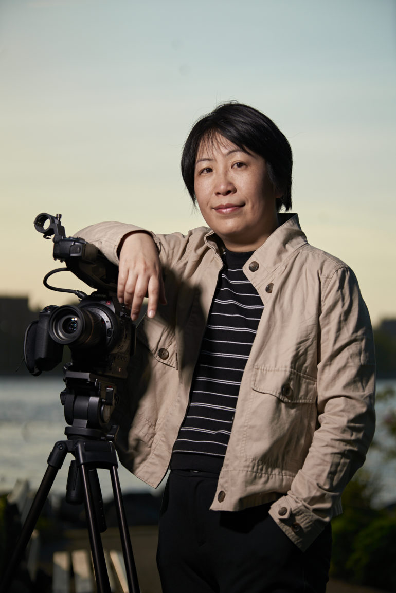
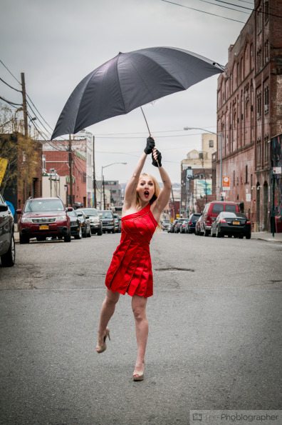
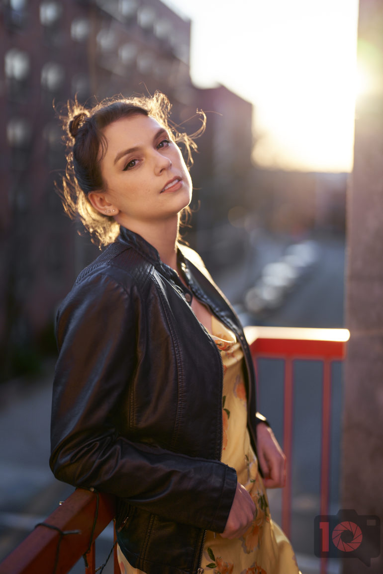
Framing an image isn’t just something that has to do with the rule of thirds or the golden spiral. It also has to do with colors. In the image above, the colors aren’t super important to the scene. So this isn’t a situation where the color composition is a great example. But in the image below, it’s a different story.

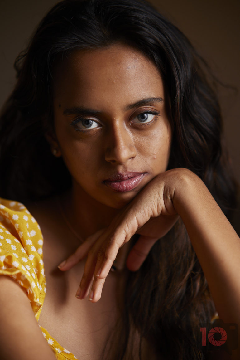
Here we see bright yellows, blues, and pinks. Those tell us exactly where the eye should go and lead us around the frame. Aside from the skin tones, those are also the three important colors in the scene. It’s a very effective use of this method that Steve McCurry has used successfully in several of his photographs.
We encourage you to check out Steve’s website and explore it for yourself.
Get rid of the ads!
Did you enjoy reading this article as much as we enjoyed writing it? There's a way to support us and our reporting, getting ad-free navigation and more as a bonus. Subscribe to us for less than a coffee per month —just $3.99— or take advantage of our yearly subscription with a hefty discount for only $25.- An ad-free experience
- A free mystery box for Lightroom or Capture One
- All the books in our store
- 20% discount on Capture One
- 30% discount on Imalume Photo Theft Protection
- 20% off Herbs and Kettle Tea Company.
- 20% off your order from MPIX printing services.
- 5% off Viltrox Products via their eCommerce store.
- 10% off all film developing, printing and scanning services from Blue Moon Camera and Machine
- 15% off 7Artisans products: The lens and accessory maker is offering a sweet discount for Phoblographer's readers.