
How many of you can tell the difference between daylight white balance and shade or Tungsten?
When you think of daylight white balance, we’re positive that many of you have a tough time figuring it out. You’re probably shooting in auto white balance. And if you had to take an educated guess, you’d think that it would be a warm-toned balance. Daylight is indeed warmer than Tungsten, at least in terms of white balance. And the way that it works is that the two try to cancel each other out. Tungsten lights are pretty warm, so the white balance has to be very cool. Daylight is very cool, so the white balance needs to be warm. However, folks like their images to be even warmer. If this is all sounding confusing to you, then please check out our infographic below.
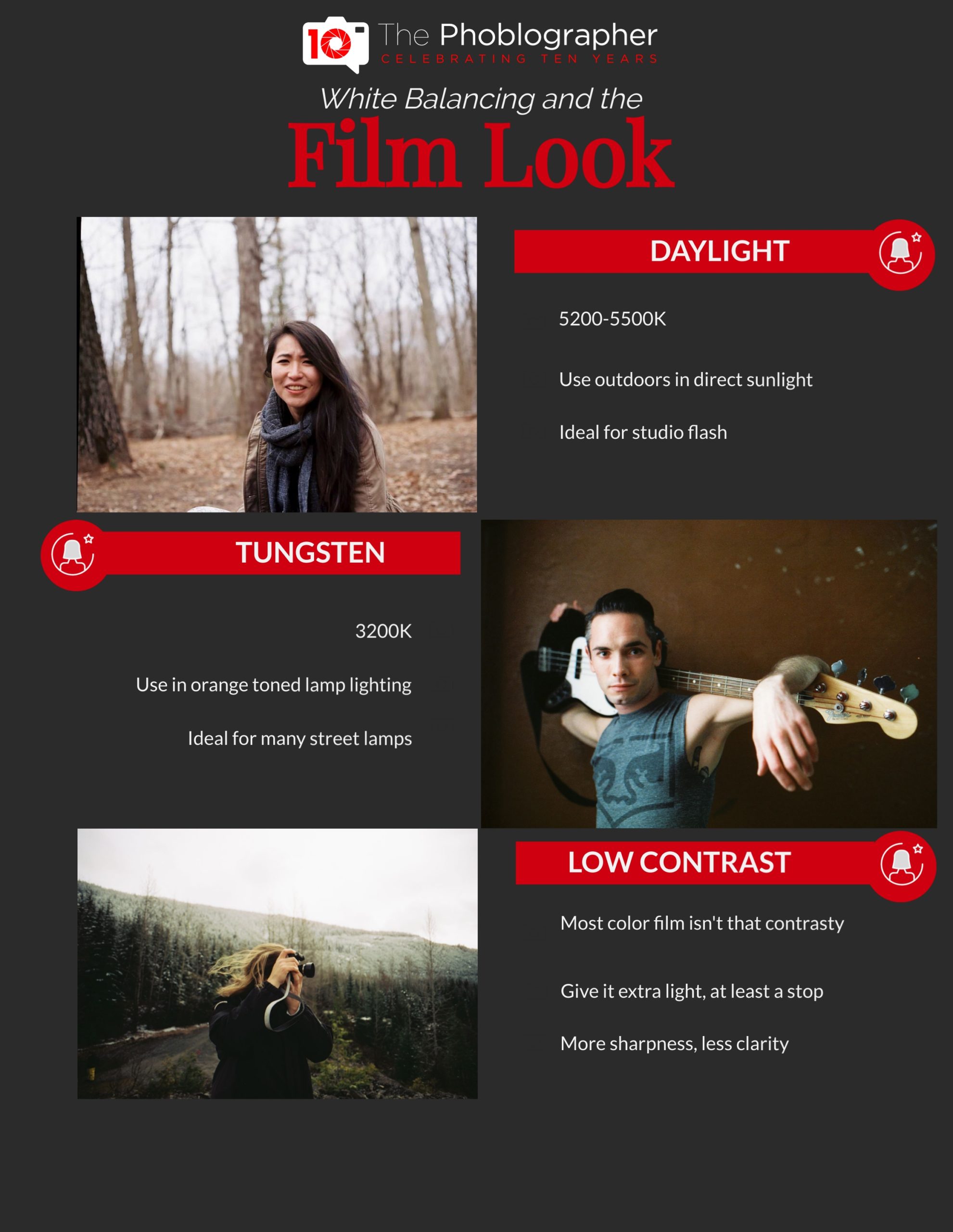
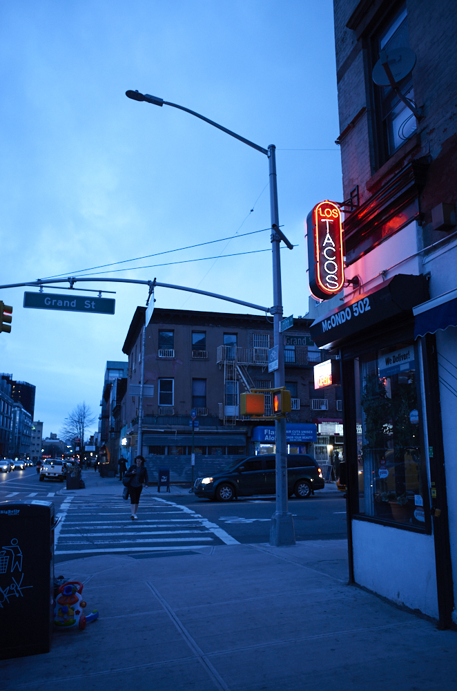
Daylight
Daylight white balance is a medium ground area. It’s considered relatively warm, although lots of folks tend to warm their white balances a bit more. This is because warmer tones look better with skin. Further, warmer tones just feel more beautiful. But film needs a toner to make it look even warmer, or you could use a warming filter. That’s how you can start to get this look. Of course, folks tend to edit the scans, although I’m personally more of a purist. This warmer light can look very pleasant during the golden hour, though at certain times it can be way too intense.

Tungsten
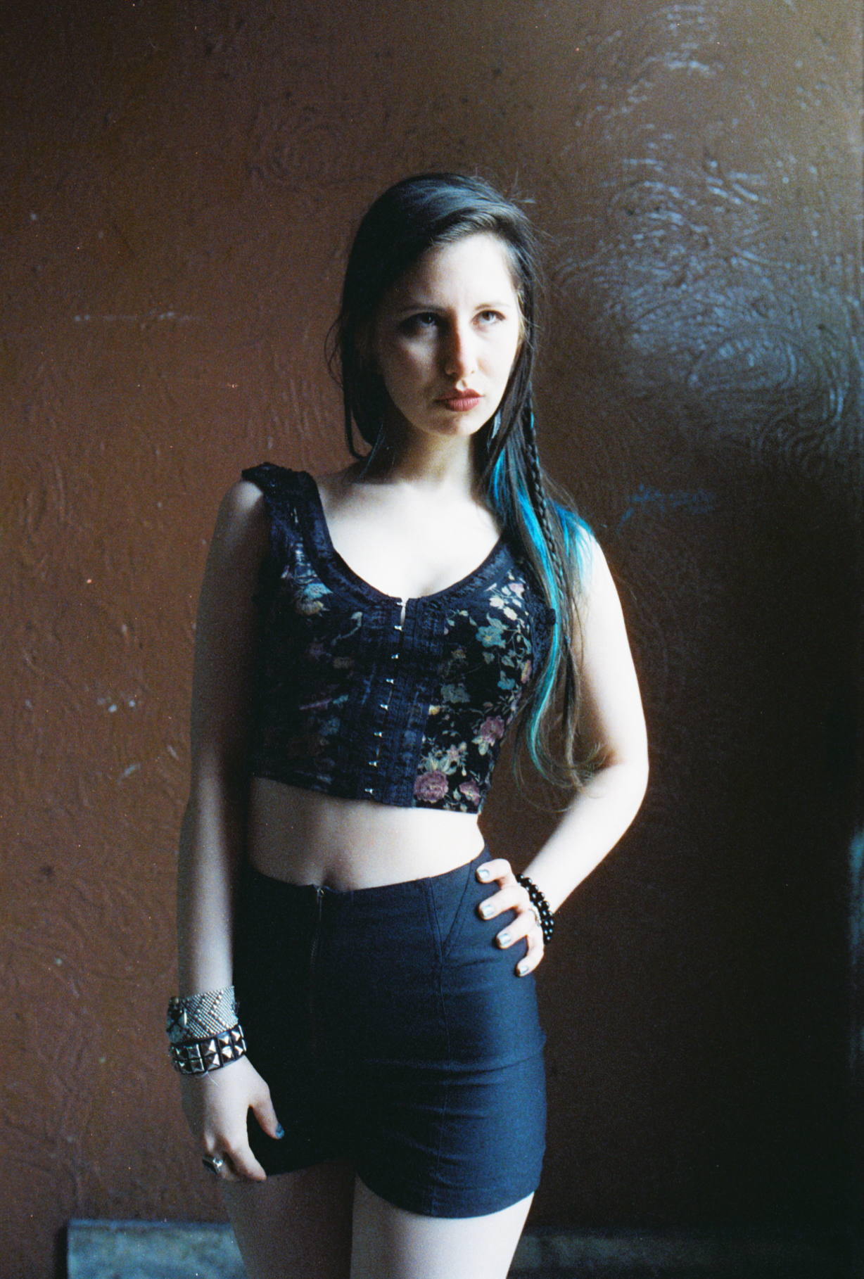
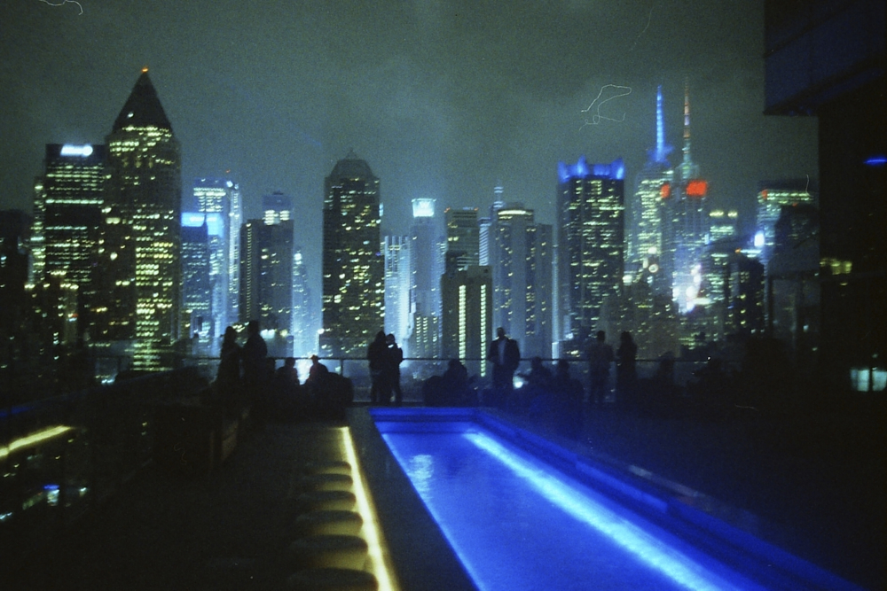
Tungsten is balanced to 3200K. That’s super cold and blue. If you shoot with it outside in the day, images will have a very blue tint to them. If you shoot with daylight colored artificial lighting, the scene will also look very blue. I like to call it something almost like Picasso’s Blue Period. Where this look is well known is for the Blade Runner look. Of course, this can be a very coveted look as it was made famous by that movie.

Sharpness Instead of Clarity
The other thing we have to say about the film look is that there is less clarity than there is sharpness. Black and white film typically has more clarity, such as with Tri-X. But with film, the mid-tones are a bit muted. Instead, you go for more pure sharpness from the lens.
Combine all of these into your image-making, and you’ll be on your way to making your photos look and feel more like film. You can also brighten up and mute the shadows, but then it may just look like an inadequate exposure. To sometimes prevent this, try exposing the way you would with the negative film: overexpose it. The rule is typical to give the film an extra stop of light and then to develop at box speed. That translates to Kodak Portra 400 being shot at ISO 200 and developing for ISO 400. But this depends on how you want it to look and the lighting that’s around. I wouldn’t do it in a studio environment where you already have more control over the environment.
The Phoblographer’s original photography cheat sheets are powered by Visme.
Get rid of the ads!
Did you enjoy reading this article as much as we enjoyed writing it? There's a way to support us and our reporting, getting ad-free navigation and more as a bonus. Subscribe to us for less than a coffee per month —just $3.99— or take advantage of our yearly subscription with a hefty discount for only $25.- An ad-free experience
- A free mystery box for Lightroom or Capture One
- All the books in our store
- 20% discount on Capture One
- 30% discount on Imalume Photo Theft Protection
- 20% off Herbs and Kettle Tea Company.