")
Last Updated on 03/20/2024 by Chris Gampat
The emotional spectrum is a fascinating thing. In the art world, many photographers channel the ideas of painters who came before them. They bring to their art a sense of color that is expressive and meaningful. It’s often something that comes from deep emotional understanding. This is in contrast to what happens in the content creation world, where the idea of attaching teal and orange to everything is more of a trendy thing than something that has a deeper meaning. One of the most channeled colors is blue — and when used intentionally, it can be a creative force worth discussing.
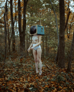
All images in this article were used with permission from the photographers in our interviews. Lead image by Holly Stones.
Table of Contents
How Blue Was Used in History
If we observe how landscape photography has been done since the advent of color photography, we can see how many photographers value the idea of blue skies when they’re not shooting at the golden hour instead of the blue hour. Some try to channel the natural world. You can see this in the work of someone like Caitlin Fullam, who makes surreal landscapes and blends shades of blue into her photographs. Differently, we can see this with Pablo Pettignani and how he made infrared landscapes in a way that people don’t normally see. However, all of this is mostly done by capturing, and not necessarily creating — and that’s an art in and of itself. But it’s clear as you proceed through this article that capturing a scene isn’t really what we’re talking about. Instead, it’s all about creating.
Therefore, we’re speaking about how photographers intentionally use the color blue to channel their feelings on the emotional spectrum.
To understand this more, I love returning to one of my favorite painters: Picasso. I remember in grammar school being drawn to Picasso in textbooks — and learning about what he went through during his blue period. This is when he channeled a lot of sadness and grief through his paintings. It’s a strong contrast to his rose period — which signified a time of great joy.
The Blue Period of Picasso is the period between 1900 and 1904, when he painted essentially monochromatic paintings in shades of blue and blue-green, only occasionally warmed by other colors. These somber works, inspired by Spain but painted in Paris, are now some of his most popular works, although he had difficulty selling them at the time. Picasso settled in Paris in 1904, having spent a few difficult years with no fixed studio and little artistic success. While back in 1903, he had produced his Blue Period works, which seemed to reflect his experience of relative poverty and instability, depicting beggars, street urchins, the old and frail and the blind.
PabloPicasso.org
Photographers who create their images instead of capturing scenes in front of them tend to insert blue into the scenes that they’re photographing. It isn’t necessarily done in post-production but in pre-production, before they even use the camera to photograph the scene.
The color blue can mean so many different things. Picasso used it for sadness. Some photographers use it to channel the idea of tranquility — which you can feel from Nicole Struppert’s Kensho series. In various interviews that we’ve done with photographers in our 15 years, they’ve used the color blue to channel sadness.
Blue is the Saddest Color
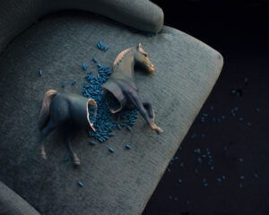
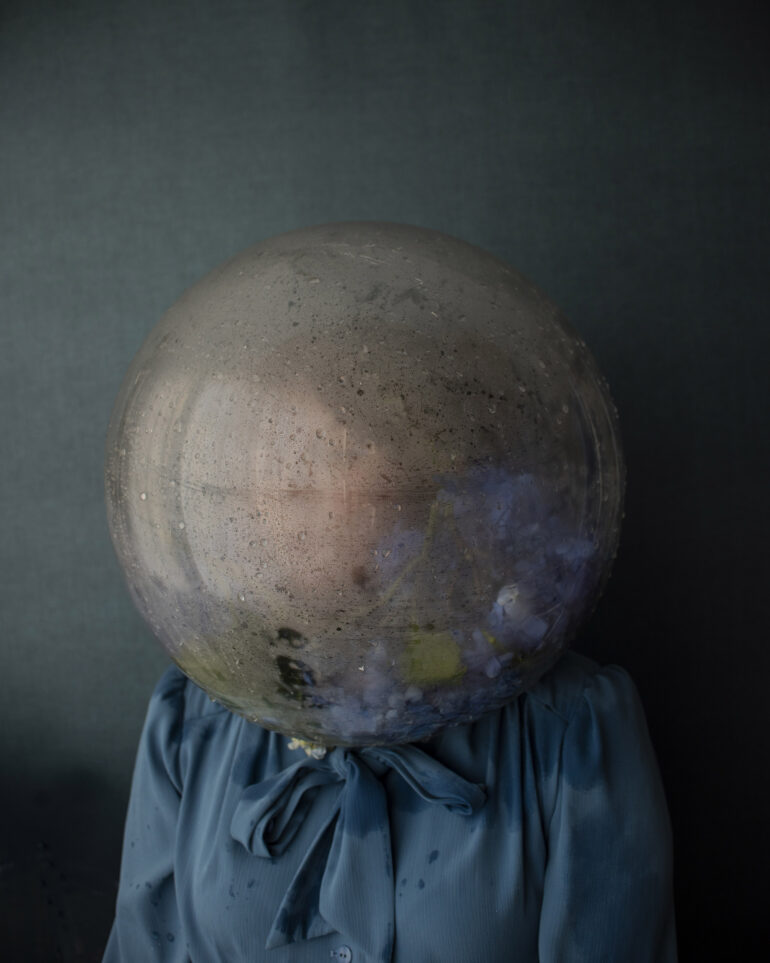
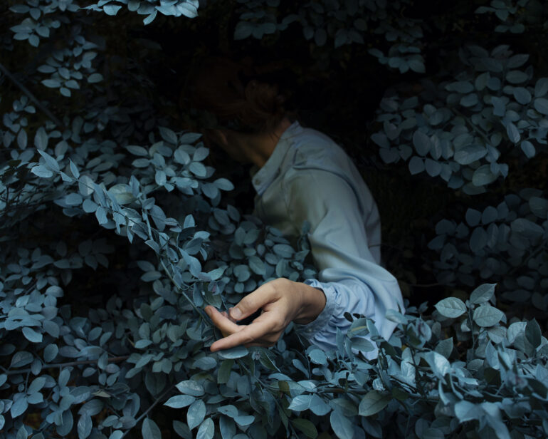
One of my absolute favorite examples of a photographer using the color blue is done by Heather Evans Smith. In our interview, she discussed with us how she was running from the grief of the death of her father. This was done by keeping herself busy with her family. But once her children had grown up, she realized that she needed to process that grief. Ultimately, she couldn’t run from it. “Wanting to express mid-life depression in women (particularly myself) was my main inspiration for the series,” she states in our interview. “I started to think about the slang we use for depression, such as saying, ‘I feel blue’ and ‘having the blues.’ For hundreds of years, this color has been associated with melancholy and sadness.” Heather also keeps in mind the ideas of Picasso, though it wasn’t her primary motivation.
All of the images above were made by Heather. And in it, we can see a ton of emotion. In the image of the broken horse, many of us perhaps remember seeing statues like this in our homes. My parents had some of them, and seeing Heather’s image brings up feelings of a childhood that was broken and medicated. Of course, that’s how I personally feel about it. I can’t imagine how someone might feel jolly about it.
We get similar feelings in her other images, also above. At the same time, we also see a sense of beauty. And indeed, there is a beauty in pain. Images like this can help to reinforce the idea that sadness, grief, and anger aren’t bad things. Rather, it’s all about how they’re used and what the intentions and reasons are for them. The idea is synonymous with music expressing sadness. The blues are an entire genre of jazz music in the same way that emo is an entire genre of punk rock. And every day, people relate to these genres.
Blue is also used by other photographers with a lot of intention. For example, Samantha Ashcraft, who is a Polaroid artist, has specifically taken to using blue more often in some of her recent works. When we spoke to her, it was difficult for her to put her feelings into words. However, she was very clear about a few uses of blue. Ashcraft used blue to channel her sadness of the overturning of Roe Vs Wade. For her, it was a throwback to some of her work in 2015 — where she also used blue during a 7-week-long medicinal abortion that she says saved her life.
Setting a Mood
Photographer Dean Bradshaw is showcased doing something similar yet dramatically stark in our feature where we profile the work he does with Fishing Trawlers. We described it as “a cold and gloomy day in the life of fishermen in Iceland with their colorful fishing wear providing eye-catching contrast to bleak surroundings.” Of course, Dean’s images also appear to be very inspired by cinema. Perhaps he added the color grading in post-production to create this effect.
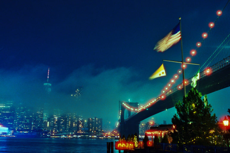
Similarly, photographer Tarik Tosun says that his use of the color blue was a happy accident of using CineStill 800T film. The film, which is white balanced to 3200K Tungsten, makes standard white lighting look very blue. “As it turned out, I got lucky, and everything came together in a lovely way,” Tarik tells us. “The interplay between the deep blue of the twilight, the fog, and the blue cast of the film creates an otherworldly ambiance, punctuated by the bright halos around the lights.” In this series, we feel like we’re seeing a different perspective on something that many of us are so used to seeing in photographs otherwise.
One of Tarik’s images is above; we can feel so many different things from the scene. It has a real sense of beauty, but it also feels very ethereal, dreamy, and dark. In my younger years, I used to play a video game called Vampire the Masquerade: Bloodlines. And this feels like an image from that world.
A Creative Contrast
In the natural world, blue is a color that can go with nearly anything else — just like green. In nature, we see every single color working alongside blue, whether it’s in the skies or in the seas. So, many photographers have used the color blue in various ways. Holly Stones is another favorite of ours. In our interview, she did the Color Project, which she did by trying to make more of her props instead of using a lot of post-production. In her Blue Project, we don’t necessarily get the idea of sadness. Instead, we get the idea of being in a dream. This is signified by the old-school telephone, the butterflies, and the playfulness that tugs at our inner child. In this way, it begs for a smile on your face — and we can’t help but provide it.
Indeed, there’s an inherent beauty in using the color blue to add contrast to things. We get this, too, from photographer Steven Gindler. In our interview with him, he stated that he uses it to make contrast — which in turn makes his subjects really pop in the scene. “Some people obsess over their ‘feeds’ holding some kind of color contrast, but I like to think in a more old-school kind of way,” he told us. “One image is one image, and the colors contained are just that. I also just can’t stay away from moving that blue slider into the teal territory in the hue section of Lightroom, it’s an addiction.” Creatively speaking, Gindler uses the variations of blue to draw our eyes to specific places in the photograph. He combines this with effective and intentional lighting along with compositional placements to make us fall in love with his images.
The color blue can be used in a myriad of ways in the emotional spectrum. In some ways, photographers can channel it to bring up feelings of sadness. In other ways, photographers use it to give us a dreamy look or tranquility. This is different from using it as a creative contrast to bring our eyes to specific parts. It can all be combined in different ways — and in the end, it’s all just about using the color with the intent to express ourselves in a way that AI imagery cannot do.
Get rid of the ads!
Did you enjoy reading this article as much as we enjoyed writing it? There's a way to support us and our reporting, getting ad-free navigation and more as a bonus. Subscribe to us for less than a coffee per month —just $3.99— or take advantage of our yearly subscription with a hefty discount for only $25.- An ad-free experience
- A free mystery box for Lightroom or Capture One
- All the books in our store
- 20% discount on Capture One
- 30% discount on Imalume Photo Theft Protection
- 20% off Herbs and Kettle Tea Company.