
Last Updated on 07/24/2020 by Mark Beckenbach
Histograms are like cheat sheets for photography. Understanding what a histogram is saying can help you create better looking images.
If you’ve spent any time playing around with the display on your digital camera’s rear screen, you’ve most likely seen what resembles a (sometimes multicolored) line graph. You’ll likely have seen something similar when editing your images in Capture One or Lightroom as well. This graph is called a histogram. Although it may look like something you had to learn in statistics class, histograms are actually very useful for photographers. While most human eyes can detect a dynamic range of roughly 20 stops, the most advanced cameras commercially available today top out at around 15. This is where the histogram comes in handy. It provides a readout of where your highlights, mid-tones, shadows, and the various color channels fall in relation to your camera’s exposure settings. If you’ve ever wondered why an image looks fine on the back of your camera but looks over- or underexposed when you import them into your raw editor, this infographic is for you. Understanding how to read a histogram will ensure that that your images are properly exposed, and that you’re recording the maximum amount of available light information into your raw files.
Reading a histogram
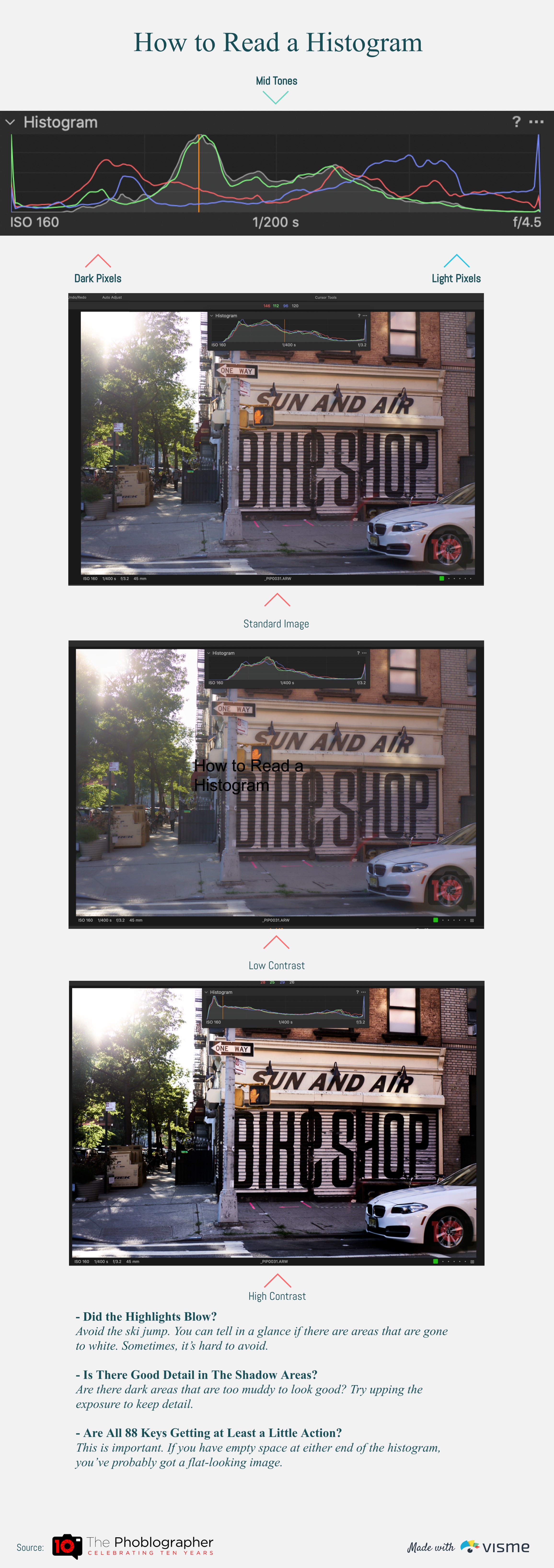
Histograms are graphs at their core. While their appearance can vary between different camera manufacturer’s user interfaces and raw editing software, they all typically look like some variation of a line graph. This means histograms basically follow the same conventions that go into creating line graphs. The X-axis (horizontal) is generally used to indicate the light value, going from dark to light pixels from left to right. The Y-axis (vertical) is used to indicate the amount of said light value that is present. Depending on your camera or software, the various lines within the histogram correspond to how much highlights, mid-tones, shadows, and color information are present within an image. Also, remember that although histograms are useful guides, you’re ultimately the creative behind the camera. Depending on how you want your final image to appear, you may sometimes want to intentionally over or underexpose it, resulting in a histogram that looks “wrong.”
Did the highlights blow?
If your histogram looks like a ski jump (it skews and tops out to the right side of the graph), you are probably blowing your highlights. This basically means your image is overexposed. Remember that even the best cameras available today have a limited dynamic range. Any information that exists outside of the histogram’s scope will not be recorded by your camera, and consequently cannot be recovered during post processing. You can adjust your exposure settings until the lines in your histogram no longer look like a ski jump, but it’s sometimes unavoidable if you’re photographing outdoors. Depending on what you’re photographing, neutral density filters can sometimes help with this.
Is there good detail in the shadow areas?
If your histogram looks like a downward slope, there’s a good chance that your image may be underexposed. Pay attention to the dark areas of your frame to ensure it doesn’t appear muddled. Can you see any details in the shadows at all? Consider raising your exposure so that the shadow details aren’t lost. Although many modern cameras have good dynamic range coverage and can do a good job of recording shadow details, starting off with a properly exposed image will always give you the best possible files to work with. The histogram is designed to help you expose your image properly, and doing so can save you a ton of time and work during post-processing.
Are all 88 keys getting at least a little action?
If your histogram looks like a small hill with empty plateaus on both sides, there’s a good chance that you’re not taking full advantage of your camera’s dynamic range. Your image will look very flat with the highlight, midtone, and shadow areas blending together into a grayish mess. To remedy this, you’ll want to adjust your exposure and “spread out” the hill, so to speak. Ensure that each of the lines covers as much of the histogram’s X-axis as possible without turning them into ski jumps or downward slopes. Doing so will reward you with much better looking images.
Get rid of the ads!
Did you enjoy reading this article as much as we enjoyed writing it? There's a way to support us and our reporting, getting ad-free navigation and more as a bonus. Subscribe to us for less than a coffee per month —just $3.99— or take advantage of our yearly subscription with a hefty discount for only $25.- An ad-free experience
- A free mystery box for Lightroom or Capture One
- All the books in our store
- 20% discount on Capture One
- 30% discount on Imalume Photo Theft Protection
- 20% off Herbs and Kettle Tea Company.
- 20% off your order from MPIX printing services.
- 5% off Viltrox Products via their eCommerce store.
- 10% off all film developing, printing and scanning services from Blue Moon Camera and Machine
- 15% off 7Artisans products: The lens and accessory maker is offering a sweet discount for Phoblographer's readers.