Last Updated on 03/23/2016 by Chris Gampat
My buddy Simon Chetrit personally introduced me to a film that really only spoken about in legends here in America. It’s called Fujifilm Natura 1600: available only in Japan, you can ship it over here to the US–though it’s a tad expensive. But it’s quite a special film. Lots of photographers shoot Portra in 35mm, but very few have tried this.
Fujifilm Natura 1600 was designed to offer very life-like color and also give a fine grain for a 1600 35mm film. It’s one of my favorite color films in addition to much of the stuff that CineStill puts out. Getting a 1600 color ISO film is tough, but getting one with little grain is even tougher. Indeed, the grain looks like that of a couple of other lower ISO films.
Tech Specs
It’s 35mm film with an ISO/ASA of 1600. It’s color negative and daylight balanced. However, a huge thank you goes out to Lomography for developing the film for me.
Ease of Use
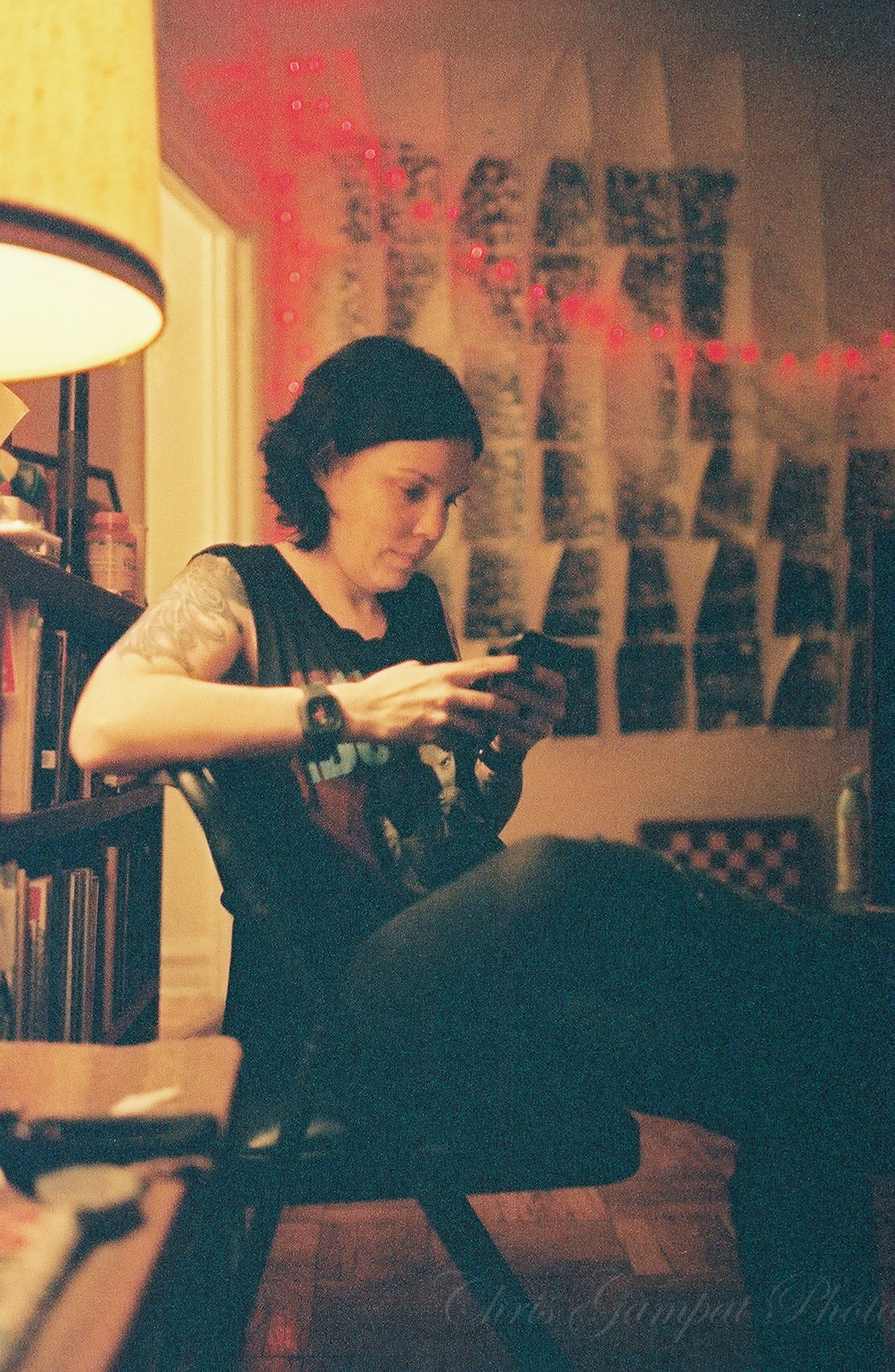
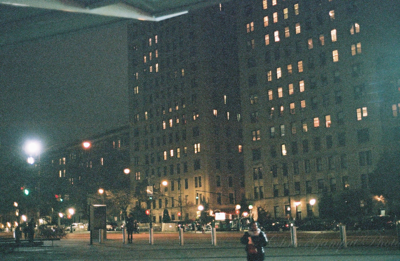
Fujifilm Natura 1600 is one of the more interesting films around I feel. During my testing, I used it in a Nikon N2020 SLR with the 50mm f1.8 and a Canon EOS Elan 7 SLR.with a Sigma 35mm f1.4. On introduction to the film, my buddy Simon used it with the Fujifilm Natura S camera: which is pretty much designed to be used with said film. His images are better and part of that is because the flash on the camera can actually work well with ambient lighting. Instead, lots of my work was done without a flash and in the oddest of lighting situations: indoors.
Typically when you shoot indoors you want to work with Tungsten film, but lots of photographers work with Daylight balanced film and just embrace the looks. No, these aren’t cross processed, this is how the film genuinely looks in a situation indoors and how the actual lighting in the apartment looked that night.
Fujifilm Natura 1600 requires a lot of light: just like any other color negative film. To that end, I generally recommend overexposing by a bit though I wouldn’t really say more than 1 extra stop of light unless you need to.
What I also found is that I was less of a fan of what I got with this film when working with Sigma glass than with the older Nikkor prime lens. One of the reasons for this has to do with the fact that the olderprime is less contrasty and newer Sigma lenses are SPECTACULARLY contrasty and saturated.
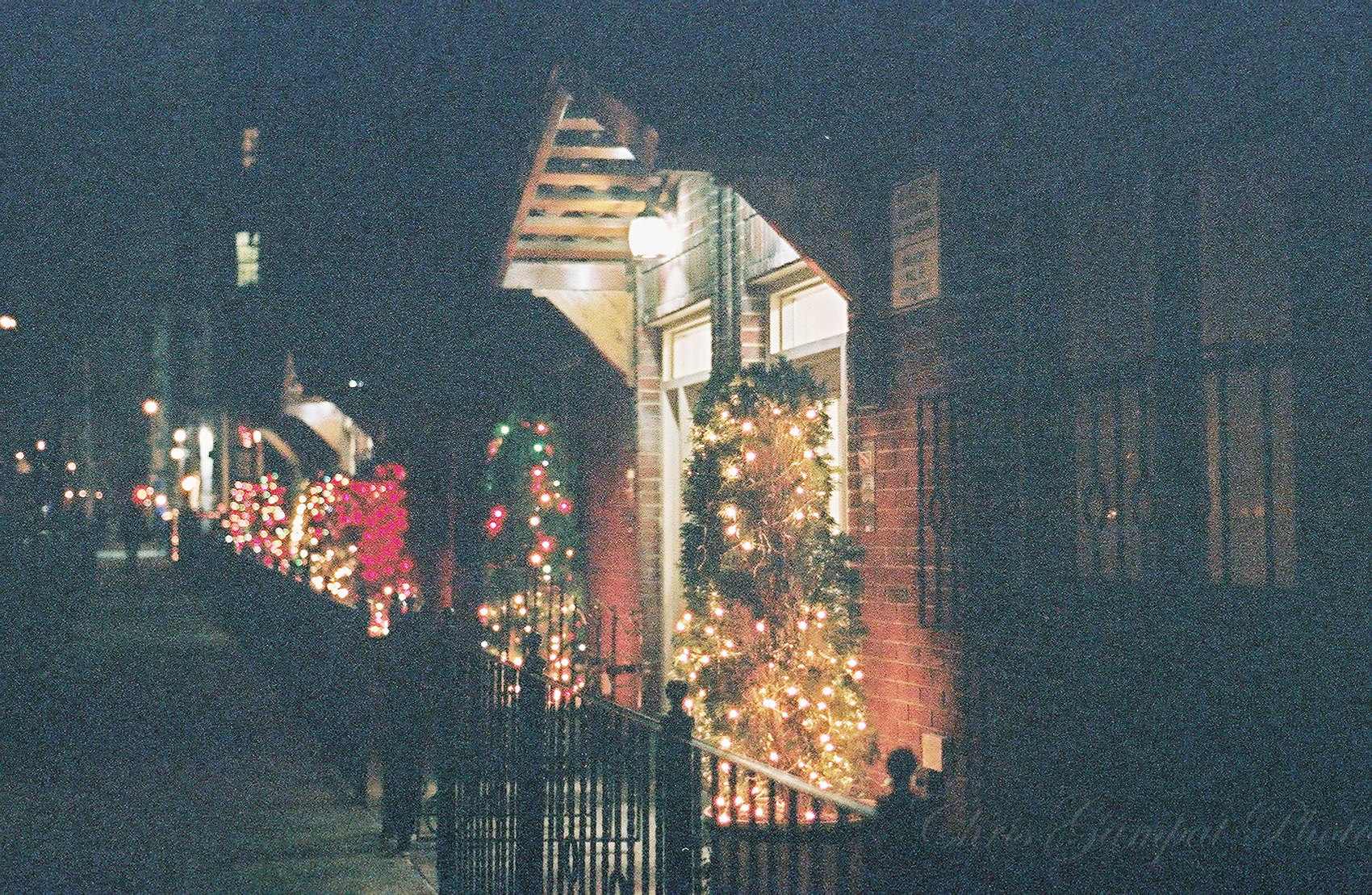
Here’s a sample shot with the Natura 1600 and the Nikon camera. See how much less the colors pop?
Image Quality
Fujifilm Natura 1600 film is a color, high ISO film that is fairly low grain when it comes to the overall rendition. It’s beautiful, though I’m going to admit that it isn’t my favorite high ISO film. That award goes to CineStill 800T. However, when I need it, Fujifilm Natura 1600 is available and can deliver a really nice, grainy look that in the right situations will look quite cinematic.

Like all other 35mm films it needs a lot of light. However, the film was also designed to be used in ambient light without a flash. I actually believe that it needs a flash to make the best of it when you’re shooting indoors with low lighting. The other alternative is to really slow down the shutter and add in maybe a stop or so more of light accordingly. In the hands of the right person, it can be really nice though I have to admit that grain tends to look much better in black and white than it does in color. Sometimes, the gritty, grainy look can be embraced: but that really depends on the subject matter of the photo.
The film isn’t very contrasty but it seems slightly more so than something like Kodak Portra 400 when pushed to 1600. If you’ve ever done that, you’ll also know how forgiving Kodak Portra is when pushed. To that end, I honestly like the look of Portra 400 when pushed more than I do with Fujifilm Natura 1600–but that’s just my opinion. For what it’s worth, Portra has the ability to render very low amounts of grain even when pushed. This and many other reasons are why so many film photographer make it their go-to film.
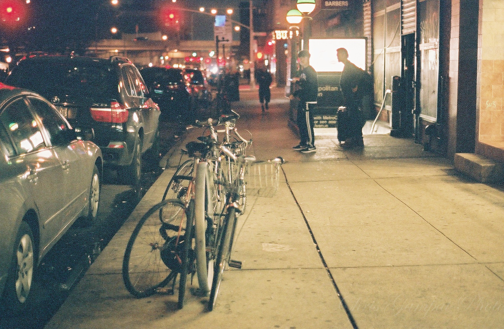
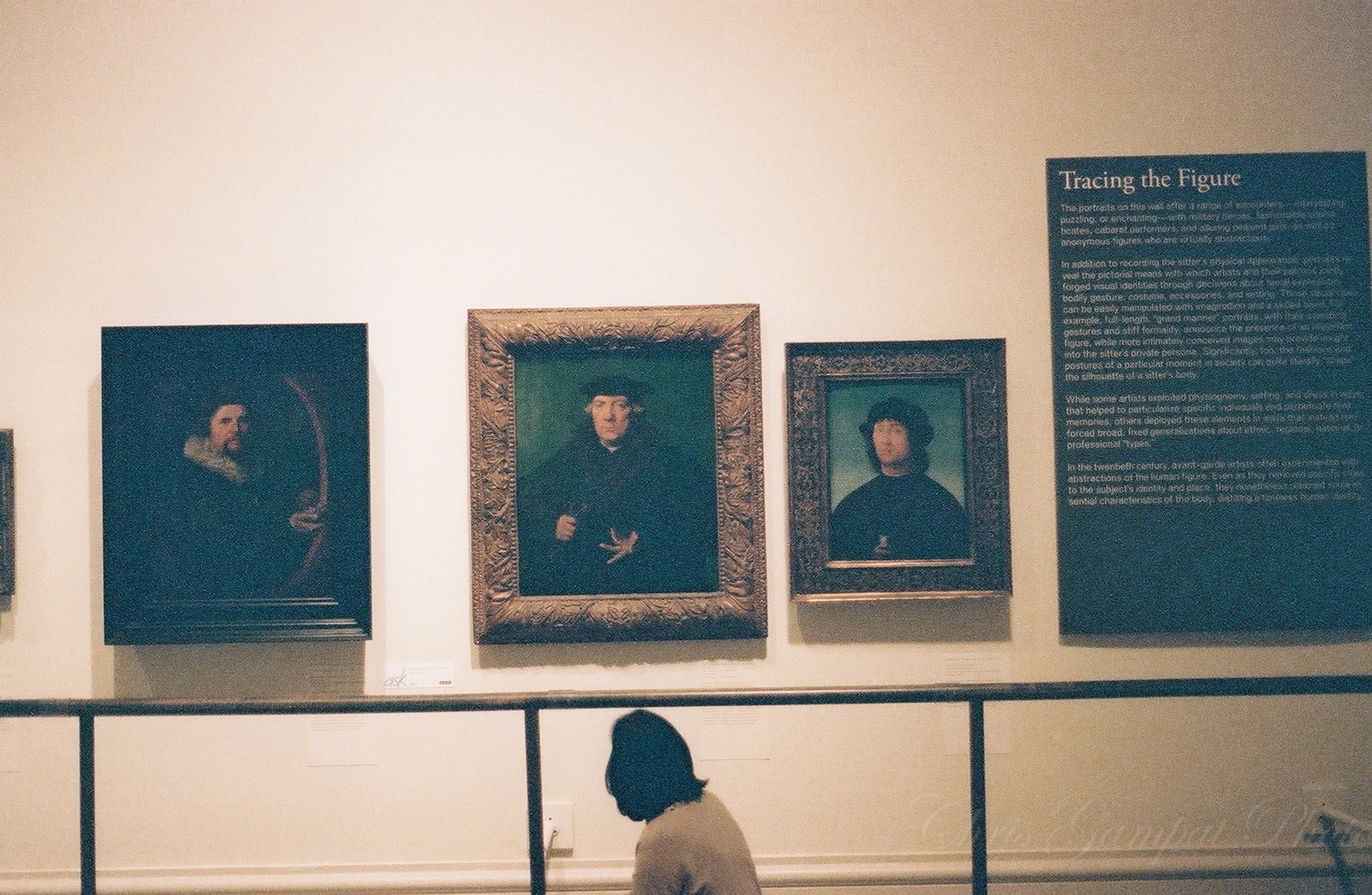
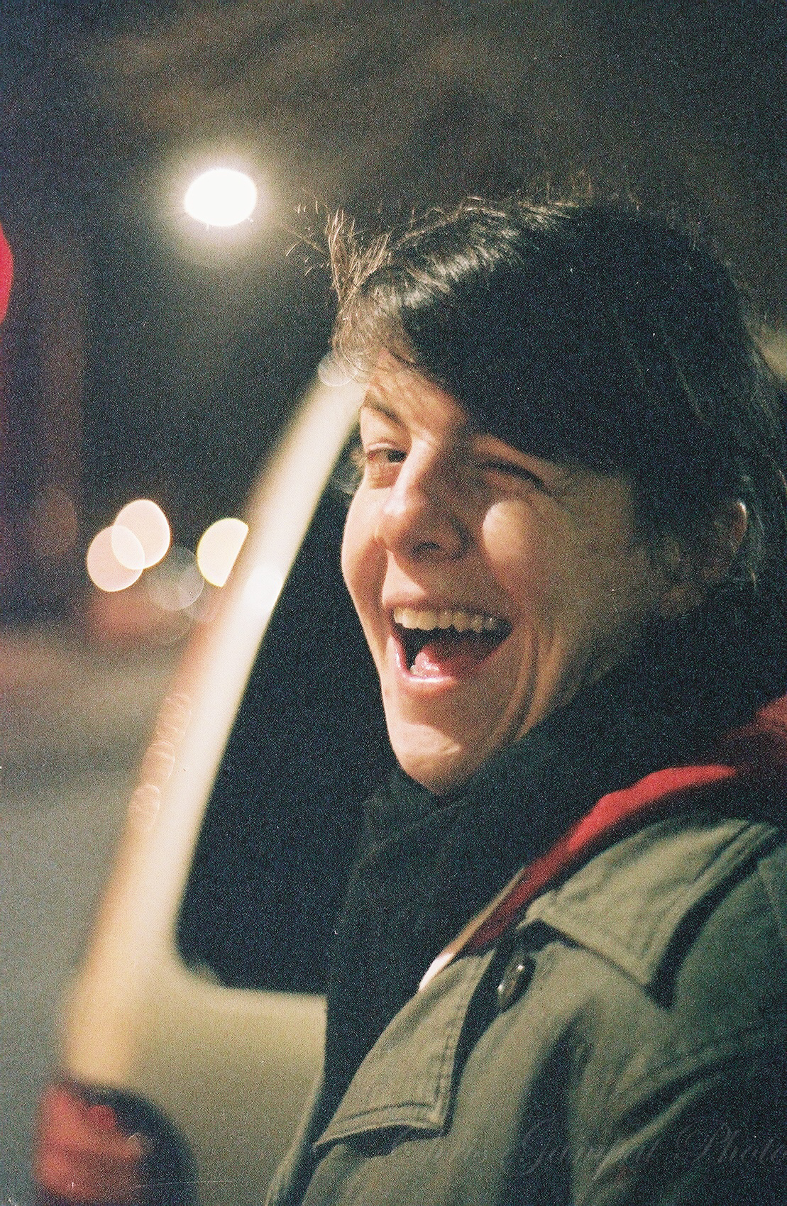
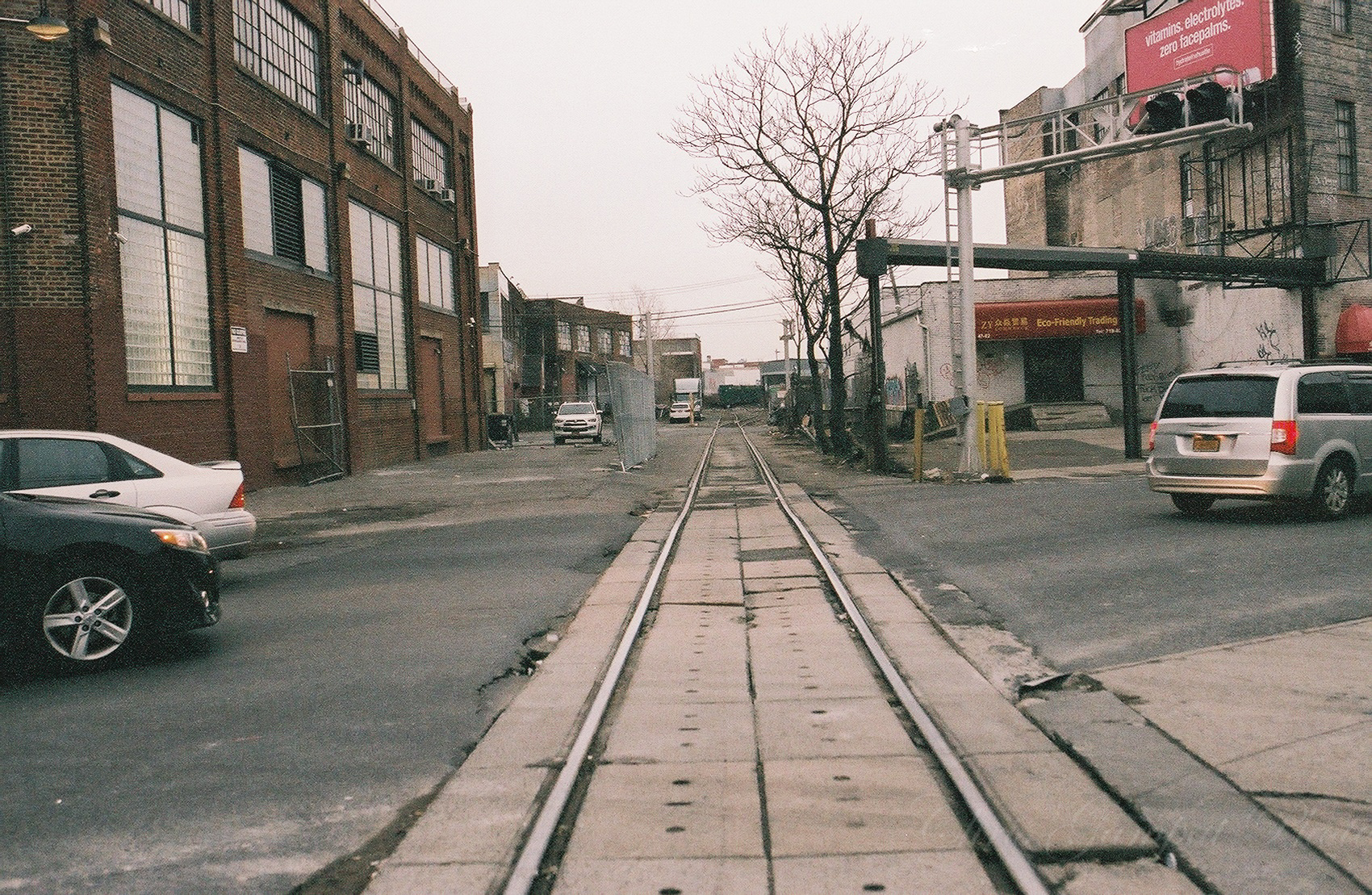
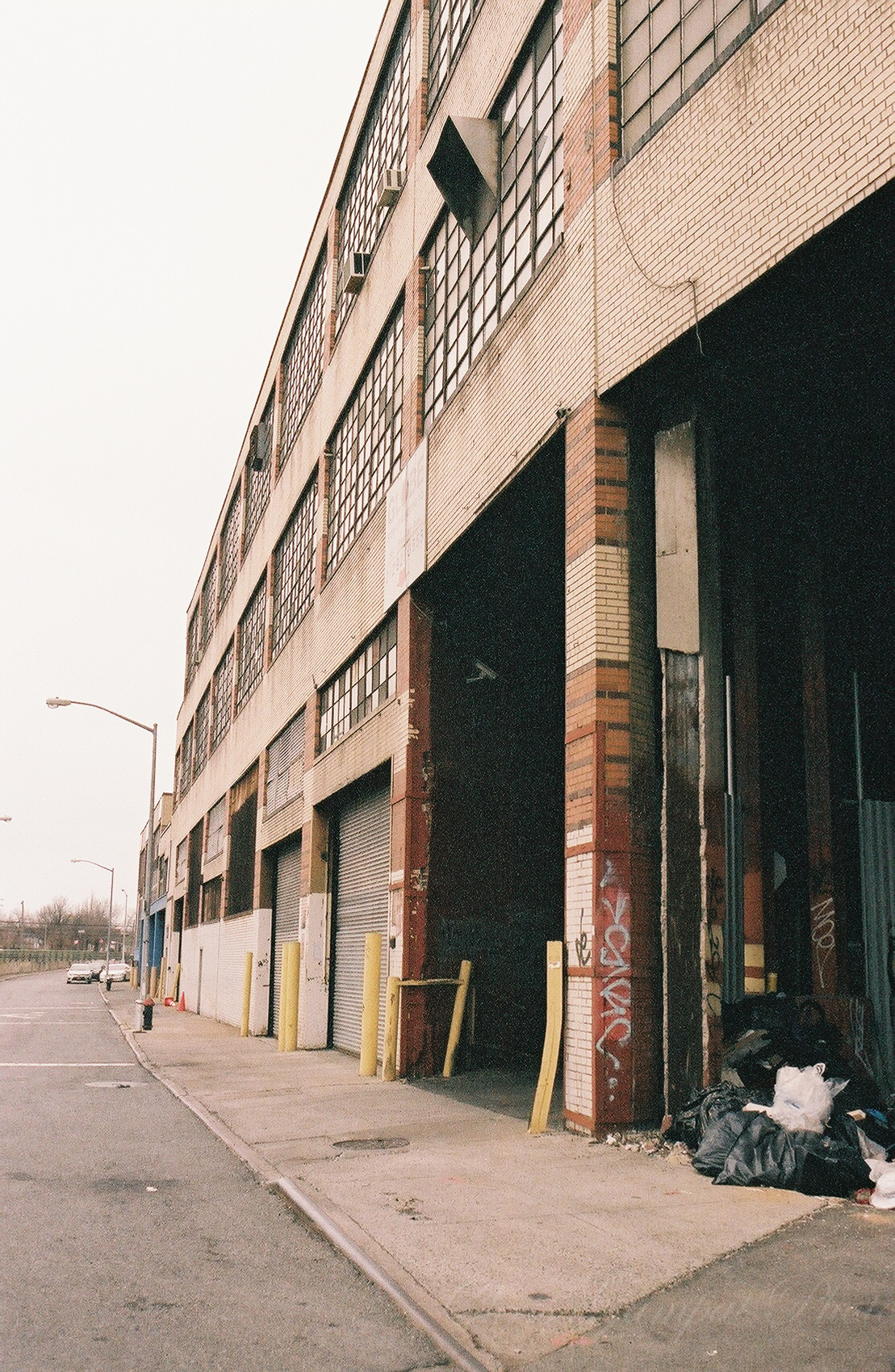
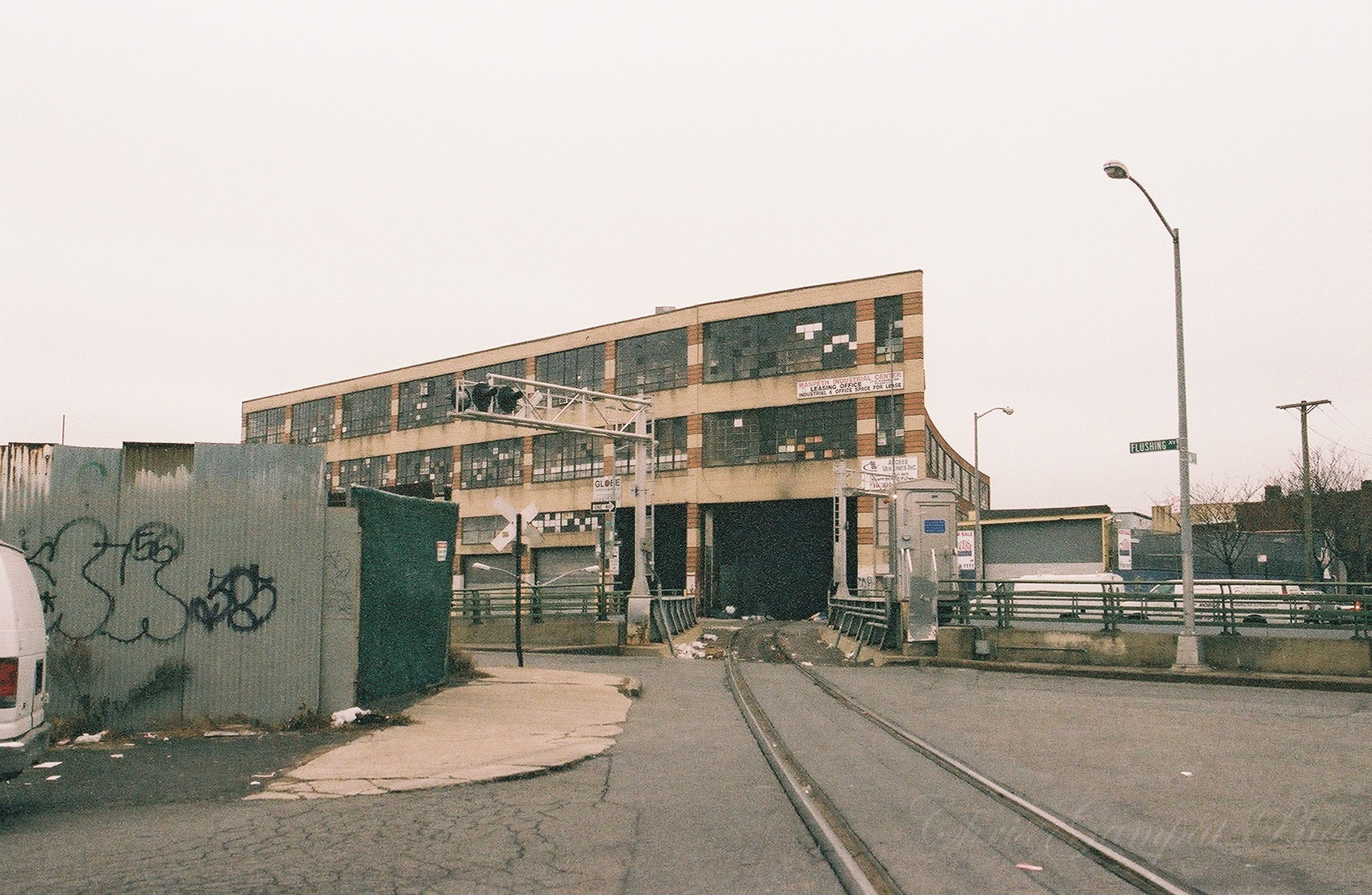
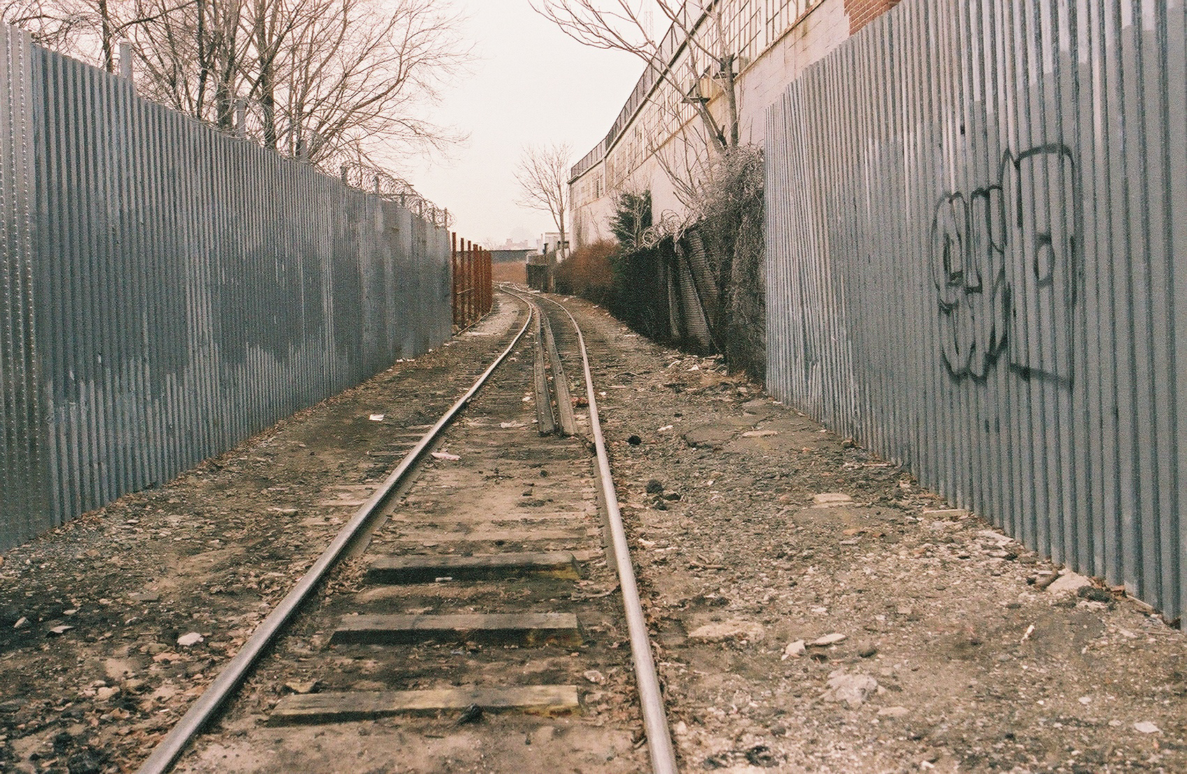
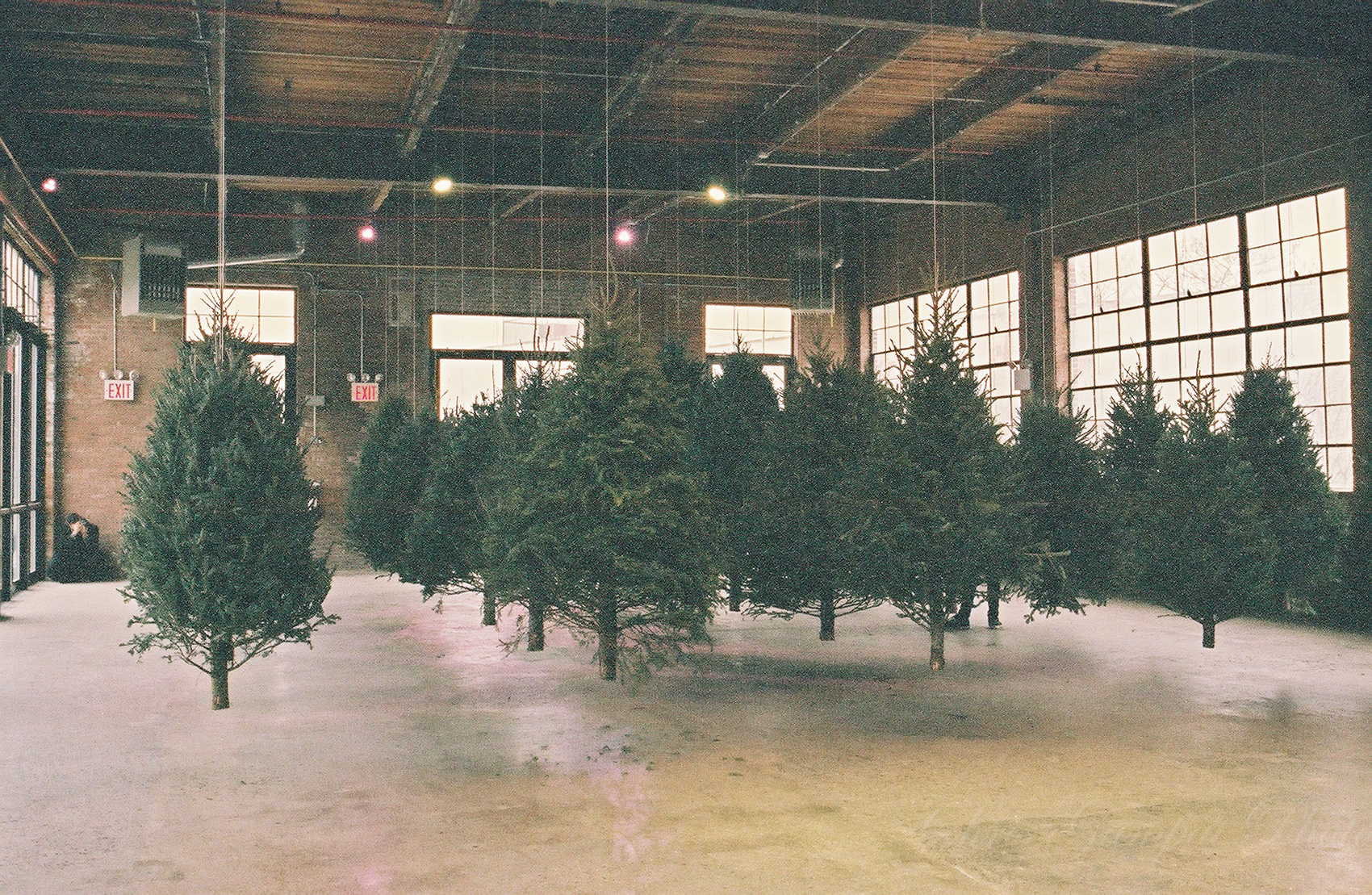
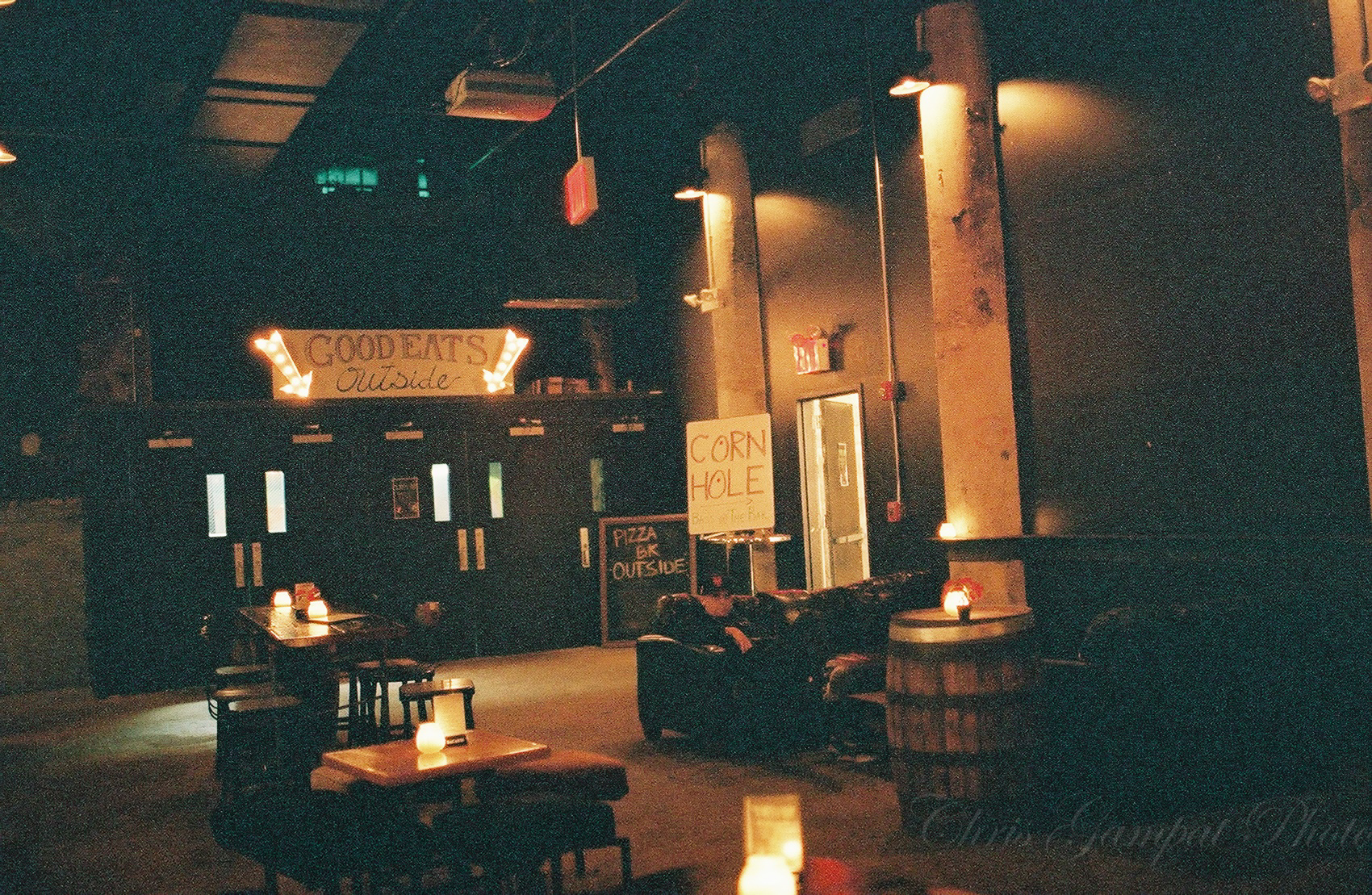
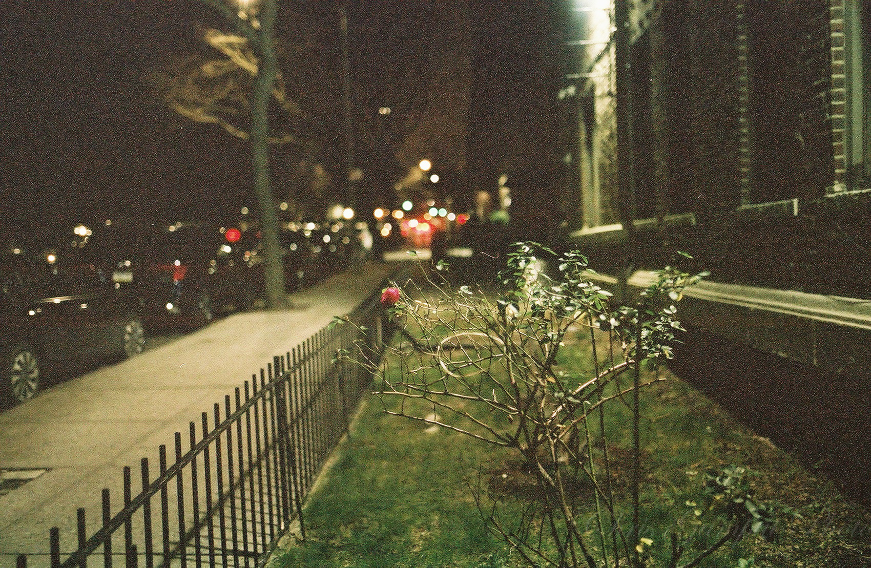
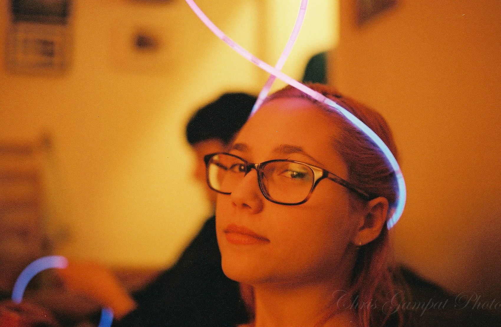
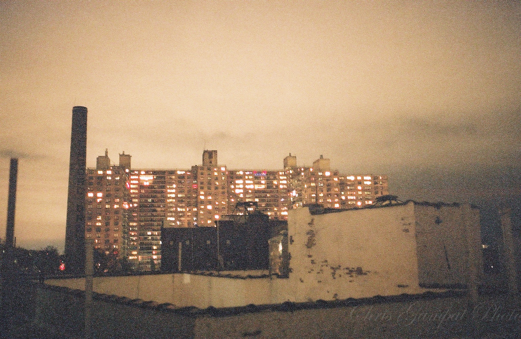
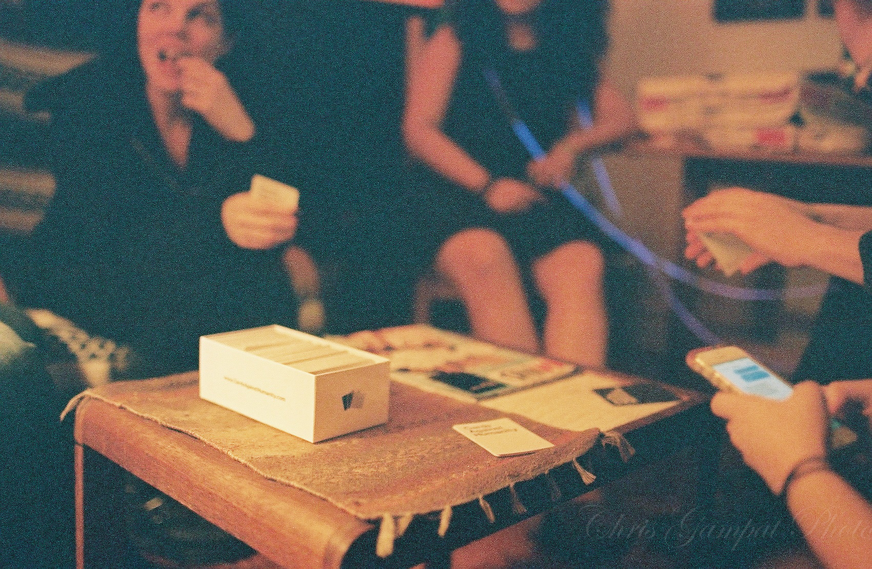
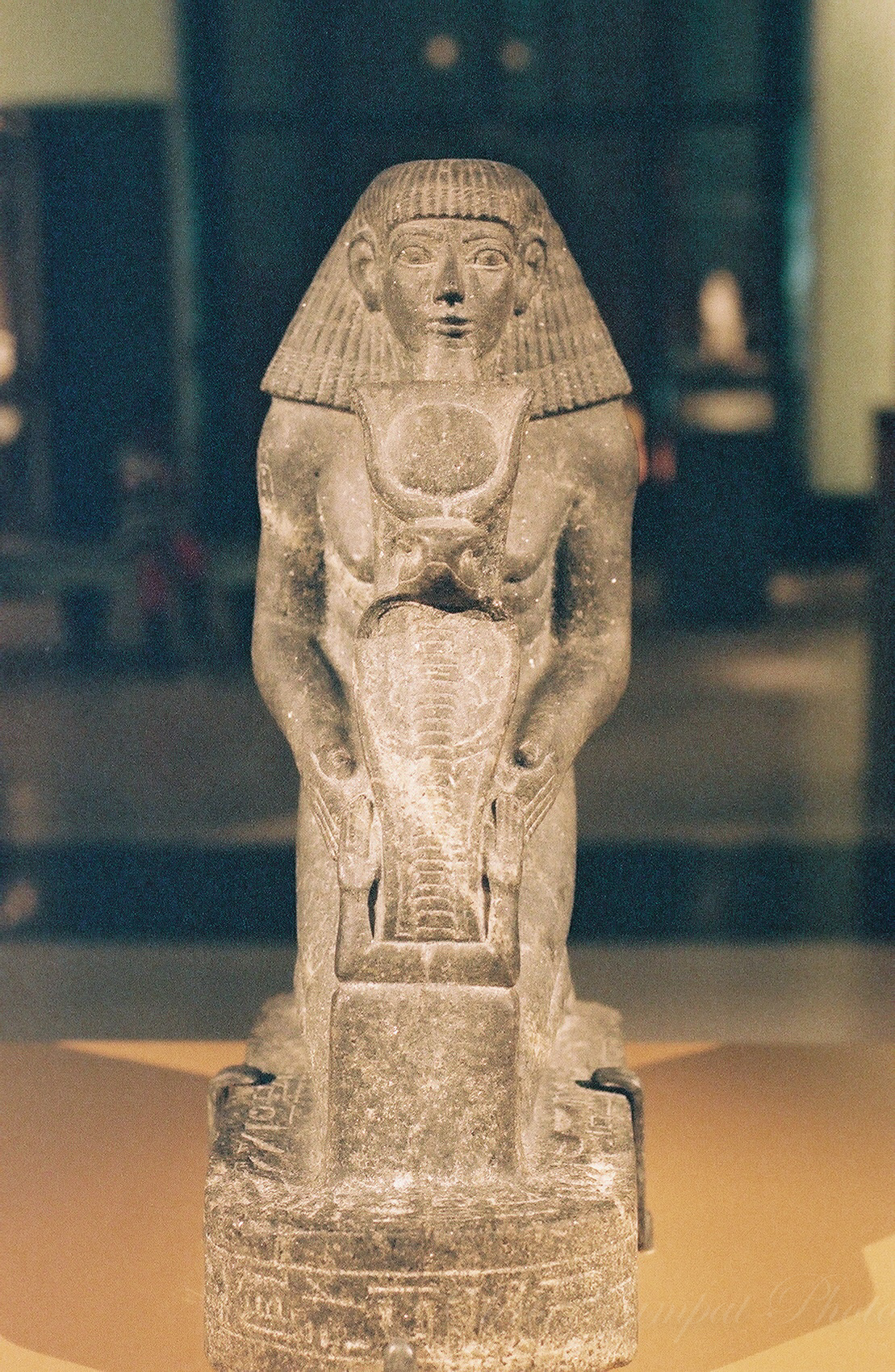
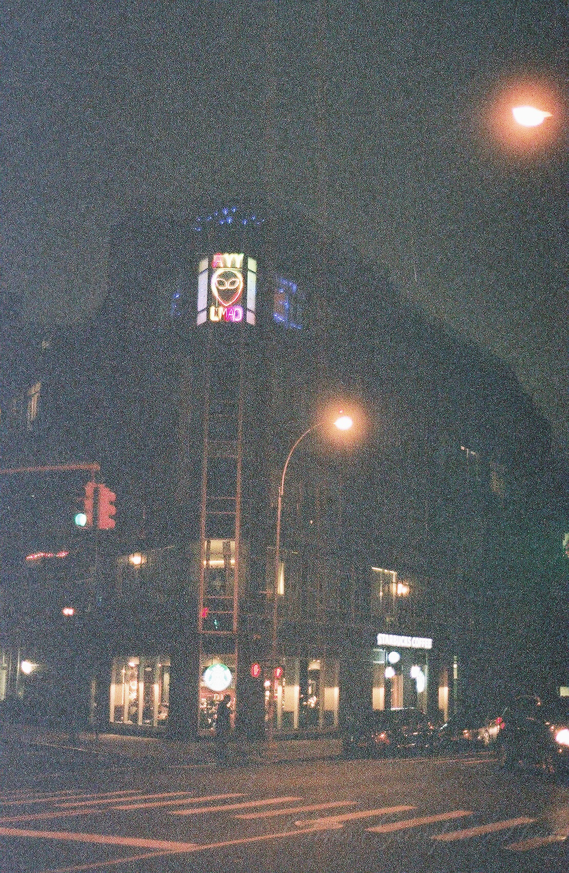
Here are other image samples.


Conclusions
This film is best used in low light conditions where it will be overexposed. But in brighter situations, it’s fine the way it is. Personally, it’s not at the top ofmy favorites though it is up there; but that all varies based on the type of photographer you are. I’ll leave that decision to you.
Get rid of the ads!
Did you enjoy reading this article as much as we enjoyed writing it? There's a way to support us and our reporting, getting ad-free navigation and more as a bonus. Subscribe to us for less than a coffee per month —just $3.99— or take advantage of our yearly subscription with a hefty discount for only $25.- An ad-free experience
- A free mystery box for Lightroom or Capture One
- All the books in our store
- 20% discount on Capture One
- 30% discount on Imalume Photo Theft Protection
- 20% off Herbs and Kettle Tea Company.