Last Updated on 02/18/2016 by Chris Gampat
Recently, the Phoblographer and EyeEm collaborated on a mission called Liquid Lunch. We’ve chosen the winner and the runners up. Here they are, and why we chose them.
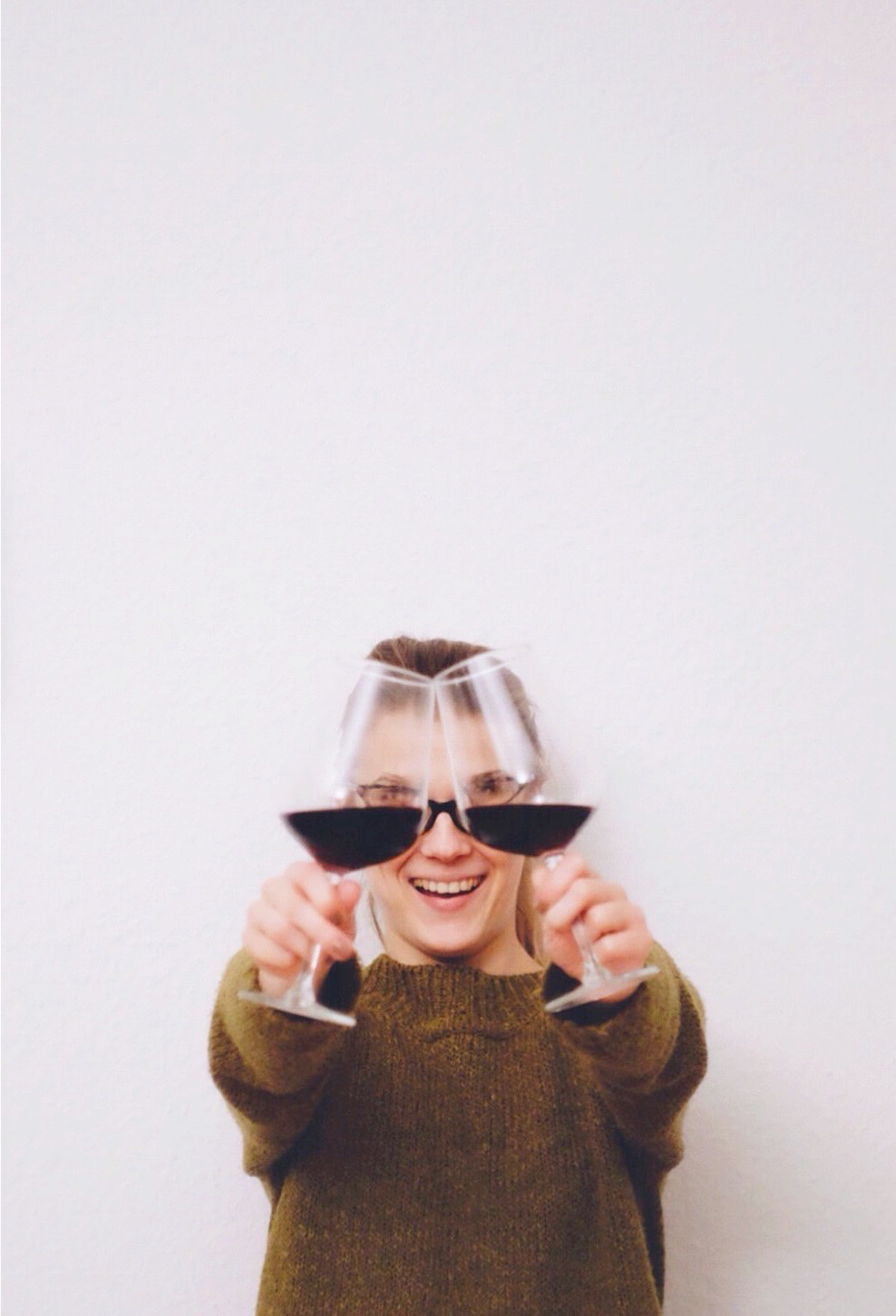
The winning image is the lead photo in this post. It’s by @prankaite, and is incredibly interesting in its use of space. When using the rule of thirds, its composed quite well, then combine this with the use of negative and positive space, plus the creative use of wine in two wine glasses to kind of look like sunglasses. It’s a fun image that is a unconventional way of looking at drinks but still quite refreshing.
This image by @Olgaaa03 is an incredible photo. It follows the rule of thirds quite well but also uses specific colors to stand out from all the rest of the scene. When you look at one part of it, your eye naturally moves around the scene and moves away from the white negative space. Beyond that, it’s a very unconventional way of looking at drinks–which is a welcome and fresh idea to this contest.
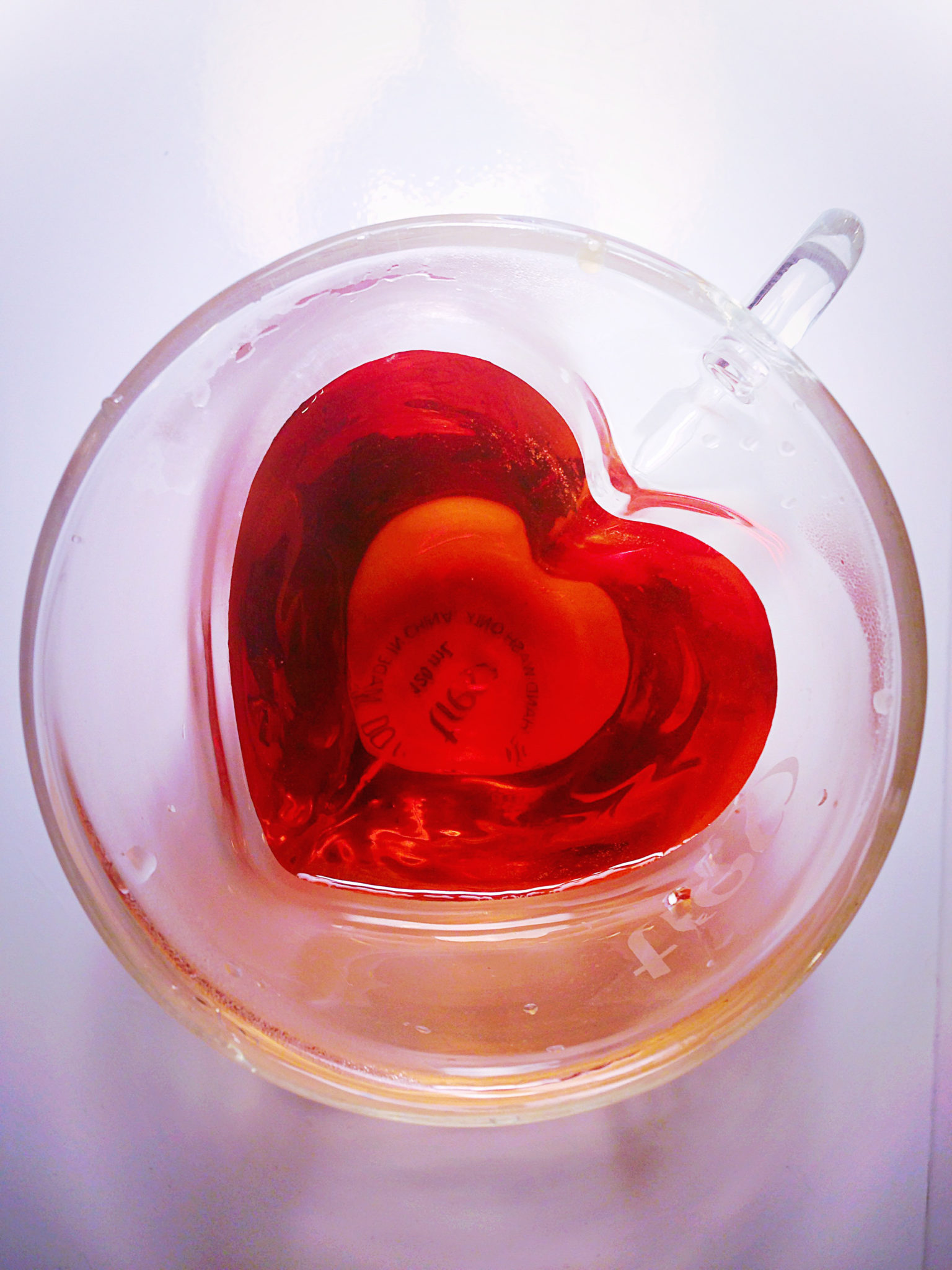
This image by @biaquarius is very similar to many of the others but uses great color composition and linear composition to make it pop out from the rest. Like the others, it has layers: the white exterior, the glassy silver mantle and the red core. Beyond that, the red is in the shape of a heart–which is a metaphor and play on words being that the heart is the center of all.

This image by @svetlanapavelko is composed impeccably but also gets the viewer up close and personal with what’s about to be drank. Sure, the bottom is cut off, but it isn’t necessarily important to the photo as much as the mixing of colors. Combine that with the way the brown layers over the white and then into the yellow/brown and it makes for a wonderful photo overall.

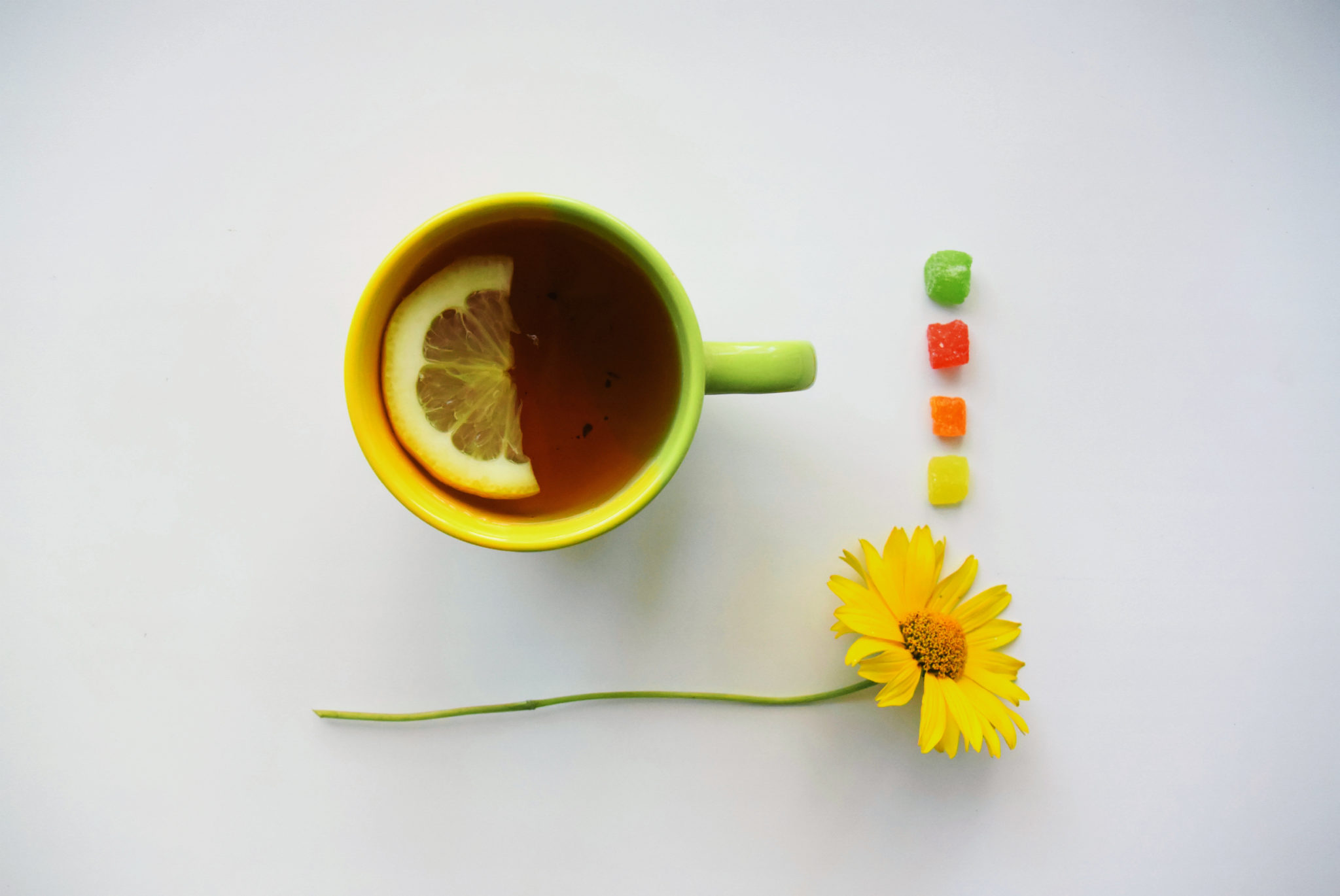
This image if by @sayinghello is a great use of simple colors that don’t overwhelm the viewer. Everything is on a wood, brown background with each major part being a shade of greenish/aqua with their own colored centers. Beyond that, there is also the white book–which makes us feel right at home in the scene when combined with the light coming from the top of the image.
Get rid of the ads!
Did you enjoy reading this article as much as we enjoyed writing it? There's a way to support us and our reporting, getting ad-free navigation and more as a bonus. Subscribe to us for less than a coffee per month —just $3.99— or take advantage of our yearly subscription with a hefty discount for only $25.- An ad-free experience
- A free mystery box for Lightroom or Capture One
- All the books in our store
- 20% discount on Capture One
- 30% discount on Imalume Photo Theft Protection
- 20% off Herbs and Kettle Tea Company.