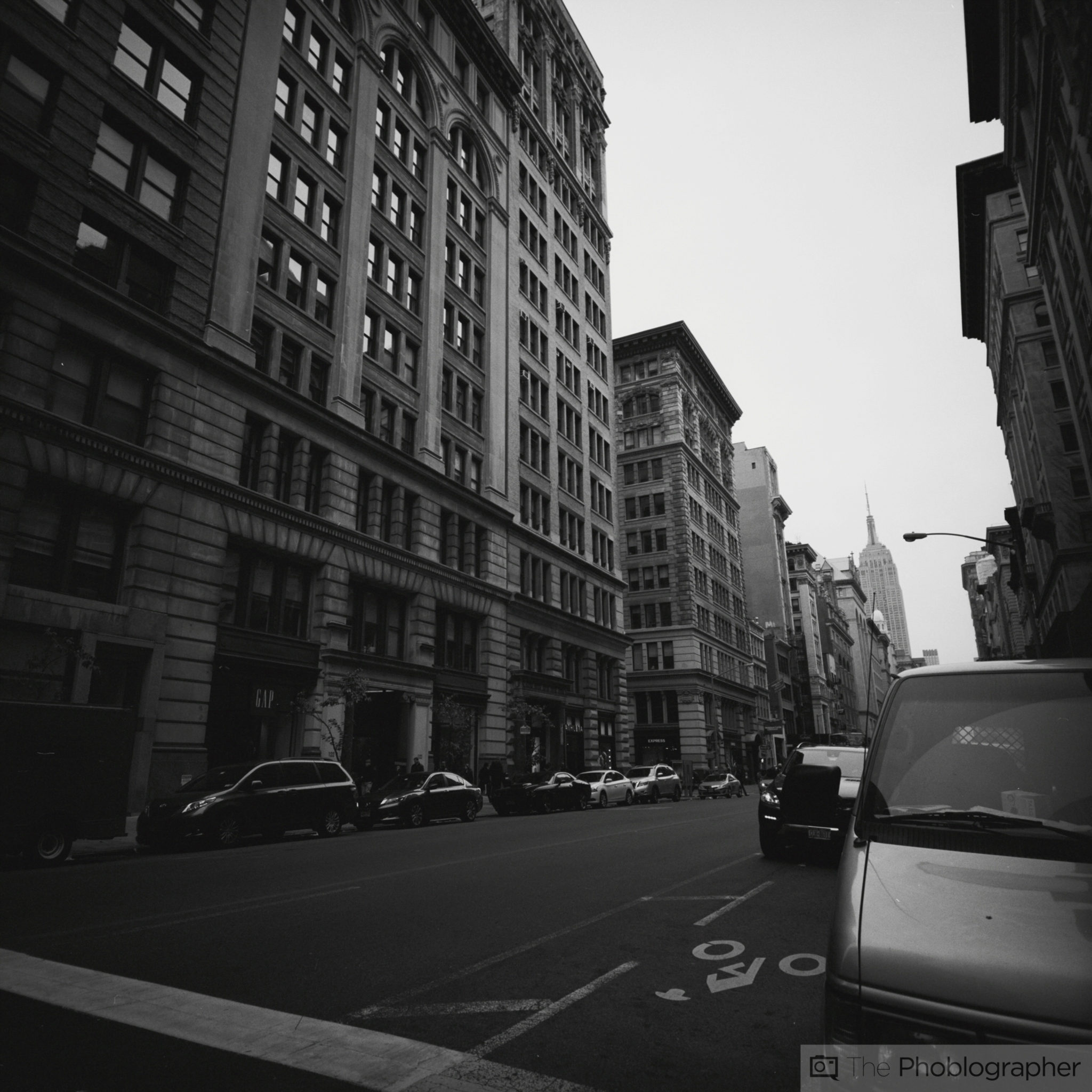
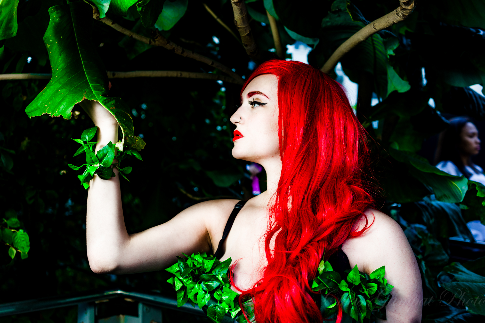
The old saying “Keep it simple stupid” resonates very strongly with the idea of creating color photographs vs black and white photographs. If you study the work of even the amazing Steve McCurry, you’ll see that what he does with his portraits is tries to keep the colors fairly simple with one primary color and two other major colors in the scene. Too many colors can overwhelm the look of an image.
But besides how colors work in a scene in terms of a simple visual aspect, there is also the idea of placing them in just the right spots for a better composition.
Color photography isn’t simple to do well though overall, it’s simple to do. In an artistic or even a technical sense, using colors effectively in an image requires just the right amount of contrast in the scene, an effective exposure and the creative use of shadows and light to really make someone pay attention to exactly what you want them to. All of this should be used on top of other techniques like depth of field, composition techniques like the Rule of Thirds, and making the lighting illuminate what you want to clearly tell the story that you intend.

But color can also work very much against you. In some area of the image that isn’t specifically important to your scene, the colors there can end up drawing the eye in too much and detract from the rest of the scene. In photojournalism, a photo editor would simply crop the photo to get all the excess out. That technique is called framing.
So what am I getting at here? In order to create better images and overall be seen as a better photographer, part of this comes with realizing all the power that color can give you and using it responsibly in a photo. I’m not talking about those here that simply just shoot for themselves and their own pleasure–but instead those that aspire to really and genuinely become better photographers.
At the same time, black and white can be used as a crutch. It shouldn’t be, and instead simplifies scenes into levels of contrast, shapes and geometry even more than color does. When you add color to all of this, the layers become even greater.
Effective use of color can be as simple as working with more punchy reds or greens in a scene; you just need to envision what you actually want. For that to happen, I greatly recommend looking at images of great photographers and taking in their work. Lots of them use color very effectively. Just look at Jeremy Cowart, Brian Smith, Lindsay Adler, Steve McCurry, Varina Patel, Joe McNally and Zack Arias for examples. All of them use color very effectively and typically find a way to keep it simpler.
Get rid of the ads!
Did you enjoy reading this article as much as we enjoyed writing it? There's a way to support us and our reporting, getting ad-free navigation and more as a bonus. Subscribe to us for less than a coffee per month —just $3.99— or take advantage of our yearly subscription with a hefty discount for only $25.- An ad-free experience
- A free mystery box for Lightroom or Capture One
- All the books in our store
- 20% discount on Capture One
- 30% discount on Imalume Photo Theft Protection
- 20% off Herbs and Kettle Tea Company.
- 20% off your order from MPIX printing services.
- 5% off Viltrox Products via their eCommerce store.
- 10% off all film developing, printing and scanning services from Blue Moon Camera and Machine
- 15% off 7Artisans products: The lens and accessory maker is offering a sweet discount for Phoblographer's readers.